

Step by step illustration of a Robin
Step by step blogs can be tricky to write – I often don’t know where to begin the explanation. In this blog, I’ll explain how I add colour to a pencil drawing of a Robin Erithacus rubecula.
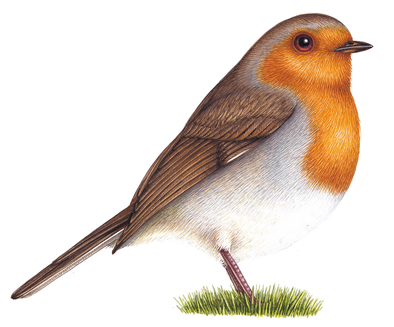
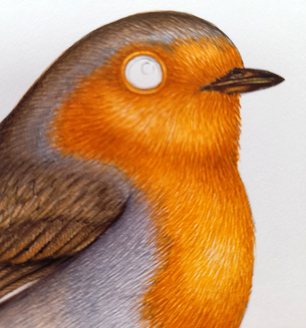
Completed Robin
Step by step: Getting reference
To get your drawing done, look for royalty free photos online, take a camera into a nearby garden or park, or (if like me you happen to have a friendly wildlife photographer on hand) ask permission to borrow their photos for reference.
I use mechanical Pentel P205 pencils with an H or HB 0.5mm lead. I draw directly onto my watercolour paper, in this case hotpress Fluid 100 by Global Arts.
One of the reasons why I use Fluid 100 is because it’s quite good at allowing you to erase your pencil lines after you’ve painted on top of them. This works especially well if you have a really light touch when drawing up your robin.
Unfortunately, I never took a photo of the pencil drawing of this animal, so we’ll have to imagine it. Apologies!
Step by step: Chest feathers
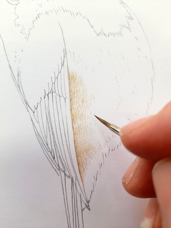
I start with the chest feathers because this is the palest part of the bird. We need to make sure it stays pale, but still shows texture. I use lots of tiny brush marks to show the texture of feathers, focussing on areas of shadow. In this case they are below the wing, and at the bottom of the robin’s body.
Winsor and Newton are my favourite watercolours, and I use pans topped up with tube colours. I mix Yellow ochre, Vandyke brown, and a touch of Cadmium orange light together. I make sure the colour is extremely pale by diluting it with water . Carefully, using my trusty Series 7 sable brush (size 1), I build up the shadow below the wing.
Building shadow and texture below the wing
Next, I mix up a grey. This is Cerulean blue with a little purple and a tiny dash of a dark brown, like Vandyke. Again, dilute this colour to a very pale tone with clean water. Referring to your reference at all times, build up the areas of grey on the robin’s body with lots of tiny brush marks. Overlap the first area of colour you put down, without swallowing it up. This blending on the page tricks the eye into making a smooth transition between different areas of colour.
Think about shadows and make sure your brush marks are a little heavier and closer together where the shadows are darker. These are around the legs and towards the back of the wings
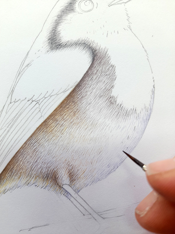
Adding grey to the Robin chest
Step by step: Wing detail
Robin wings are brown, but it’s not a colour that comes straight from the box. There’s a softness to the colour. I mixed up two browns. The first is darker and used to put detail onto the wing feathers. It’s Vandyke brown plus a little Yellow ochre, and a tiny bit of purple.
Outline the edge of each wing feather, then with a lighter touch, add texture to each one. Try to leave a white margin between the individual fathers, this will be knocked back by successive layers of browns in due course, but is important in supplying detail and tonal difference.
The second brown is yellower and lighter. Yellow ochre with a touch of Vandyke, applied quite dry to the upper feathers on the wings. Again, pick out the edges of each feather and add texture with lots of tiny brush strokes.
Wing feathers are outlined and given texture
Step by step: Wing colour
Next, add a lot of clean water to your darker brown, to make a light shade. Once your feathers are totally dry, pop this top wash across the entire wing (except for the areas which are lightest of all. With watercolour painting, highlights are represented by the white paper that the drawing sits on. Allowing this to remain unpainted gives luminosity to an illustration. And if it looks too stark, don’t worry – you can always make it darker by adding paint.)
Wing with top-wash of pale brown paint
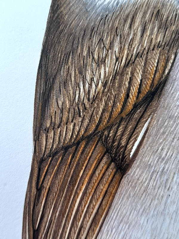
Seen in context, the wing is the right colour, but looks pretty flat. Add a little more colour and tonality to help clarify the structure and the detail.
Robin wing with colour but no shadows
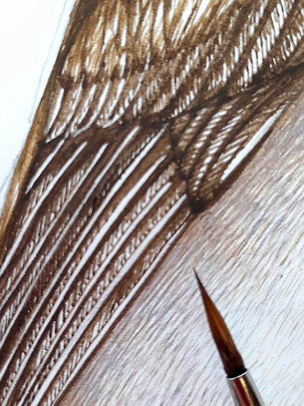
Step by step: Wing Shadow and texture
The photo below is a little confusing as it’s more exposed and thus paler than the one above. However, it shows the next step. This is to add a dash of extra vibrancy to the front area of each wing feather. This is an orange mixed with yellow ochre, and is used quite dilute and pale.
A darker brown (Vandyke plus purple) can be carefully applied to the dry feathers to add a tiny bit of extra texture, and to show shadow and definition between individual feathers.
Detail of wing with orange and darker brown detailing
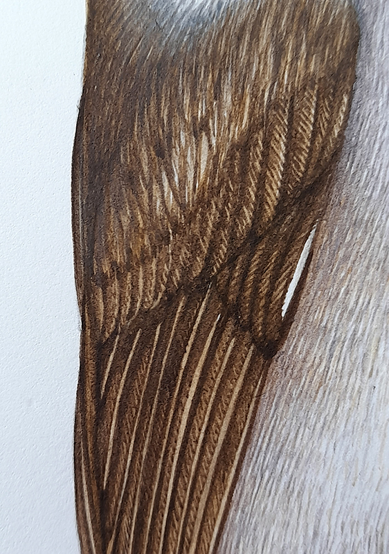
Hopefully the illustration below shows how adding these details have made the wing look crisper and more realistic.
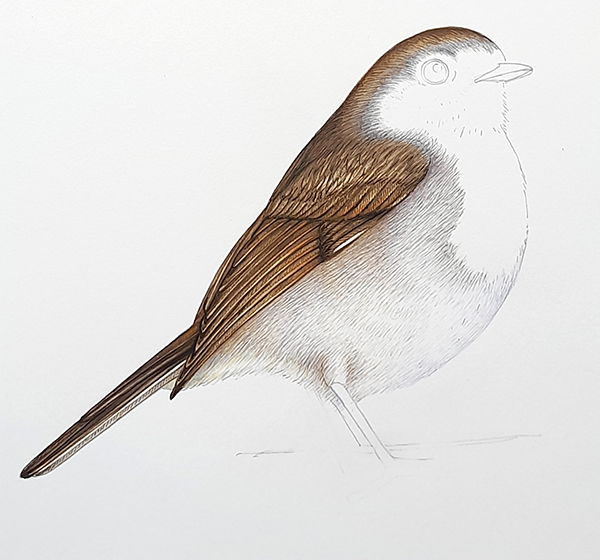
Robin with completed wing
Step by step: Robin’s orange chest
Now that the wing is done, move onto the chest.
People always say that the European robin has a red chest. this is blatantly untrue, the chest feathers in both sexes are a vibrant orange. This is a tough colour to work with as it instantly draws the eye. To make sure you look at the entire illustration, not just the chest, you can add touches of this orange across the rest of the robin. Do this in places where it’s not obtrusive (such as the wing feathers).
This orange is a mix of Cadmium orange light, a bright yellow, and a touch of yellow ochre. You want the paint to be quite dry, somewhat like the texture of cream. This allows each brush mark to carry plenty of colour.
Again, using the tip of your paintbrush, build up the colour with lots of tiny little brush strokes. This gives the impression of textured feathers. Where the orange is darker (reflecting the underlying anatomy of the bird) put the brush marks closer together and apply a little more pressure.
Once this initial layer of orange has dried, mix up a more watery and yellower colour. I did this by adding Cadmium yellow dark to my orange, and diluting it a little with water.
Repeat the building up of little strokes, but as the colour is lighter you can afford to be a bit less precise. this layer adds a golden glow to the chest and fills in the worst of the white spaces on the orange bib.
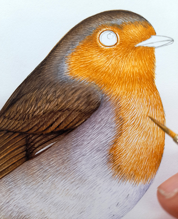
Working into the robin’s orange bib
Leave a small areas of white in the centre of the chest, this makes the feathers look brighter and allows the white of the paper to glow through.
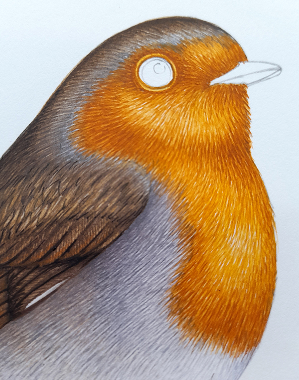
Robin with chest completed
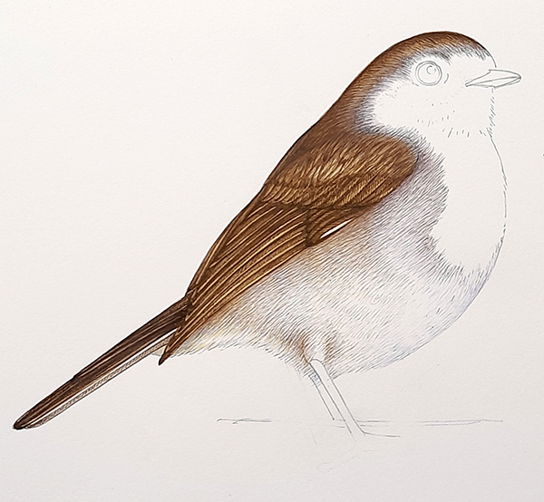
At this point, the Robin should look pretty detailed. Still missing legs, beak and an eye; but the colour and texture and shadows of the feathered areas have all been completed.
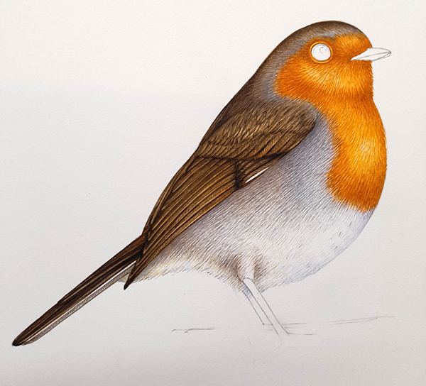
Robin with feathers done
Step by step: Add the beak and legs
Robin beaks are almost black, so mix a dark brown by adding some blue to a crown. Define the edges of the beak and let this dry. Then put a top wash of a paler brown over the beak. This will knock back the white areas. I added some of the chest orange to the beak too; the logic being that this colour would naturally reflect upwards onto the shiny surface of the beak.
Robin with beak added
Next up is the legs. these are a darkish brown with plenty of pink in the mix. I used Vandyke brown plus Alizarin crimson. Draw along the outside edges of the legs with your brush, then paint each scale along the legs. It’s when I’m painting the legs of birds that I remember that these creatures are, in fact, feathered dinosaurs!
Dilute the pinkish brown colour to a very pale shade, and pop this over the legs.
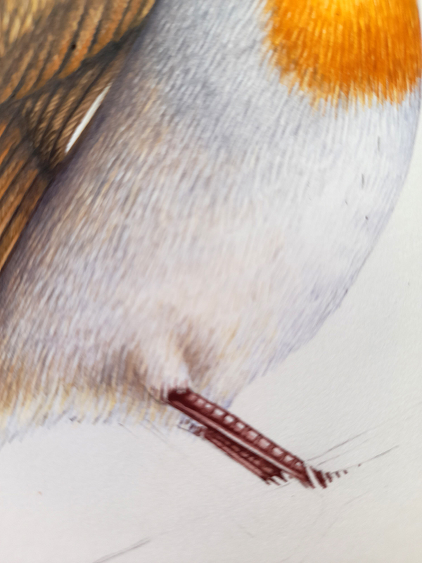
Robin legs completed
The last thing I paint is the eye. It’s a risk; if you mess up the eye then the whole painting is hard to fix. But I don’t like the creatures I paint watching me as I work on them, so I only add the eye at the very end.
Robin eyes are a reddish brown. I used a little artistic licence by making the eye pinker than in real like. This was to trick the eye into including the pinkish legs into the picture when you look at it. Echoing a colour across an illustration makes it easier to see the whole picture, and not to get stuck in one corner.
Likewise, I used the same eye colour to pick out some details of the darkest areas on the orange feathers.
Do the iris first, leaving an area of white paper at the base of the circle. Then knock this back a bit with a yellower or more dilute colour. Once dry, add the pupil. Try to leave an obvious white circle on the pupil. Make the transition between pupil and highlight a little less stark by softening its edge with a pale, pale grey.
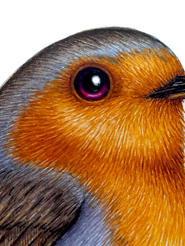
Robin with completed eye
Step by step: Final details
Normally, I add the really dark darks and shadows at the end of an illustration, In this case I didn’t, I brought in the darks as I went along. This meant all that needed doing once the eye was completed was the grass around the robin’s feet.
Represent grass by outlining each blade of grass with green, and (once dry) putting a diluted and slightly yellower green over the top of the area.

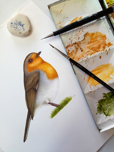
Completed Robin with paint-box
The last step is to use a good eraser and rub out the pencil lines. This should lift the pencil line without compromising the watercolour paint. Use a light touch if this feels scary, and be aware that some papers don’t allow this to happen as readily as others.
And there you have it. For more of my step by step blogs on painting birds, please check out my posts on the Pied wagtail, Barn swallow, Goshawk, Parrot, Waxwing, Golden plover, and Puffin.
Thank you so much. As an untrained beginner it is often the colour mixing that is so difficult. Your clear explanations of technique along with colour guidance makes this ‘project’ so much less daunting than facing a blank page, a box of paints & a reference photo! I have saved this to do next year. Happy Christmas 🎄
Hi Charlotte
What a wonderful comment! I lvoe that it makes things feel accessible, thats the best thing I could hear. Enjoy it, and happy new year!
Thank you for this post Lizzie. Again marvellous commentary with the images.
May you and your family have a good and safe seasonal break.
Regards Peter
Dear Peter
What a lovely comment. Thankyou, Im glad you enjoyed it. And happy new year and stay safe and well
yours
Lizzie
Thank you Lizzie, for this very detailed explanation. It is a beautiful painting. This will also go on my list to try soon. Maybe one more month before….. so looking forward to try out the Fluid 100. 😊😊
Wishing you and your family a very happy and corona (if possible) free and healthy year.
Aww thanks Ineke!
Lizzie, As always a perfect painting, perfect directions, and an inspiration. Thank you for all the blogs. Your blogs and u-tubes are better than any TV program, movie, or any of that other stuff thrown out over the air waves. Have a fantastic 2022!
Dear Beth, thanks so much for this lovely feedback. A wonderful 2022 to you, too!
I have just discovered these wonderful mini lessons.Thank you so much.
I am particularly interested in the fact that you erase pencil lines after the work is completed.
Hi Min, so glad you like these blogs. And yes, with the right paper erasing pencil lines is a doddle! Such a helpful thing to have those graphite guide lines. Glad you like it. Lizzie