

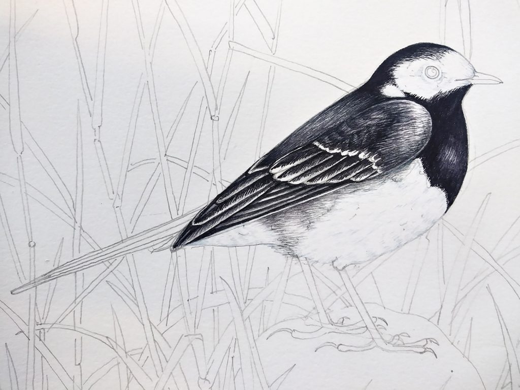
Pied Wagtail Illustration
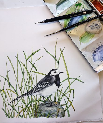
Pied Wagtail
The Pied Wagtail Motacilla alba yarrellii is a common garden and urban bird here in Wales. I love the way they trot about, wagging their elongate tail up and down and cocking their black-capped heads inquisitively to one side. We have a regular garden visitor who spends a lot of time scampering from one side of my roof to the other, pausing to look for food and to twitch its tail. This week I’ll explain the steps I used to paint this engaging little bird.
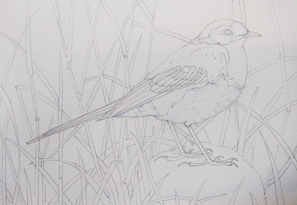
Starting out
First, get decent reference and draw up your bird in pencil. I often refer to the exquisite photographs of Pete Walkden who allows me to use his material for reference. I also combine images from multiple other sources. With the Pied wagtail, I drew an overgrown corner of my garden for the background. I draw up my illustrations without tone or shading, almost like the page of a coloring-in book.
My favourite pencils are mechanical P205 Pentel ones with 0.3mm H or HB leads. I draw direct onto watercolour paper (in this case Stonhenge Aqua hotpress).
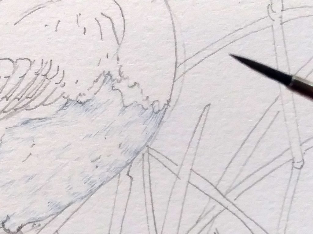
Painting the white feathers
Although white feathers are white, you need to use colour to illustrate them.
I use a mix of Cereleun blue, Cobalt blue, and Purple lake (all Winsor and Newton) and only ever use my trusty Winsor and Newton series 7 sable brushes (a number 1 in most cases).
Diluting the purplish blue, I use tiny brush marks to show areas of shadow and texture on the white regions of the chest and head. The trick is to get enough paint onto the paper to make it feel textured and tonal, but not to muddy the white. It’s easy to add too much colour too fast, and impossible to remove it, so be careful.
Working into the Greys
Grey feathers cover the wings and shoulders and a lot of the back of the Pied Wagtail. There’s a great deal of tonal variety in this sombre colouring. I mix my grey from Cereleun blue, purples, a touch of burnt umber, a touch of sap green, and Cobalt blue. It’s worth messing about with this mixing, and taking the time to get it right.
You also have to decide if you think the grey is a blueish grey, a pinkish grey, or a greenish grey. I kept changing my mind as I painted the shoulders of the bird, and I think the inconsistency shows!
Lighter areas are achieved by using less of the tiny brush strokes, thus allowing the white of the paper to gleam through. Diluting the colour mix with water also helps keep it pale. Avoid mixing in whites, they make colours feel heavy and chalky.
You can darken the mix by adding black hues, or perhaps a touch of purple or Winsor blue. I darkened the grey with some Burnt umber and Pthalo blue. I think you can see how the tiny strokes build up to give the colour a little more depth.
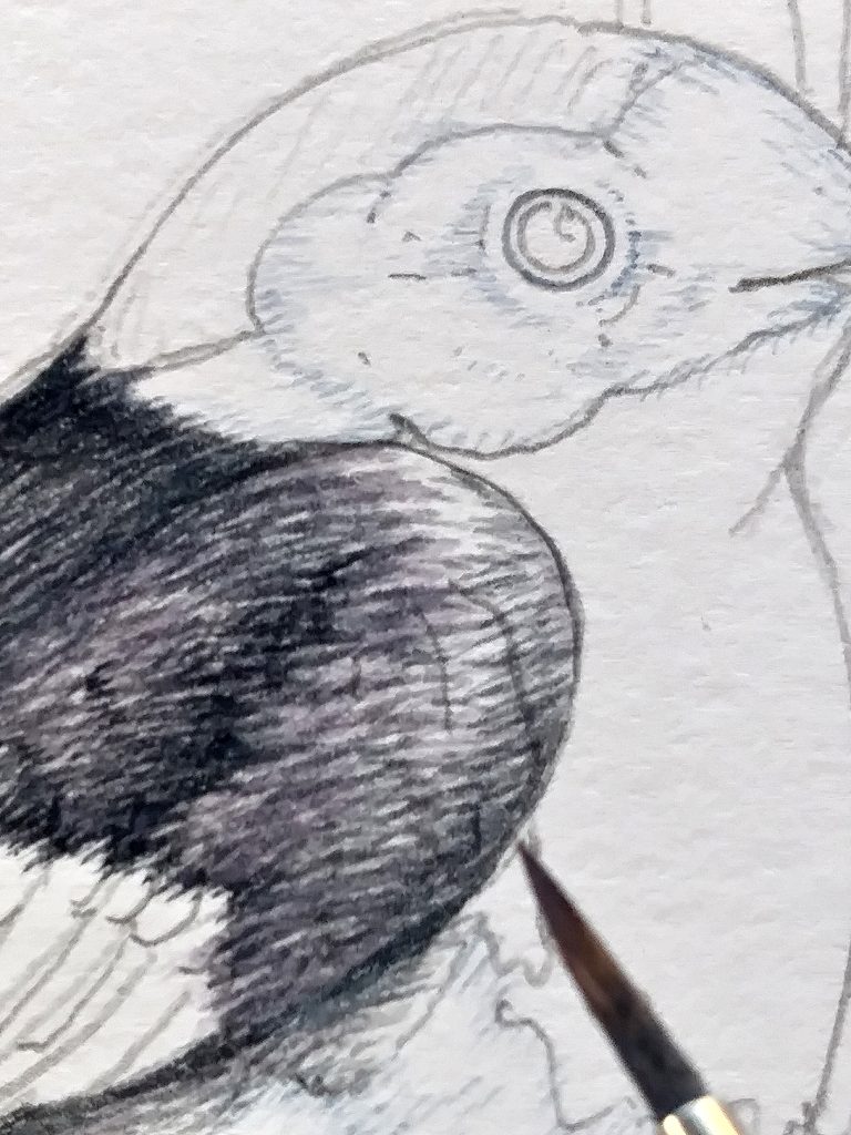
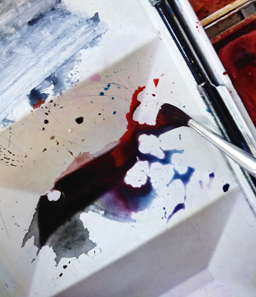
Mixing Blacks
It’s easy to buy ready-mixed black watercolours, but I tend to mix my own. This often gives the colour a richer feel. I liken it to comparing the colours of cotton or of velvet – both may be red, but the velvet has a depth and intensity that’s missing on flat cotton. It’s the same with mixing your blacks.
Getting to a satisfactory black can also be a lot of unexpected fun. Recently, I’ve started adding Cadmium orange dark to many of my blacks. Who would have thought that such a vibrant colour could be a vital component of a black?
Below, you can see that there’s the Cadmium orange, some pre-mixed Ivory black, Purple lake, and Winsor blue all added to the mix. Make sure you make enough of it, and make a quick note of what colours you put into the brew!
(Mixing neutrals and greys is also interesting, and home-mixed hues tend to be better than pre-mixed. For more on this check on my earlier blog.)
Painting the Wings
Using your black mix, build up a layer of colour on the wings and feathers. It’s vital to follow the organic lines of what you’re illustrating. Imagine your brush is following the filaments of each wing feather. A solid line at the margin of each primary feather makes it distinct from its neighbour.
Leaving the edges of the feathers unpainted is the best way to show whites – use the paper. Again, tiny brush marks help to make the transition between black and white less stark.
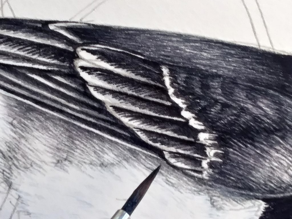
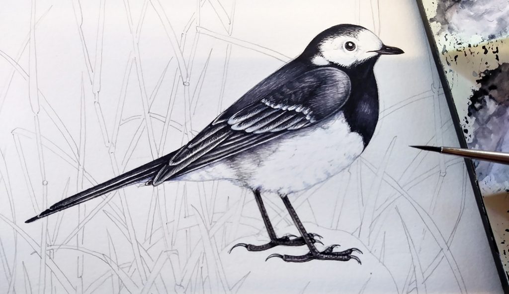
Taking a view from further away, you can see how the tiny lines end up giving something of a sense of depth to the Pied Wagtail plumage. You can also see how, even in the black region of the chest, the paper has been left partially un-painted to give highlights. Later, I’ll knock this back a little with a very watery purple mix. It’s always easy to go darker with watercolour, but almost impossible to do the reverse. Have a light touch as you paint.
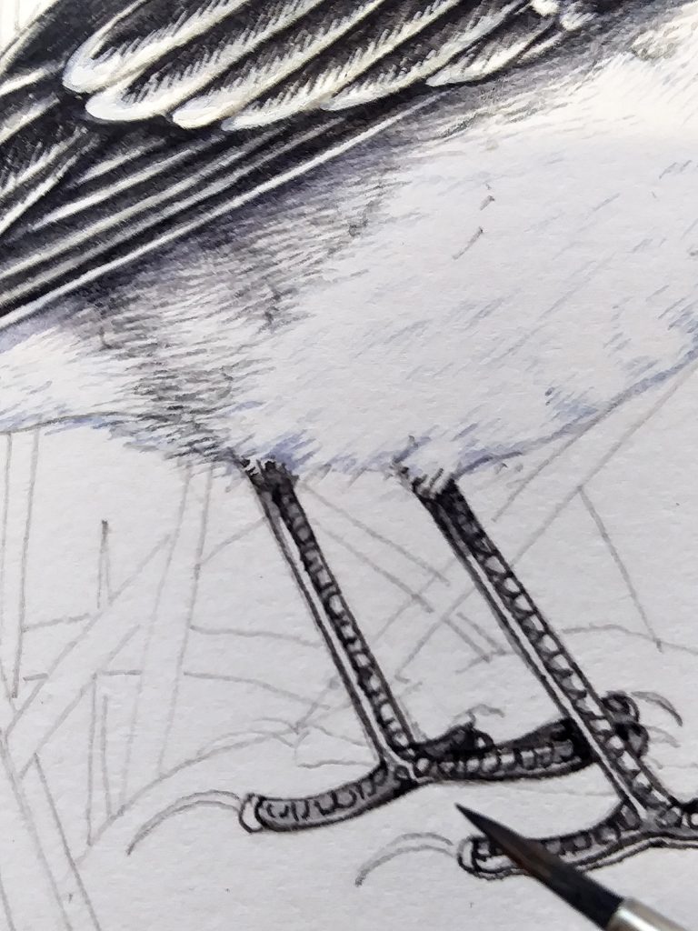
Painting the legs, eyes and beak
For some reason, I always leave the legs, beak and eye until the end. In truth this is very stupid. If I mess up the eye, then the whole painting is irretrievable. However, I don’t much like being peered at as I paint. The eye always goes down last of all.
I mix a slightly purpler and thicker black, and work on the legs. The anatomy of bird legs is interesting. The scales and claws show their close relationship to reptiles, and it’s important to look closely at this in order to capture their texture and structure. I often simplify this as it’s really hard to figure out exactly what’s going on unless you have a specimen right in front of you. Leave a strip of white paper along each leg for a highlight; you can knock it back with a very pale grey wash later.
Completed Wagtail
Below is the finished bird. When the illustration is complete, stand back and think about the lights and darks. I often add shadows at this point, or work into the darker areas of the plumage. I also add a drop shadow below the wing, this is a mix of dilute Cobalt blue and purple. It helps make the white feathers look brighter.
In general, I will paint the background first then add the bird. I wanted to get two illustrations from this painting though. By working on the bird first, it’s far easier to isolate him as a “cut-to-white” image. If I’d done the background, there would have been a lot of computer based erasing and tweaking to do. As is, it’s far easier to remove any background on the computer and not risk cropping the edges of feathers.
Adding the Background
Any of you who regularly read my blogs will know I’m somewhat obsessed by illustrating grasses. I chose to put the wagtail against some long grass in a corner of my garden, and loved playing around with the curves and composition. I also used artistic license when illustrating the boulder. Adding patches of yellow lichen meant I could introduce areas of bright yellow to the grass. This helps move the eye across the page and helps the “flow” of the painting.
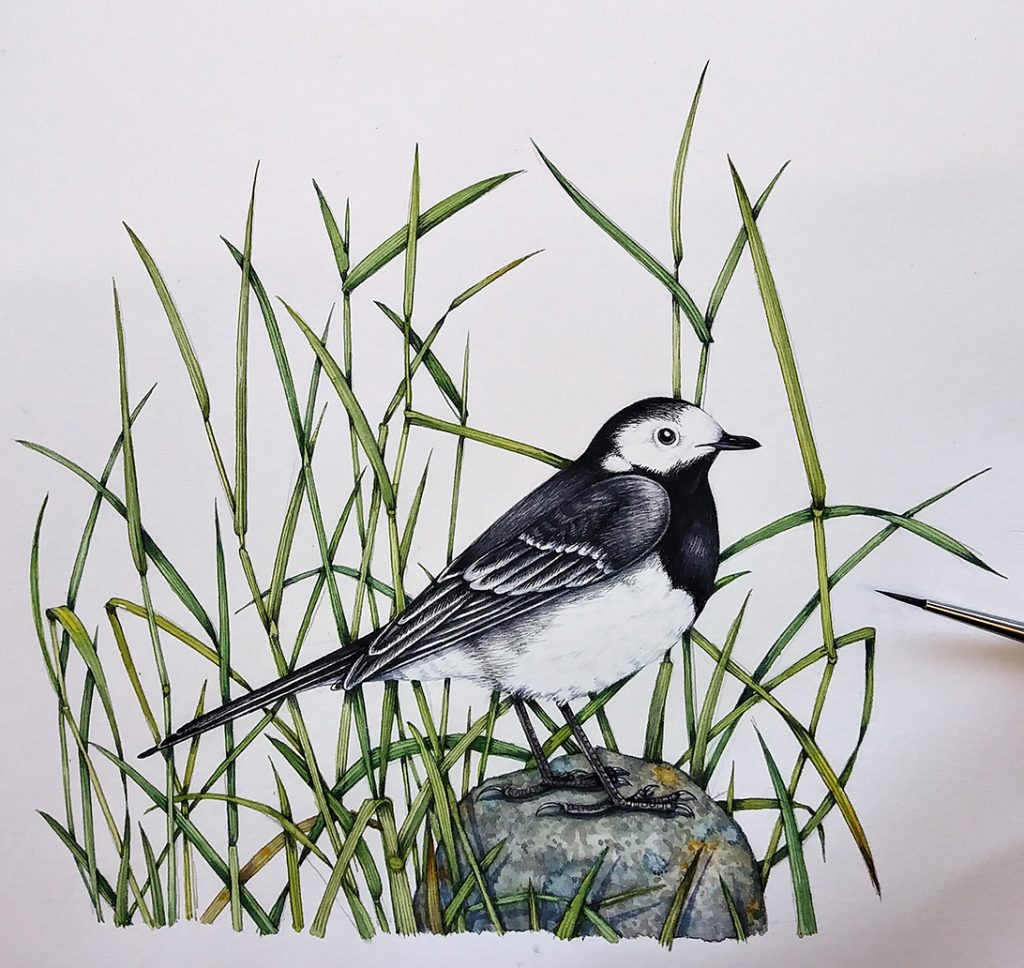
I’m quite pleased with the end result. It feels rather more sombre and less cheerful than the behaviour of this dear little bird might suggest, but I think it’s a decent depiction of one of my favourite garden visitors.
For more step by steps on illustrating birds, check out my blogs on illustrating a Swallow, a Waxwing, and a Goshawk.
Really love and appreciate your step by step posts. Thanks!
Hi Candice
My pleasure!
Lizzie
Thanks Liz. Love this Article and Bird.
Hi Lois
Thanks for this, Im glad you like the illustration and the blog.
Yours, Lizzie
Watching your step-by-step demos are like refresher courses. Thank you. I’m gaining confidence because of you and artists like you.
Bobbie, sounds to me like you are so ready to get a piece of paper and get going again – yovue clearly got the art passion in your soul. Go on, treat yourself. Put yourself first and make a little time to see what you can create and where you’re drawing and gaining confidence takes you. It’s wonderful hearing things like this, and knowing the joy people returning to their passions might be feeling. Thanks Bobbie jean. x