

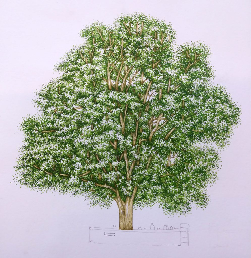
Sycamore Tree step by step
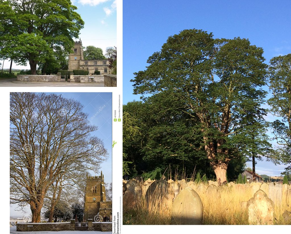
Sycamore trees can have distinctive shapes, and be well loved by those who recognize them. This is why I was commissioned to illustrate a large Sycamore tree growing in the churchyard of All Saint’s Church in Slingsby, North Yorkshire. The tree that dominates the graveyard was to be the centrepiece of a new interpretation board.
Sycamore tree reference
Not living nearby, and as the commission came in the late autumn, I had to work from photo reference. For more on the challenges this poses check out my earlier blog. Luckily, the client supplied photos of our tree in full leaf (although with the top cut off). Combining this with a fuller image of the tree in winter, and of the same tree from another angle allowed me to draw up the Sycamore.
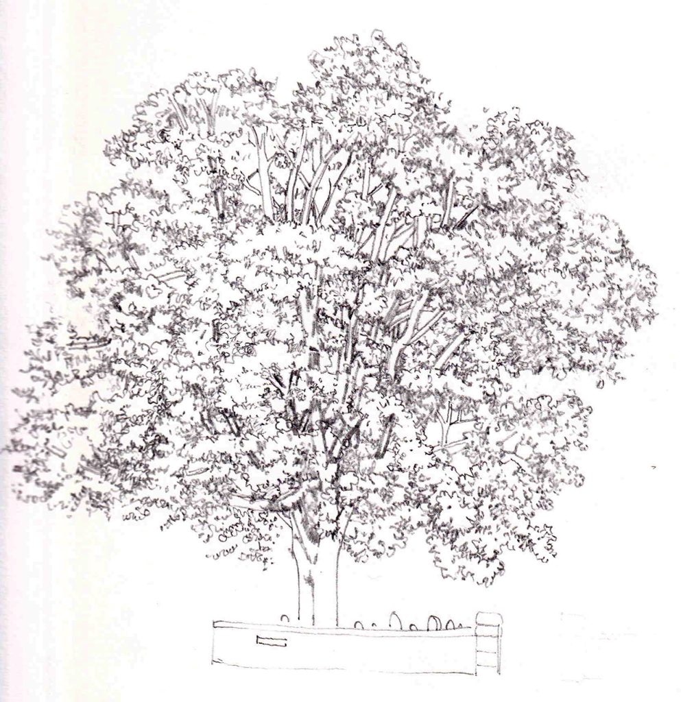
Pencil rough
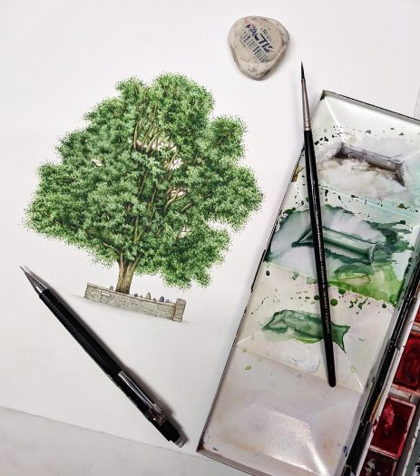
I always draw directly onto my watercolour paper using a propelling pencil. I love Pentel P205s with a 0.3mm HB lead. I work on Stonehenge Aqua hotpress paper, and use a triangular Factis eraser.
Normally I avoid putting any tone in these rough drawings, but with this Sycamore tree I had to add a little so I could find my way around the foliage. I chose to add the wall at the base of the tree to provide some context, and to help people recognise “their” tree.
Painting the Mid-tones
I used to say I began an illustration by painting in the darkest darks. I’m no longer entirely convinced by this statement. Iris M Gross, who follows me on Youtube and Facebook, pointed out quite correctly that I start by putting in the mid-tones. Then I work on the paler areas before finally concentrating on the darks.
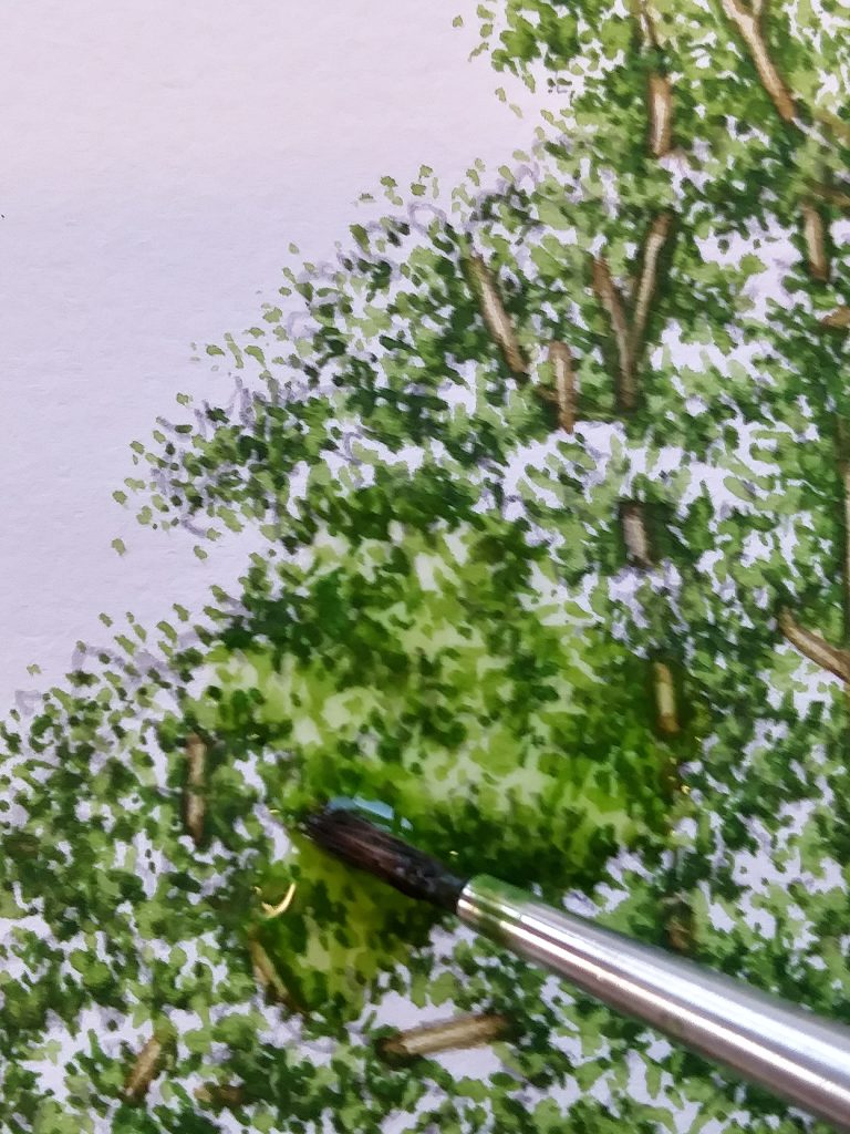
I begin by mixing up a decent green. Nothing too stark or alarming, and with plenty of browns and yellows. I use Winsor and Newton paints, mixing Sap green, Yellow Ochre, Gold green, a little Burnt umber and a touch of purple. As always, I use my beloved W&N Series 7 sable brush, a number 1.
I build up texture and colour with lots of little brush marks, trying to emulate the shapes and shadows seen in Sycamores in summer. Very thin lines are used to pick up emergent branches.
This first step takes ages. By the time it’s done we have a basic tree on the page. In order to make sure I don’t get lost in all the leaves, I paint in the tree trunk and branches next.
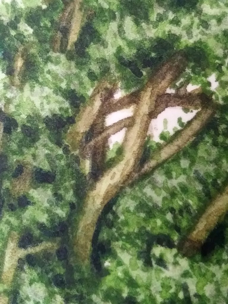
Painting the Trunk of the Sycamore tree
The trunk of this tree is quite pale. I mix Yellow Ochre with a little brown, a touch of purple, and a little green. I build up the texture of the wood before adding a top wash. This is the same colour, but diluted with water. I keep this wash quite wet. When it dries, the sharp edges that come with wet paint that has dried will emphasize the edges of the trunk and branches.
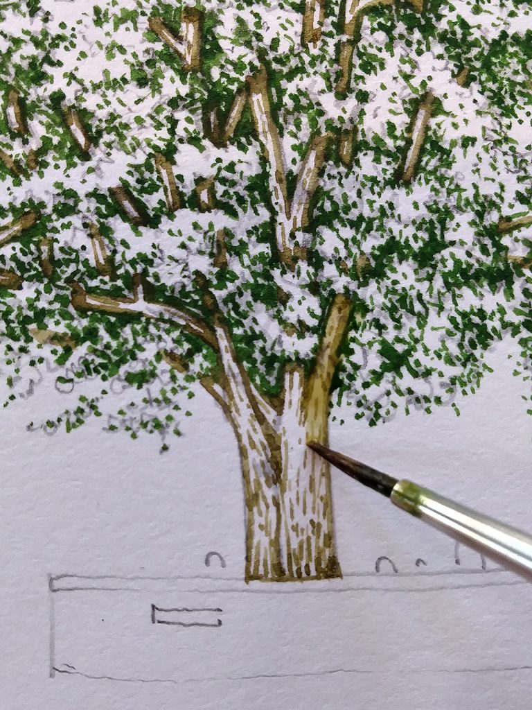
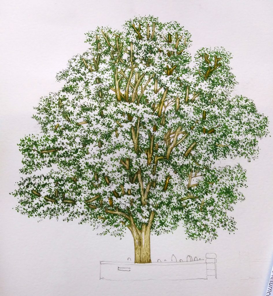
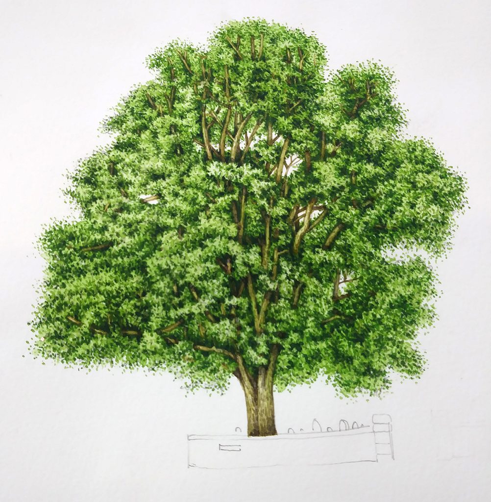
Below you can see the tree with the completed branches and tree trunk.
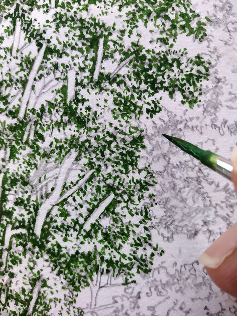
Painting the lighter leaves of the Sycamore Tree
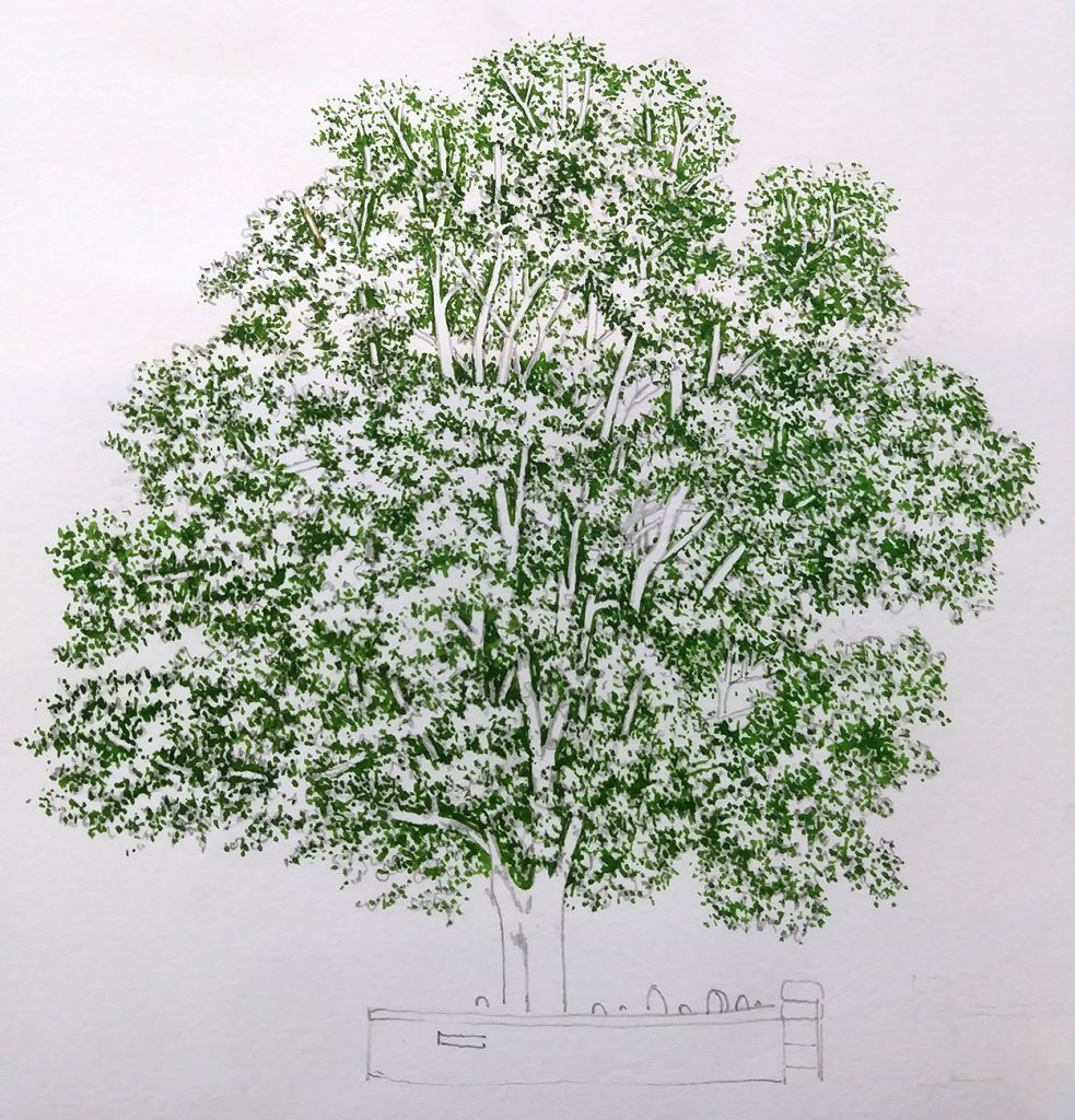
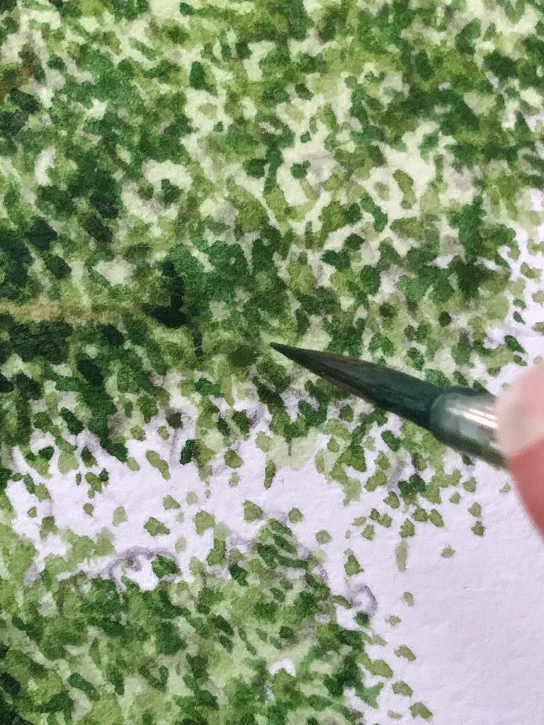
Next I work on the light foliage of the Sycamore. The green I use is a mixture of Sap green, Cobalt blue, a touch of purple, and Cadmium yellow light. Using a stippling motion, I try to build up the feeling of leaves, as well as some depth of colour. Even though we’re working on the lightest areas of the tree, it’s vital to leave plenty of the paper untouched. With watercolour, your paper provides the highlights. Without this, the whole painting becomes dark and muddy. Adding white will simply muddy things further.
I tend to apply this stippling to the edges of the darker green areas. Suggesting leaves blowing about in the wind, and a more organic silhouette, I add a few of these around the external perimeter of the tree. When it’s finished, I believe I’m getting closer to the feel of the tree. However, I also feel a little saddened as something of the crispness is lost.
Top wash
I often witter on about top washes. What I mean is a colour mix which is far more liquid than the paint I normally use. A watery but vibrant paint instead of one with the consistency of blood. In this case, the colours used are Gold green, Sap green, and a good dollop of Cadmium yellow. You can see from the photo just how wet the mix is. I put this over the whole of the tree, and even cover the branches with it, albeit in a far more dilute form.
It’s vital to let the paint dry between layers. With really wet washes like this one, that can be annoying and time-consuming. I tend to have several illustrations on the go at once so I can get on with something else as the paint dries. With this tree, I was busy planning teaching workshops between washes. Another option is to use a heater, hair-dryer, or (in summer) place the painting in direct sunlight.
Once dry, it becomes apparent that the tree needs a great deal more work doing on the shadows in the leaves.
![]()
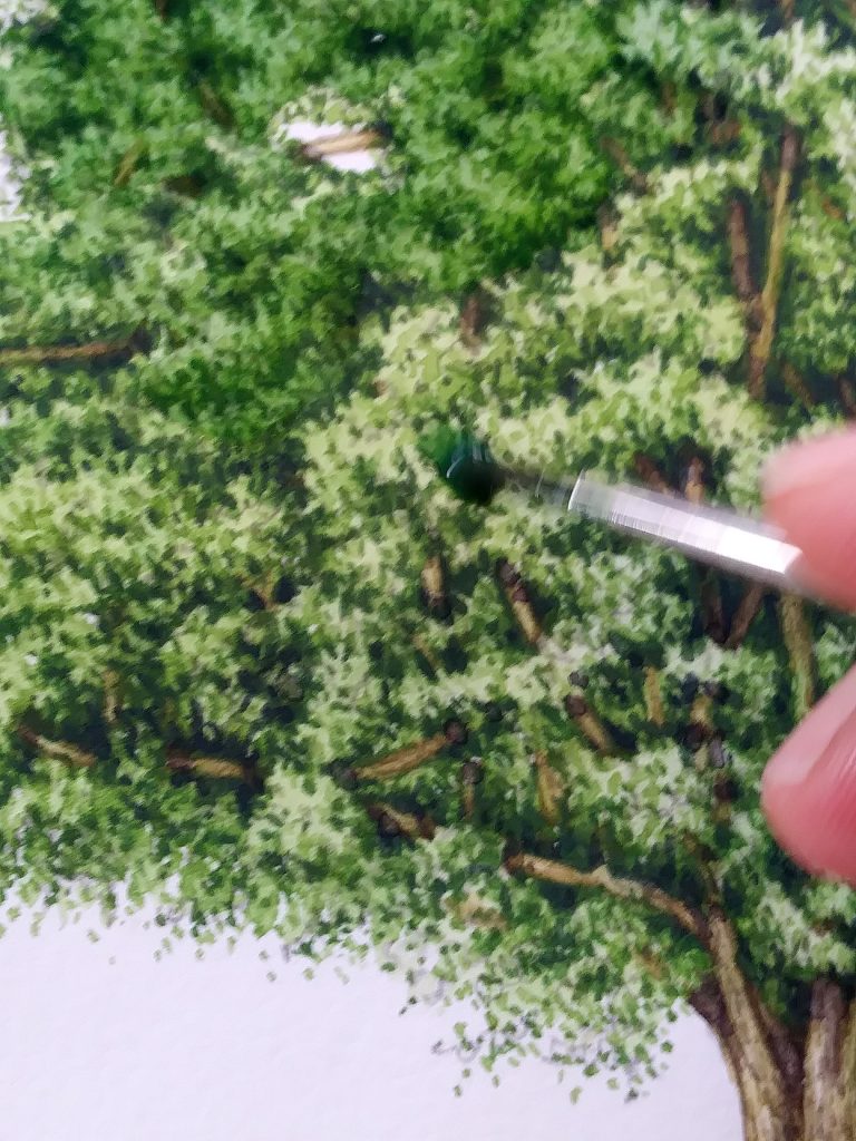
Working into the Shadows of the Sycamore Tree
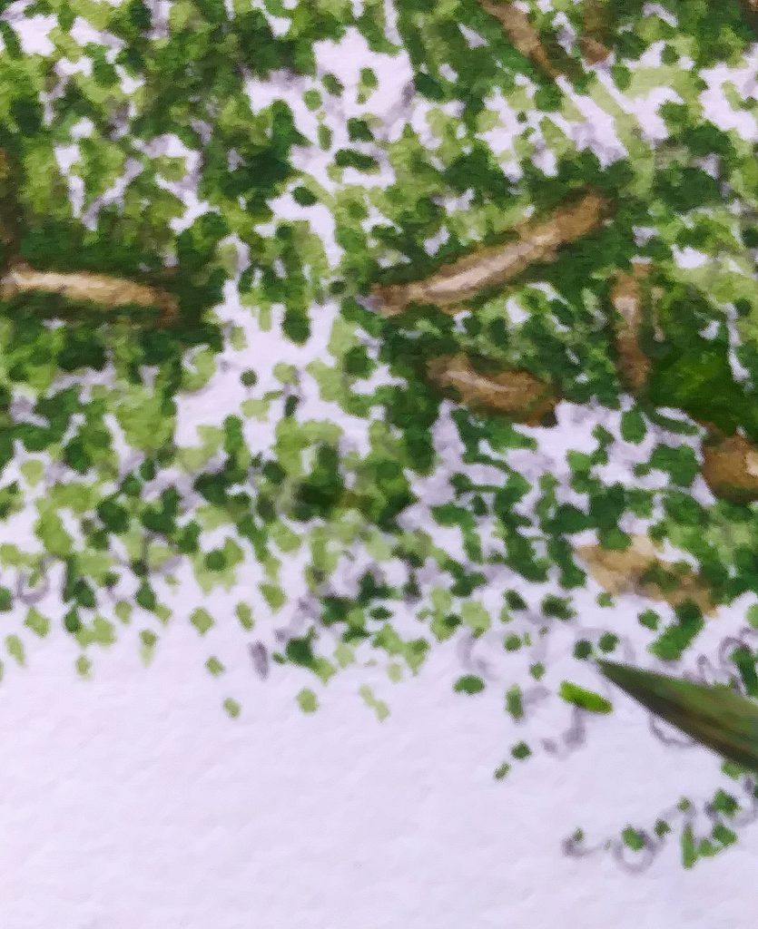
I mix up a dark blue-green. Winsor blue, Pthalo green, a touch of purple (always a touch of purple!). Using the same stippling motion, I try to go deep into the shaded regions between the clumps of leaves. I use a similar approach with the brush that I do when working in pen and ink. In fact, the pen and ink illustrations of trees I’ve recently done for The Living Wisdom of Trees by Fred Hageneder was helpful as I worked on this illustration. Different medium, same approach.
I work into these dark areas across the tree. The fact that there are no trees with leaves on in the garden means I’m having to work from memory rather than life. The photo reference is good, but wasn’t taken on a bright sunny day. This means figuring out the intensity of shadows, and shapes of these regions is a matter of conjecture.
When I’m done the tree is better. But far from good enough.
More shadows
I try to emphasize the dark areas with more of my dark green. Another green top wash is added, this time avoiding the brightest areas of the tree. I do a bit of cursing, and I struggle. Truth be told, I’ve never loved painting trees. Somehow the mix of their enormous size and the desire to capture their lovely tiny and delicate details baffles me. Trees themselves are things of wonder. My botanical illustrations of them? Less so.
This second top wash helps, but doesn’t solve the problem entirely. The tree looks flat. Again, I go over and add more depth to the darkest parts of the canopy. This time it helps a little.
Once dry, there’s only one corner of the tree that particularly offends me. There’s something deeply dissatisfying about the unnatural curve of the central branch. Unfortunately, it’s in a position where I can’t alter or edit it. This is the drawback of working in watercolour. You can’t apply “sticking plasters” when you mess up. You have to decide if you can live with it, or start from scratch. I add a further wash on top of the region and decide to live with it.
Finishing the Sycamore Tree
The last thing to do is the churchyard wall. Normally I’d enjoy this, but I was in a rage and a funk, so I didn’t. However, it worked out well.
Often when illustrations don’t go swimmingly, walking away then returning helps. That was certainly true for the tree. I went and had a cup of tea and some Marmite on toast. When I returned, it was ok. It’s not the best illustration I’ve done. But I think it’s competent. It’s a decent watercolour illustration of a tree, and it’s not nearly as disastrous as I’d believed.
See, even people who draw and paint for a living get these crises of confidence. I thought you might like to see one of mine evolving, then ebbing away again. The client paid, so it can’t be that bad.
And now, when I look at it, I rather like it. Like the tree on the wall, perhaps it’s starting to grow on me. I still hate that bendy branch, though.
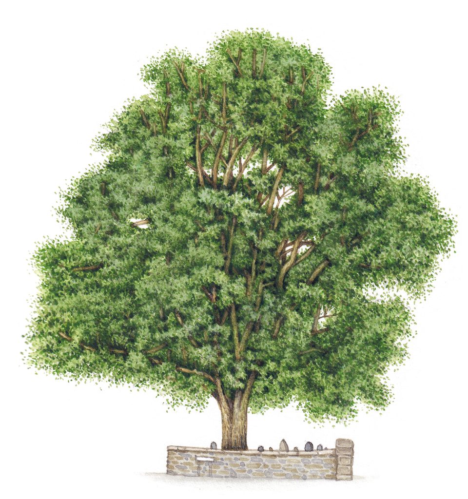
It’s worth noting that the commissioner found my work when she saw it in one of my Field Studies Council (FSC) leaflets, and got in touch. This one was about plants of church and graveyards, and was produced in collaboration with Caring for God’s Acre. Sometimes people setting out as illustrators ask where art commissioners find out about you, where work comes from. The answer is that it comes from wherever you manage to have your illustrations published, and wherever you make your work visible.
A brilliant tutorial – you are very generous to share your talent. I love everything about trees, their colours, character, history. Amazing. I have never tackled a full tree (apart from yew tree in my diploma) but it wasnt really right. But I may have a go having found your tutorial. Much appreciated you talented lady ?
Hi Rosemary, what a lovely comment! Like you with your Yew tree, Im not conviced that this Sycamore is “really right”, and know colour tree illustrations is an area I need to brush up on (no pun intended!) But if it gives you inspiration, then that’s amazing, and so good to hear. Enjoy it if you do give it a go, and let me know how you get on. x
I stumbled across your helpful tutorials via Twitter. I am a complete beginner at watercolour painting. The last art I did was 35+ years ago in school. Thank you, the detail of your colour mixes, brushes & paints used is really helpful along with your description of method. I don’t get much time to paint at the moment (a day every 3/4 weeks) but I plan to try a tree next time I get a painting day.
Hi Charlotte,
That’s fabulous that you’re picking up your brushes again, I’m so happy for you! A big challenge with art is ring-fencing time to actually DO the painting and drawing. I’m glad my step by steps are useful, that’s lovely to know. ANd the best thing about doing illustration etc is the more you do it the better you get! Hope you find time to draw and paint in 2020, and enjoy it! X
Love this tutorial, so well explained and knowing the colors used to, helps.
Thanks, Liz.
Cheers Lois, as I say, trees are not my strong point, but Im glad what I share seems to be helpful! X
Thanks for mentioning me in this post. I feel famous! I admire your patience with all those leaves.
Hi Iris, you ARE famous to me! Youre so useful and consistent with your comments, and it is a treat to have someone reflect a mirror on your process, which is exactly what you did. Yeah, Im sort of over trees right now! Give me a bird or a big flower any day! x
Hi Lizzie,
I love how you explain your process. As a beginner your approach has been illuminating. I look forward to watching and reading all of your work. Thank you!
Hi Hope, thanks for such positive feedback, and for taking the time to leave a comment. I hope the way I work is simple enough to emulate, and takes some of the mystique out of drawing and painting. And good luck with your art! x
Thanks so much for your tutorial!
I found it interesting to see that you first add the details and afterwards the washes, that’s a kind of approach I’ll definitely try.
I’ve found your blog and website just now – and will enjoy to come back. Thanks for your effort and time!
Cheers from Germany, Anna
Hi Anna, Thanks for the comment. I’m really glad the approach appeals to you. For me, doing it that way round means I havent got to hold the image in my head all the time as I work into the detail. Get the detail done first then play about with tonality. Simpler, I reckon. Let me know how you get on with the approach, and if it works for you. Thanks again for the comment, yours Lizzie
Love this.thanks.It helps.
Thank you, Gloria. Glad to be of use. x
Your step-by-step depiction of the sycamore tree is truly mesmerizing! The level of detail in each stage of your drawing brings the tree to life, and I admire how you capture not only the structure but also the unique character of the sycamore. Your inclusion of botanical details, like the shape of the leaves and the texture of the bark, adds such authenticity to the artwork.
On a related note, as someone interested in tree care and removal, I often encounter situations where mature trees need to be assessed for potential removal due to safety concerns or disease. Do you ever consider the lifecycle or ecological impact of the trees you draw, and if so, does that influence how you approach your work?
Hi Tulsa tree removal company. That’s a really interesting question, about the ecology of disease, and safety concerns. I do sometimes get asked to illustrate plant disease and symptoms, recently doing a sheet on the effects of Xylella on various plants, including Olive trees. And in the past I did a sheet on the visible signs of Ash-die-back. But as a holistic approach, including this information in my illustrations if not specifically requested to do so, well no. It’s not something I’ve done yet. But I like the idea. I also like the idea of including seedlings and saplings in work on trees, to broaden the understnanding of how much their appearance and habit can change over time.
I can imagine illustrations could be quite useful when assessing the potential danger of larger branches, wind-damaged trees etc., specially for those with less experience. Nice idea.
Thanks for your positive comments about my work, I really appreciate that.