

Great Burnet Step by Step

Recently, I’ve illustrated the Great Burnet, Sanguisorba officinalis for an interpretation board, to be cited on Jubilee Pasture, in Bugthorpe, Yorkshire. This blog is a step by step explanation of the process. For step by steps of other botanical subjects, please click here, and visit my Youtube channel for real-time films of me illustrating plants and explaining the process as I go..
Materials
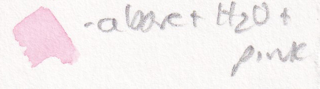
I always use the same materials. Draw up the flower in pencil, using a Pentel P205 mechanical pencil. My current favourite paper is Fluid 100 hot press watercolour paper, using Winsor and Newton watercolour paints, and a Winsor and Newton series 7 sable brush (size 1). In this particular illustration, the colours I’ve used are: Cadmium yellow, Winsor blue, Cadmium yellow light, Purple, Pthalo green, Ywellow ochre, Cobalt blue, Burnt sienna, Burnt umber, Cadmium orange, Opera pink, Purple lake, and Alizarin crimson. However, I’m a bit chaotic with my paints; filling up the pans from tubes etc, and am never 100% what the names of the colours I’m using are!
Pencil drawing
I draw up the Great burnet, along with a close up of one flower. For this, I use excellent online websites such as Wildlfower finder, Nature spot, and Kew’s Plants of the World site; along with my reference books. These tend to include the New Flora of the British Isles by Stace, HarperCollins Guide to Wild flowers by David Streeter, the collected illustrations of Stella Ross-Craig, and Wild flowers of the British Isles by Streeter and Gerrard.
These resources are vital, especially when the flower I’m drawing isn’t in bloom.
The pencil illustration is done direct onto the watercolour paper and sent to the client for feedback. Once alterations have been made and approved, I start painting.
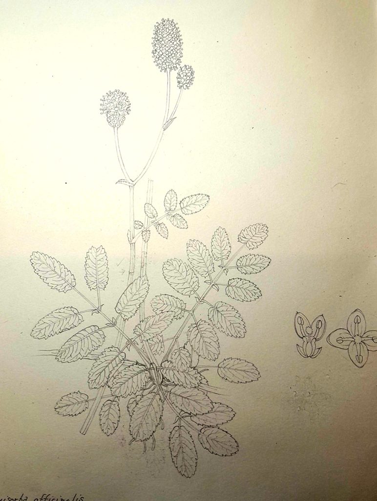
Pencil drawing of the Great burnet plant
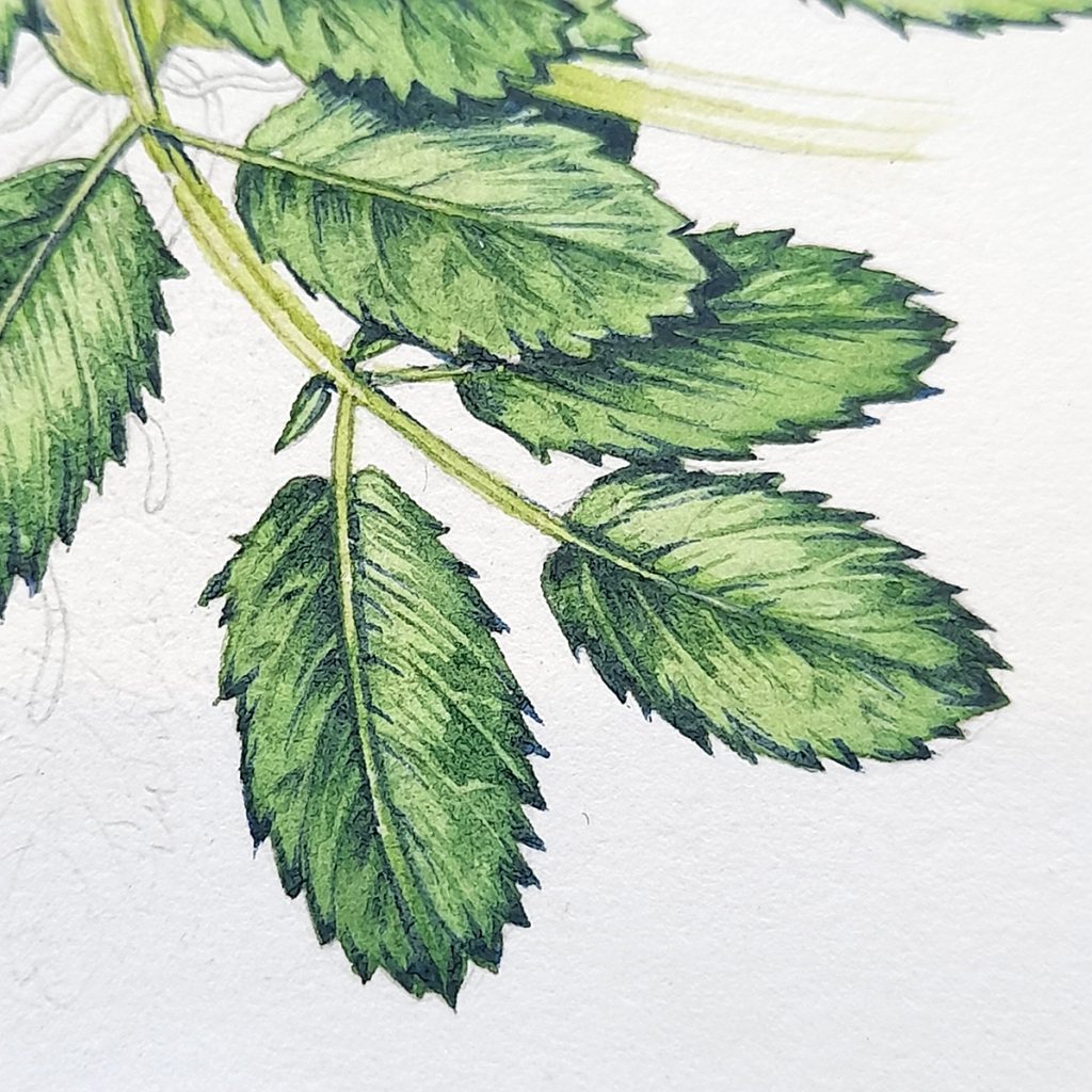
Step 1: Laying down detail onto the leaves – painting the first side of each leaflet
I start with the leaves, and this first layer gives a lot of information. I look closely at all my reference, and search for patterns in the way the light falls on the foliage. Traditionally in botanical illustration, your light comes from top left, so shadows follow this plan. Once you’ve figured out how the shadows will fall, you can apply this to all the leaves. Obviously, when I have the plant in front of me it’s far simpler, I just paint what I see.
The mix of colours for the Great burnet is Cadmium yellow, Winsor blue, Cadmium yellow light, a touch of purple, and a dash of a blue-green, like Pthalo green. the paint is mixed to the consistency of cream, so looks pretty solid when applied to the paper.
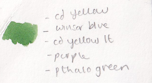
Colour mix for the details of the leaves
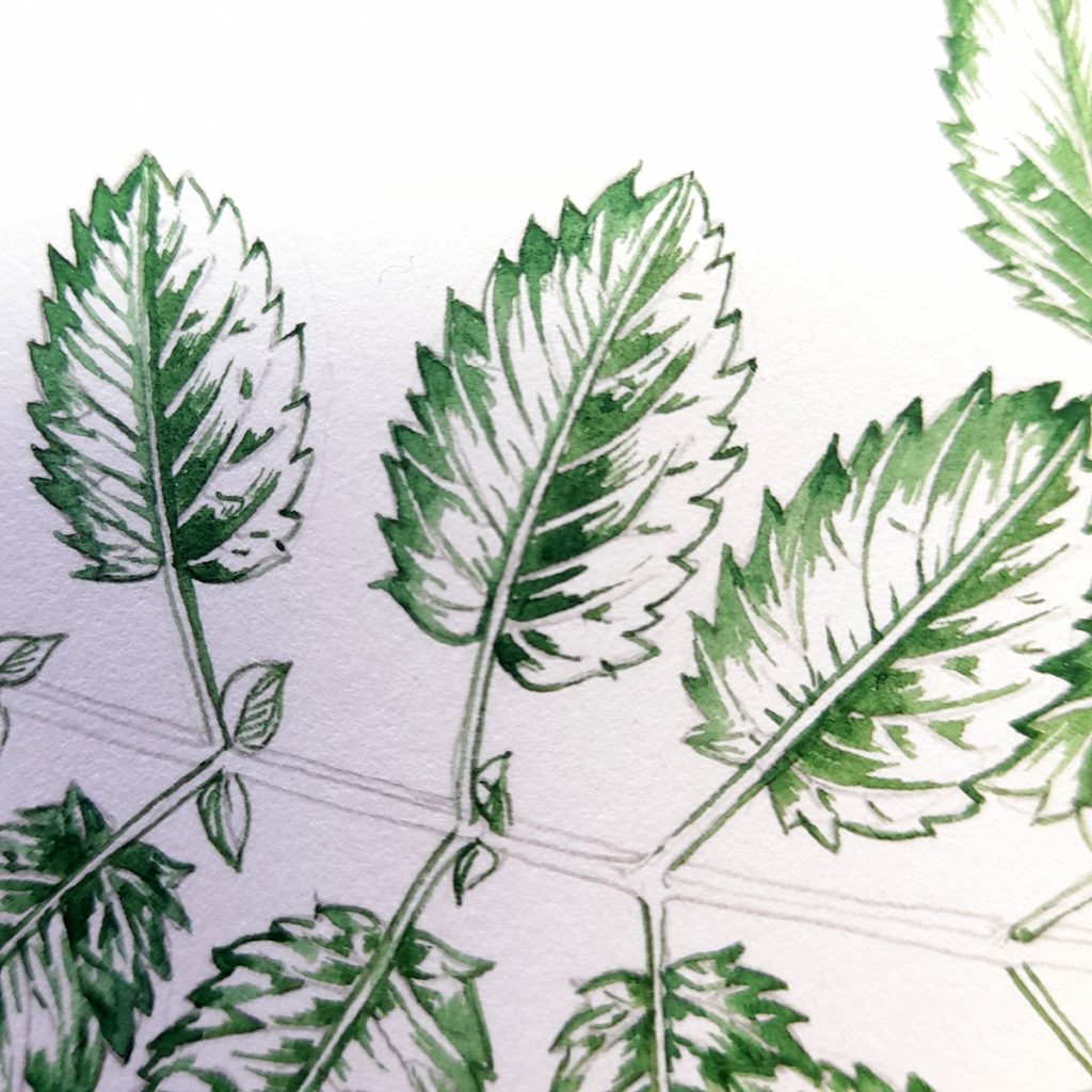
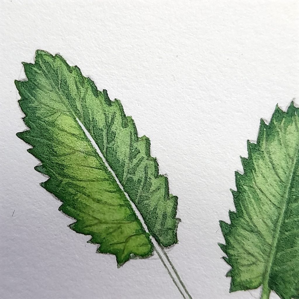
In general, if there are lots of dark mid-tones on the left of the central vein of a leaf, you can reproduce this across the plant, flipping sides if you have leaves on both sides of a central axis. In truth, these are leaflets, paired and opposite on a central stem. To make the pattern clearer, I initially added the leaf veins, mid-tones, and details to only one side of each leaflet.
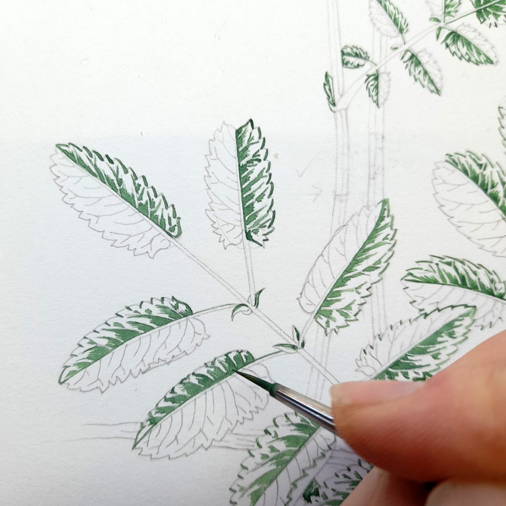
Working into the darks on one side of the mid-rib
In the photo below, you can see how one side of every leaflet has been treated in the same way. The unpaired terminal leaflets need care as they’re not quite the same. Looking at a similar terminal leaflet for inspiration (I referred to a fallen Rowan leaf) can help untangle your lights and darks.
One side of each leaflet is painted
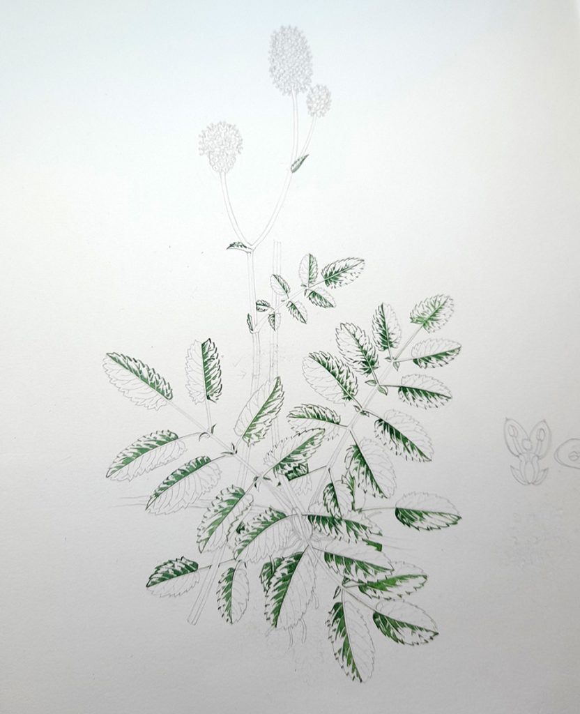
Step 2: Paint the other side of each leaflet
Using exactly the same paint mix, I plot in the detail on the other side of each leaflet.
If the darks are heavy toward the central vein of a leaf, there’s likely to be less shadow on the other side, with darks seen more towards the leaf edge. This relates to the physical structure of a leaf. The reason for a shadow is because something (in this case some of the leaf blade) is casting a shadow. It’s unusual for both sides of a leaf to bulge up toward the central vein, normally one will hit the light whilst the other sits in its shadow.
You can reduce this to a repeatable pattern. Again, it’s always better to work from live material if you can, because these regular patterns, even when closely based on reference phtos, aren’t true to nature’s individuality.
Detail with both sides of the leaflets painted in
Once you’ve completed this step, you can see the skeleton of your leaves on the page. There’s even a visual suggestion of whether or not the final illustration will look realistic, in terms of the balance of lights and darks.
Completed plant with the details of all leaflets plotted in
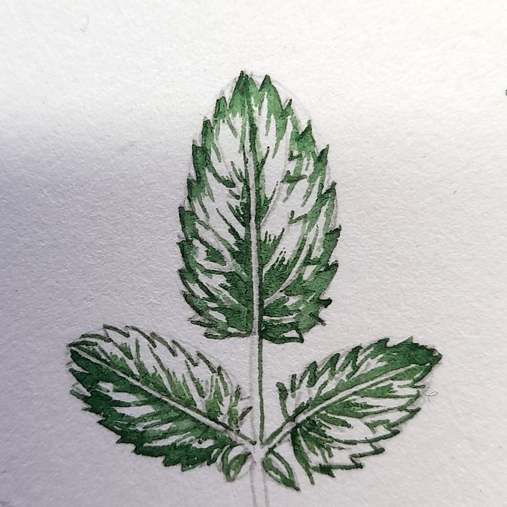
Detail of Completed leaflet details
Below is a detail showing how the pattern of darks flips on either side of the central leaf-stem. To see it more clearly, look for where the darks cling to the mid-rib or ventral vein, and then note how that’s flipped in the other leaflet. This also shows the slightly different approach to the shadows falling on the terminal leaflet, basing darks down towards where the stem joins the leaf blade.
In all cases, I keep the central vein white.
In watercolour, your highlights and palest areas are the white of the paper, so you really need to keep these clear of paint in they;re going to be paler than the surrounding areas. They’ll be knoced back under a colour wash at a later stage.
Detail of two leaflets and a terminal leaflet, plotted in
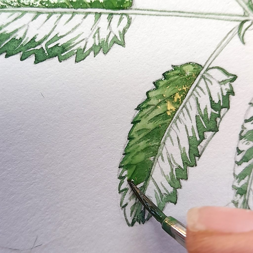
Sep 3: First top wash on the darker side of each leaflet
Once all the detailing is dry, I put the first wash on top of the painting. This will only be applied to one side of the leaflets, the darker side.
The paint is the same mix as above, but with some more light yellow, and diluted with clean water. With watercolour painting, you make a colour paler by diluting it with water, not be adding white.
Using the paint wetter than before, I paint over the whole of one side of the leaf, taking the paitn into the tips of the margin teeth, and allowing it to sit quite wet on the page.
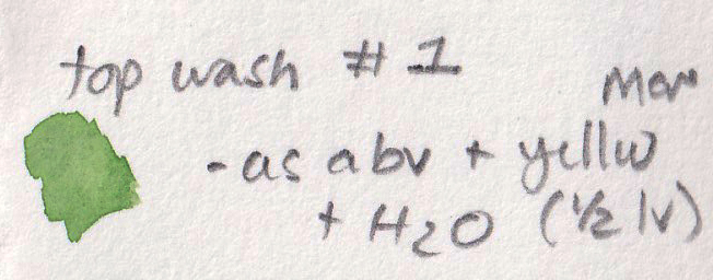
Top wash number 1 – same green mix as before with water and more yellow added
Allowing the paint to dry from a wet puddle means the edges of the paint can give a crisp line which can be very beautiful. It’s vital to allow the paint to fry fully though, before moving onto the next layer of colour wash.
Applying the top wash to one side of each leaflet
In the photo below you can see how wet the paint is on the page, and how the pigment is concentrated towards the edge of the leaf. This effect remains once the paint is dry.
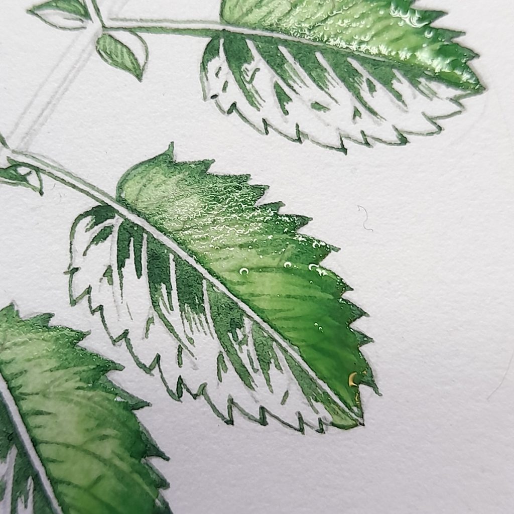
Close up of two leaves with wet top wash drying
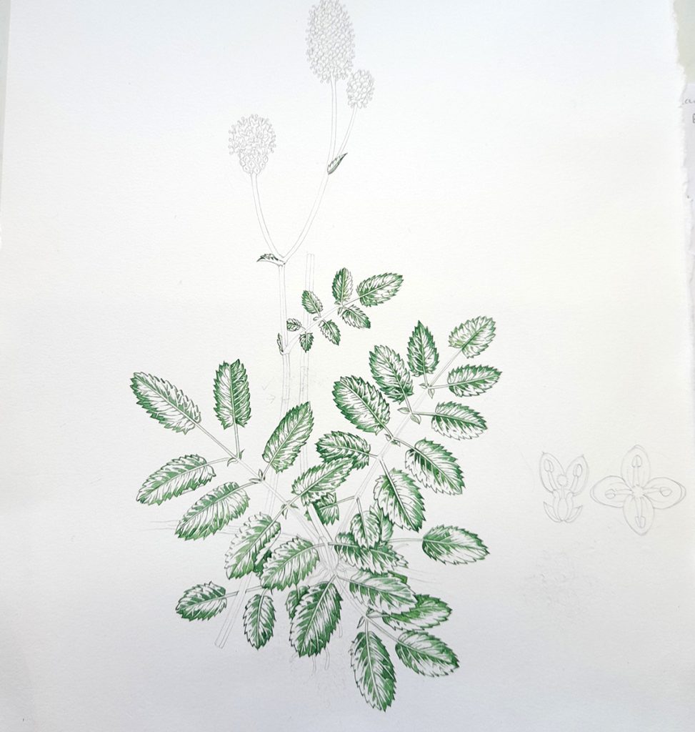
Below, you can see the whole illustration as that first wash dries on the page.
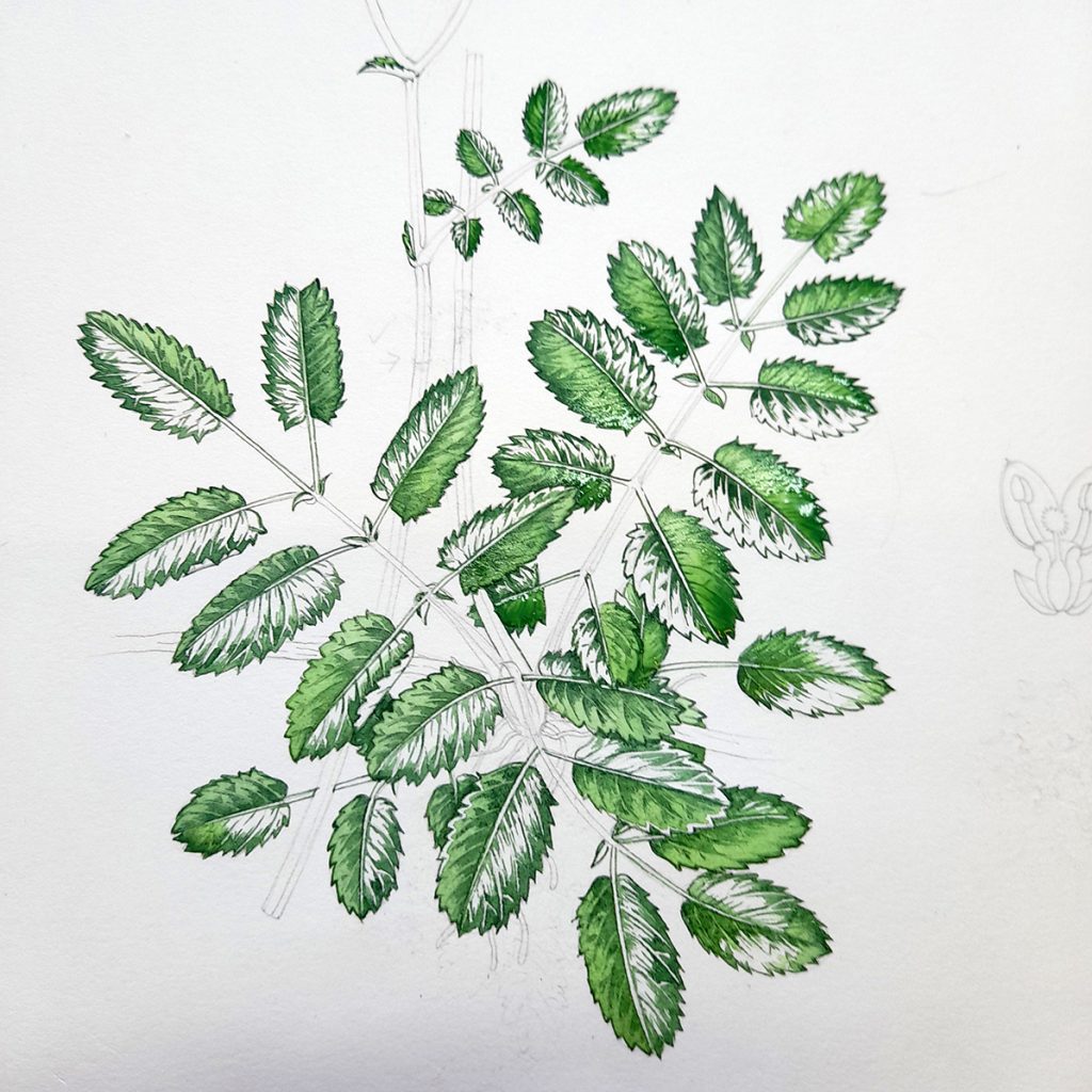
Whole plant with first wash drying
Step 4: Second wash on leaves
Mix up a paler version of the colour above, using it as your base. Add water, more yellow, a touch of yellow ochre. This mix looks really quite watery as it’s quite pale and dilute.
This time, I put the wash on top of both sides of every leaflet; both the side which already has a layer of colour on it, and the other side. yet again we’re leaving the mid rib veins as white paper.
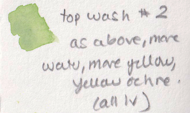
Top wash mix two: Add water, yellow, and yellow ochre to the first wash
The effect here is that the side of the leaves which already have a dried layer of colour on now appear darker than the ones which have only just had their first layer. The benefit is that because the colour has covered the entire leaflet, this difference looks natural rather than clunky.
Detail of one leaf with second colour wash drying
When you see this applied to all the leaves on the plant, it doesn’t look too dramatic at all, quite naturalistic. But that distinction between lighter and darker sided of the leaf remains.
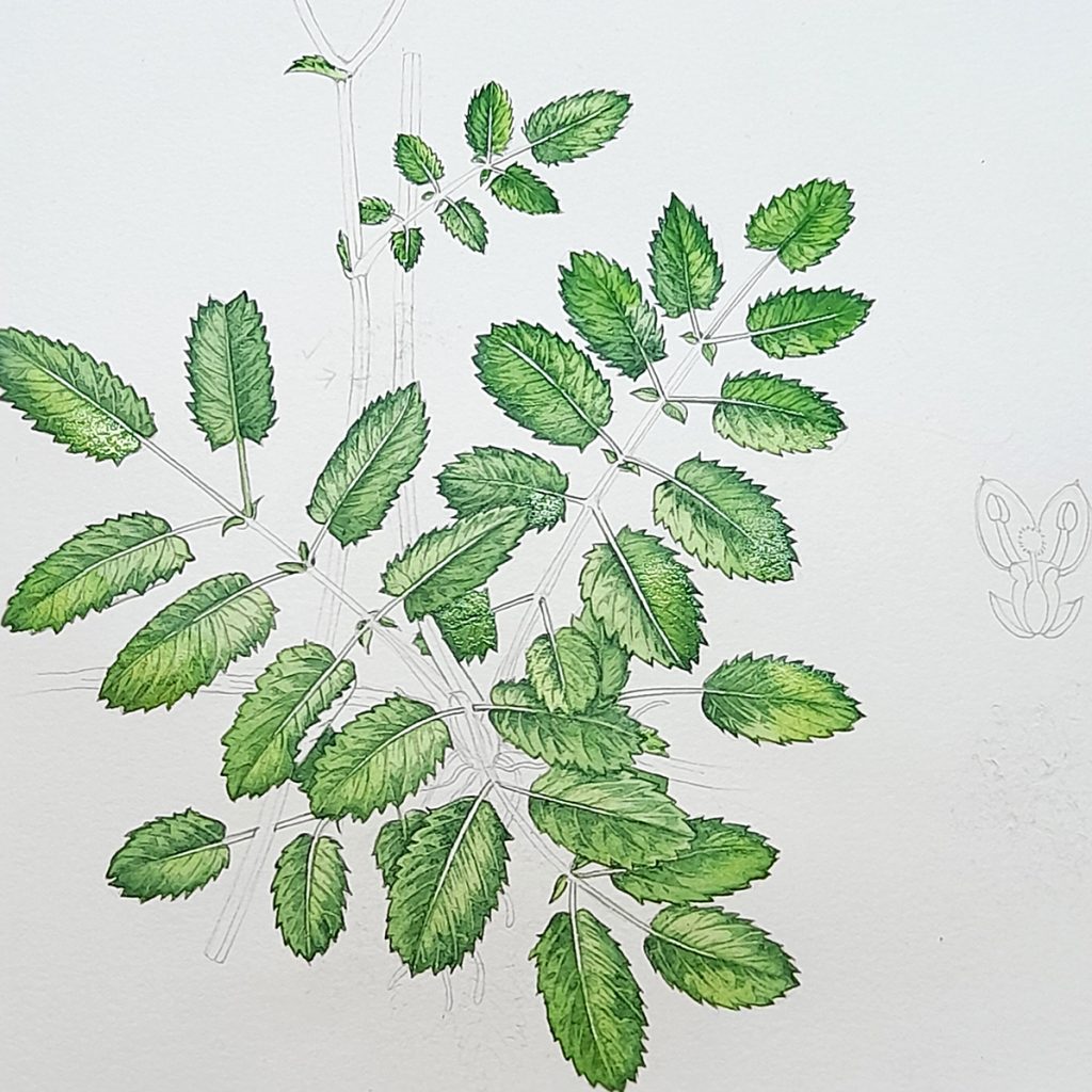
Whole plant with second colour wash drying
As before, it’s crucial to allow the wash to dry completely before continuing to work into the painting. You can hurry things along if you like, by using a fan heater or a hairdryer.
Step 5: Picking out the darks
I pick out the darkest bits of each leaf with the tip pf my brush, and some judicious decision making. Don’t add too much dark, or the plant changes colour. Too little dark, and the leaves look flat. You want something in between, where the deepest shadows are picked out, but the leaves remain that same hue of green.
The colour we mix here is the same consistency as our first colour, something close to cream. Colours for this mix are Cobalt blue, purple, and a Pthalo green. It looks less stark when laid on top of the green of the leaves, but I’ll use the same shade to pic out the darkest areas of the flowers and the stem, too.
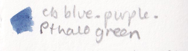
Mix for the darks: Cobalt blue, Pthalo green (or a blueish green) and purple.
The darkest areas tend to be at the tips of the leaflet teeth, and close to the central margin. You also need to pop darks where one leaf casts a shadow on top of the one below, and where a leaf curls back on itself.
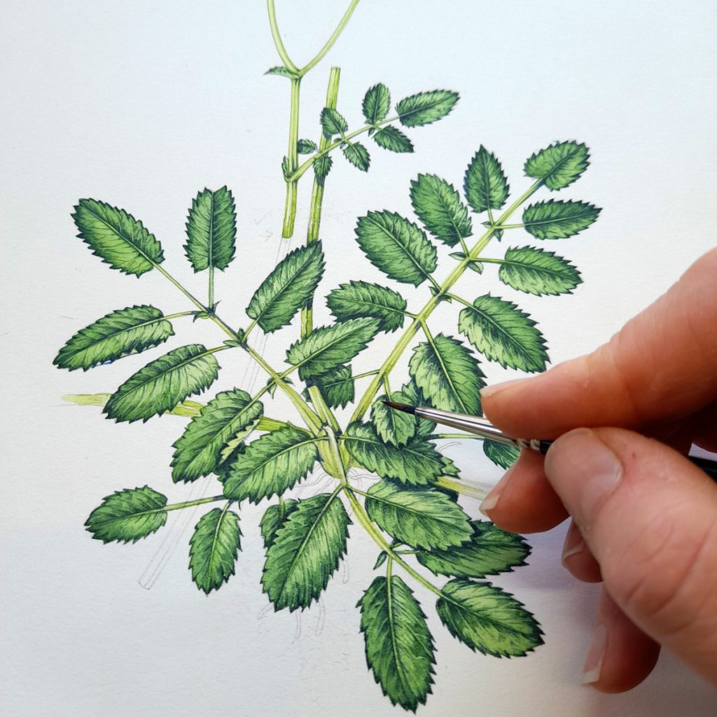
Working into the darks near the centre of the leaf rosette
In the photo below you can see that the marks made with the dark paint are the same as those initial ones made with the first green. They’re tiny individual brush marks, following the line of growth. And they’re certainly not covering the whole of the leaf blade. Be juducious with these darks or everything gets muddy.
Detail of leaves once the darkest darks have been picked out
Step 6: Stems
Let the leaves dry so you don’t end up resting a hand on wet paint and smudging it.
Now I mix up the colour for the stems. This is still based on that initial green, but by now it’s become much paler and much more watery. Add lots of yellow to the second top wash, until you get a very yellowish bright green.
Using a steady hand and the tip of the brush, I follow the lines of the stem. I press slightly harder on the right hand side of the stem, this leaves a marginally thicker line, which registers as a slightly darker edge.
Stem colour mix: All those greens from before (Cadmium yellow, Winsor blue, Cadmium yellow light, Yellow ochre, purple, Pthalo green, extra yellow and LOTS of water)
Let these two lines sit for about 60 seconds; long enough to stain the page but not so long that they’re totally immobile on the paper. Then I use a more watery version of the stem colour, and with one brush stroke, paint on top. An extra blob of stem colour at the base and below leaves gives the suggestion of shadow. Allow to dry
If the stem is ridged, as it is here, be sure to put in an extra line to show the angle. Once the top layer is dry, you cna add a second layer of colour to show that the stem has a facet which is turned away form us, and which is marginally darker as a result.
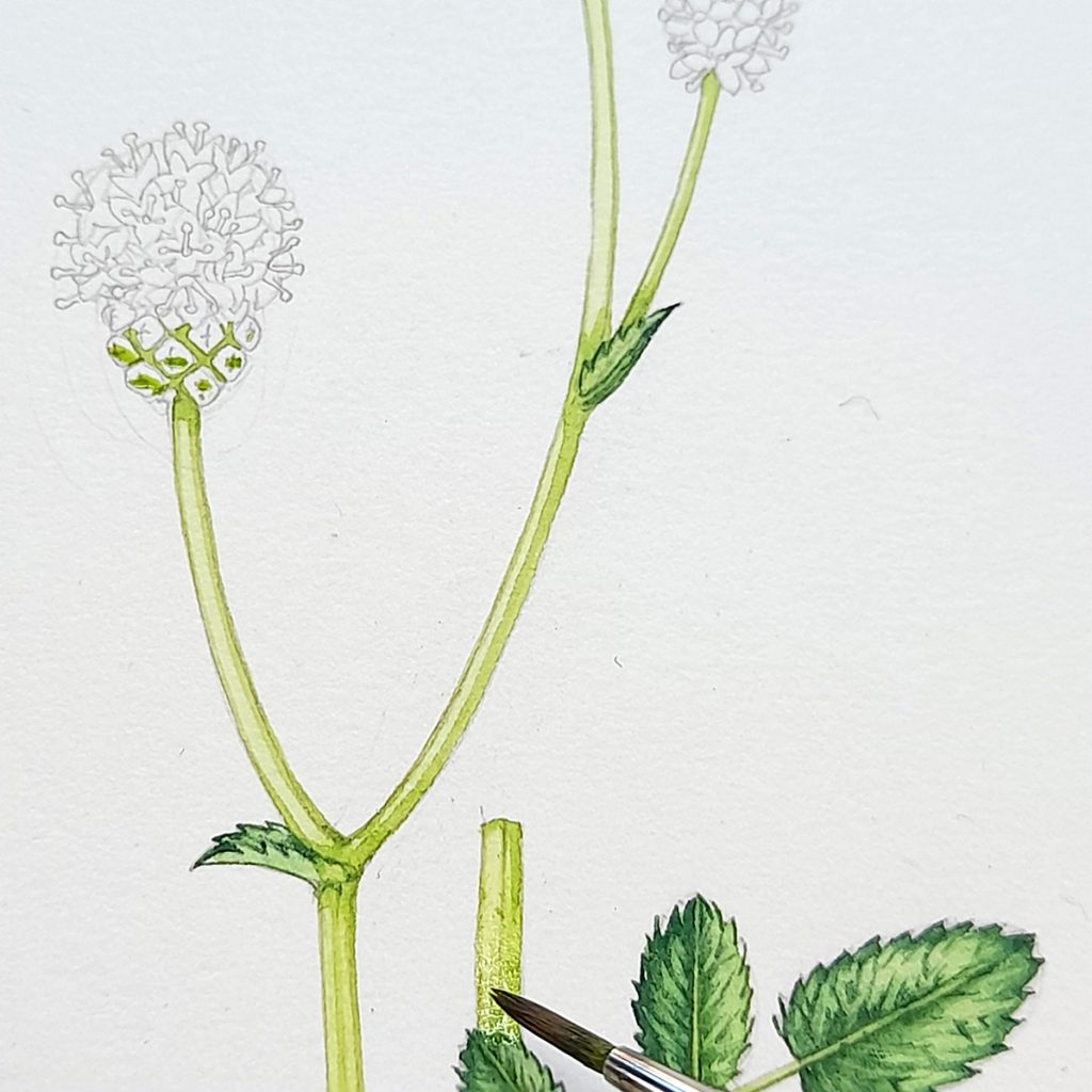
Painting the stems and handling the angled, cut stem
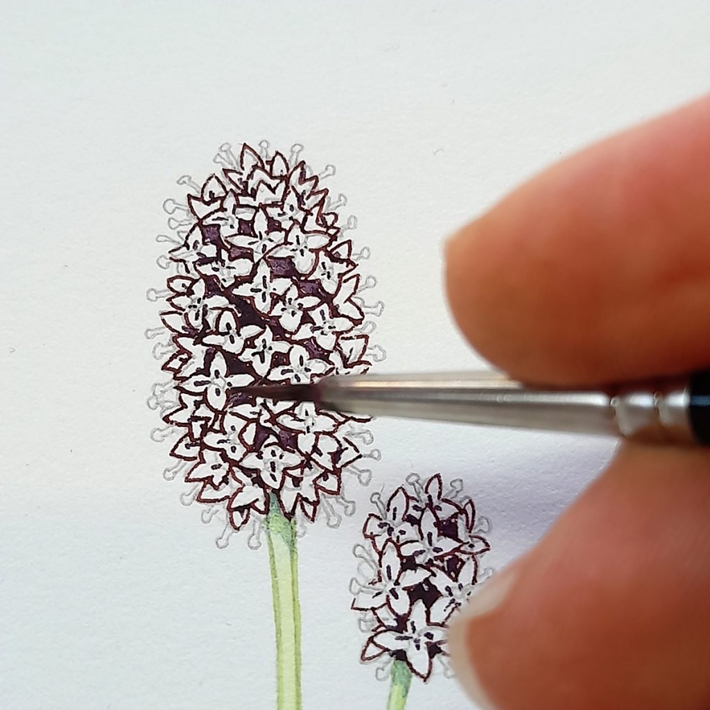
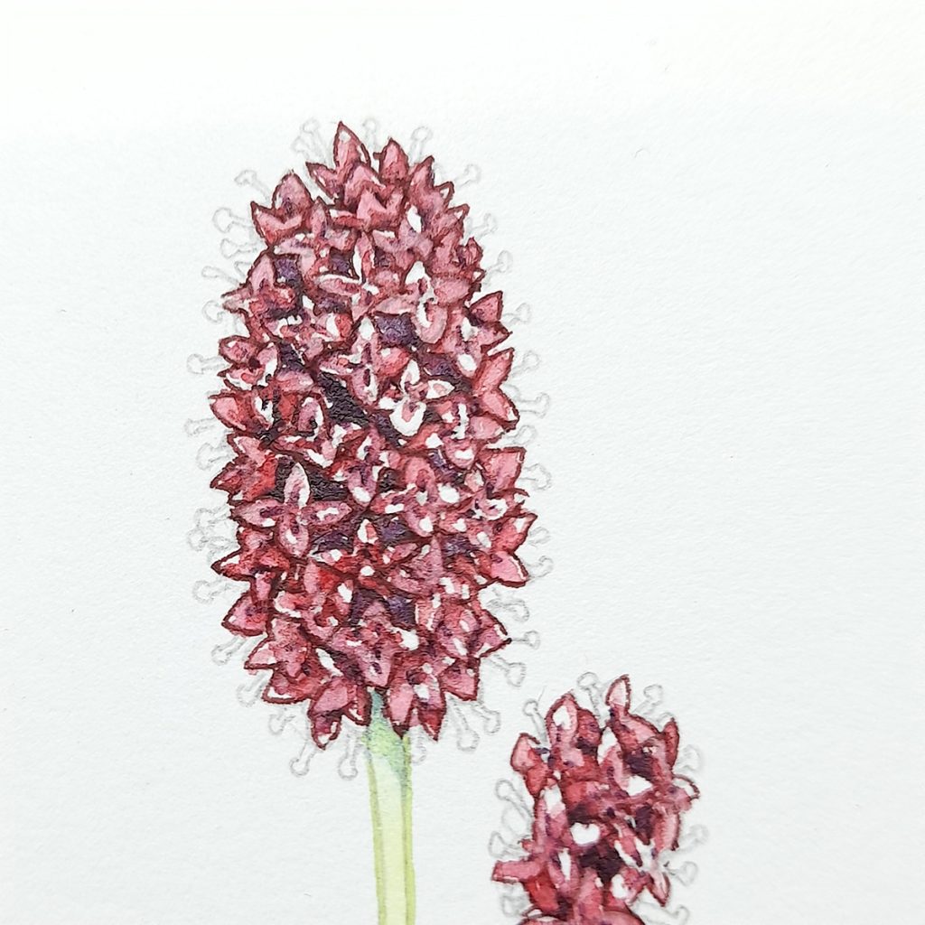
Step 7: Outlining the flowers
This mix was a challenge. The flowers are a really unusual dark brownish red, and I would have loved to have a few actual specimens to look at. However, I was limited to the colours on engravings and in photos.
This mix, created in a different part of the paint-box to your greens, has that same cream-like consistency. It’s a mix of Purple, Cadmium orange dark, a pink red like Alizarin crimson, and a warm purple (like purple lake).
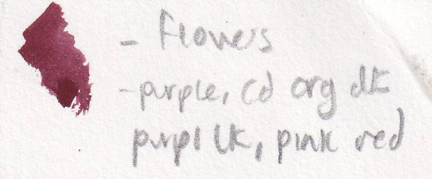
Colour of the flowers: Purple, orange, pinkish reds
Outline each flower with this colour, trying not to let the paint to get messy or run. Once dry, add a bit of blue to your flower colour and paint in the square spaces between the individual florets.
I also put a suggestion of detail at the centre of each floret; just four little lines. This is to help point the eye to the flower’s middle.
Having outlined each flower, plot in the spaces between them
As always, allow the paint to dry fully and completely.
Entire illustration with the flowering heads plotted in
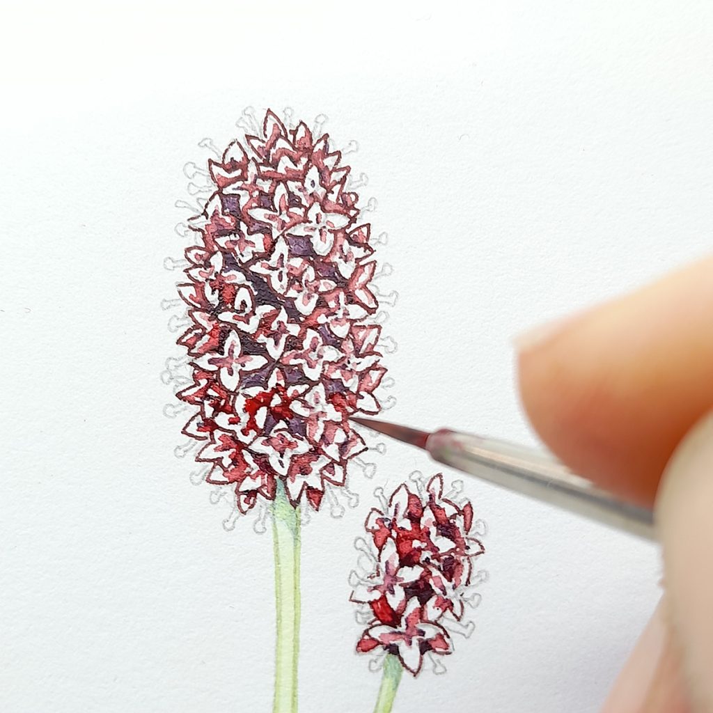
Step 8: Add colour to the flowers
Each of these florets is tiny, so the challenge is to get some colour onto the flowers without losing detail and definition. I admit I didn’t entirely succeed in this, I got tied up ith leaving white paper for the bright yellow anthers, and this compromised the colour of each flower.
The mix for the body of each petal is as before; purples, oranges, pinky-reds. But with an added dash of red, and a touch of a bright pink like Opera rose.
Colour mix for the flower body: As for the outlines of the flowers, but with more red and some bright pink like Opera rose
I focus this colour towards the centre of each floret, and where one overlaps another. Keep the colour fairly light. The whites of the page here help the eye distinguish between the different florets, so we need to be sure it doesn’t all get swallowed up in reds.
Working into the petal colour
Let the paint dry fully.
Step 9: Add a Pink top wash to the flowers
Dilute your reddish colour with water and add a dash of a bright pink. Keeping the paint very dilute and watery, lay it over the best part of the flowers youve painted, leaving the occassional bit of white, and the spaces where the golden anthers are going to sit white.
Great burnet flowering head with top wash of pink applied
Let this pale wash dry before the next step, adding the golden anthers.
Top colour for the flowers: That same pink body colour, but diluted with lots of water and with a bit of pink added
Step 10: Finish the flowers, then finish the painting
Using a golden colour from your paint-box, unmixed, like a Cadmium yellow dark, just paint a little circle where each anther should be. Once dry, use a slightly dilute brighter and paler yellow, and pop a dot on top. Allow to dry.
I left the pencil lines to suggest the stamen filaments; you could go over these with a pale grey or a pale blue if you prefer.
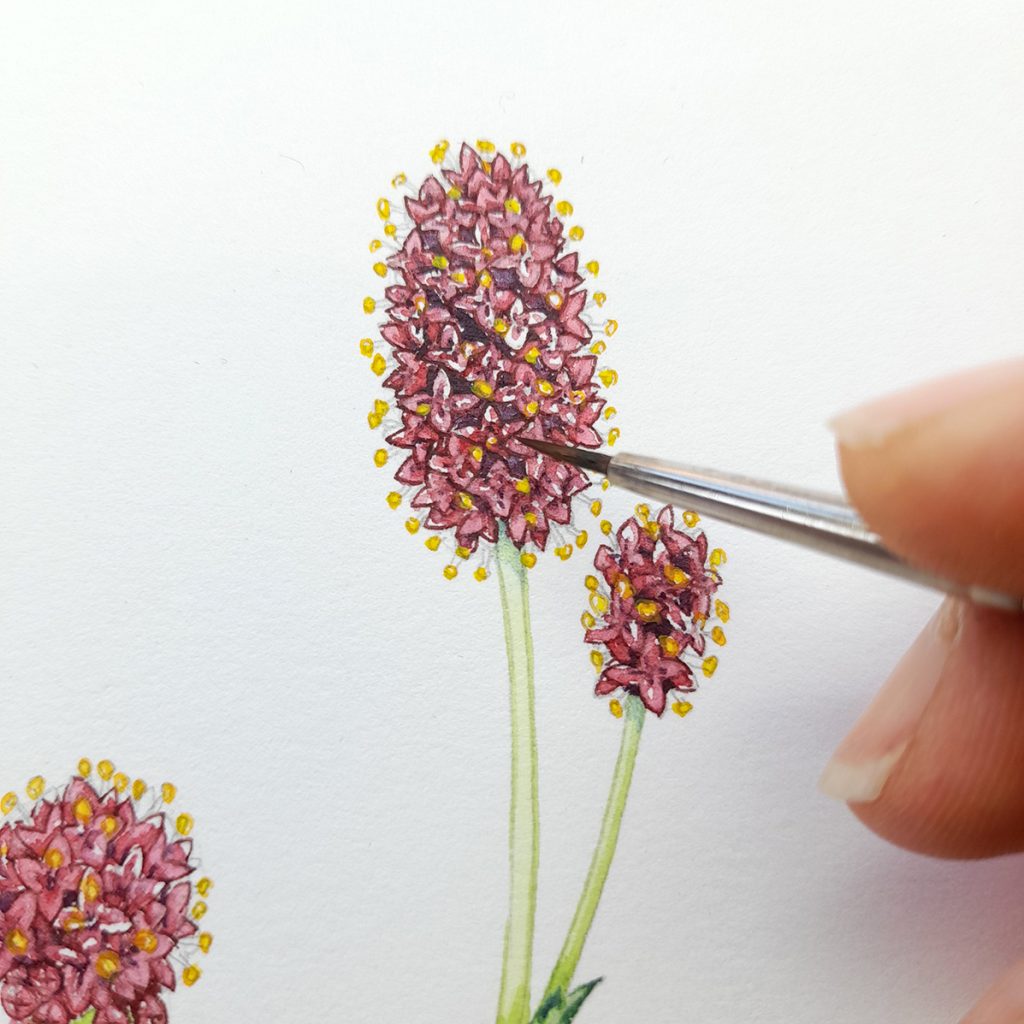
Adding the anthers
The next step is to plot in the woody stem and roots with a reddish brown mixed from Burnt Sienna, reds, and Burnt umber.
Final touches are knocking back those leaf midribs with a watery yellow green, and looking for more darks. Anywhere that needs crisping up, giving dark edges, adding depth of shadow…pop some of that blue and purple mix on.
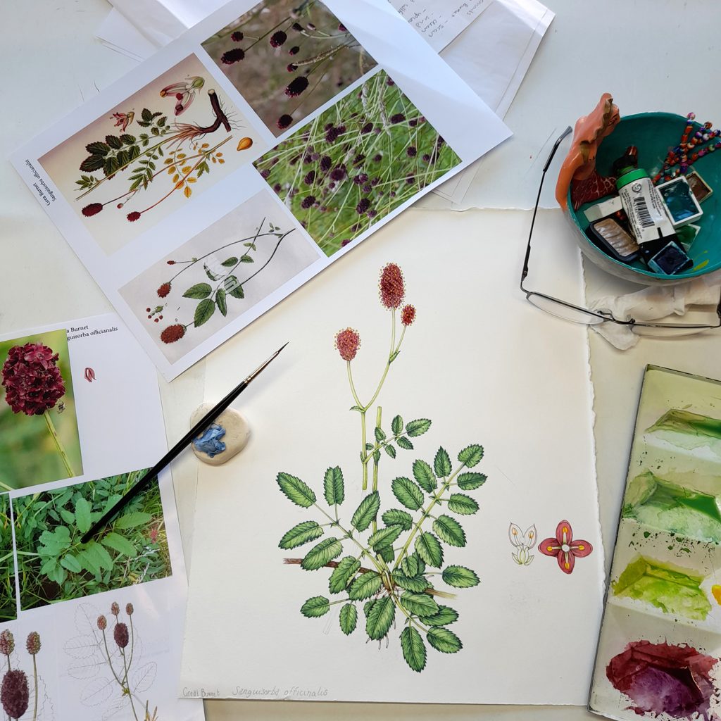
Completed illustration with paints and references
I colour up the individual flower details, using the same mixes as were used for the main illustration.
And there you have it…finished!
This approach can be used for illustrating most wild flowers, so long as you have decent reference materials. The outline, adding darks, adding layers of top wash, then picking out the deepest darks. But, like I always say, if you can get your hands on living specimens, you’ll be making life a whole lot easier for yourself!
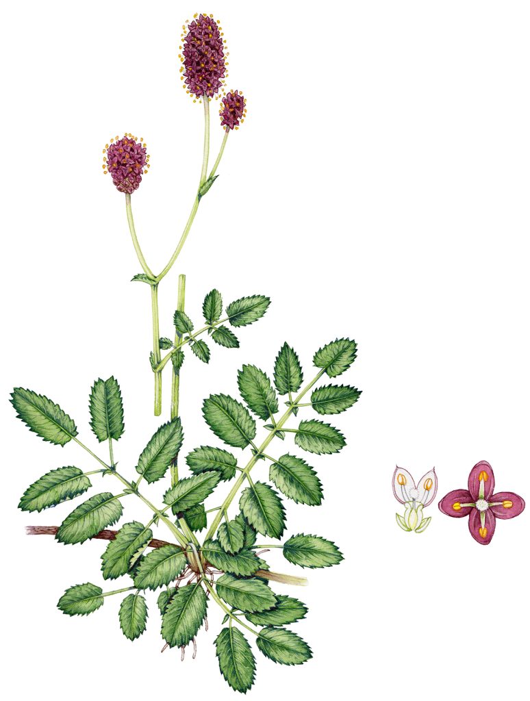
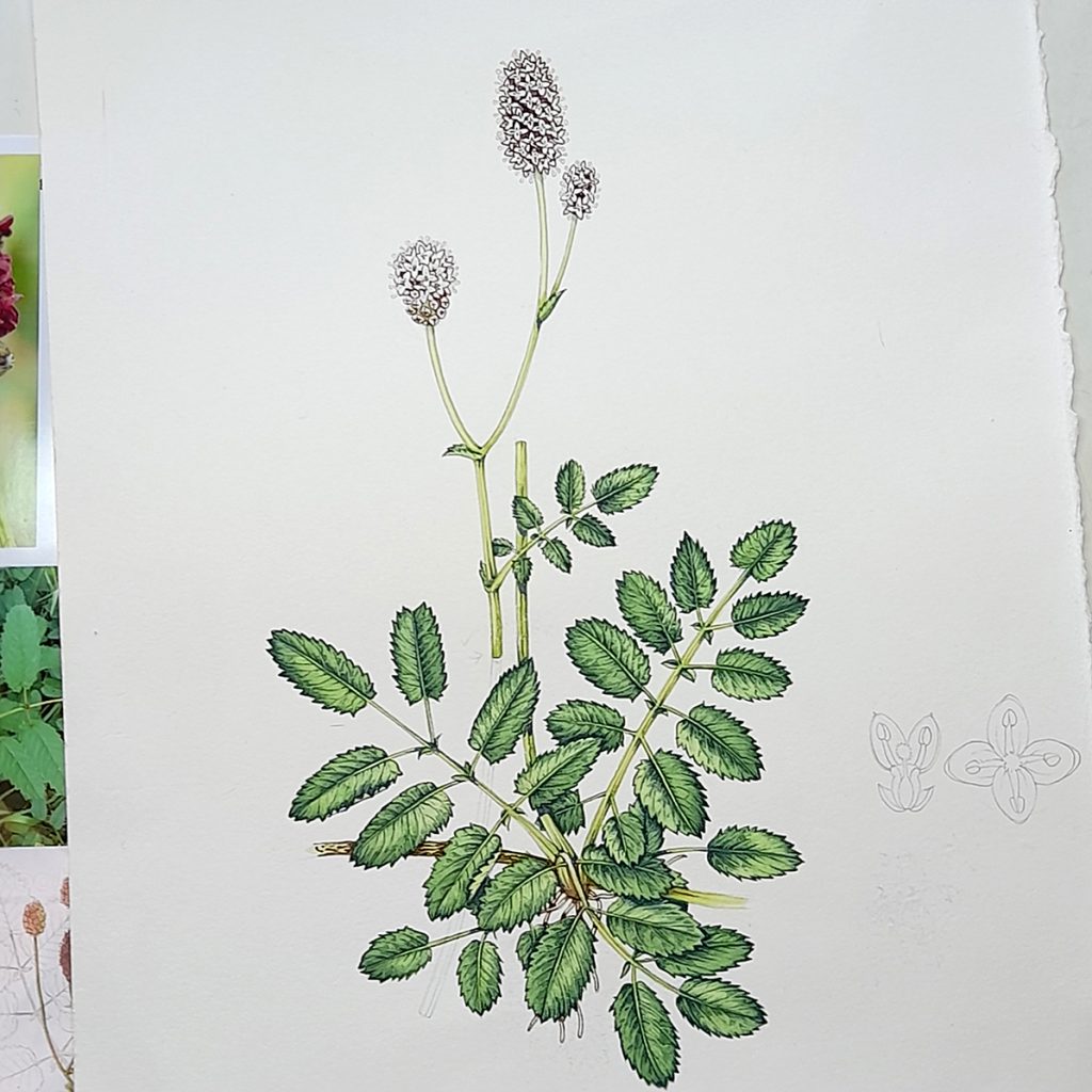
Completed Great Burnet illustration
Hi, thanks for the interesting step by step explanation!
I’d be interested to know how you deal with measuring the plant for illustration if using only picture references and not living specimens? Do you illustrate the plants generally in 1:1 scale?
Thanks!
Hi Jari
Good question. I tend to go by information in the botany books if I cant get my hands on a specimen. (always easiest to work from life). And, as time has gone by, by trusting my eye. In terms of scale, I try not to worry too much as my illustrations are shrunk and enlarged all over the place. And illustrating some things like trees etc 1:1 isn’t feasible. I tend to stick to an A4 size. If I were doing a new species description etc Id definitely be using callipers to be sure everything is exact, but mostly my work tends to be long lists of plants that just need to look and “feel” right, which is a slightly different aim. As long as I have the different parts of the plant in the correct ratio then it’s more or less ok.
Thanks for a good question though, mostly in botanical illustration scale is vital. And even for i.d. work like this, the proportions remain very central to identification and to getting the plant looking right.