Watercolour paints: Inside my paint box
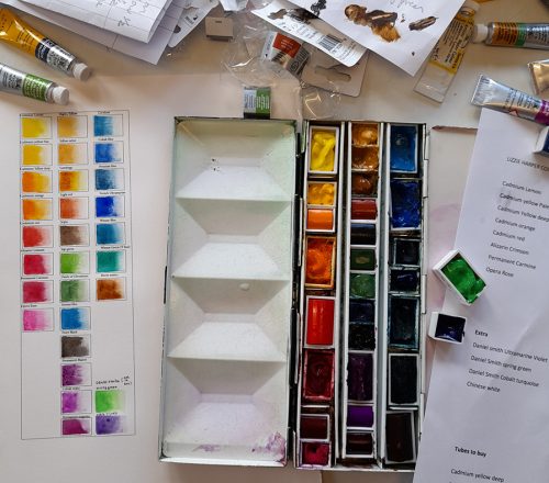
Watercolour paint choice is very personal, and everyone will have their own favourite colours. I have recently been giving the matter more thought as I try to simplify equipment lists for students, and thought I’d share my paint box with you.
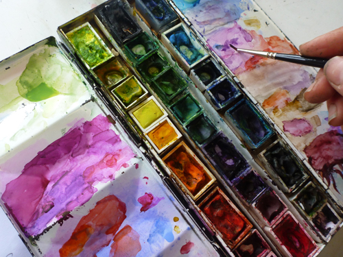
My paint box in use
I also made a guide to the colours I use which was a first. I have been painting for 30 years and it is only now I have felt inclined to produce a (surprisingly useful) colour chart of the contents of my paint box. Old dog new tricks, anyone?
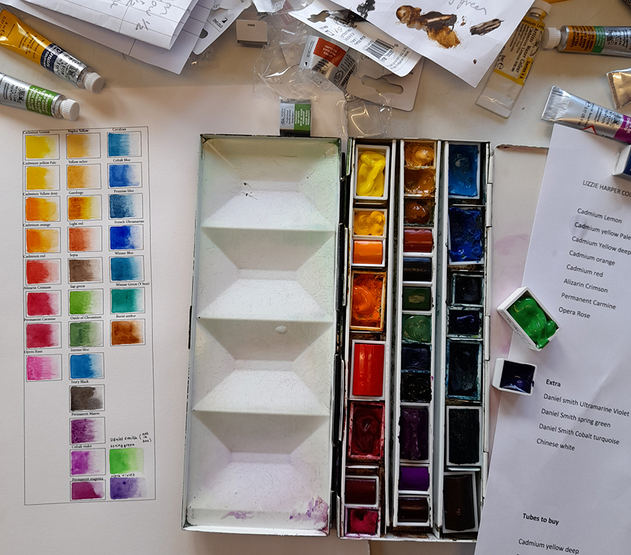
My paintbox alongside my guide
Below is the guide so you can see what store bought colours produce what hues (screen colours permitting).
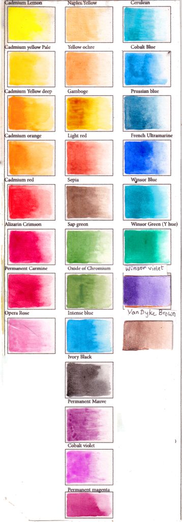
Colour guide
Some colours are transparent and some are more opaque. The way I do watercolour, laying down mid-tones first, means that having some more solid pigment in the mix is quite important. Experiment with your paints to see which colours are transparent, or less transparent.
Pan or Tube?
I use watercolour pans and as they get used up I top them up with paint from tubes. The manufacturers advise against this, but it has never proved problematic and probably is a cheaper option than wasting tube paint on a palette or buying endless pans. Do try to make sure you top up not only with the exact same colour, but also with the same brand of paint. Different makers colours can be very different from one another.
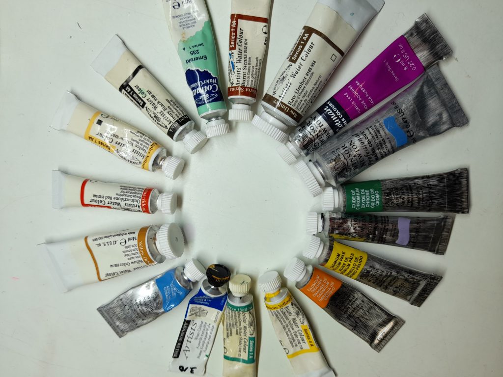
Some of my tubes of watercolour paint
I also keep empty pans and half pans so I can decant a tube into them if I buy a new colour. There are some paints that don’t fit in my paint box and I keep them in a plastic teacup on my desk.
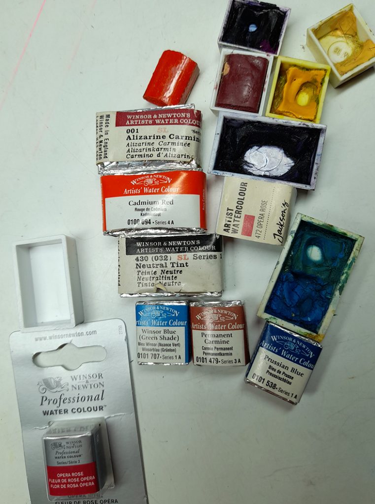
Some of my pans and an empty full pan
What brand?
There are many excellent brands of watercolour paint and you should feel free to use some colours from one manufacturer and others from another. I use a lot of Winsor and Newton, along with Daler Rowney and a couple of Daniel Smith colours. Other excellent brands include (but are not limited to): Schmincke, Old Holland, Sennelier, Holbein, Mijello, and a little cheaper Royal Talens Rembrandt, and St. Petersburg White nights.
Primary colours
Each colour or hue comes in many different varieties. With primaries, I think it is important to focus on having a warm primary and a cool primary colour although lots of other primary colours have crept into my paint box over the years. Primary colours are red, blue, and yellow. These are used to mix secondary colours (oranges, greens, and purples) which, in turn, are used to mix tertiary colours like green-blues, yellow-oranges, and blue-violets.
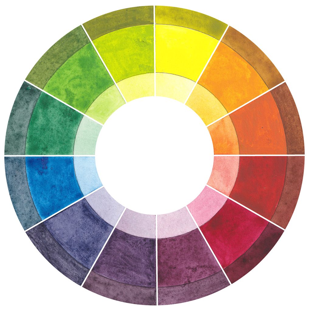
Colour wheel based on three primaries: Permanent Carmine, Cadmium Yellow and Cobalt Blue
Primary colours: Reds
A warm red will have an oranger tint than a cool red, which is more purple. My favourite reds are Permanent Carmine Red and Cadmium Red. Permanent Carmine is a cool, purplish red and the Cadmium red is very orange. The Carmine replaces Alizarin Crimson which I recently found out is quite a fugitive colour, liable to fade over time.
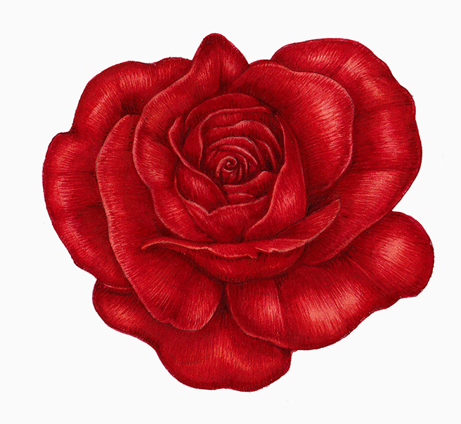
Rose with warm reds
Above is a rose painted with cool reds like Permanent Carmine and Alizarin crimson. Below is a Crimson waxcap painted with warm orange-reds like Cadmium red.
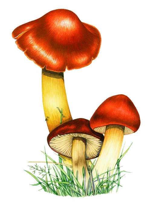
Crimson waxcap Hygrocybe punicea
Primary Colours: Blues
I have just counted and have five blues in my paint box. the ones I use most are French Ultramarine, which is a warm blue tinged with purple, and Cobalt blue, which is almost neutral. This means it is neither a warm nor a cold blue. A third blue I use a lot is the cool blue Cerulean Blue which has a blue-green tint to it. I also use another cool blue a great deal because it is such a pure and strong colour. Intense Blue.
The Forget-me-not below is painted with the cool Intense Blue (diluted with water).
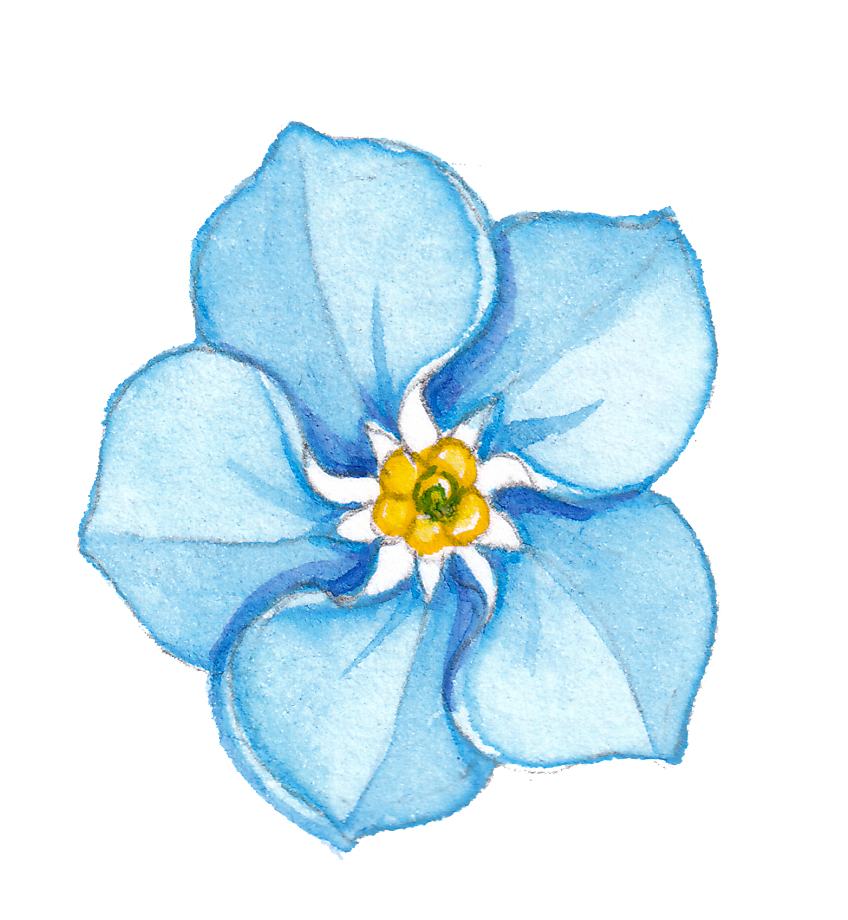
Forget-me-not Myosotis arvenis
The Gentian, however, is painted with warm Ultramarine and Cobalt Blues and looks more purple.
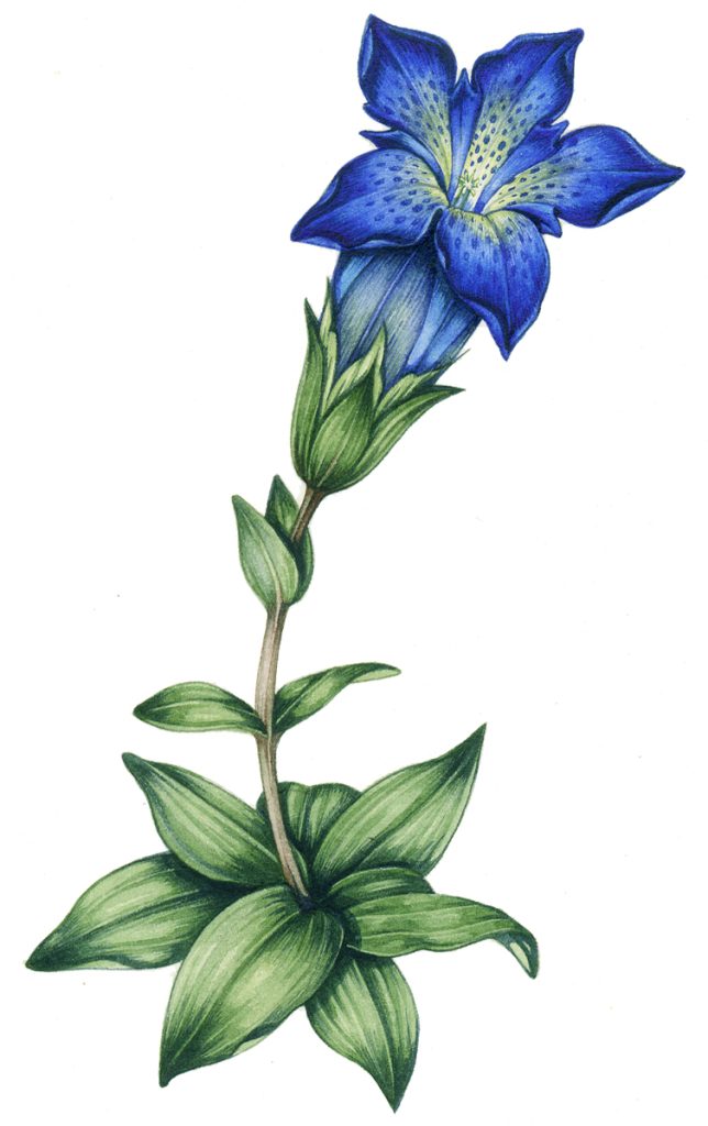
Gentian Gentiana acaulis
Other blues I have and use from time to time are Prussian blue, which is dark and greenish and Winsor blue which is a bright turquoise. The Cornflower below is mixed from French Ultramarine and Opera Rose (more on which later).
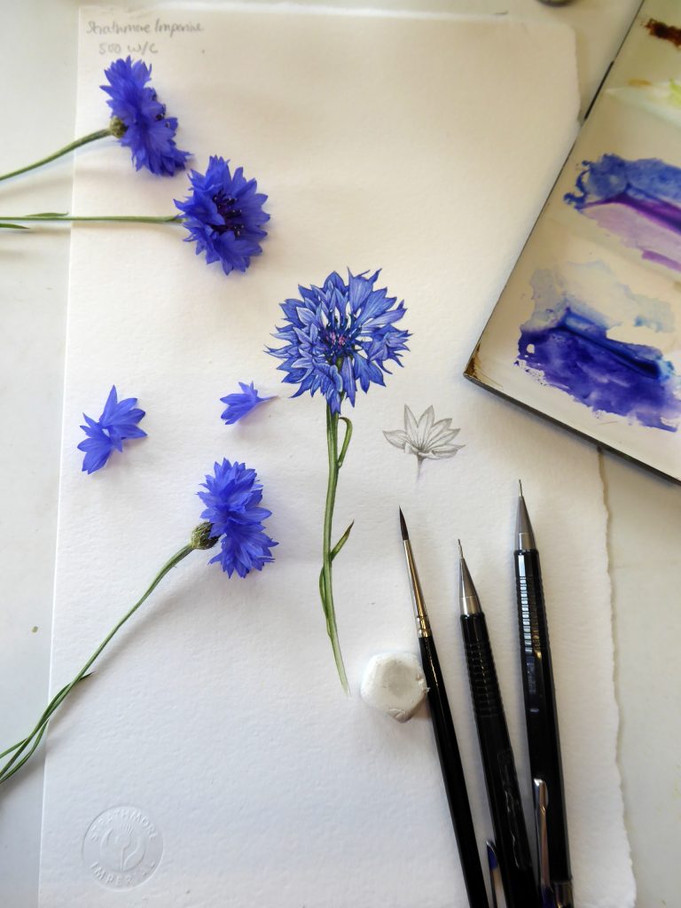
Cornflower Centaurea cyanus with paintbox and equipment
Primary colours: Yellows
My favourite cool yellow is Cadmium Lemon which is crisp and clean and slightly green. My warm yellow is Cadmium Yellow Deep. I also use Cadmium Yellow Pale, another cool yellow, and the very orange Cadmium Orange.
This Yellowhammer was painted with Cadmium Yellow Pale and browns. The Mahonia flower was all Cadmium Lemon.
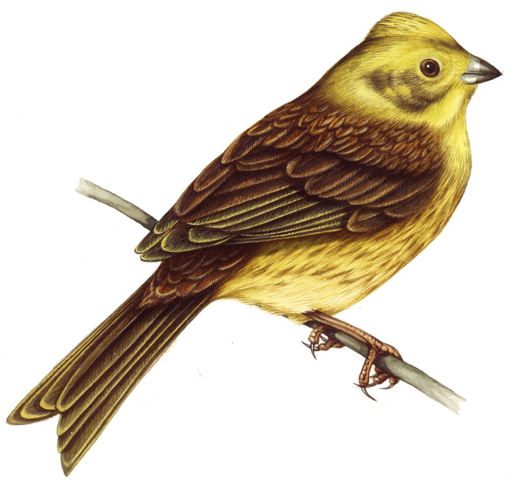
Yellowhammer Emberiza citrinella
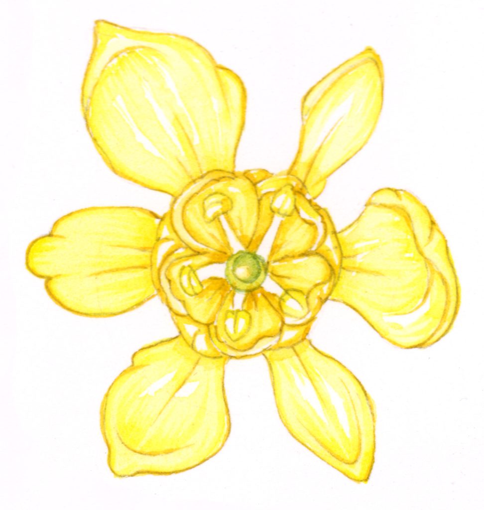
Mahonia flower close up
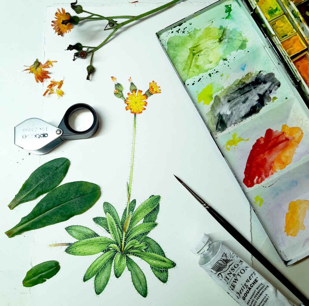
The Hawkweed below relies on Cadmium Yellow Deep mixed with Cadmium Yellow Pale and is a warmer shade.
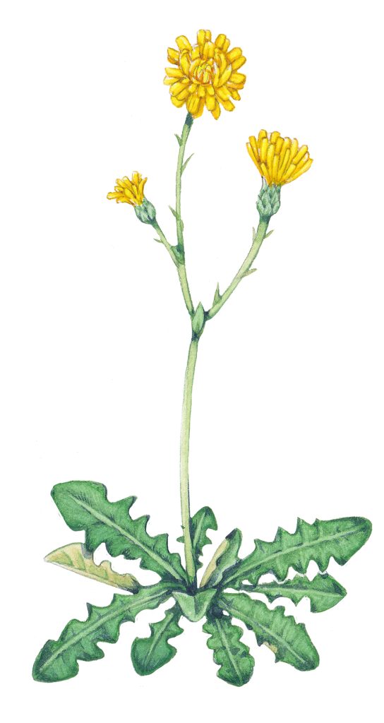
Hawkweed sketch Hieracium species
There are a few peculiar yellows that I like. Gamboge is rather green and feels golden. It is particularly useful when mixing greens. The same is true of Yellow Ochre, a brown yellow.
The Portland spurge shown below shows the watercolour paint box where the yellows are mixed. Top left is Cadmium Lemon, below it is Cadmium Yellow Pale and on the right side is Gamboge. The green mix below is Gamboge plus Intense Blue. I think!
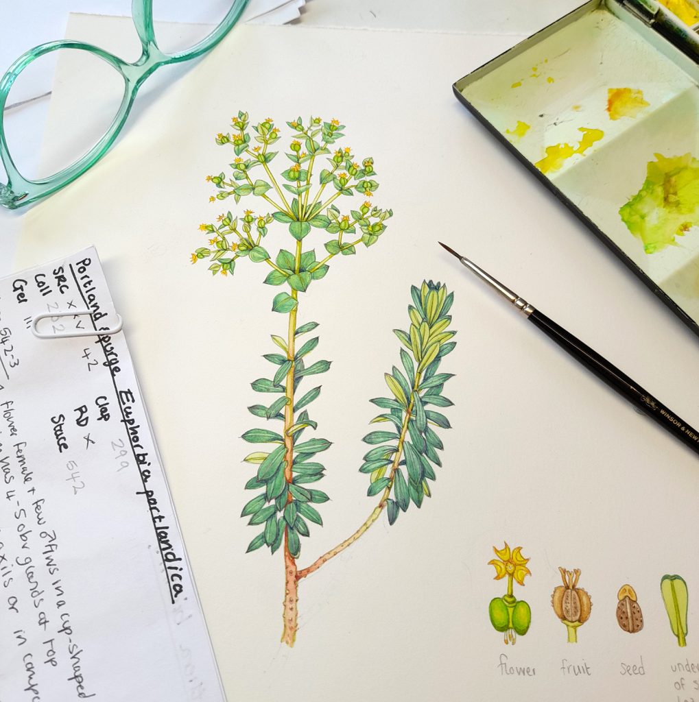
Portland spurge Euphorbia portlandica with paint box
The last yellow I love is Naples Yellow. This is a cloudy pale colour and I use it a lot when mixing waxy leaf greens or if I am tackling primroses.
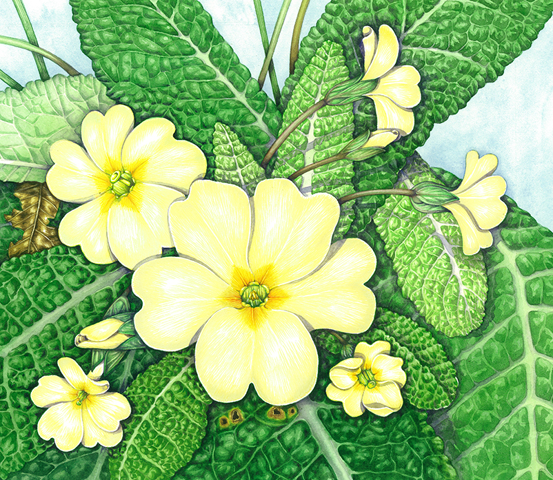
Primrose Primula vulgaris
Mixing Colours
Now we head into choppy waters where people have strong opinions. I like to experiment with mixing colours, and may put four or five different paint colours into one mix. For some people this is horrific. No more than three! Others claim you can mix every colour under the sun from three well-chosen primaries and indeed you can get an enormous amount of variety from a limited number of colours.
The colour swatch below shows a whole range of hues mixed from three colours: Ultramarine Blue, Permanent Carmine and Cadmium Yellow Pale. The difference comes by varying the ratios of each component.
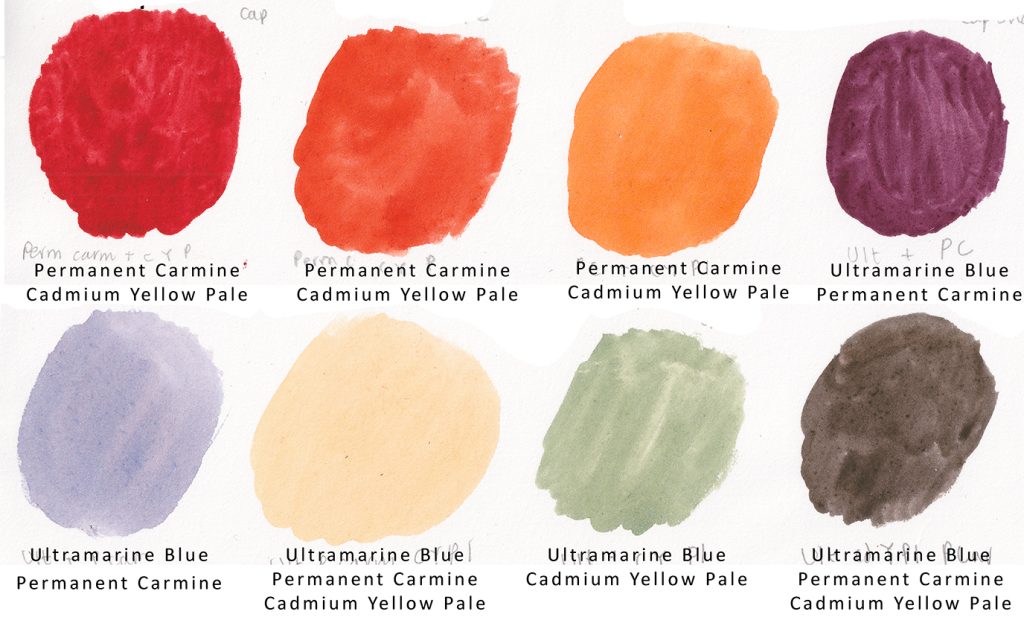
Colour swatch showing wide variety of colours mixed from three original paint colours
However, I think people should be allowed to play and experiment. Sometimes getting a new colour of paint is like being a child in a sweet shop, and you just want to add another one to the box. And why deny yourself?
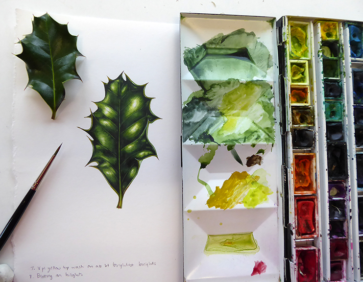
A whole lot of colours went into mixing these Holly greens Ilex aquifolium
All I would say is keep written notes of your mixes so you can re-mix a colour in the future.
Secondary Colours in the Paintbox
I have some secondary colours in my paint box too. I tend to add other colours to these, but they can be useful bases for mixing. The greens I use are Sap Green and Winsor Green (Yellow Hue). I sometimes use Oxide of Chromium and for a very bright colour I turn to Daniel Smith’s Spring Green. The leaf below is mixed from Winsor Green (Yellow Hue) with Cerulean Blue and some Cadmium Yellow Pale.
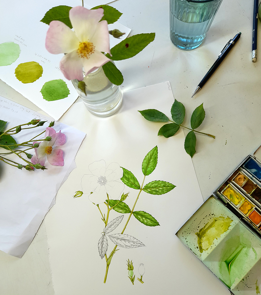
Mixing greens for a Dog rose
My favourite browns are Vandyke Brown and for a deeper shade, Sepia.
Winsor Violet is my go-to pre-mixed purple. I also love Permanent magenta, especially for richly red-purple flowers. Permanent Mauve and Cobalt Violet are also in the box but tend to go un-used as they are weaker hues.
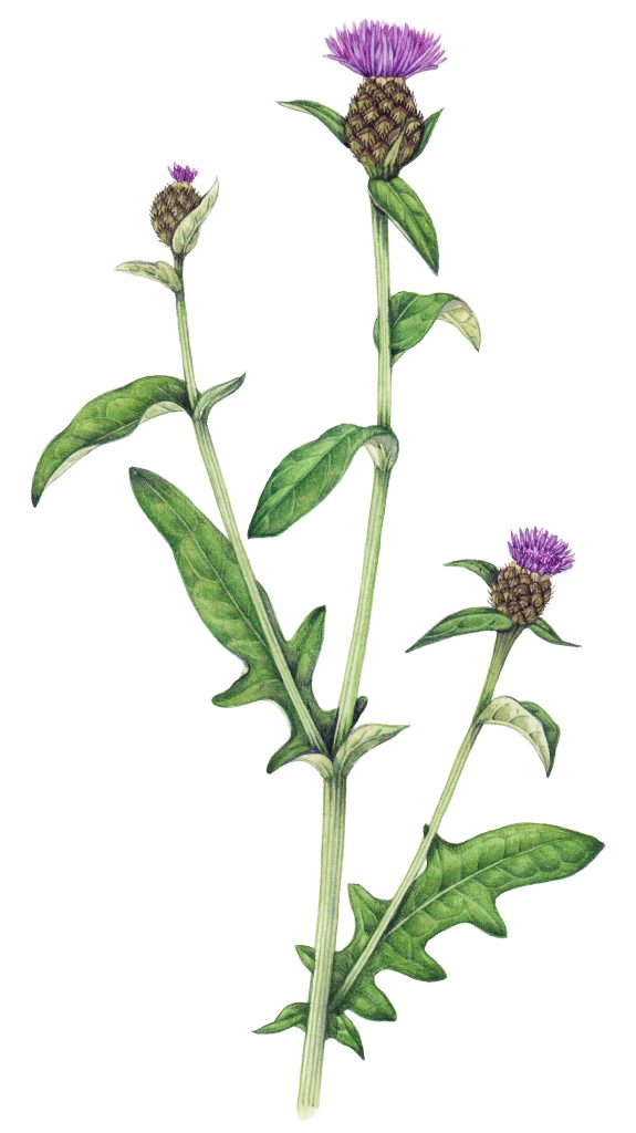
Common knapweed Centaura nigra painted with some pre-mixed purples
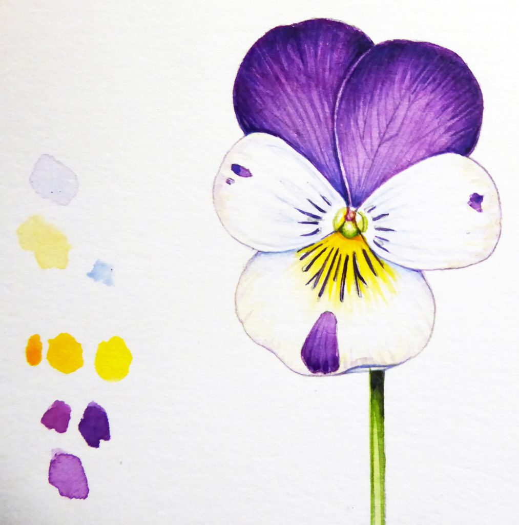
Pansy Viola x wittrockiana with colour mixes showing reds mixed with Winsor Violet.
I have Cadmium Orange and Light Red in the box too, but rarely use them.
A vital pink
A lot of wildflowers are pink. Herb robert, field rose, sweet pea, Red campion, Heathers…the list goes on and on.
I am unable to mix these pinks from primaries, nor even by diluting reds. I can get close, but it just is not right. So I use a secret ingredient.
Opera Rose. Most manufacturers have a version of this colour. Currently I’m favouring the Winsor and Newton one. it is a clear bright pink. When diluted with water it becomes the palest most delicate tint. Mixed with purples it adds a kick. Add it to blue to finally capture those warm purples of wild flowers like Meadow cranesbill, Harebell, Cornflower, and Bluebell. It is invaluable to me. I know it is a colour that fades (or even goes black, according to some reports!) over time. But I love it and rely on it heavily.
The Sweet peas below sit alongside diluted pure Opera Rose. Need I say any more?
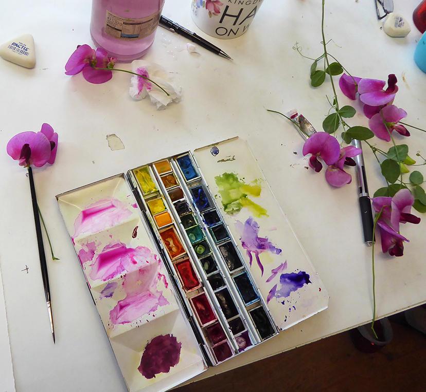
Opera pink and Sweet peas.
White?
The final colour in my paint box (that’s 30 colours we just covered) is Chinese White. Now I hate using white in watercolour. It makes the colours heavy, thick, chalky. The white of the paper no longer glows through the paint. However, there are a few colours I simply can not capture without it. Dog rose pink. Primrose yellow. So I use it. Resentfully and sparingly.
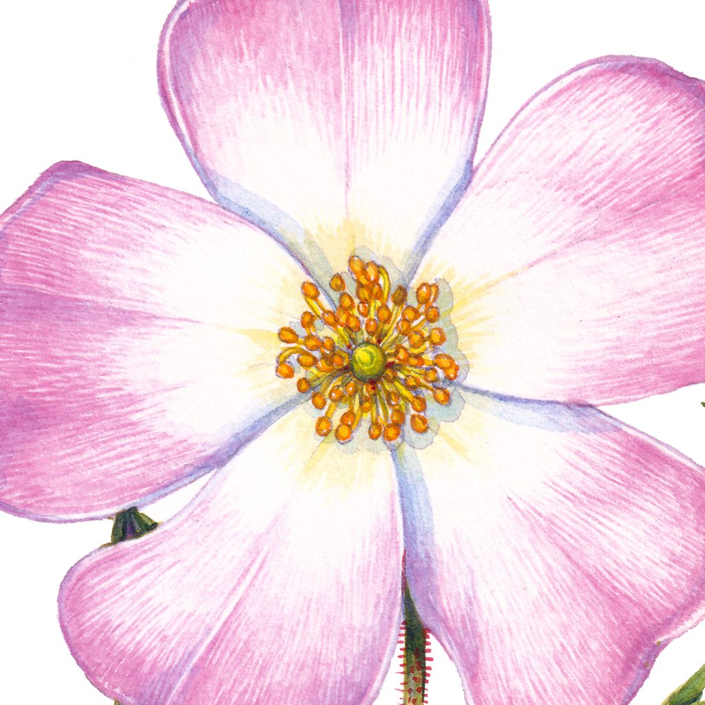
Dog rose Rosa canina
Conclusion
So that concludes my rather chaotic blog. Use what colours you want. Enjoy the, Keep notes. Experiment with mixing. But for a list of my essentials, see below. For a lot more on my paints check out my blog, and my other series of blogs on equipment for botanical illustration.
Blues
Ultramarine Blue
Cobalt Blue
Cerulean Blue
Intense Blue
Reds
Permanent Carmine Red
Cadmium Red
Yellows
Cadmium Yellow
Cadmium Yellow Deep
Cadmium Yellow Pale
Others
Opera Rose
Winsor Violet
Vandyke Brown
Chinese White
Winsor Green (Yellow Hue)
Fox and cubs with paint box and equipment

Not chaotic at all. Really informative and mightily useful. Thank you.
Thanks Helen
I have this terrible guilt at the number of “convenience colours” I have but can’t resist – this is such a useful article, thank you!
My absolute pleasure
Very informative, this goes to show that every artist has their own favorite brands and colors. My favorite green is olive green. As with brands, or pans or tubes. I just see what I have in my stash of colors. I am not allowed to buy more. LOL. I do love your colors very much.
Bless you Ineke
Your attention to detail captures the delicate nature of these beautiful flowers perfectly. Reminds me of the flowers my Grandmother used to paint. You have inspired me to start painting again – thank you for that!
Thats a lovely comment, thanks
Hi Lizzie!:)
Thank you for getting in the trouble to make such a complete list of the colours that you use. This post is great and I would suggest to pin it on top of the list of other posts or make it a downloadable pdf because you forgot to mention that the semi transparent and opaque colours of your colour selection are actually essential for painting in your so unique painting style.
I’d like to point that out as semi transparent and opaque colours are definitely needed for plotting the midtones. I’ve realised that during that fantastic Birds Foot Trefoil online tutorial were I tried to plot the midtones with my transparent, split primary palette selection and I saw that transparent colour palettes though they are great for working in layers and glazes, are not suitable for plotting details and then glaze as in your very unique painting style. Your technique needs its own setup.
That is the reason why I think that this particular post is so important for your tutorials. It is super useful.
Hi lovely Marialena
Thats a good idea. Ill see if I can pin the post to the top of the equipment section. ANd its a good point about transparent and opaque colours. Another benefit of those on the outside looing in, and brining a fresh perspective. Thankyou
Second this. If you’re teaching online especially. You’ve changed too in 5 or 10 years of art why not your paint choices? Plus it’s fascinating to see what others use and why.
I’ve just started adding granulating/slightly opaque colours to my box of toys after 5 years of neither. Am no artist/pro/whatever I’m just having fun!
Though I stock up when the price is (insanely cheap) right I’ve now got a stash more of 5ml tubes by WN. I got a couple giant tubes for colours I think I’ll rely more on (14ml French ultramarine and Winsor Lemon plus a new 15ml Manganese Blue Hue DS). But the transparency suited and now, after using a granulating green the most, I’m clearly changing my methods too.
The new paint pigments available are fascinating too- Palomar Turquoise looks amazing (WN “Aqua Green” pigment name) but it’ll take me major time to play with them all. My toy time means no TV so I can ignore the crazy outside of my paper. I need it especially right now 😉
Thanks again for the look at your paint tin
Hey Max. Ok, Im off to the sweetie shop to buy a tube of “aqua green”, sounds glorious and would be interesting to give it a go when it comes to mixing greens. Something I spend a LOT of time doing! I tend to get stuck in my old habits, so suggestions as to new developments and pigments are always very welcome. Thankyou.
What specific watercolor paints do you have inside your paint box, and do you have any favorite colors among them? Greeting :
Hi
I think this blog covers the question more or less. Favourite colours are Yellow Ochre, Opera rose, and Ultramarine. But I love them all!
Thank you so much for taking the time to educate us. So many lessons learned, even though I’ve been painting for years! Love your work and YouTube’s as well
Hi Connie
My absolute pleasure, thanks so much for such a lovely comment!