

Mixing Neutral Tints and Colours
What are Neutral Tints?
Neutral tints (or colours) are grey hues which don’t carry any dominant shade. They are, as the name suggests, neutral. In 1887, a neutral tint was defined by Winsor & Newton as, “‘A compound shadow colour of a cool neutral character.” So a blue-grey or a grey with a pink tinge wouldn’t be neutral.
These tints are designed to make a colour darker, but not to alter the colour itself when you pop the tint on top. A good neutral tint will make a yellow a deeper shade of yellow, but not make it turn greenish or orange.
Why and when should you use Neutral Tints?
Dealing with shadows on pale flower petals is always tricky. If you mix up a colour that’s too feisty it can make a white flower look foolish, or just wrong. (For more on tackling painting white flowers see my earlier blog). If you don’t add shadows you risk creating a very flat illustration.
Yellows need neutral tints too. If you’re putting shadow onto a pale yellow petal, you need to avoid mixing a colour that has too much red or green in it. You also need to apply the tint with care – don’t cover the whole petal with it, it’ll look flat and muddy.
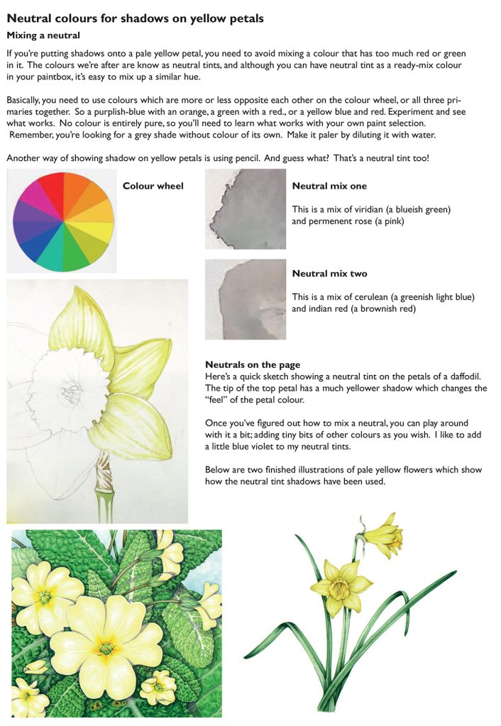
Mixing Neutral Tints
Neutral Tint was first created in the 18th century, from a mix of Light Red (red iron oxide), indigo or iron blue and gamboge or yellow ochre. (Thanks to Jane Blundell Art for the history!) Most watercolour paint manufacturers nowadays make neutral tint using a black pigment (see Daniel Smith and Winsor and Newton), but it’s just as easy to mix your own.
So how do you go about mixing a neutral? Basically, you need to use colours which are more or less opposite each other on the colour wheel, or all three primaries together. So a purplish-blue with an orange, a green with a red, or a yellow blue and red. Experiment, and see what works. No colour is entirely pure, so you’ll need to learn what works with your own paint selection.
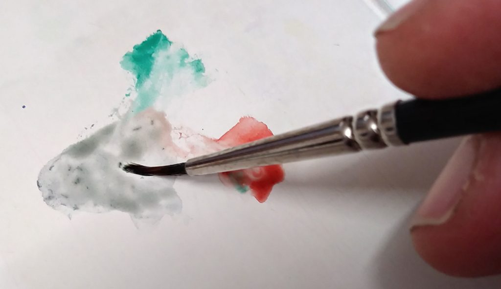
Remember, you’re looking for a grey shade without colour of its own. Make it paler by diluting it with water.
Another way of showing shadow on yellow petals is using pencil. And guess what? That’s a neutral tint too!
Neutral mix one
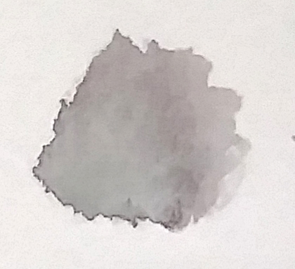
This is the dried mix of viridian (a blueish green) and permanent rose (a pink). This is one of the mixes used by Christina Hart-Davies.
Neutral mix two
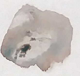
This is a mix of Cerulean (a greenish light blue) and Indian red (a brownish red), a mix favoured by Mary Brewin.
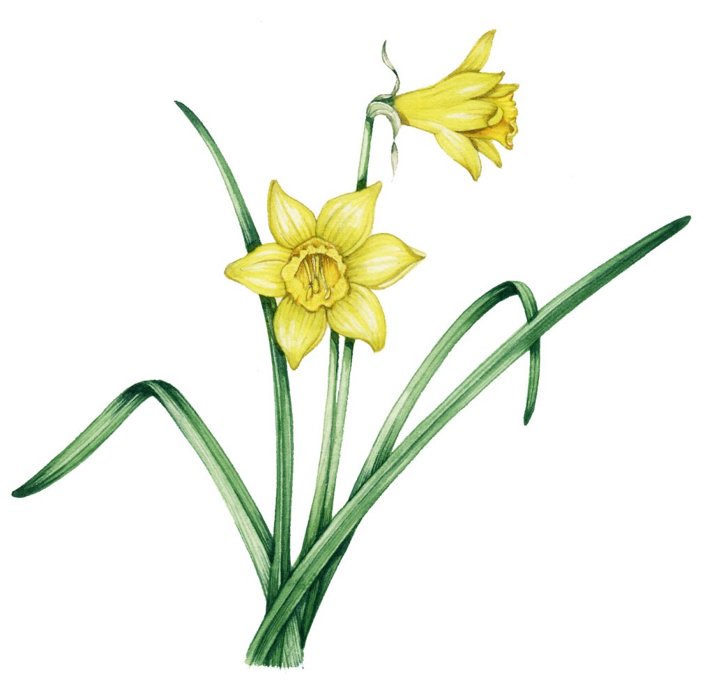
Neutrals on the page
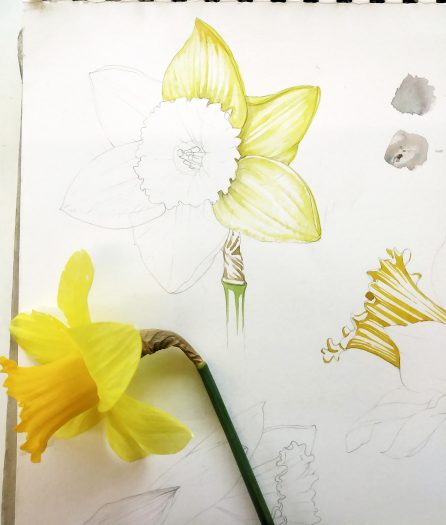
Below I’ve done a quick sketch showing a neutral tint on the petals of a daffodil. The top petal has a much oranger shadow which changes the “feel” of the petal colour. This is because the shadow has colour and is not neutral. The lower petals have the neutral tint and aren’t so heavy.

Once you’ve figured out how to mix a neutral, you can play around with it a bit; adding tiny bits of other colours as you wish. I like to add a little blue violet to my neutral tints.
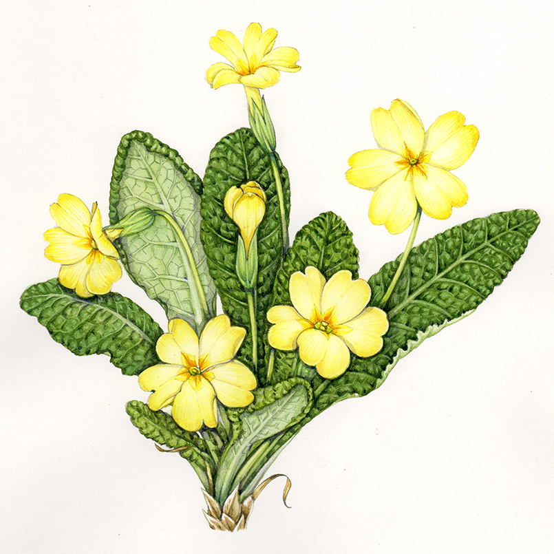
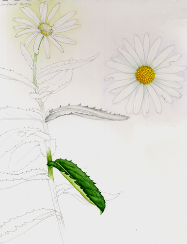
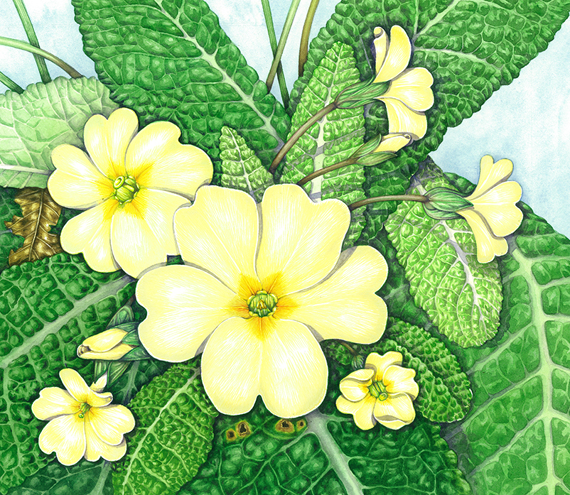
Below are two finished illustrations of pale yellow flowers which show how the neutral tints have been used.
For a summary of this information as an A4 handout, please visit my Pinterest site, where you can also access a handout on how to paint yellow flowers.
If you want to learn more on this topic, check out Coral Guests’s blog.
Thank you for these great tips on neutral colour mixing
Absolutely my pleasure. It took me a long time to get my head around neutrals, so Im more than happy to pass on what I’ve been taught. Glad it’s useful for you.
Thanks for this detailed explanation.
I was not sure and thought it was a purple shade.
I am much happier now and shall experiment using you guidelines.
Oh good, so glad to be of help! X
I’m confused about this, because I’ve always learned that the shadow color in a painting should reflect the lighting and the setting around whatever it is you’re putting a shadow on, that shadow colors *shouldn’t* just be a darker version of the main color, that they should always be a different tone depending on the light. Do flowers just defy physics this way, or is there another reason why this sort of neutral shadow is required for flowers and not other things?
Hi Lavender
Ah, yes. Well, the thing is that you can combine your correct prior knowledge with the stuff about neutrals. What you’ve learned about shadow reflecting the surroundings is, of course, correct. It makes sense, right? Of course shadows echo what light and colour conditions are going on. So what about these neutrals? Neutrals are another tool in the box of tricks that get used with trickier colours. They’re a cunning way of dealing with colours that can go horribly wrong if you make a shadow from a darker version of that colour. When mixing paints, dark yellow becomes an orange, a green, or a brown, yet the shadow on a pale daffodil petal is neither of these colours. I guess the use of neutrals is a fudge to cover the limitations posed by physical mixing of colour vs the optical light and colour that we see in nature. Using neutrals helps preserve luminosity, and keeps the painting un-muddied. And another good point you make – it’s not specific to botanical illustration. It’s a tool to use when you’re painting any subject that would end up looking muddy or “wrong” if you used physical paint in a darker hue. I suppose what you raise is a bigger issue altogether; the way that painting an object can replicate that object…but only so far as the physical materials we use (paints) are capable of doing so. As we can’t paint with light (what an idea, I love it!), recreating the physics of light mixing and reflection is, necessarily a fudge. And I see using neutrals as a tool in our efforts to manage this task. Thanks for a really interesting and valid point, I enjoyed having to think about it. Hope that makes at least a little bit of sense? X
Thanks Lizzie, such a helpful article and so well explained. Reading your response to Lavender was a lightbulb moment for me.
Ah! Nothing as exciting as feeling responsible for a lightbulb moment, Im very flattered. Glad the chat about neutrals has proved helpful. X
In regard to the point about shadows reflecting the lighting and setting of the surroundings, we also have to consider that some surface textures are more reflective than others. A velvety flower petal or a towel for example, won’t reflect nearly as much light and color as water or a hard smooth surface.
Hi Donna
That’s a valid and useful; point to make. And avoiding shine of soft textures can help actualize the texture. Thanks for the comment, I appreciate it. x
I mixed the Veridian and Permanent Rose and with my paints, Daller Rowney Veridian and Paul Rubins Permanent Rose and And that wasn’t quite neutral, so I added a touch of Daller Rowney black (no mention of what black it is) and gained a very neutral, slightly warm neutral. I mixed in the ratio Veridian 3pts, Rose 2pts and Black .5pts. I think for many uses it’s better than Daniel Smith’s Neutral which to me isn’t very neutral. I mixed my formual with chinese white and got a very nice, apparently neutral gray…neither warm nor cool, smack dab in the middle.
Hi Peter
‘m so glad to hear you’ve been experimenting! And what you say is exactly what I love to see, people trying things out and finding their own favourite neutrals. I agree, a pre-mixed neutral can be a useful thing, but the warmth or coolness you can get from your own mixes is bound to be better. And as you say, some pre-mixed neutrals dont feel at all neutral to me, either! Nice work. I hadnt thought of adding the Chinese white either, so thanks for that tip.