

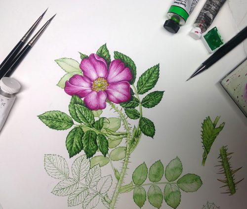
Botanical Illustration of a Japanese Rose
In my last blog, Botanical illustration of Rose leaves, I discussed the processes involved in completing a botanical study of the leaves of the Japanese Rose, Rosa rugosa. This blog will focus on the flower.
This sketchbook study was completed for FOR Sweden, and is one of a series of 12 invasive species illustrated.
As mentioned in the last blog; this is one of a whole clutch of blogs I’ve written on how to illustrate roses. You can check out another one on painting this species, one on illustrating a dog rose, and one on doing a sketchbook study of a pretty peach rose for The Garden Forager by Adele Nozedar.
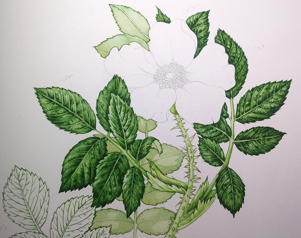
Illustration with completed leaves, awaiting illustration of the flower
Materials
You need to have your art materials and a few rose flowers ready. If the rose isn’t in season, either use a whole range of photo reference, or wait til it blooms! My botanical illustrations are always completed on hot press watercolour paper, in this case Stonehenge Aqua by Legion Papers. Mechanical pencils create a good crisp line for drawing up the plant, I favour the Pentel P205. The watercolours I use most are Winsor and Newton pans, although I’ve also used a some Ultramarine violet from a tube of Daniel Smith watercolors for this illustration. I mix a few drops of the very vivid pink (Quinacridine magenta) Doctor Martin’s Hydrous watercolour ink in with my rose hues, and always use a size 1 and 000 Series 7 sable brushes by Winsor and Newton.
Draw up the Rose
In this case, we’re returning to an illustration we’re already working on. However, you could just as easily take a pencil and draw a line drawing of the flower direct onto the hotpress watercolour paper. Keep a light touch and precise, atonal lines.
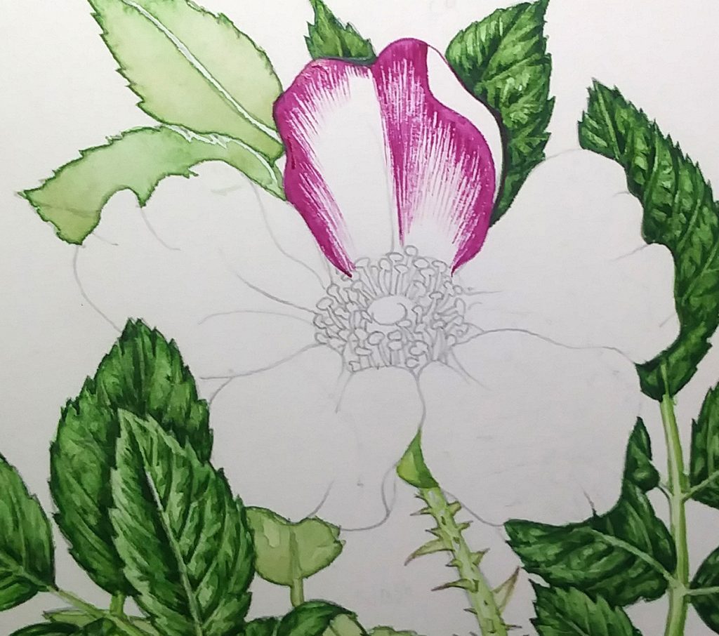
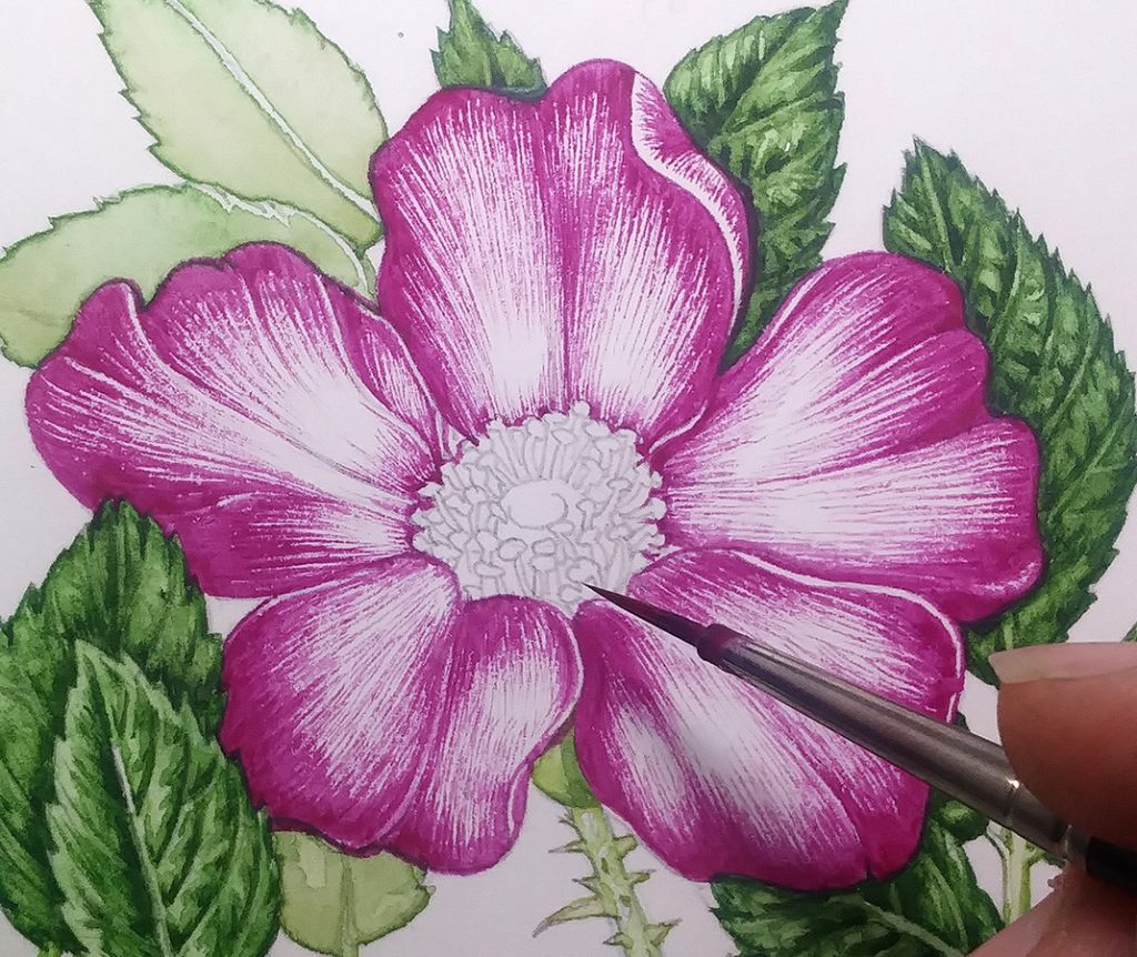
Starting out on the petals
The first step is to mix up a good magenta. The hue of the Japanese rose is very distinctive, and is quite a blue-pink. I used plenty of Winsor and Newton (W&N) Opera rose, a touch of Daniel Smith (DS) Ultramarine violet, some W&N Permanent rose, some W&N Cobalt blue, and a tiny bit of W&N Quinacrodine violet. To add an extra kick, I put in a drop or two of Doctor Martin’s Quinacridine magenta hydrus ink.
It’s all rather experimental, mixing hues. I keep written notes of what I’m adding and go on mixing until the colour matches the petal. Sometimes I paint a tiny drop of the mix onto the petal itself to see how close of a match it is; this is ridiculous in truth as paint dries a different colour and appears differently on the substrate of white paper. I like to think it’s a good pointer, though.
Following the lines of growth on each petal, and painting outward towards the outer edges, I start to build up colour.
Make sure to leave plenty of white paper. With watercolour, the white page provides you with the colour white, and with your highlights. Swallow these up with colour at your peril.
One petal has the first layer of colour applied
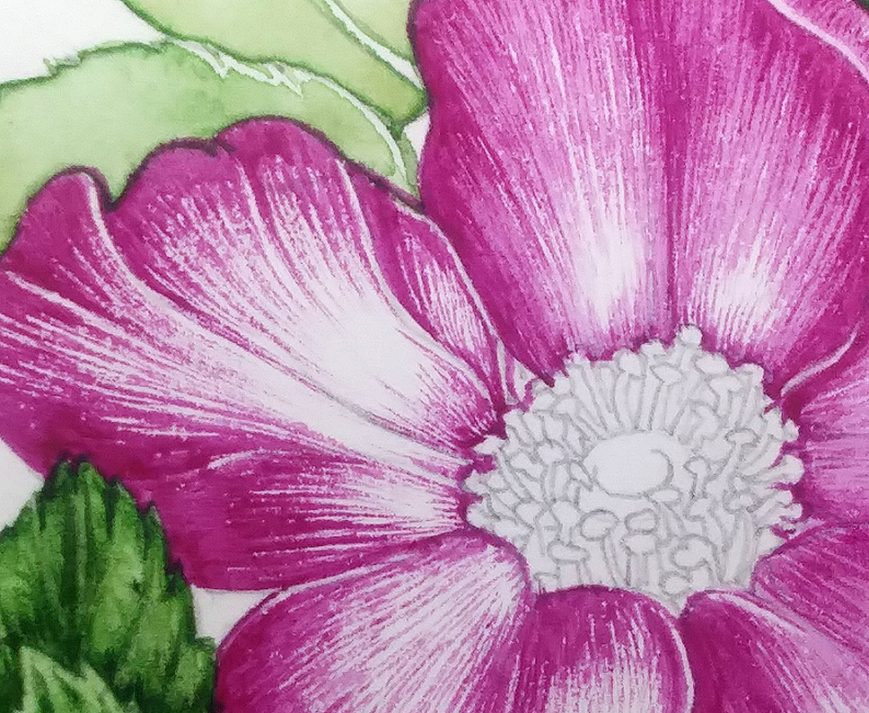
A close up of the petal shows that the colour is made of lots of tiny lines. To get this crisp effect, the paint has to be pretty thick; probably similar to the consistency of cream.
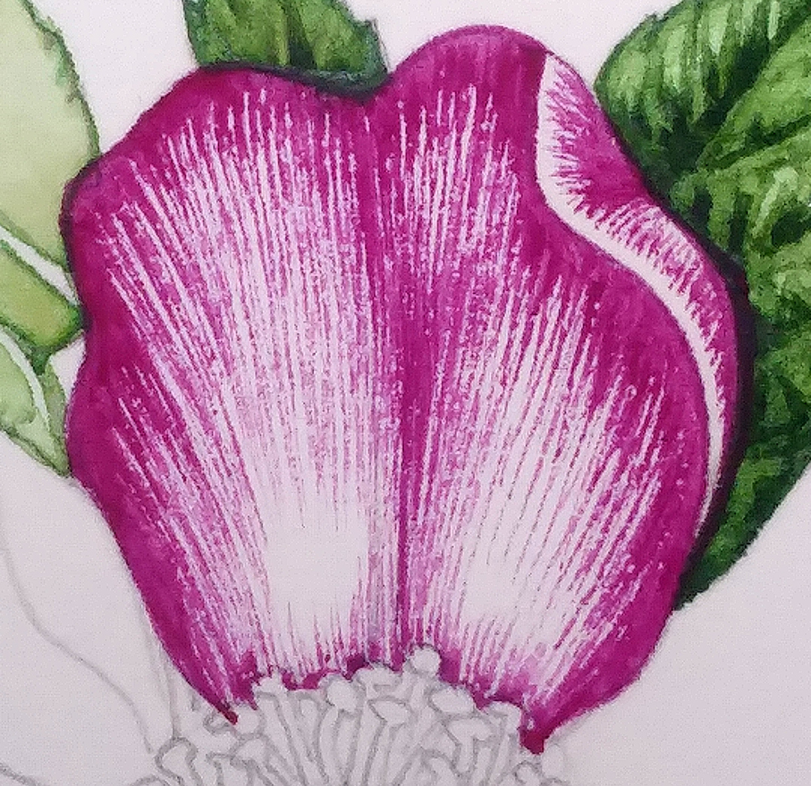
Close up of the petal
Working around the petals of the Japanese Rose
Move from one petal to the next, being sure you don’t lean your hand on anything you’ve just illustrated. A piece of scrap paper under your painting hand helps avoid dirtying the rest of the sheet of watercolour paper and allows you to focus on the area you’re concentrating on.
Working around all five petals of the rose
By following the lines of growth, and by anchoring your lines at the outside edge of the petal you’re echoing the structure of the flower, and adding movement to the illustration. It also makes the outer edges of the petal darker, which helps the eye find and settle on the exterior of the flower.
Top wash
Next, I dilute the pink hue with clean water. Water is the best way to make a tint, or paler version of a hue. It makes the colour paler and lighter but doesn’t muddy it with white pigment. The paint used here is really quite watery, and is applied over the top of the areas of petal already painted. As with the leaves, extend this paler area further in to the white highlights on the page. This makes the juxtaposition between colour and white paper softer, and more realistic.
This layer is applied as before, with parallel tiny brush strokes which follow the line of petal growth.
Close up showing the top wash on the top petal
Work your way around the petals, being sure not to smudge your work. Don’t swallow up the white of the page entirely, it provides highlights and gives life to the illustration.
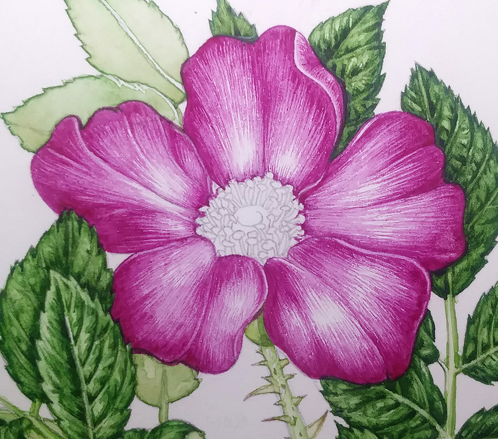
Flower with all five petals complete with top wash.
Be brave about when to stop working on the petals
With many flowers, I’d do another paler dilution of the colour, and gently apply this over the entire flower. This can make a flower glow, but can also stifle its delicacy.
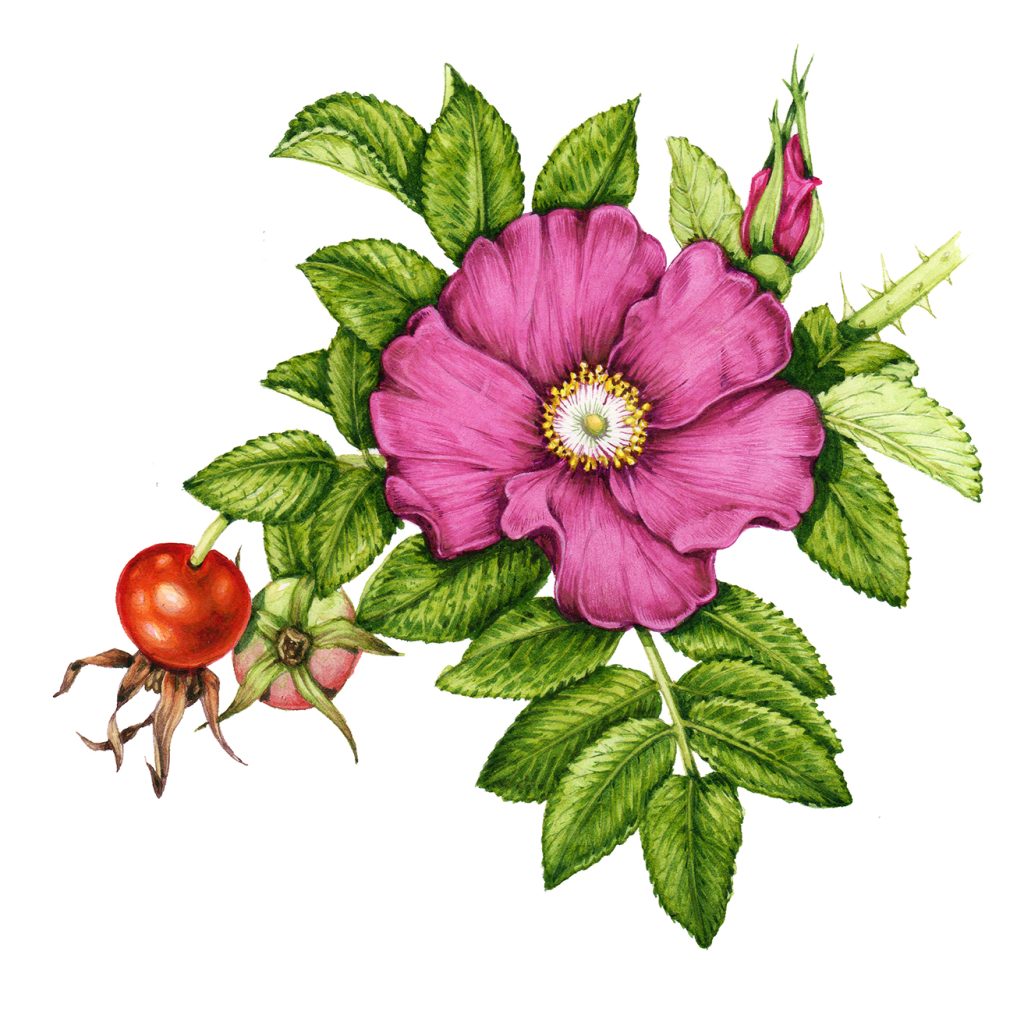
In an earlier illustration of a Japanese Rose (below), this top wash slightly compromised the illustration. It was needed, as the illustration had to be complete and polished, but with this sketchbook study I chose to relax and not add a third layer of colour.
Illustrating the Stamens and Stigma
Look closely at the centre of the rose. You’ve already drawn all the stamens with their anthers, and can see the top of the stigma. Mix up colours that match what you see. For the anthers I used W&N Cadmium yellow, outlines with Cadmium yellow and a touch or Cadmium orange. The filaments are the same yellow, but with a dash of green.
The hue of the stigma is a colder and greener yellow than the anthers. W&N Winsor Lemon works well, with an outlying circle of the same colour mixed with sap green.
For more on the anatomy of roses have a look at my earlier blog on the structure of rosehips, or this simple guide from Texas A&M University.
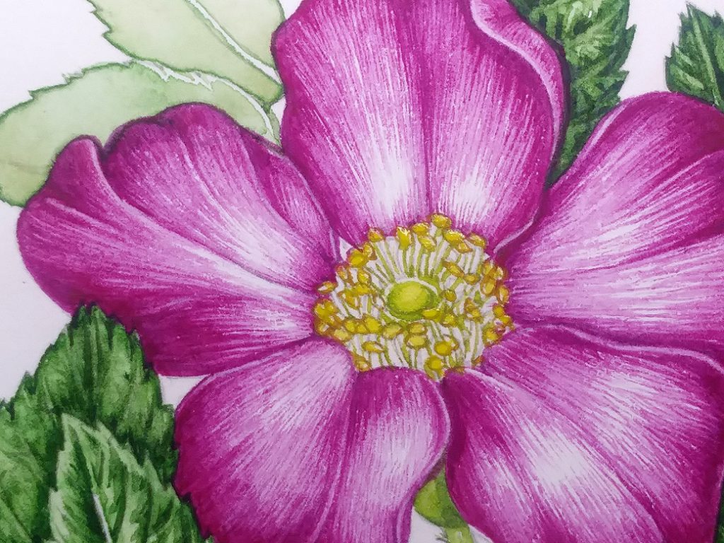
Japanese rose with stamens and stigma coloured in
Working into the shadows
The last thing to do is to mix up a good colour for shadows, and to pop some of these in. I tend to use W&N Cobalt blue and a purple, and love the crispness a good drop shadow can give.
I also like to add a few tiny brush strokes of this watery, darker hue to the external edges of the petals. it seems to help provide focus to the illustration.
A little more judicious use of shadow around the stamens brings the illustration together. It’s finished.
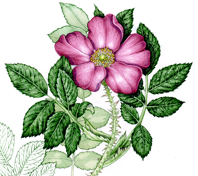
Completed Japanese Rose sketchbook illustration
For a film of me working into this rose illustration in real time, and explaining what I’m doing as I paint, please take a look at my Youtube film:
For a blog on my sketchbook illustrations click here.
Conclusion
I always paint the flower after the foliage in the same way as I leave the tastiest bit of a meal until the end. It’s the treat to reward me for the hard work that goes into navigating those seas of green.
It’s not just that doing botanical illustrations of flowers like this Japanese rose is more fun than working on the leaves (although that’s true), it’s also easier. Tracing the patterns of lights and darks is simpler as the structure is less complex. The colours are a whole lot of fun to mix and work with. And there’s something infinitely satisfying about sitting back after completing a decent day’s work, and seeing the flower you just illustrated glowing on the page.
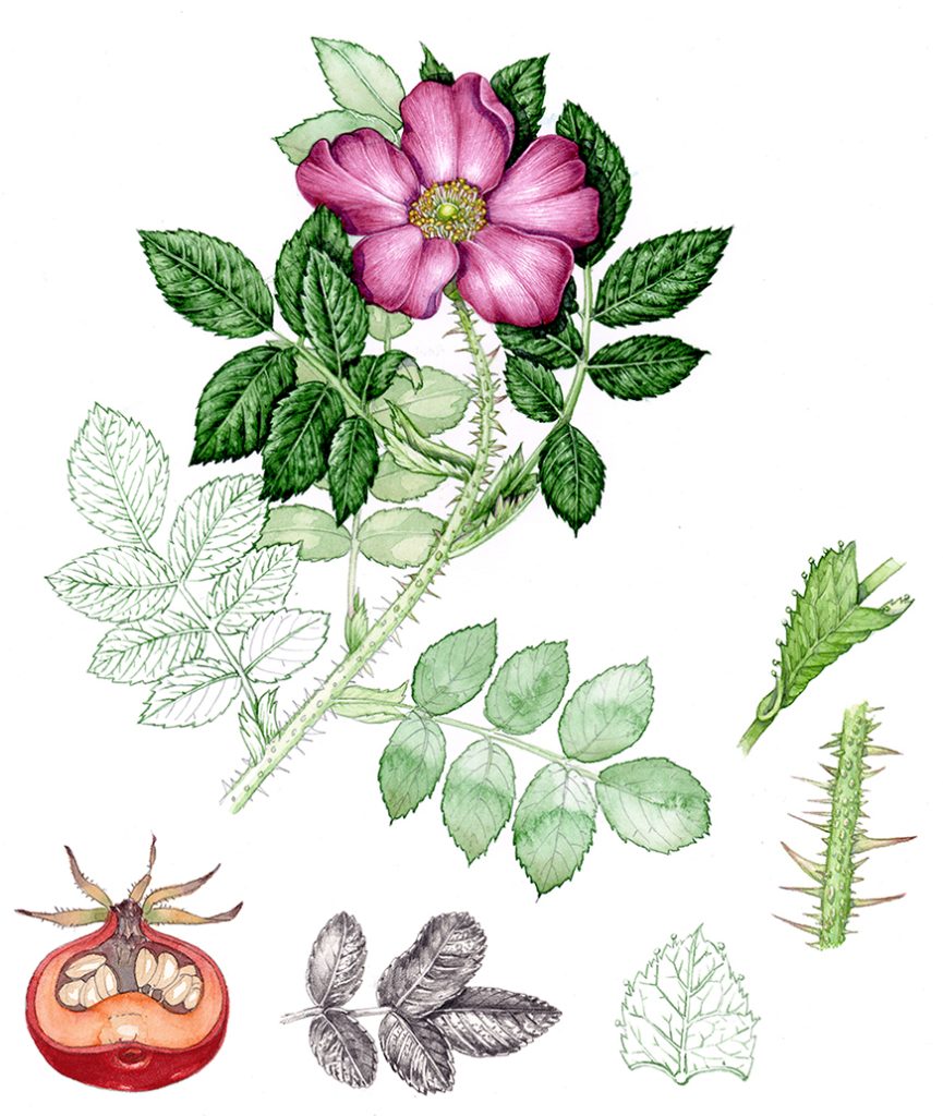
Completed sketchbook study sheet for the Japanese Rose
This is a beautiful rose. I love your application and will be following it in the future. Your details and colors are very beautiful and inspiring.
Hi Kathy
Thanks so much for that wonderful comment, I appreciate it!
Lizzie
Hi Lizzie
I really enjoyed watching your video. I think you are amazingly talented and passionate about what you do. I love your honest comments and humbleness.
Thank you very much for sharing your skill online.
Yolandé
Hi Yolande
That’s a really lovely comment to get. I have a bit of a bee in my bonnet about people making botanical illustrations somehow unattainable and mystical. In my opinion it’s a gorgeous way of understanding the natural world that can be done by anyone willing to pick up a pencil and take a little time. I try to get that across in my films, showing that even when you’ve been doing it for years you make mistakes and have panics. And the only reason why we so-called “professional” illustrators have a decent quality of work is because we’ve been lucky enough to hone our craft over hours, days, and years. If my films end up making one person who thought they couldn’t do a painting of a flower decide to give it a go anyway, then I’ll have succeeded! Comments like yours make me feel like I’m heading in the right direction. Thankyou.
Hi Lizzy,
thank you so much for these two rose videos, I have stuggled with the leaves for some weeks now (they end up muddy and fuzzy and overworked!). hopefully I can have a better go after seening your approach.
Please keep up the fantastic work, I know it is a pain for you to do but It is soooo apreciated.
Thanks again Alan
Hi Alan
I’m so glad you like them. It’s not that much of a pain (although there’s some very ripe language directed towards my phone when I’m filming and the thing pops out of its tripod etc etc which (lucky for my delicate audience) I edit out!)
Fuzzy leaves do sound like they might be overworked. Or is your paper nice and crisp? You def need hot press if you want to hold onto those edges. Also, are you letting it dry completely between layers of wash? Even if it’s just a bit damp that can compromise the clarity of lines laid down in an earlier layer of painting. And make sure to leave your whites til the end. Good luck, and thanks for the comment. Good luck with it, I hope my video helps a bit.
Yours
Lizzie
Dear Lizzie:
I trying to learn how to do this type of watercolor ,and the more I try the more I like….but I’m not progressing as much as I wish…..
Thanks for sharing some of the steps you do to achieve such a beautiful results.
Do you have online classes?
I live in West-USA and I really want to learn these techniques. I totally love your work.?
Thanks
G
Aww what a lovely comment! No, I don’t do online classes, but if you search for my YouTube channel I’ve got several films of me explaining the process in real time as I paint which might be of interest? Thanks agaim for the generous comment.
I painted this. I’ve on,y been painting 3 months. I wish you could see it ?
Ooh, it sounds like it went well? Send me a photo if you’d like, its info@lizzieharper.co.uk. I lvoe people getting inspired about botanical illustration, and love it even more when they’re at the beginning of their journey in illustration. Thanks for the comment, Karen.
I am 61 years old from Southwest Tennessee and just starting to paint and I have watched many hours of your videos. Your techniques are awesome and your inspiration to others as well as myself is invaluable. I have always desired to be a painter that also inspires others to be creative too. I believe if you have a gift it is your duty to share and pass on your knowledge to others. I am so grateful for your blogs, videos and tutorials. Please keep up your good work. I greatly look forward to more, if you have time in your busy schedule.
Hello Judy what a wonderful and generous comment! So sweet of you to say those kind things. I agree about sharing creative inspiration, I think it’s also mutually satisfying, knowing you’ve given someone the tools to magnify their own creativity feels like such a treat. Thanks again for such a lovely comment. x