

Botanical Illustration: Rose step by step
I love the series of 50 natural history illustrations (done in a sketchbook style) needed for the follow up to The Hedgerow Handbook by Adele Nozedar. This rose is one of the plants on the list. The book is “The Cultivated Forager”, and will tell you what and how to eat common garden plants.
Preparing to paint
This week I paint a gorgeous rose (we’re unsure of the type of rose; if anyone DOES know, please let me know!). I’m rather up against the clock as the rose looked tired on delivery. They have a deadly habit of unfurling all their petals then shedding them before you can finish your illustration.
I’ve also blogged about painting another rose, Rosa rugosa. This uses different colours.
I plunged the rose into a jar of water, and got my stuff prepared. I use hot press watercolour paper, if it’s nice and heavy (300gsm+) you need not stretch it. Fabriano Atristico 100% cotton takes graphite and watercolour equally well, and has been my firm favourite for many years.
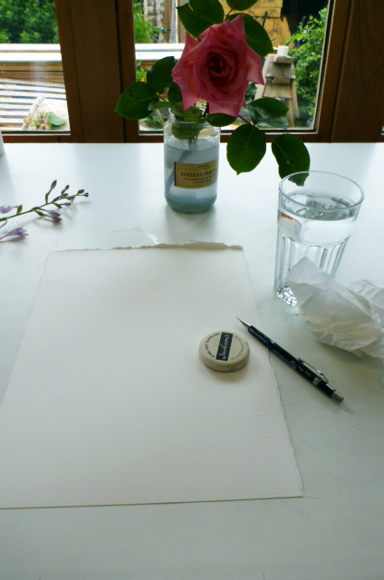
Ready to paint
Materials
For pencils, I favour the Pentel P205 propelling pencil, 0.5mm lead, HB or H. What I love about these pencils is that they’re comparatively cheap, easy to re-fill, and give an excellet sharp line. To “sharpen” your pencil tip, just snap the tip of the lead off by pushing hard on the table. Excellent.
Rubbers I’m a bit rubbish at; kneadable ones tend not to lift the sharp, hard lines I use. Plastic-coated ones that school kids might use tend to work better, but be sure your rubber isn’t too hard or it’ll smear the line (not erase it) and tear the page.
Drawing up the flower
Indulgently, I begin by drawing a line illustration of the open rose. The outer petals are easy enough to plot in, but getting toward the centre you’ve really got to keep the petals straight in your mind as they overlap so much.
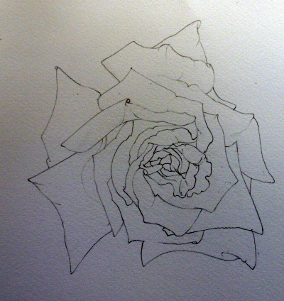
Pencil illustration of the open rose
Next, I plot in the stem and leaves. You have to try and keep your head steady for this, because if you change your viewpoint nothing will line up right! I try to include the underside of a leaf, and enough foliage to show clearly how the leaves grow in threes or fives.
Drawing up the leaves
Rose with leaves plotted in
To keep the paper clean, I lean on a sheet of A4 copying paper which prevents my hand from smudging the pencil.
Drawing in the stem was difficult because I had the rose in a jar rather than in my hand, so again, keeping the viewpoint constant was critical, and a challenge.
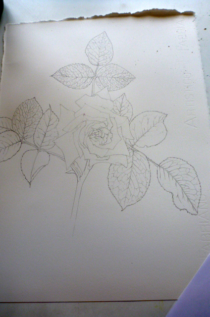
Rose drawing completed
The leaves of the rose weren’t my priority with this illustration as there’ll be another rose illustration in the book (Rosa rugosa, see my step-by-step blog) with similarly coloured leaves.
The petals and bloom most assuredly were.
Mixing up watercolour for the base layer on the rose petals
I began by mixing up a warm, slightly orange yellow watercolour (I like Windsor & Newton). Cadmium orange, Cadmium lemon, and a touch of Permenant rose.
Using a Series 7 No.1 paintbrush (the best sort if you want a fine tip and a good resevoir for paint) I plotted in the yellow regions of each petal using tiny strokes, following the shape of each petal, and plotting in the darker areas.
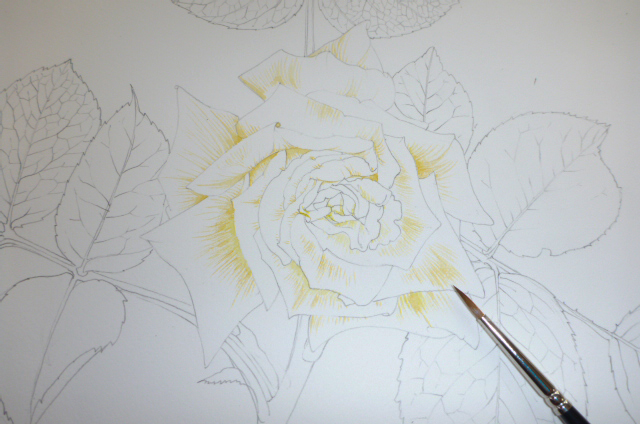
Base layer of yellowish orange goes onto the illustration
The petals of this rose are yellowish towards their base, and flushed orangey, then true pink toward their outer edges. The central petals are devoid of the yellow regions; this variation needs to be recorded, but I also needed to be sure all the petals looked like part of a coherent whole. This meant introducing a tiny amount of the yellow into the central area.
Adding Pink to the Rose
Next comes the pink. This is a little easier as the darkest and richest regions lie along the outer edge of the petals. Again, small strokes with the same brush provide gradation between the pink and the yellow zones.
The pink was a mix of cadmium orange, alizarin crimson, and Doctor Martin’s watercolour inks – moss rose. These inks are incredibly bright (and very fugitive, be aware of this if you plan on selling work done using them, they’ll fade, especially in direct sunlight.)
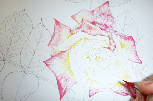
Plotting in the pinks on the rose
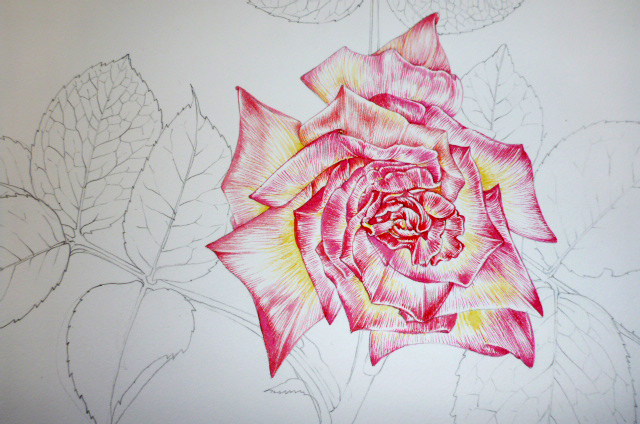
I rather like the illustration at this stage; I know it’s far from complete, but there’s a freshness to having so much white on the page that gets lost as the colour continue to be layered on.
Darkening the Rose
Next up is getting some shape and structure into the flower; using the same mix as above but with a little more of the Alizarin crimson. Using a very light touch, I outline the petal edges, and plot in the darkest areas of the pink (where the petal’s in shadow).
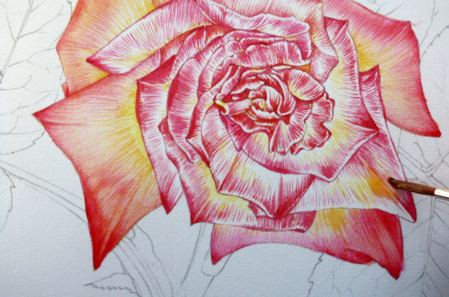
Applying a pale orange wash
Towards the centre of the flower, where the petals are pinker, I added a tiny amount of the Moss rose Doctor Martin ink to the peachy wash. After it’d thoroughly dried, I went back in with a darker pink shade to pick out the details lost to the wash.
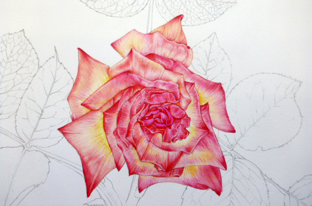
Rose illustration with pink central wash, and orange wash on the outer petals.
More definition is needed in the heart of the rose, where the darks are darkest and the structure is the most convoluted. For this, I mixed Permenant magenta with a touch of Prussian blue, and kept my painting very light. It’s a perfect chance to destroy the whole illustration by over-doing the shadows; but also an excellent chance to unite the purplish stem with the heart of the rose by echoing the colours.
Painting the leaves of the rose
Using swift brush strokes, and a green mix of Cadmium lemon and Winsor green (with a touch of yellow ochre, I always add a touch of yellow ochre to botanical greens) I rapidly plotted in the leaves.
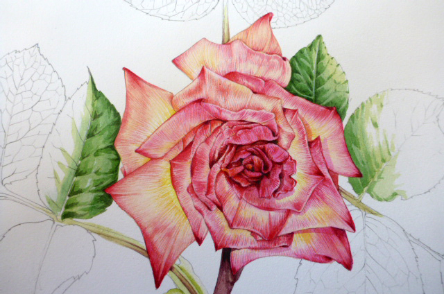
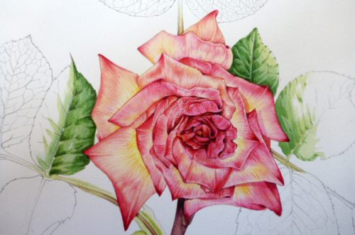
Rose illustration with flower detail and leaves completed
I didn’t want to obsess about these, so kept the detail minimal and popped a paler green wash on top. Darker regions were picked out with the same mix, but with extra prussian blue and Permanent mauve added.
Illustration of one rose petal
By now the flower was wilting, and the shape of every single petal had radically altered. I somehow felt that although the sketchbook study looked “right”, I’d lost something of the bright freshness of the petals. A quick study of one lone petal (removed from the outer edge of the rose with a scalpel) provided the extra information I felt had been missing.
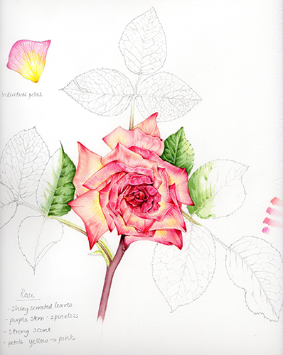
Finished study of rose
Final thoughts
You can see, on the far right of this image, how hard I found it to get the pink the right shade. It took four tries before I was satisfied that the colour was correct both for the detail, and when used in a wash.
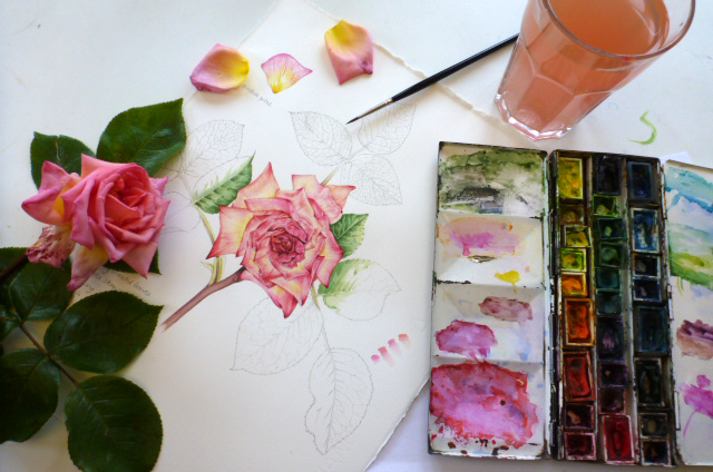
And finally, here’s my desk at the end of the process. As always, my water is dirty and my paintbox is a mess. The flower’s nearly dead. BUT the illustration is complete, the rose didn’t manage to wilt completely, and I finished just in time to rush out and get the kids from school. Success!
So Happy that I have found your instructions. You such a blessing. Thank You
Hi Journey, I’m so pleased to be of use! x