

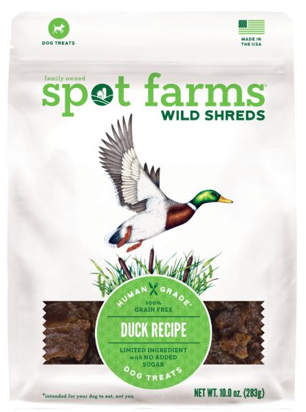
Wild Shreds: Illustrating Pet Food packaging
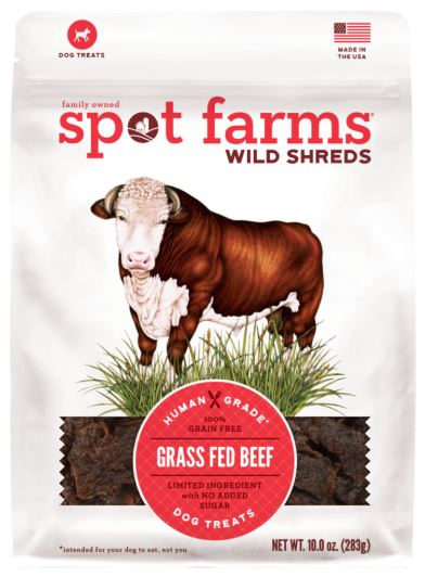
Wild Shreds is a range of dog food produced in the US. It prides itself on being good enough for humans to eat, and is an organic and high end product. Produced by Spot Farms, this range has recently been re-packaged. And the illustrations on the new packaging are by yours truly! All illustrations in this blog are copyright Spot Farms 2019.
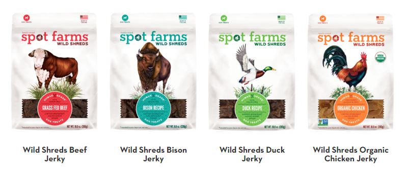
Wild Shreds range of flavours
There are five flavours of wild shreds currently available, and each one required a polished illustration. In all cases, the animal in question had to look, “imperious and majestic”. Each of my illustrations was large, and I worked closely with an excellent designer from Heat, Austin O’Connor. Austin knew exactly what he wanted from each illustration, and provided information on the desired posture, colour scheme, and what species should be growing at the animal’s feet. Although this made the work hard to get perfect, it was helpful as I knew exactly what was wanted. This is not always the case!
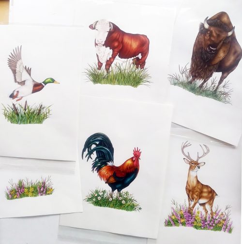
The animals illustrated were the White-tailed Deer, the Hereford Bull, the American Bison, the Mallard duck, and the Cockerel.
Materials
All the rough and colour rough illustrations were done on Daler-Rowney Smooth heavyweight cartridge paper. I use Pentel P205 mechanical pencils. The finals were done on Fluid 100 Hotpress watercolour paper, using Winsor and Newton watercolours with the odd dash of the vibrant Doctor Martin’s hydrous inks. As always, my brush is a Winsor and Newton series 7, size 1.

Watercolour originals used in Wild Shreds packaging
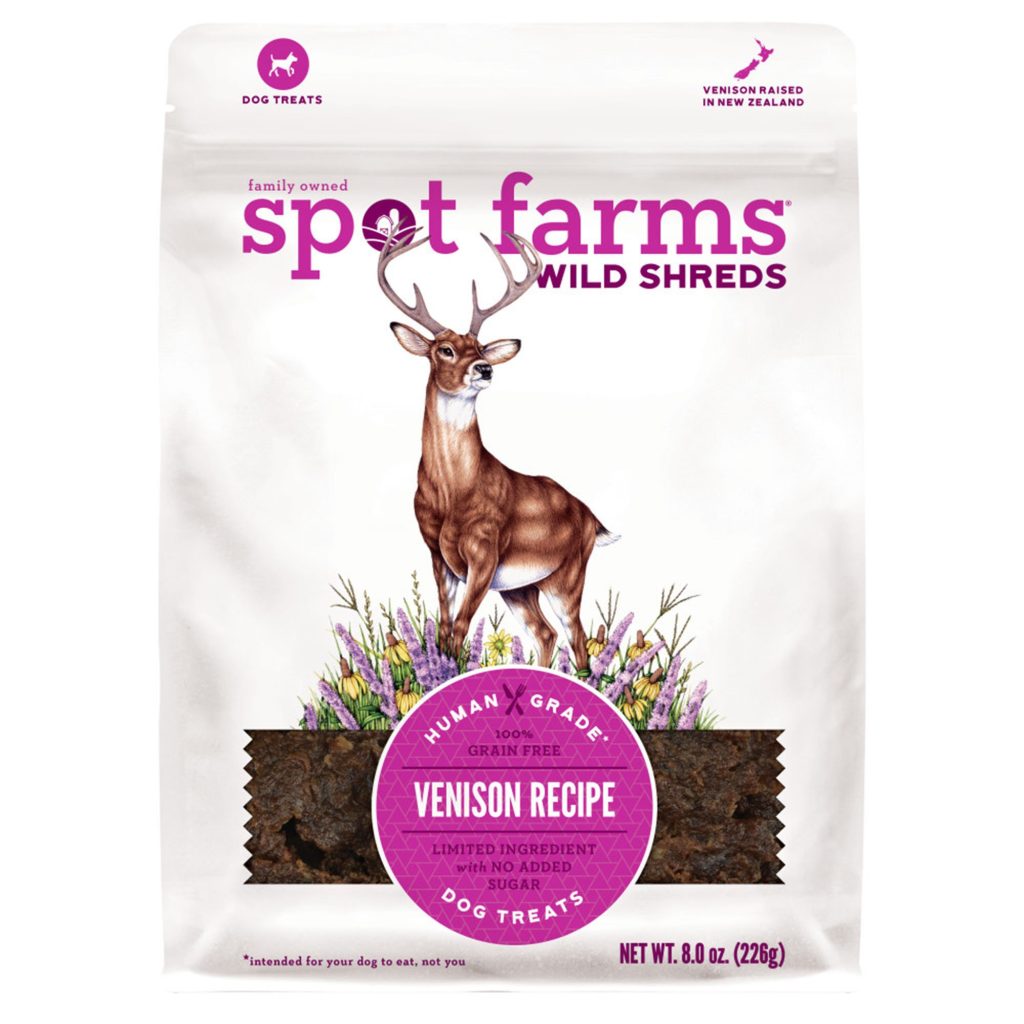
White-Tailed Deer
I was fortunate with the reference for the deer. In the UK, the White-tailed and Mule deer are not native, and I couldn’t find anywhere to go and see them. Luckily I already had some really good photos from an earlier job, so I could trawl through these until I found the perfect few images to work from and collate. Of all the animals illustrated, the Deer was by far the easiest to make look majestic. And yes, I did refer to the head angle in “Monarch of the Glen” to see what visual tricks bad been employed by Landseer!
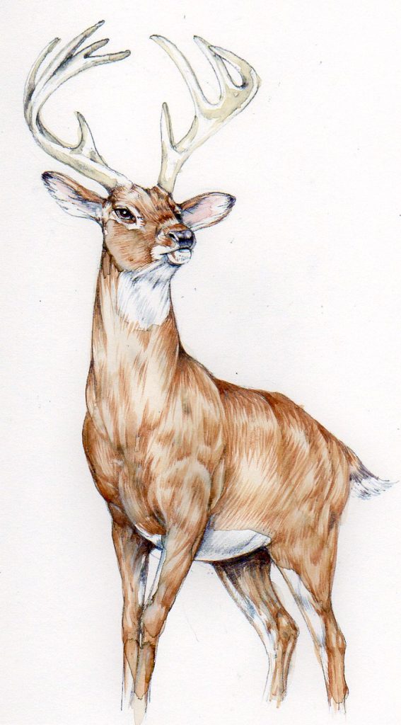
Colour rough of the Deer
Although the deer didn’t change position much between the colour rough and final stage, there was a lot of intense discussion about the plants at his feet. This related more to the juxtaposition between the writing on the package and the grass stems than to the quality of the illustration, and I ended up painting these plants twice to ensure the label and text had space to breathe. Of all the animals done for this project, I feel the deer is the most successful and fits the brief most accurately.
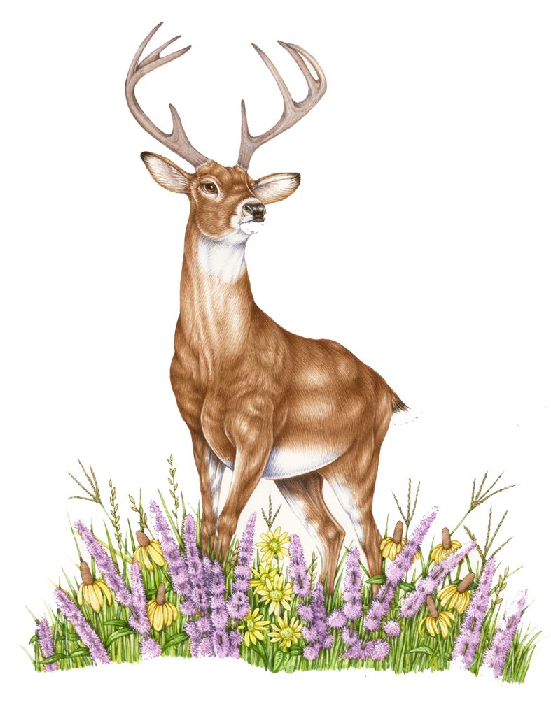
Final illustration of the Deer
I also love the colours of the flora at his feet. Watch this space for a blog about completing this particular illustration in the next few weeks.
American Bison
Getting reference for this illustration was truly taxing. I’m based in the Welsh borders, in the UK. Alas, there are very few bison hanging around our hillsides. Although I spent a long time looking for reference online, this job really needed me to go and look, and sketch, and photograph the animal in situ.
I found a buffalo farm, Bush Farm, a few hours drive away. Having got in touch with the extremely kind owner, I spent an eventful (and rather terrifying) day in the company of herds of frisky bison.
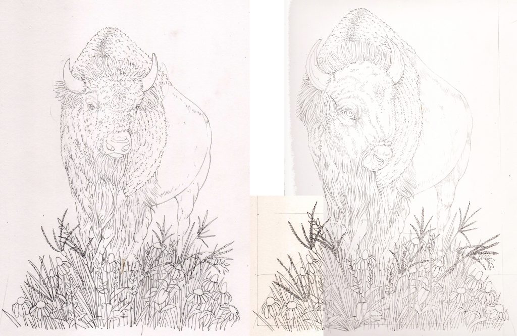
Pencil roughs of bison
The challenge here was to use the head of an adolescent male bison, which still had structure and definition; with the body of a powerful and mature male. The heads of adult males are so woolly that it’s hard to establish any underlying structure, let alone to locate an eye peering out and looking imperious.
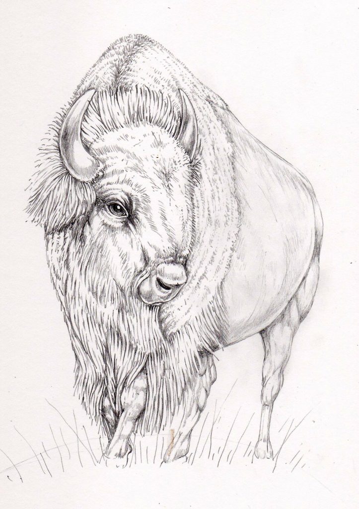
Pencil tonal study of Bison
We sorted out the body position early on, but there were lots of tweaks and alterations before we finally found a head position which worked. Another challenge was untangling the mane and the woolly region at the front of the bison’s body. With no room for fudging or invention, it took some doing, and a lot of poring over my collection of more than 70 photos taken at Bush Farm.
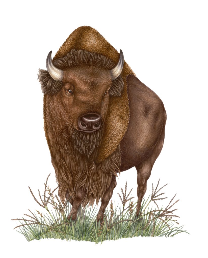
Final illustration of the America Bison
Below is the illustration on the packaging.

Hereford Bull
I live in Hereford, and am fortunate enough to know local farmers who put me in touch with one of the top breeders of Hereford Cattle, Stan Quan. His Border herd is legendary in Hereford Cattle breeding circles, so I consider myself extremely fortunate to have had an afternoon with Farmer Quan and his cattle.
I turned up at his farm, and spent a very happy few hours sketching and taking photos of his beautiful adolescent bulls. They were passive and sweet-natured. None looked imperious, just placid and content.
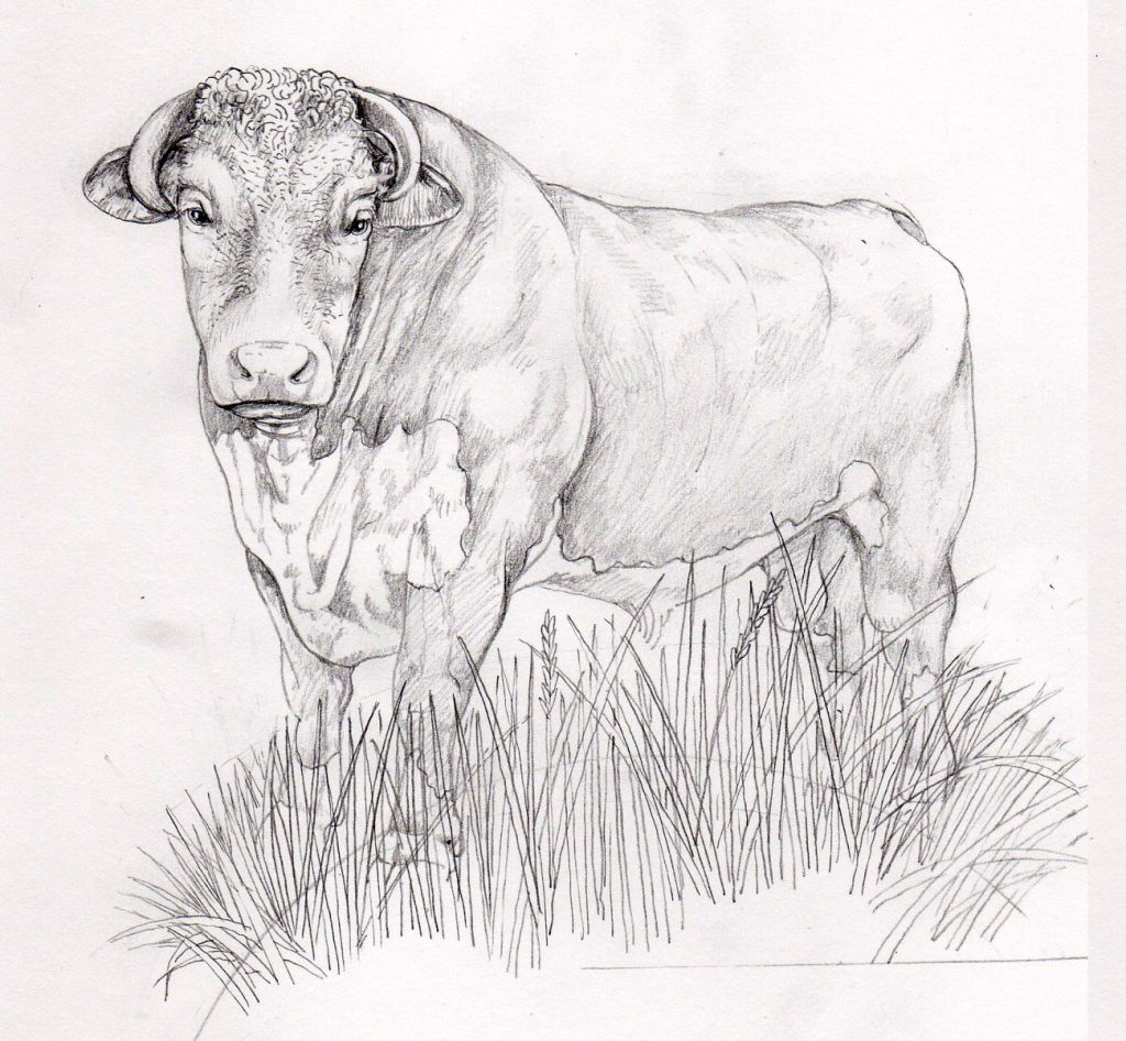
Tonal rough of Hereford Bull looking peaceful
There was some discussion about whether or not the bull should have a ring in his nose; and for the more sensitive customers, we ensured carefully placed blades of grass partially obscured the bull’s family jewels. So to speak.
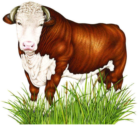
Final illustration of the Hereford Bull
Despite my best efforts, I couldn’t make the bull look fierce. Austin and Spot Farms didn’t seem to mind too much, and I’m glad. I wouldn’t want to imply these animals are fierce or frightening. There’s a lot of hysteria around bulls, and I’m not keen to be a part of that.
Mallard Duck
Mallards are everywhere, and there are some particularly bold ones near me. I visited Llangorse lake, and the Brecon Canal.
As with the other animals, the view point needed to be looking upward, to make the duck look bold and proud. (I do know how silly that sentence sounds.) This entailed me grovelling about on my belly on the canal tow-path, creeping up on the local duck population. The ducks were unmoved, but various passers-by seemed keen to get past me….
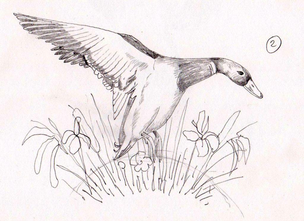
One of 12 initial pencil sketches of the Mallard
I knew I wanted the mallard to be taking off in flight; this pose is far more majestic than when they’re waddling about squabbling over bird seed. Within that remit, there are many, many different poses to explore. Finally Austin whittled it down to one image, which I worked into a colour rough.
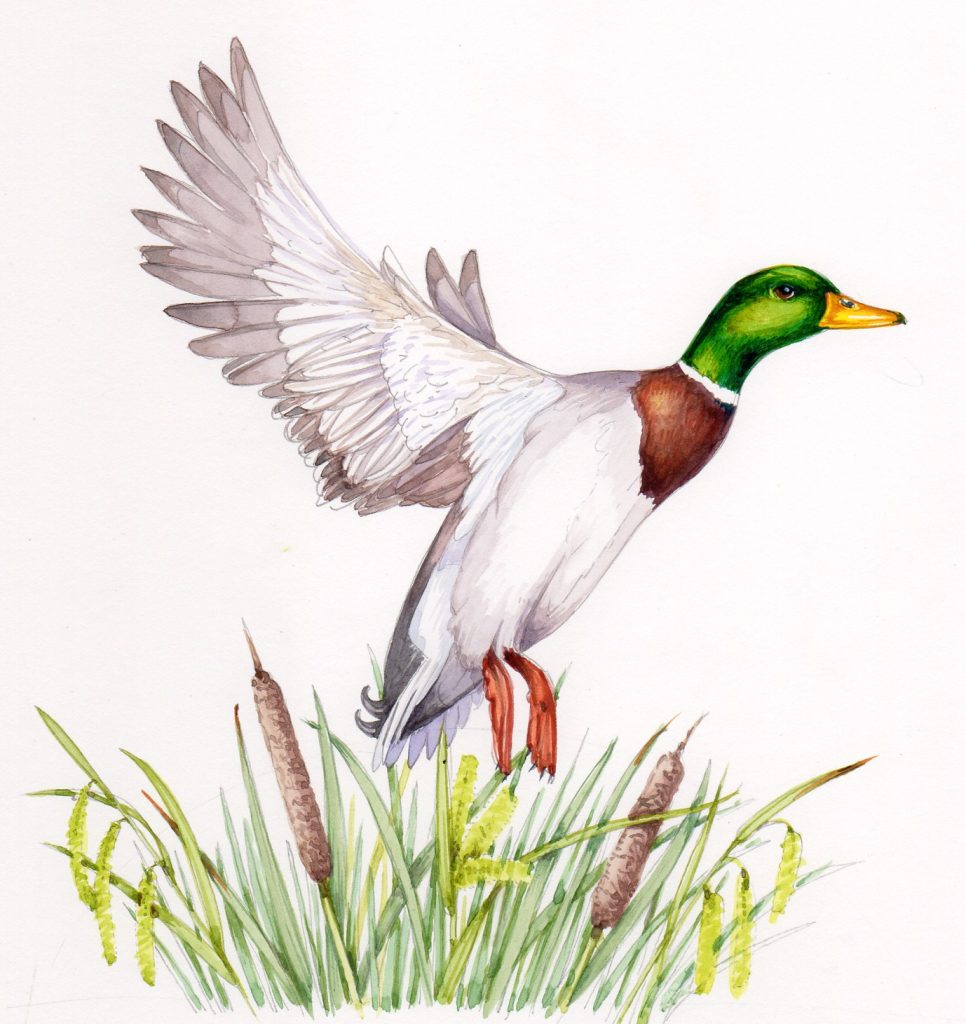
Colour rough of the Mallard duck
This was tweaked further, we tilted the body of the bird so it was a less vertical composition. The vegetation had an important role to play with the duck as it echoed the astonishing bright colours of the head, and the deep brown of the chest. I also stuck in some of my beloved sedges.
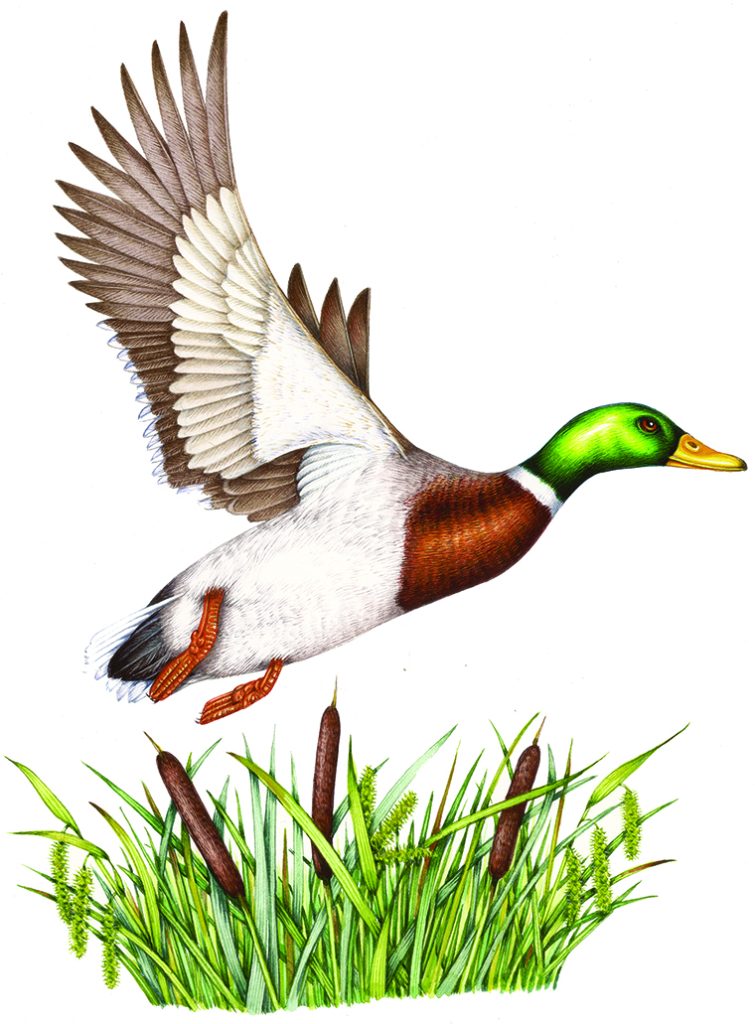
Final illustration of the Mallard duck
I really like the packaging for this one, it has a lightness to it that I find pleasing.
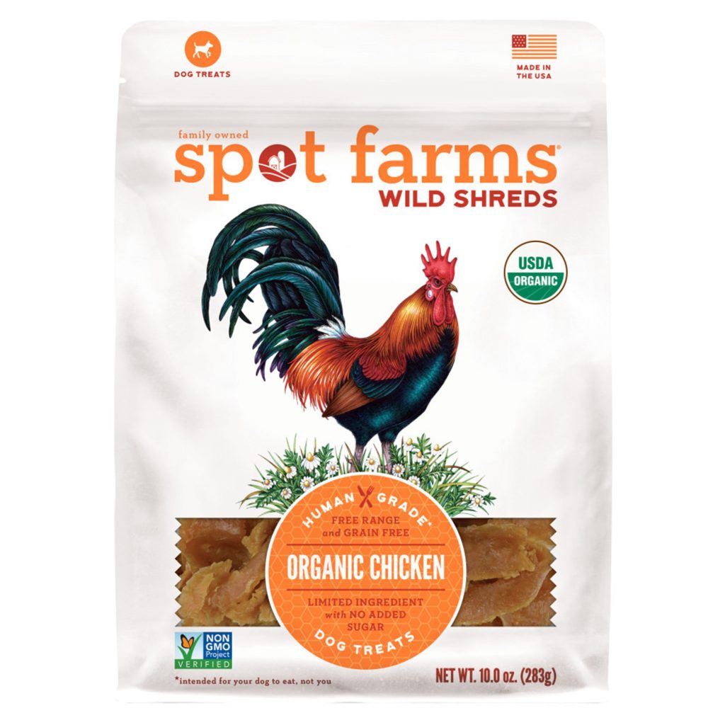
Cockerel
The cockerel or rooster was the last of the illustrations. It was commissioned as I was finishing off the others, and required a swift turn-around. Luckily the species of rooster wanted is easy enough to find and draw. There are some that wander around on a road about 5 miles from me, so I spent a little time making their acquaintance. Although they were far from being the glossy, show-ready birds I was after; they provided plenty of material to work from.
I have to admit to struggling with the iridescense on the tail feathers. I worked at them too long, and ended up having to use a lot of gouache to redeem the mess I’d made. The final result looks alright, but there were some desperate moments involving black and green paint, and swear words.
I really enjoyed making the cockerel angry and imperious. Far easier to do than with the other animals, I think perhaps I took it a little too far. he looks livid. The chamomile flowers at his feet, reminiscent of farmyards, seem incongruous below such a scowl.
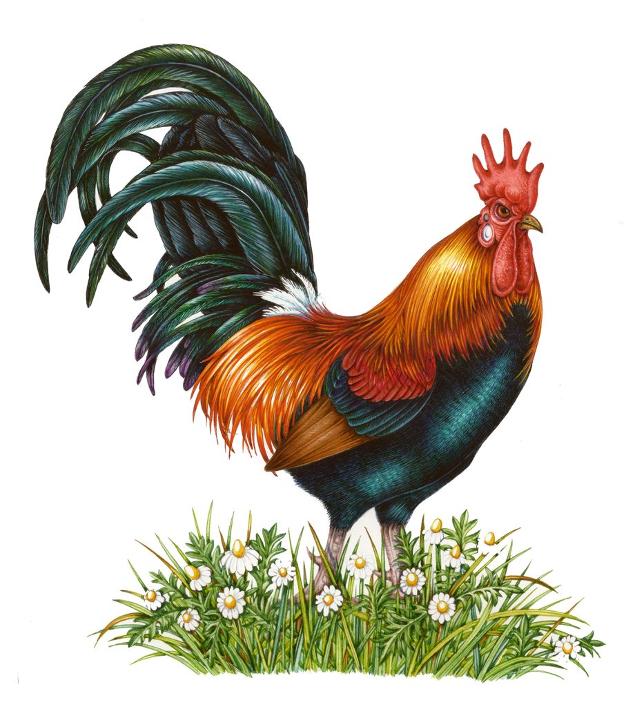
Cockerel final illustration
Yet again, the packaging layout works. This is down to the careful attention Austin paid to marrying the colours in the illustration with those in the branding. I am always full of admiration for a good designer, and this was great design.
Conclusion
So there you have it. Five illustrations for a classy brand of pet-food. I’m hoping that if Spot Farms choose to expand their range they’ll get in touch again. For now, I just need to thank them for a great job, and for the lovely sets of the packaging that they’ve sent me for my portfolio.