

Botanical Illustration: Comparing HP Watercolour Papers 3
Introduction to the watercolour paper quest
This is the third of three reviews of Watercolour Hot Press papers for botanical illustration. This time, I find the holy grail…a replacement! Please check out the first and second in this series for more tests and results.
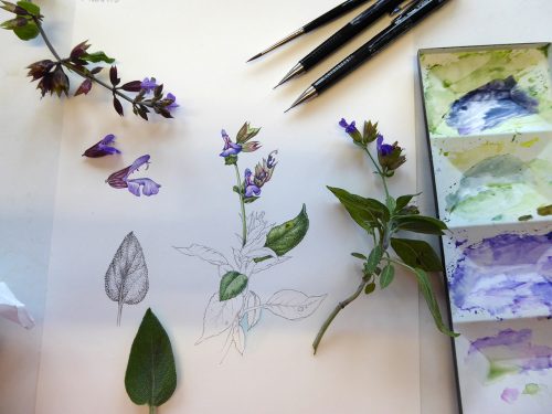
As a natural history illustrator and someone who does plenty of botanical illustration, it’s been easy to get embroiled in the quest for the perfect hot press watercolour paper to work on.
Like many other botanical illustrators, I used to work on Fabriano Artistico or Classico; sadly recent manufacturing changes mean this paper is no longer ideal. The quest is on for an alternative, and this will be my third blog (also available as a youtube video with time-lapse footage and discussion on each paper’s merits) trialling possible replacements.
This time though, there’s a difference, I believe I’ve found a replacement!
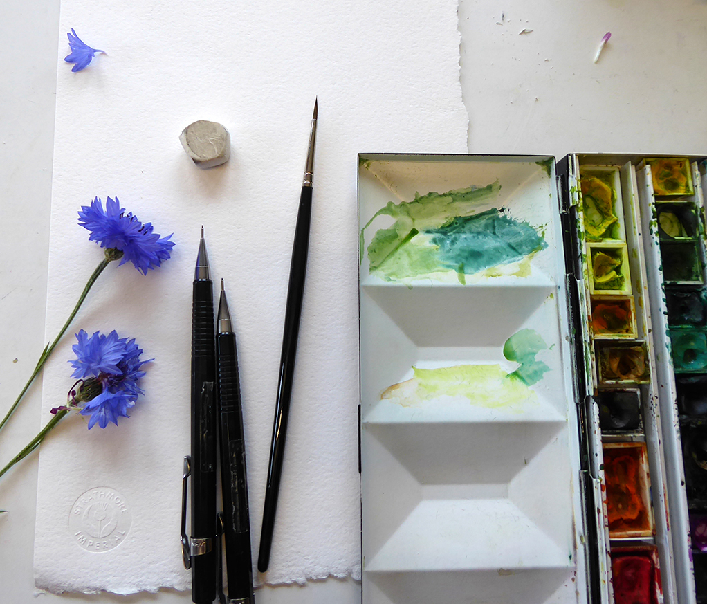
I tested six papers this time, these were Clairefontaine hotpress watercolour paper, Winsor and Newton medium surface heavy weight Cartridge, Strathmore series 500 Imperial watercolour paper hot press, the new Fabriano artistico traditional white hotpress, some old stock of Fabriano Artistico hotpress (which I used to work on and which no longer exists), and finally a new paper called Fluid 100 hotpress.
All the papers were 140 or 135lb weight.
To be honest, every paper I trialled in this batch is a good-enough hotpress watercolour paper that I’d happily recommend; but I’m not searching for “good-enough”, I want to find my perfect replacement!
Clairefontaine Hotpress
I painted a red clover on this paper (thanks to my student Deborah for giving me the paper sample).
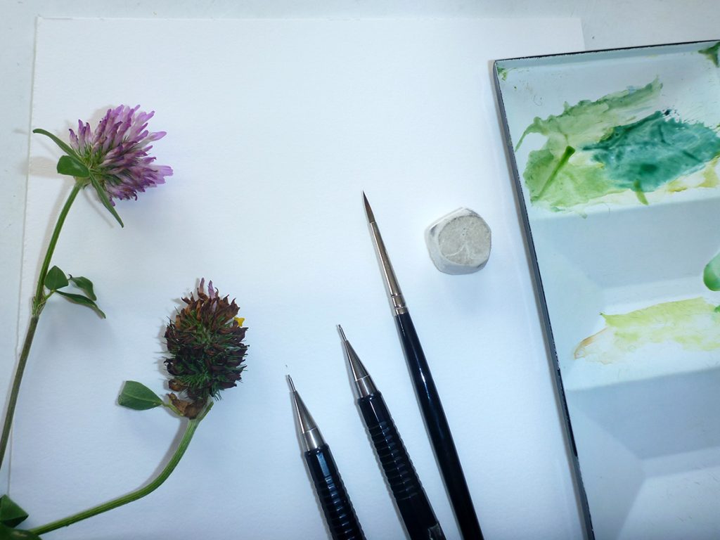
Clairefontaine with Red clover, ready to begin
I found it was lovely for graphite work, it took pencil really well and was fine to work on. It didn’t blur the paint, keeping edges quite crisp. When I came to work into layers of paint already applied there was no issue with colours blurring or lifting off, the integrity of the detail remained intact.
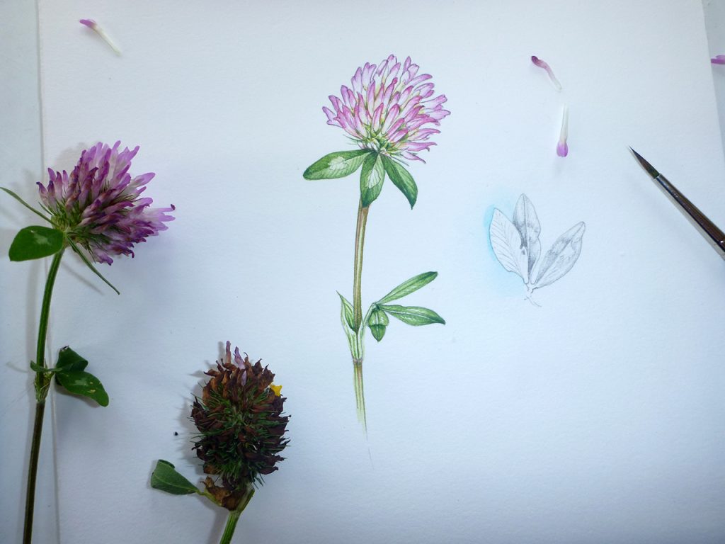
Completed sketchbook study of Red clover on Clairefontaine hotpress paper
So why have I not fallen in love with this paper?
There’s a softness to it that I didn’t love. The feel of the paper is less sharp than I’m used to, and I feel like some of the intensity of colour was absorbed. This has happened with other papers I’ve trialled, and is a deal-breaker for me.
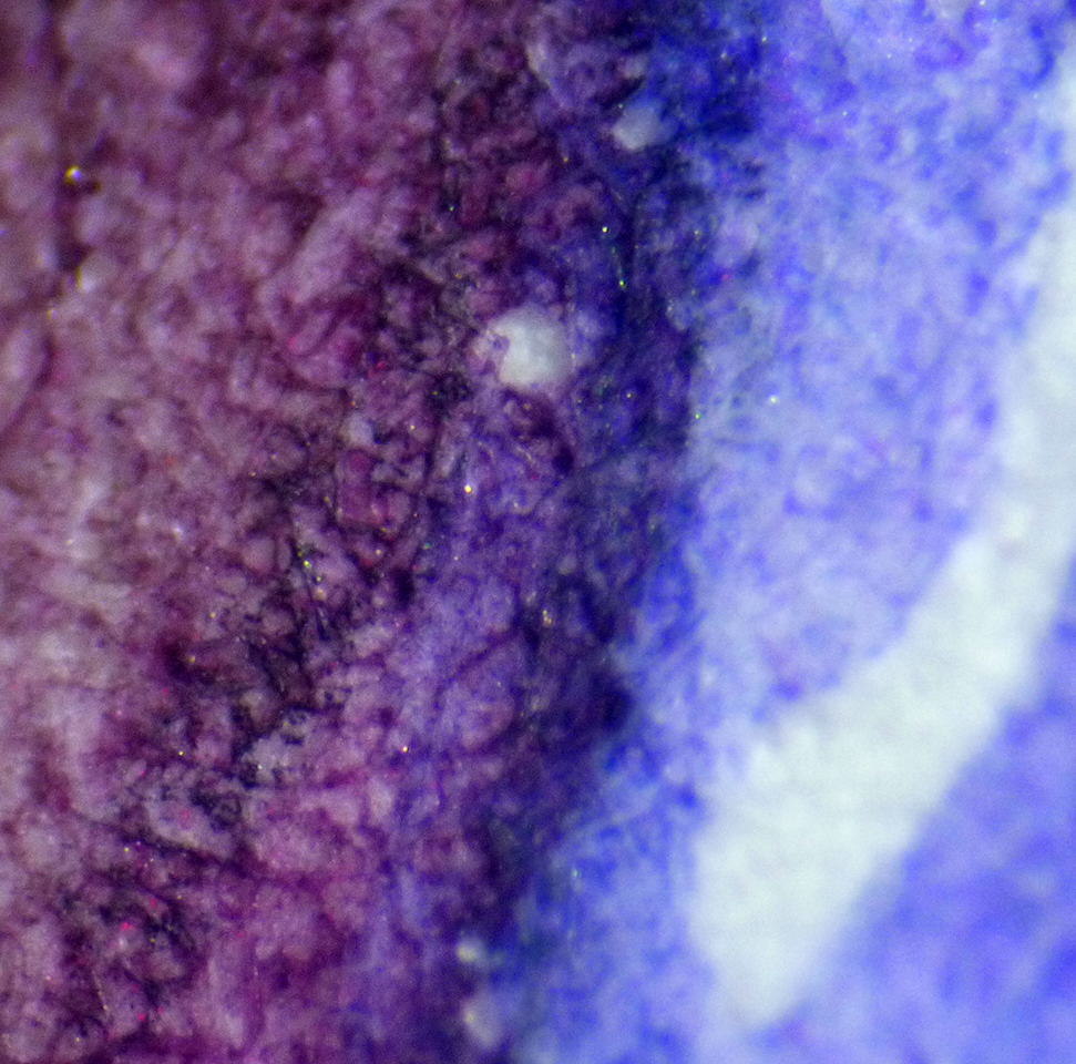
Claire Fontaine under the microscope
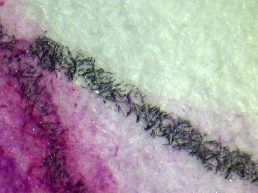
Clairefontaine under the microscope
Under the microscope, I think you can see that the fibres aren’t clinging to pigment or detail.
This paper is fine, and holds detail well but its soft feel and colour sucking tendency means I probably won’t be using it again.
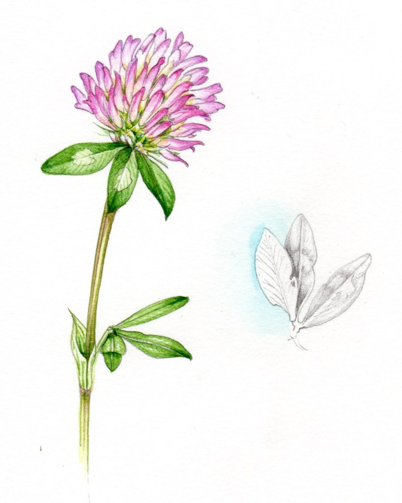
Finished scan of the Red clover on Clairefontaine Hotpress paper
Winsor and Newton medium surface Heavy weight cartridge
When I first looked at this paper I was a bit worried, it has a visible texture to it which alarmed me (I’m so used to super-smooth surfaces). I picked an unruly sprig of Purple bugloss from the garden to test this paper.
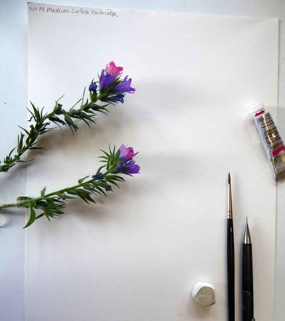
Purple Vipers bugloss ready to be painted onto the Winsor & Newton cartridge paper
However, it was really lovely to work on, it surprised me. Pencil went on smoothly and rubbed out cleanly; watercolour was bright and didn’t bleed, fade, or lift with subsequent layers. Washes didn’t stain the page and blotted readily. It was actually a joy to work on.
Finished Bugloss on Winsor and Newton medium surface heavyweight cartridge. Got to love that Opera pink paint….
It seemed to make the colours glow.
Winsor and Newton Medium surface cartridge under the microscope
Under the microscope you could see there was very little bleeding, the bumps being caused by the paper’s texture.
Winsor and Newton under the microscope
I was feeling quite optimistic…until I took the painting to the scanner. Unfortunately, the texture and shade of the paper meant that the scanned illustration lost a lot in the process, and seemed to come out greyer and flatter than in reality. This may be down to my scanner, but it was enough to put me off.
Scan of Purple bugloss on Winsor and Newton medium surface heavyweight cartridge – the scanning looks dull and textured
I would say that the Winsor and Newton cartridge is a lovely paper to work on, and would be excellent for work which doesn’t need to be reproduced or printed from scans. For me, unfortunately, this glitch is a deal-breaker.
Strathmore Series 500 Imperial watercolour paper Hot press
I was recommended this paper (along with the Winsor and Newton) by botanical illustrator Marialena Sarris.
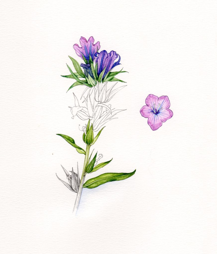
It’s another one which looks and feels far softer than it behaves, I was put off by the rough surface initially, and despite it performing well, the roughness continued to sway me. A late flowering cornflower was the subject.
Cronflower & Strathmore Imperial series 500 watercolour (you’ve got to love the classy embossing on the corner of the paper…)
The rough texture meant that it wasn’t easy to use with graphite, some of the crisp edges were lost and it was hard to get a depth of tonality.
However, it was wonderful with watercolour! It clung onto the intensity of the colour, and kept crisp details through subsequent washes. There was no bleeding, and wet washes and blotting were a pleasure on this surface.
Unfortunately, when it came to rubbing out graphite, the paper held on to the pencil marks and dented.
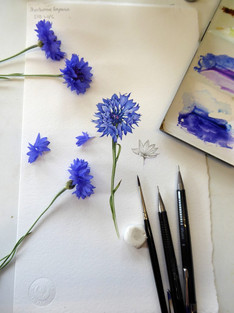
Strathmore series 500 Imperial watercolour hotpress with completed cornflower sketch
Strathmore Imperial under the microscope
Under the microscope it was tricky to see what was going on, I had real trouble taking the photo! Still, I think it shows that there was very little bleeding.
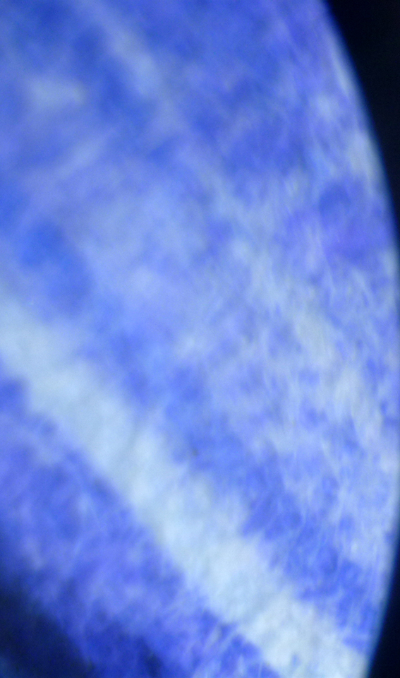
Shockingly poor photo of Strathmore series 500 Imperial watercolour paper under the microscope
Scanning and reproduction was, surprisingly, not a problem.
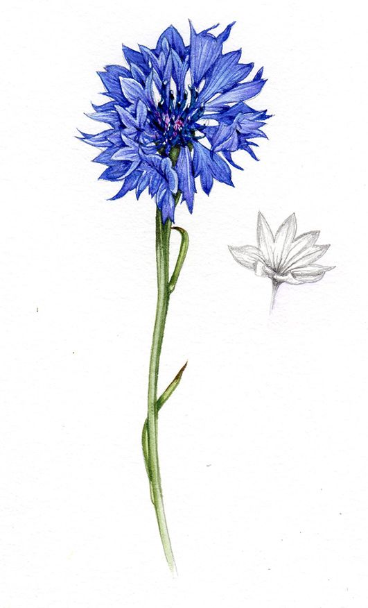
Cornflower study on Strathmore Imperial series 5oo watercolour paper.
In conclusion, I think I’m just a smooth-surface girl, I simply don’t feel comfortable or at home working on these rougher surfaces. That, combined with the slight problems with graphite, means it’s not a replacement for me.
However, I do want to stress what a good paper it is, and the way it holds details and makes colours glow means it is absolutely a “good-enough” paper for botanical illustration.
New stock Fabriano Artistico Traditional white hotpress
In the name of fairness, I realise I have to do a controlled test of the new stock of Fabriano, despite feeling a resentment to it for changing from the old stock, and knowing I don’t get on with it very well. I chose a purple aster for this test.
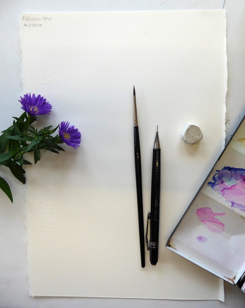
Aster, brushes, and mechanical pencil ready to be painted onto New stock of Fabriano Artistico
I love the looks and feel of this paper, it’s smooth and takes pencil beautifully. You can rub out graphite without leaving a dent, and get a lovely range of darks and graphite detail.
Applying paint feels great, tiny lines are held, there’s no loss of intensity or detail, and no lifting of earlier paint layers.
Then it all goes wrong. So I can apply three or maybe four layers of detail to a painting, returning and working into the same area repeatedly, with no problem. Suddenly though, it all changes. Instead of working into the darks making the painting crisper there’s a shift, and each subsequent attempt to make the painting sharper makes it blurrier and muddier.
I can’t figure out exactly when or why this happens, it’s almost imperceptible, and reminds me of the horror I felt for about a year, before realising the paper had changed, not me.
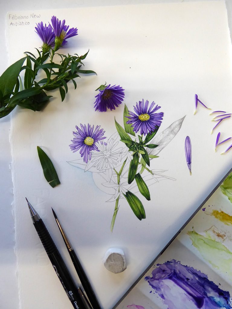
Completed sketchbook study on New Fabriano artistico – look how muddy and confused the centre of the leaf rosettes is!
I thought my eyesight and skills were going; panicking, I rushed to the optician. Self doubt rushed in as I questioned my ability to keep a painting clean and crisp. I had a crisis of confidence…then I stumbled on lots of blogs from miserable botanical artists in the same boat and it all made sense again. Phew. But that moment also marked the start of this intense and exhausting quest for a replacement paper.
New stock Fabriano under the microscope
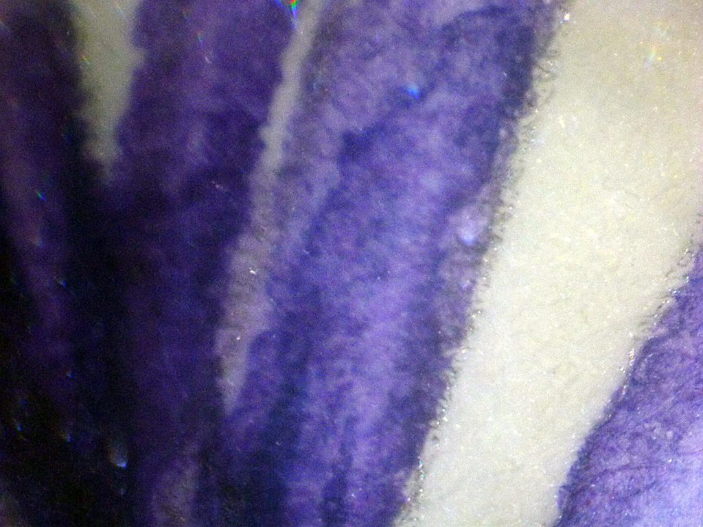
Blurry photo of the new Fabriano artistico under the microscope
Under the microscope, not a great deal is revealed. Perhaps I’ll never know what triggers the sudden muddy-ness. Suffice to say it’s heart-breaking.
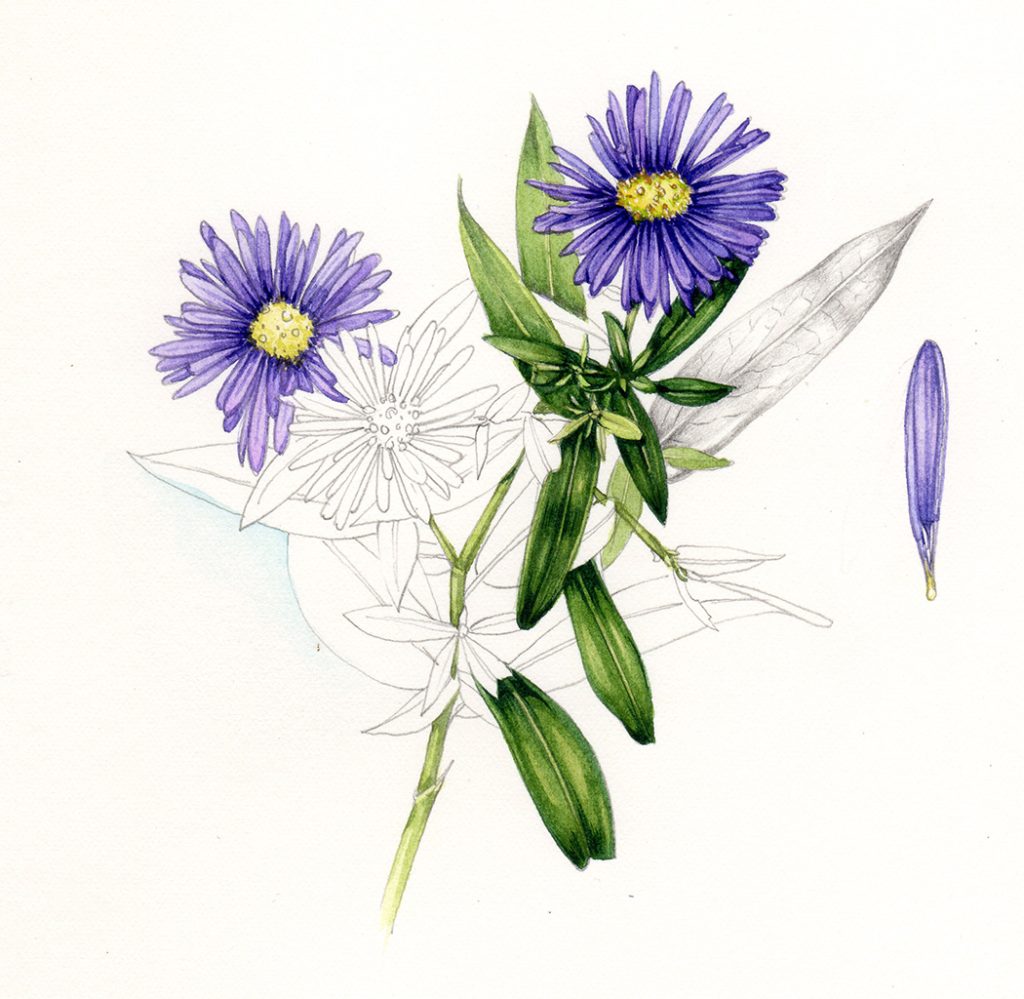
Completed sketchbook study of aster on current Fabriano Artistico hot press paper
In conclusion, there’s nothing this test has given me that I didn’t know. New Fabriano is an ok botanical illustration paper, but it muddies unexpectedly, and I have neither time nor inclination to alter my technique to accommodate this new and unpleasant characteristic. (Not like I’m bitter or anything, right?)
Fabriano Artistico (Old stock)
Having spent months wittering on about how much I loved the old Fabriano, I knew I had to put it through the same test as the other papers. The only problem being…I haven’t GOT any old Fabriano (that’s the whole problem!)
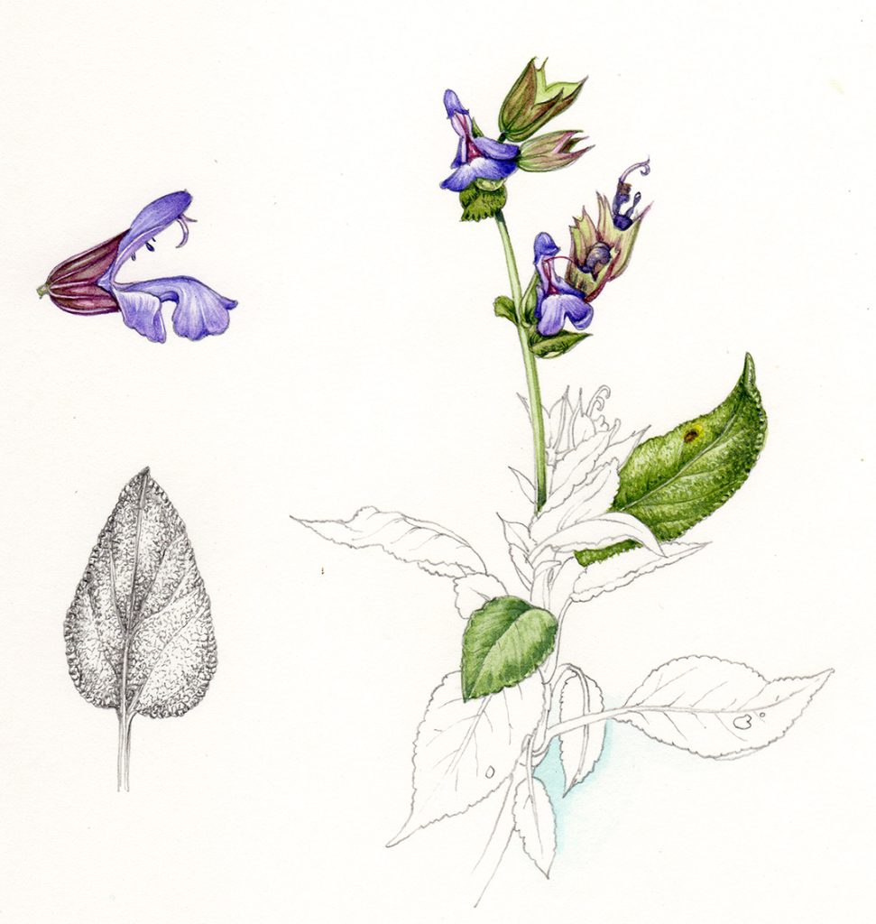
After a lot of looking through the plan chest and swearing, I finally found a sheet which had a crane-fly drawn up on the back (there’s food for another blog – things you draw up and never find time to paint). I sacrificed it to the test, choosing the Wall bellflower as a subject.
Wall bellflower and a special sheet of old-stock Fabriano Artistico
The whole process was wonderful and heart-breaking in equal measure. I know the paper inside out, I know how it works and how to work it, I know what to expect and indeed I learned to paint on it, developing my approach to suit its nature.
The surface is beautifully smooth without being squeaky, graphite glides on and is crisp and intense in its layers of tone. It rubs out well, with no dents.
Watercolour just slides on, the tiniest of marks are retained, no bleeding or blurring happens. Colours build up into intense layer with no compromise of underlying detail and no muddying. It blots well, it does pale washes well, it is the perfect paper.
Wall bellflower Campanula porcharskyana on discontinued Fabriano Artistico
Old stock Fabriano Artistico under the microscope
Under the microscope you can see the tight weave and clarity of edges of lines. No wonder it works so well!
Slightly blurry photo of paint on old stock Fabriano Artistico
It felt like getting into a warm bath, or arriving home; working on this paper again was a dream.
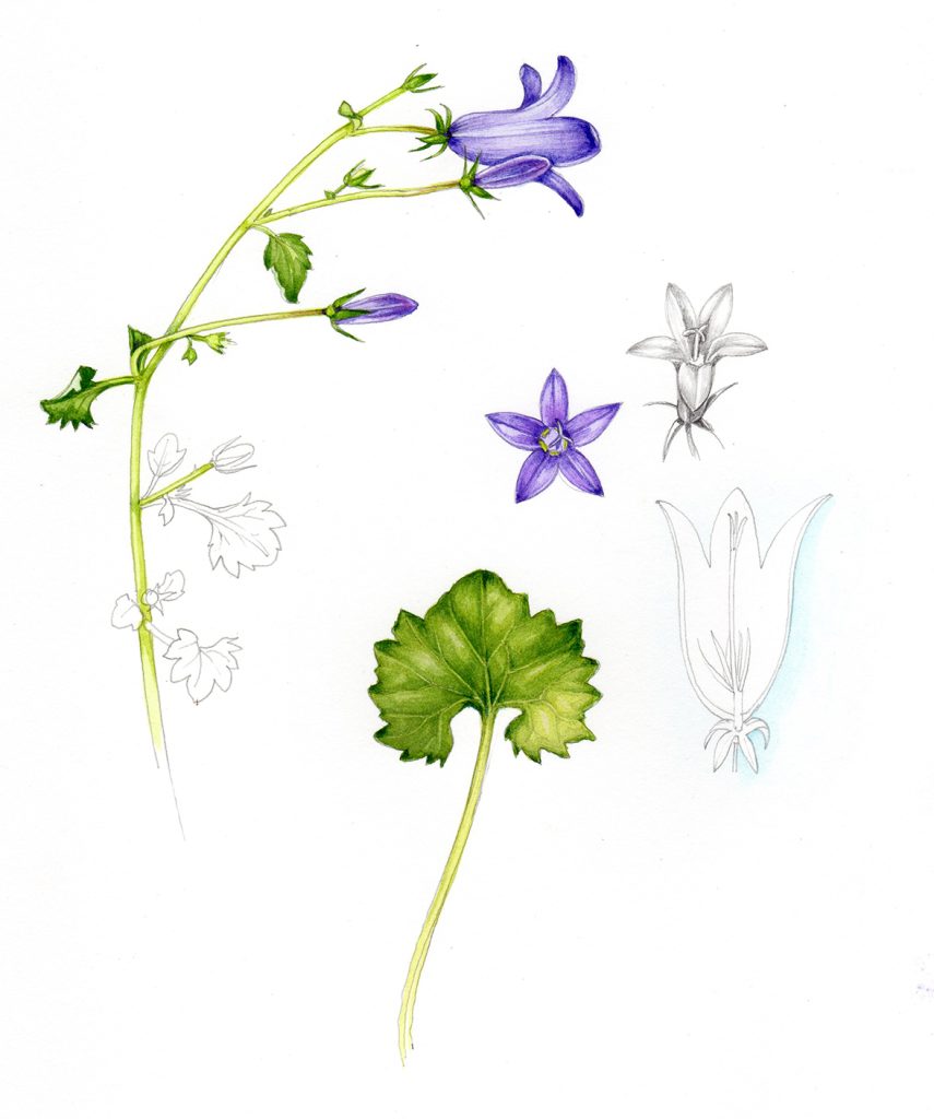
Wall bellflower on the old discontinued Fabriano atristico paper
However, it no longer exists. Dry those tears and try the next contender…..
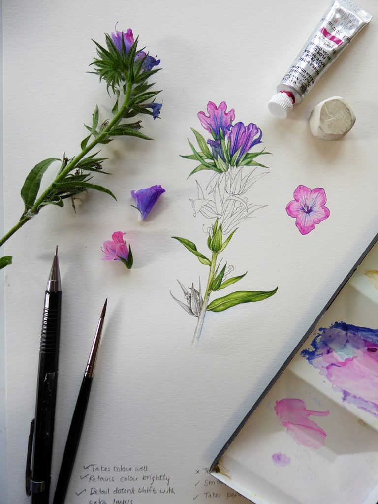
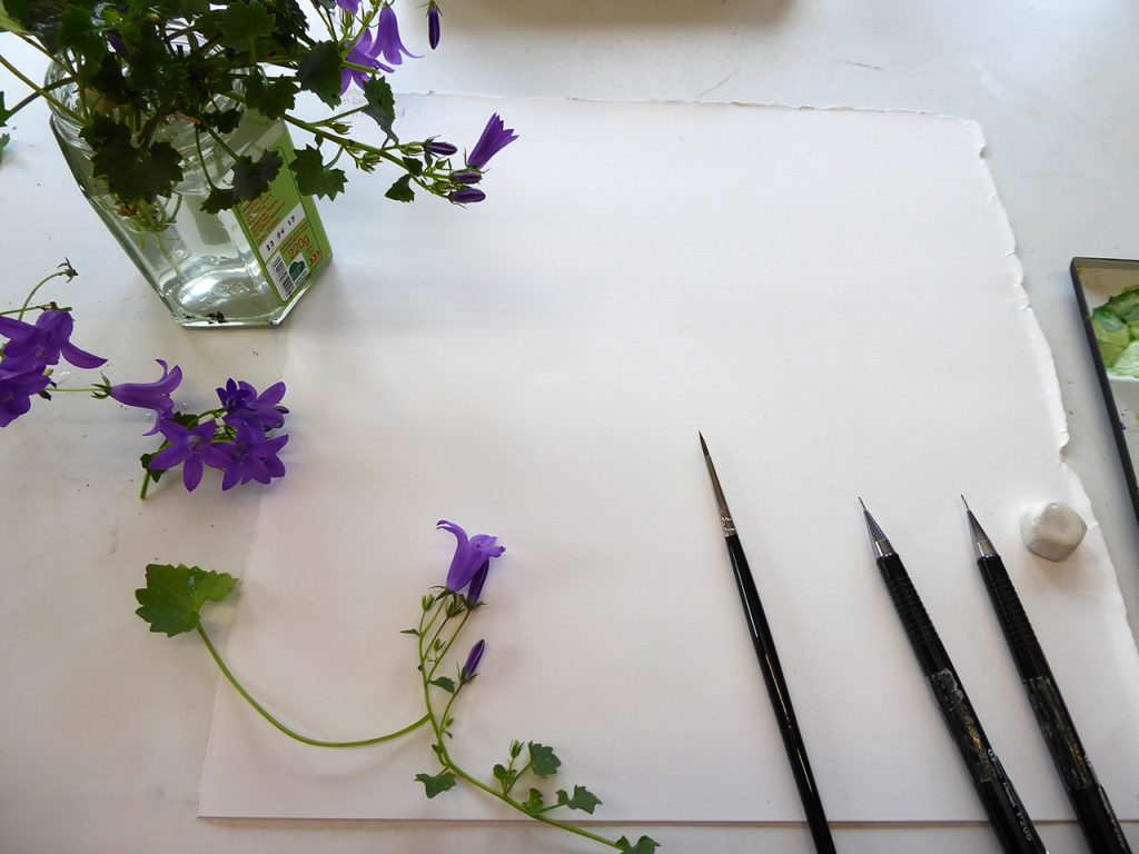
Fluid 100
After having tested this company’s other watercolour paper, Fluid, I got in touch with the company as various botanical illustrators had told me there was another, newer product that needed testing. The company were kind enough to send me a couple of sheets of this Fluid 100 to test.
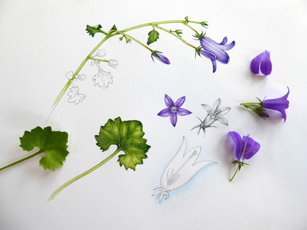
I liked the texture and feel of the paper, reminiscent of my lovely old Fabriano. For this paper, I chose to illustrate a sprig of sage (a bit of a tricky plant because the green is unusual).
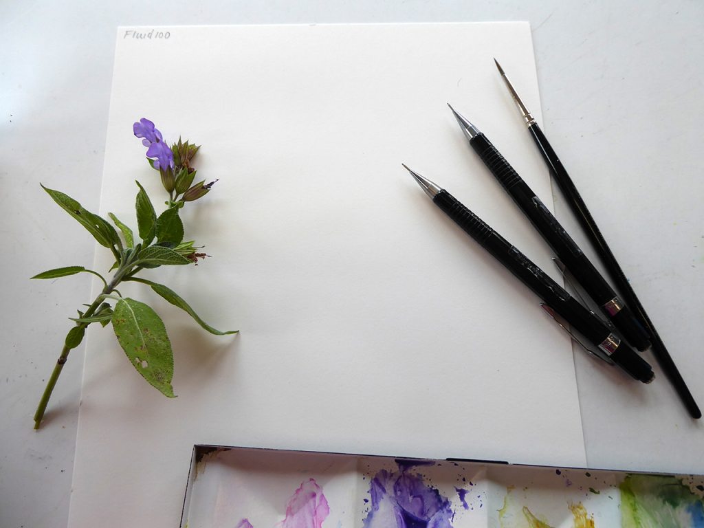
Sage sprig ready to be painted onto Fluid 100 hot press paper
Pencil lines felt great. The pencil showed up clearly, and recorded details crisply and showed a broad range of tonality. Rubbing out left no denting and was clean.
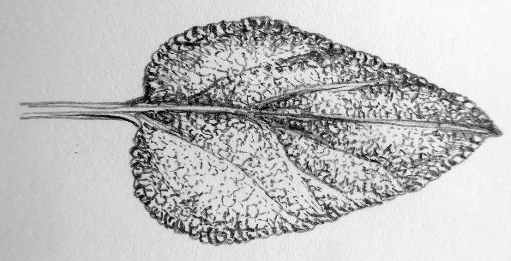
Close up Pencil detail of a sage leaf on Fluid 100 hotpress
Then the watercolours. O my goodness, the paper held detail even sharper than old Fabriano. The tiniest of marks sat there, no blurring and no alteration to colour or intensity. Subsequent washes did nothing to compromise this exquisite retention of detail. The colours were true, and layer on layer of intense and detailed work neither muddied them, nor blurred the detail.
I was so excited I spent far longer painting my test piece than was necessary, I didn’t want to stop! I wanted to make sure the paper continued to deliver this quality that I’d been looking for for about 18 months. Ladies and gentlemen, I am pleased to announce that indeed it did.

Sage sprig sketchbook study painted onto Fluid 100 Hotpress
I worked into one leaf, into a calyx, into the stem. It was simply wonderful.
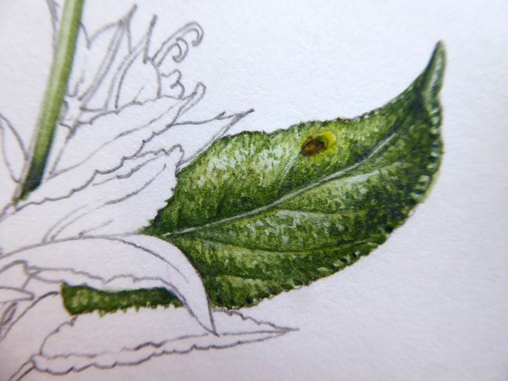
Close up detail of single sage leaf
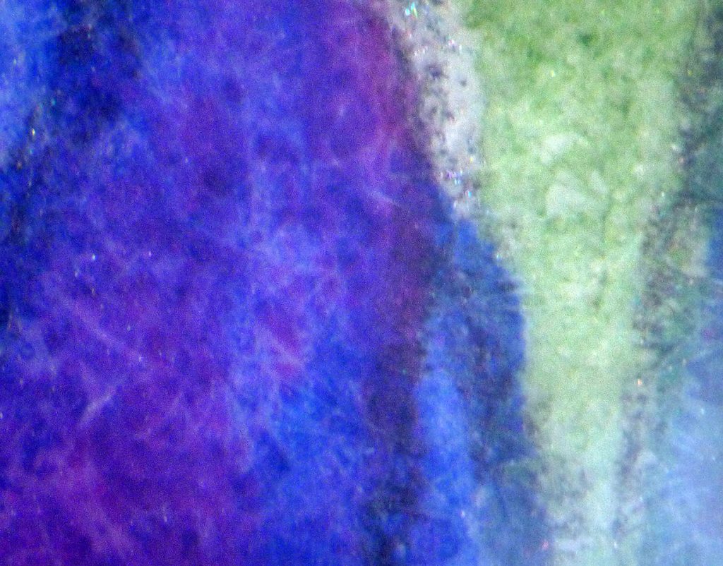
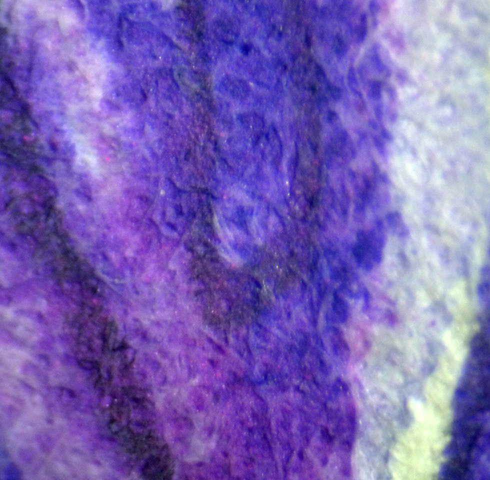
Fluid 100 Under the microscope
Under the microscope you could see crisp lines, intense colour, and no blurring.
Fluid 100 hotpress paper under the microscope
I’m almost unable to express my relief and joy at having discovered Fluid 100 (and no, they’re not sponsoring me!) My quest is over, I have found my Holy Grail.
Completed study of sage on the really exciting Fluid 100 Hotpress paper
It has to be said that this whole batch of papers were good, especially with watercolour. I’m left feeling joyful, and optimistic.
I know Fluid 100 may not be for everyone, and I would urge anyone doing botanical illustration to conduct trials like this for yourself, everyone has different techniques and different feelings about the papers they use.
Conclusion and Top 4 Watercolour Papers for Botanical Illustration
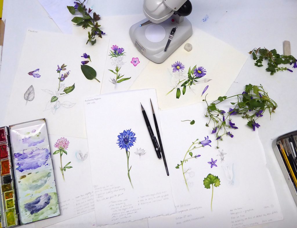
A good day’s work! All the sketchbook illustrations on their respective sheets of test paper. And a busy looking paintbox.
In conclusion, I’d like to list my favourite papers from all 3 trials (a total of 14 papers having been tested). (I’m excluding the old Fabriano from this list as it’s not available.)
(* It should be noted that there have been issues with the sizing in some batches of Arches, I’ve not suffered from this yet but as this discussion board points out, it seems quite a few people have done.)
With the discovery of Fluid 100, and with these other alternatives as really good options, I think the botanical illustration community can relax a little. For me personally, I feel like a long and dark adventure is over, I’m back on shore and now need to order a massive stock of Fluid 100 before going to the kitchen and making a wonderful cup of tea.
Now my paper is sorted, all is well with the world, and I do so hope these blogs on hotpress paper for botanical illustration have ended up giving some of you the same feeling of hope and happiness that I’ve stumbled on! The next quest is to pressurise suppliers to stock it in the UK…
To see some other opinions and reviews sparked by the alteration to Fabriano (and there’s a wide range of different opinions on the subject!), please follow links to posts by Dianne Sutherland, Jackson’s Art shop, Shevaun Doherty, Making a Mark, Wendy Hollender and Gaynor’s Flora.
Thank-you for all your suggestions and comments along the way, I could never have found out about all the different papers out there without the help of our lovely botanical illustration community.
Thank you for all this research, Lizzie. I just started painting again after many years away from that profession. For 15 years I painted on Arches HP, but I have noticed some color change in that paper with my old work on it. I had switched to Fabriano Artistico 300lb in 2001, and have a small amount of it left, but was very upset recently when I started hearing about the deterioration in quality of that paper. After ordering several other 300lb hot press papers and sending them back due to their lack of smoothness, and after going over all your blogs I went today and got some Fluid 100. I like it very much, though the whiteness takes some adjusting to. I just wish they made it in 300lb! But I will use it.
Hi Cristine,
Yes, I agree that the white of Fluid 100 takes a bit of time to get used to. The Stonehenge aqua feels good, too. I do still use Arches HP, but agree that the colour sems a little altered. I do still miss the old Fabriano, but it’s such a relief that there are alternatives out there. I hadn’t realised they didn’t make it in 300lb, that seems like the obvious next step for the manafacturer. I’m so used to being a cheap-skate and stretching my paper (adn to working so dry I don’t need to) that I’d not seen it wasn;t around in a heavier weight.
Congratulations on returning to painting! Lovely that you’ve found a way to come back to it.
All the best, and thanks for the feedback and comment
yours
Lizzie
I know this is an old post but I just wanted to say how much I too love the Fluid 100. Are you still using it? Although I’ve been painting in watercolour for years it was actually the first hp paper I used when I started botanical painting last year simply because I could buy a small sized block of it and although I’ve tested out a few since nothing comes close to it. Part of the reason I have found my home in botanical painting is because I enjoy the paper so much! I wish I could have a go with the old Fabriano just to see why everyone loved it!
Hi Sue
Thanks for taking the time to leave a comment. I know, I love the smooth crispness of Fluid 100 too, its a lovely paper. I also do lots of work on Stonehenge Aqua (hot press) which is slightly softer but still wonderfully crisp. I know what you mean about a paper making you feel you can take on a whole new discipline,; it just goes to prove that the equipment you use does have quite a big effect on what you can produce (I always think about this when I see children’s magazines, printed on china-clay shiny paper with rubbish crayones of pecnils attached for free. Even poor Leonardo couldnt have done much with these, so why inflict such a horror on little ones who are just starting out!). To be honest, I think I love FLuid 100 as much as I used to love Fabriano. Its smoother. Thanks again for your comment, and good luck with your further adventures in botanical illustration!
Hi Lizzie. Here is a question and a small update.
What is your opinion about Bockingford HP? Have you tried it? I’m asking because I have heard a lot about how hard its sizing is but I haven’t been able to find any reviews about its hotpressed version and information about how it is performing on botanicals. As I have told you in the past, it is not easy to get paper samples here in Greece to test them myself.
I have also published on my website’s blog Andre Jute’s thorough review about Millford paper in case you are interested about it.
Here are another two papers for you to try.
Give a try to the Canson Aquarelle XL on its underside as the front side is like a smooth CP but the underside is like HP with hard sizing. It is not of course an 100% cotton paper but it is in my opinion a good paper for studies and botanical sketches.
And another one that I think that you are going to find interesting is the Saunders Waterford Extra White. Its surface is slightly smoother than the White one and though it is definitely softer than the super hard sized papers that you usually prefer, it performs nicely. Give it a try because it doesn’t perform the same as the just White one. ( that is not white at all!)
The Moulin du Roi HP has changed again sizing. I bought a package of full sheets recently and it is now completely different than the paper that I used to use some years ago.
It is now almost completely unsuitable for painting in layers, with very hard sizing though it doesn’t repel the washes as it used to do, with no deckled edges, no watermark and slightly lighter in weight than it used to be. Jackson’s customer service told me that Canson is going to discontinue the full sheets and offer this paper only in pads.
I haven’t manage to get the Fluid 100 and I’m more than a year registered in a waiting list for the Strathmore Aquarius!
As it is obvious there is no end on testing new and older papers as the companies keep on changing them.
Hi Marielena
Wow, you’ve been doing your homework! When I found that I got on well with Fluid 100 and Stonehenge Aqua, I stopped running my trials. But Bockingford – well, years and years ago (we’re talking decades) I did work on HP Bockingford and felt it was rather like painting on a sponge, it felt soft and far too absorbent. Perhaps they’ve changed the sizing since then? Or the whole paper? The manafactureres do seem to be forever changing the recipes, it makes life very confusing.
I love the idea that it’s worth trying the underside of the Canson XL, next time Covid lets me near an art shop I might buy up some of those that you suggest and give them a go. And the Saunders sounds interesting too – although I did try a Saunders, is wasn’t the extra white. Worth a whirl. But you’re right, I’m a sucker for a brutally hard sizing and surface.
Ugh, so annoying that Moulin has changed their sizing! And you never know about it til it’s happened. I wonder what’s in it for them, Im sure theyre trying to improve, but I wonder what they’re basing that on? So irritating that it doesn’t take layers of wash any more.
Listen, if you’d like me to order in some of the bockingford, Fluid 100, and Strathmore for you; then I’d be more than happy to order you some and post it from here? You could cover postage and we could settle up via paypal or something, I’d be happy to help out if that appeals? Waiting over a year for paper is no fun at all. Email me if you’d like.
Thanks for such an amazingly informative update, Marialena. It’s a really useful resource for people.
XLizzie
Hi Lizzie 🙂
I’m sorry for replying that late, but I didn’t see your comment or it would be better to say that I’ve lost the post.( shame on me- where do I have my mind?? ) lol
Thank you very much for your offer but I currently have all the papers that I need to work and if for one thing I’m not waiting one year to resupply with paper, but I’m waiting to get a sample of one of them that is constantly out of stock. I’m talking about the Strathmore Aquarius that I have heard that is a very strong and a somewhat different kind of paper, that is very thin, doesn’t buckle but it isn’t also made by cotton or other conventional material. It is a high tech thing or something, I”m not sure what is all about but I’m super curious to find out!
It is this one:
https://www.artistpapers.co.uk/strathmore-500-series-premium/product_id-403/name-strathmore-500-series-aquarius-ii-watercolour-paper
I can send you though the Canson Aquarelle XL to test it and see if it works for you because I found it at a local store and I bought a block at A3 size.There is no reason to buy a whole block if you try it and it doesn’t work for you. Just give me an address to send you some sheets to test it.
I wanted also to mention that you should try the underside of the Winsor and Newton’s Medium Cartridge paper that you said on your video that you found it a bit rough for your taste. This paper’s underside is smooth too, and it handles the same as it’s front side ( the one that is up when you open the pad). All these cartridge or non cotton papers have usually two different surfaces with the front one being like a smooth cold pressed ( or mixed media) and the other side being very smooth, like hot press or sometimes “plate” one. I prefer to use such kind of papers for sketches or practice and trying new techniques because I save my “good” ones ( the cotton ones) and the full sheets for works that I exhibit at galleries or for commissions.
Regarding the Strathmore Imperial HP that you said on your video that you found it way to rough. Well you were right. It is indeed rather rough for a hot press paper, but it is extremely strong too. It is definitely not suitable for botanicals but I made a use of it.
I made on this paper this painting
https://www.marialenasarris.com/ideographies/
that is currently exhibited at at this art gallery.
http://minify.link/6pl ( I minified the link because it was huge)
This paper is suitable for works that require a lot of lifting and layers and works very well with masking fluid too. It is very strong. The strongest I have ever tried.
And that’s all my news.
I’ll be looking forward for your email.
Take care
Marialena 🙂
Marielena
Thanks for this. It’s so interesting to gather in all these suggestions and information. Ok, I wont send you any samples unless you need them, and you’re right, its a great idea to try new papers. As Im happy with my Fluid 100 and Stonehenge aqua, I’m sticking with those two for now and not really trying any others. But as I have several pads of it, I’ll certainly give the W&N cartridge underside a go, thanks for the tip. And the Strathmore 500 does indeed sound intreguing!
Congratulations on getting your painting into the exhibition, it’s a compelling piece. I can see how a tougher paper would work well for such a piece.
Thanks again Marialena for you educational and wonderful comments, they’re a treasure trove of researched and respected reviews of different products, and I thank you for taking the time to write up and share your findings with us.
XXXXXXXXXXXX
When sketching, which paper do you use then, and which weight?
For pencil and ink work I use Daler Rowney smooth cartridge 300gsm
Good Information
Regards