

Illustrating Long-tail tits and Cyclamen
A recent natural history and botanical illustration commission has been one of my favourite jobs of the year.
Coming up with ideas
The painting is for a 90th birthday, and needed to include an array of meaningful plants and animals. The client and I shared a cup of tea, and came up with some ideas which I took home to worked on.
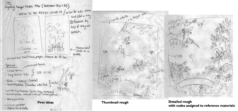
Series of thumbnail sketches and roughs
I finished sourcing reference material for all the elements. (Yet again I blessed my sketchbooks – I seem to have pages of visual notes on Silver birch Betula pendula!) I could now piece together a detailed pencil rough for the client.
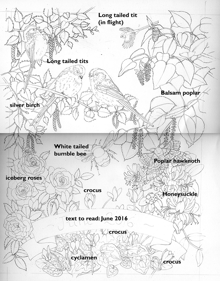
Annotated pencil rough illustration
Painting from the top down
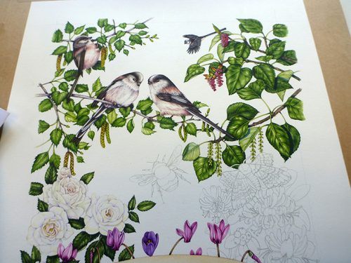
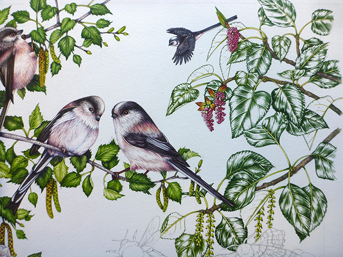
Once given the go-ahead it was a matter of deciding which area of the painting to work on first. Generally I go for the hardest part, to get it done. I also like to work from left to right so that I don’t lean on areas of the painting I’ve already painted. In this case I started with the silver birch and long-tailed tits Aegithalos caudatus. I begin by plotting in the darks of the birch leaves, building up areas of shadow with a green mix based on sap green and yellow ochre. Then I pop a pale and slightly yellower watercolour wash on top, leaving white spaces for where the light falls. A third watery pale wash covers all the leaves (and the twigs and catkins, it unites the tree). Finally, I work into the darkest areas showing shadow with a mix of ultramarine and violet.
The long-tailed tits are done in a similar style, building up layers of tiny brush strokes to give colour to their pink chests, and using black mixed with purple on the flight and tail feathers. I always do the eyes and beaks last.
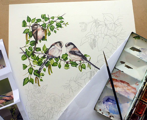
Long-tailed tits get Aegithalos caudatus and Silver birch Betula pendula completed
Illustrating the roses
Roses were next, and very tricky. They’re a white rose called Iceberg, and although the petals are slightly creamy the shadows are purplish blue. If you’re not careful with this colour combination everything goes khaki green. The trick is to keep the yellowish tint to parts of the petal where shadows don’t fall. The roses have a blush too; I used opera pink for these. Dark leaves behind the flowers help the roses stand out; it was good to see something I’d planned when composing the illustration work out. For more on painting white flowers, see my blog.
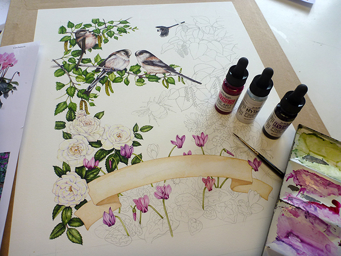
Iceberg roses completed, starting work on the cyclamen
Illustrating the cyclamen
I moved onto the cyclamen next; a mix of Cyclamen hederifolium and Cyclamen coum. The flowers were a joy to paint, not least because of my new Dr Martins hydrous inks which have wonderfully bright colour and are fade resistant. I mixed them in with a little violet lake and opera pink Winsor & Newton watercolour to ensure they didn’t look too saturated; very little of these inks goes a long way and for botanical illustration there’s nothing to beat their pinks and purples.
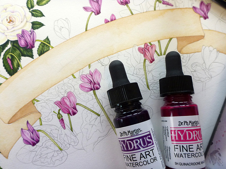
Cyclamen flowers with Dr. Martin Hydrous inks
The leaves had to have pale variegated areas, and are quite a blue green. I used plenty of cereuleun blue, and left the variegated areas white. Once I’d worked into the darks and put a paler wash on top, I used a mix of cereulean blue and cadmium yellow light, mixed with white, just to pick out the shadows in the variegated parts of the leaves.
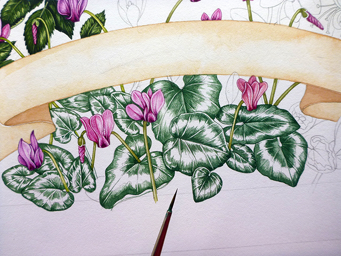
Painting the cyclamen leaves
Next up was the expanse of Balsam Poplar Populus balsamifera, a tree I’m not familiar with. I started by painting in the scarlet flowers and the catkins. Having this bright red in the corner is tremendously helpful in terms of composition as it allows your eye to move from the reddest areas of the long-tailed tits, down to the red shadows in the cyclamen flowers, then up again to the crimson Balsam poplar flowers.
An area of isolated red attracts the eye, and your viewer tends not to be able to take in the rest of the painting.
Working into the shadows
Next I plotted in the darker green midtones and shadows.
The Balsam poplar Polulus balsamifera leaves are plotted in
I added three or four layers of paler and slightly yellower washes before getting some shadow onto the leaves. As always, I love purple and blue mixes for shadows, and ensure the shadows cover the relevant parts of twigs and other leaves too.
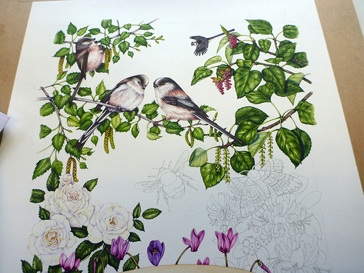
Illustration with Balsam poplar completed
Illustrating the bumble bee
The bumble bee was next, a white tailed bumble Bombus lucorum. I rather messed her up by extending the areas of black too far across her yellow stripes, and wish I’d allowed more overlap of wing with leaf. However, she’s competently painted. Again, the bee is done with the build-up of lots of tiny brush strokes. With birds and insects I often avoid adding paler washes on top of these tiny brush marks as they can swallow some of the crispness of the detail. The only brush I’ve found that will provide a point good enough to put hairs on a bumble bee leg is a Winsor & Newton Series 7 sable brush (number 1). Believe me, I’ve tried other less costly alternatives, but none come close.
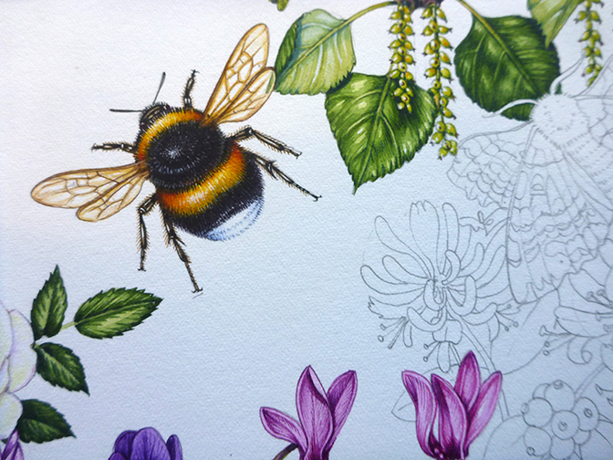
White tailed bumblebee Bombus lucorum completed
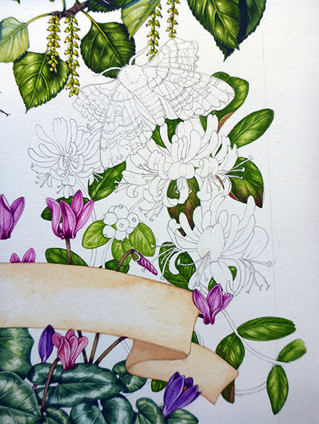
Honeysuckle and a moth
The honeysuckle Lonicera periclymenum and Poplar hawk-moth Laothoe populi were left; and as there was another job needing doing I stayed up til 2am to get them completed. At times like this, BBC World Service is invaluable to keep your mind busy as your hands do the painting! I started by doing the honeysuckle leaves, a brighter yellower green than the other foliage. This was partly because the leaves do differ from the birch and poplar, but also because I wanted a little more variety in the spectrum on greens in the illustration. I also got to add a crimson tinge to the leaves which helped in balancing out the reds.
Working into the Honeysuckle Laothoe populi leaves.
The Hawk-moth was tricky as the pattern and layers of colour on its wings were hard to paint symmetrically. Lots of greys and browns were laid down before putting the blacks onto the paper. These helped define the stripes. Again, I was lucky with the colours; the Poplar hawk-moth has a flash of bright orange on its hind wings (held forward of its fore wings) which echoed the oranger tones in the long-tailed tit plumage.
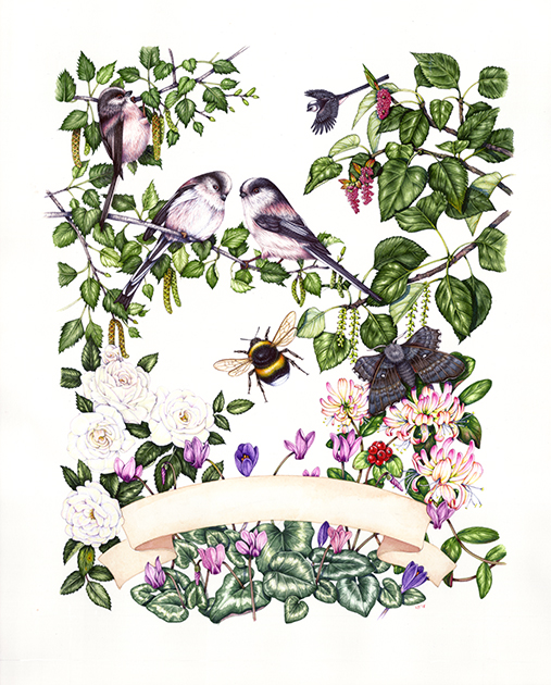
Finshed Illustration
The last step will be to write the name of the lady whose birthday it is onto the banner, along with the year. My handwriting is, alas, not as good as my illustrations skills, so I’ll be asking my mother to do the penmanship for me!
This has been a time-consuming and challenging job, but I have absolutely loved it, and just hope the birthday girl enjoys having the painting as much as I enjoyed working on it.
Fantastic work!! Really gorgeous painting!! Thanks for sharing your process!
My absolute pleasure, Irma. Glad you enjoyed it.
Beautiful illustration. I find it fascinating how you start with the darker tones on the leaves first rather than light to dark. I am now itching to give this technique a try myself!
Thanks Louise. Yes, give it a go, some people find it really simplifies things for them, having those darks laid down early on.