

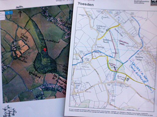
Illustrating a Nature Reserve map

I am often lucky enough to work with the Wildlife Trusts UK, creating scientific illustrations and botanical illustrations for their interpretation boards and leaflets. A while back, Staffordshire Wildlife trust and (separately) Berks, Bucks & Oxon Wildlife Trust started comissioning maps from me.
These are quite tricky to do as they have to be correct and clear; and all the information I include has to be checked by the Trusts’ staff whilst still at the pencil stage. This is a challenge for all of us: I have to make the map clear, they have to go over it with a fine-tooth comb to spot any errors lurking in the graphite.
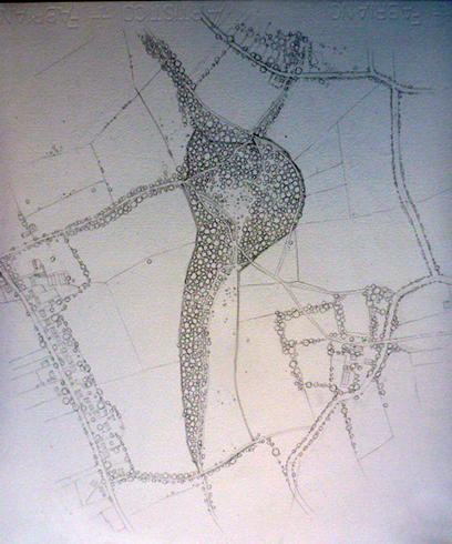
Drawing up the map in pencil
The first step is to draw up the map of the nature reserve. This involves unifying ariel photos with OS map information so that houses, paths, roads, ponds and boundries are all in the right place (the OS map); as are trees, areas of scrub, people’s gardens etc (the photo helps here).
Both trusts are magnificent in getting me all this information, and annotating it so I can emphasize key points. This specific map is of a recently expanded reserve in South Buckinghamshire, Yoesden, run by BBWOT.
Once this is drawn up, the pencil rough is emailed over for editing. Alterations complete, it’s time to start painting.
Getting starting on the nature reserve colour
First thing to do is to get a very pale watercolour wash on the area surrounding the reserve itself. This involves very wet washes, and blotting the edges to white so the map has no abrupt corners.
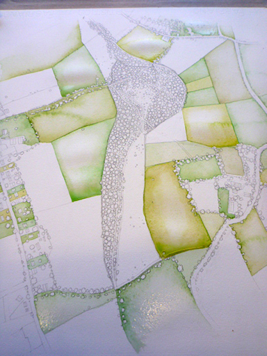
If you look closely you can tell how wet the paint is here, before it dries. It literally pools in each field, so it’s importanat not to let them run into each other.
Adding background details
Next it’s the buildings and trees. Again, the surrounding areas need to be very pale to make the reserve itself stand out. I tend to do the roads and buildings first as the trees can take ages.
Below is a detail of the trees being painted; after putting in a very pale area to suggest texture and shadow, an overwash of almost colourless green is applied and allowed to dry.
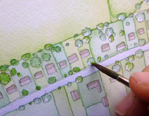
Overwash on faded trees, using a number 2 paintbrush
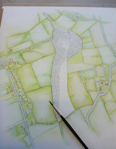
Painting the Nature reserve itself
Once the background is done I can get started on the reserve itself. It helps to have the surrounding area complete as it dictates how bright the colours within the reserve should be to stand out.
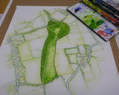
As before, I put the paint on very wet because I love the slightly unexpected way it dries and gives texture to the illustration.
I also put more tonality within the reserve, and use far gaudier colours. I try to fade the greens to brighter yellowish hues so the map doesnt look heavy and solid. Then I do the trees. Again, this is a bit of painting on one side of each tree “blob” then, once dried, a variety of washes ontop, very watery. It’s important to have variation in the tree colours if you want to avoid the map to looking like a plantation.
This detail shows some trees still white, while the majority have their underpainting complete.
The paths are a much paler green than the background; this works well and was the idea of the communications officer at the reserve. Some earlier maps have pathways as dotted coloured lines. This worked, but I think the pale paths is an elegant solution.
Next it’s time to pop in the drop shadows; very pale and wet; a mixture of french ultramarine and purple; darker within the reserve than in the countryside surrounding it.
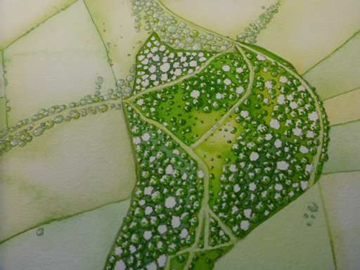
The finished map of Yoesden Nature reserve
The final step is to paint the border of the reserve in clearly. I use a mix of dark brown and purple for this; it’s less brutal than black. And the illustration is complete.
Once professionally scanned (a thankyou to Old Forest Arts in Hay on Wye) I pop it in Dropbox or file sharing software, along with any additional vignettes. In this case these will be a tiny Adonis blue butterfly, a Hellebroine, and a scabious. Luckily for me, the goodly folk at BBOWT amalgamte the images into the final map they’ll use on leaflets and interpretation boards.
I like doing these maps; it’s difficult and exacting, but lovely seeing them come together. However, it has to be said I don’t like it quite so much when there are hundreds of tiny trees!
For more on why I love working with the Wildlife Trusts, check out my blog.