

Botanical Illustration: Comparing HP Watercolour Papers 1

Hot press water colour papers and botanical illustration
This is the first of three reviews of Watercolour Hot Press papers for botanical illustration. Please check out the second and third in this series for more tests and results!
As some of you may know, there’s been a bit of a panic in the Botanical illustration community recently. This is because the firm favourite hot press (HP) watercolour paper of many illustrators, Fabriano Classico (and Fabriano Artistico) has altered its manufacturing process. This has resulted in the surface of the paper being given a different sizing, which results in it being less smooth than before, and now when you paint on it the watercolour bleeds and pools a little, clearly not the effect a botanical artist is after!
It should be pointed out that the difference is not enormous, and that Fabriano remains a very good Hot press paper for all botanical illustrators, but I’m keen to see if anything out there comes close to the former glory of this paper.
Various alternatives have been proposed, and thanks to the fabulous RK Burt & Company (who make the essential Fat Pads) I got hold of most of them as samples, and compared them.
I picked some flowers from the garden as subjects, painted a quick 1 hour sketch onto each of my five trial papers, popped them under the microscope, made notes, and have made a film of the process, along with my conclusions which is on Youtube. Here they are in blog form.
As a disclaimer, I do want to stress that these are reviews from my own perspective and my own (slightly untraditional) style of doing botanical watercolours, and there’s every chance that if you were to try these different papers you’d come to different conclusions. Paper choice is very subjective.
Moulin du Roy
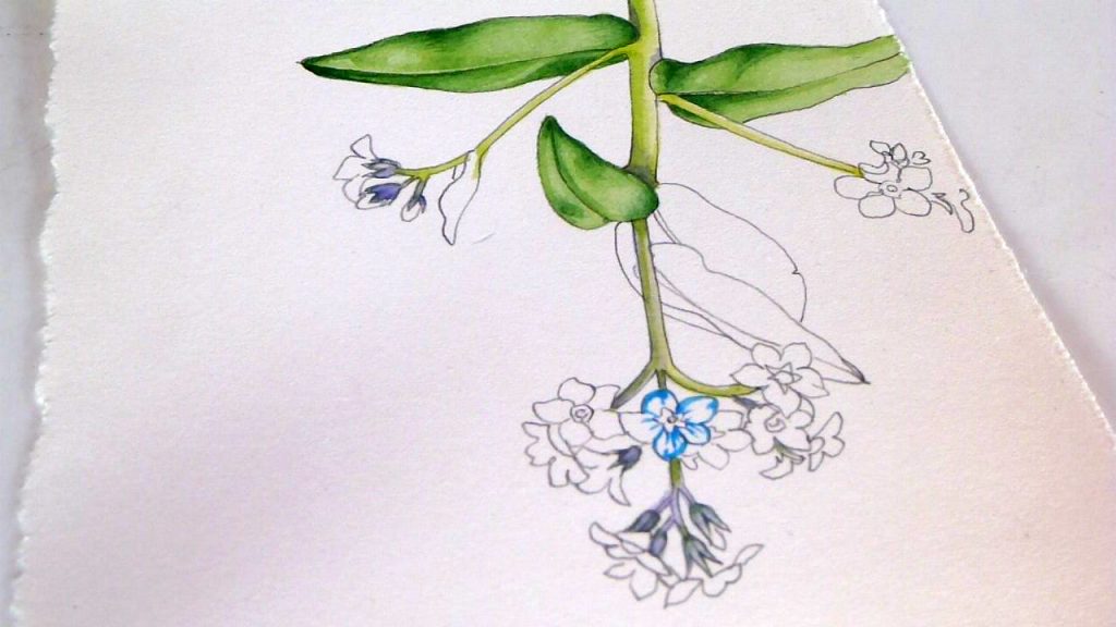
First, I tried Moulin du Roy Hot Press. The surface of this paper feels and looks incredibly smooth, almost like porcelain, and it’s a good bright white. I painted the Periwinkle Vinca minor on this paper.
Initial reaction was of joy. It holds lines incredibly well, and is very sharp and crisp, with no blurring or bleeding. Sometimes there was a tiny bit of repelling of paint, caused by the sizing on the surface, but a second pass with the paintbrush sorted this.
When I was done with my base shadows and details, I was smitten.
Working more into the details after the first layer of paint was applied was great too, it took lots of different layers of detail without blurring them. However, if you tried to get paint to move into an area of wet you really did have to pull it with the brush every inch of the way, there was no organic bleeding of wet areas into each other.
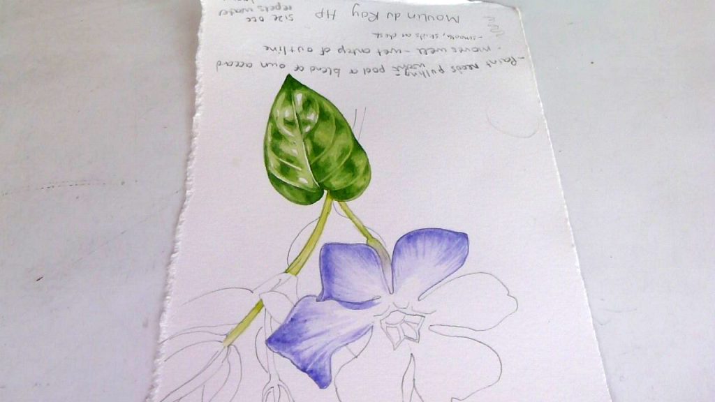
Painting a Periwinkle onto Moulin du Roy HP paper
However, when I came to paint the flowers, things went wrong. I put lots of detail onto each petal, then unite it with a pale and dilute wash. With Moulin, this second top wash lifted some of the detail from the page, leaving boggy, clogged regions.
Wet watercolour washes were good, there was no staining where the initial darker colour had been laid before being diluted in situ. It allowed for blotting and this didn’t alter the paper surface at all.
It rubbed out wonderfully, leaving almost no dents and not compromising painted areas.
The colours seem a bit less vivid than when they were applied, I’m not sure what accounts for this dulling of hue.
Moulin du Roy under the microscope
When I got the painted area under the dissecting microscope I could see that the fibres making this paper are thin, and tightly knitted. This explains the crisp edges and lack of bleeding.
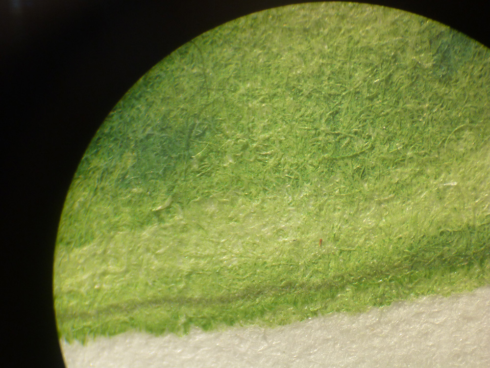
Painted leaf edge on Moulin du Roy under the dissecting microscope
In conclusion, I think Moulin du Roy is a good option for botanical illustration, although the loss of vibrancy and the fact that applied paint is liable to slide off the polished surface when a top wash is added is a real drawback.
Arches Hot Press
Next I put Arches Hot press through its paces, I know lots of botanical illustrators love this paper.
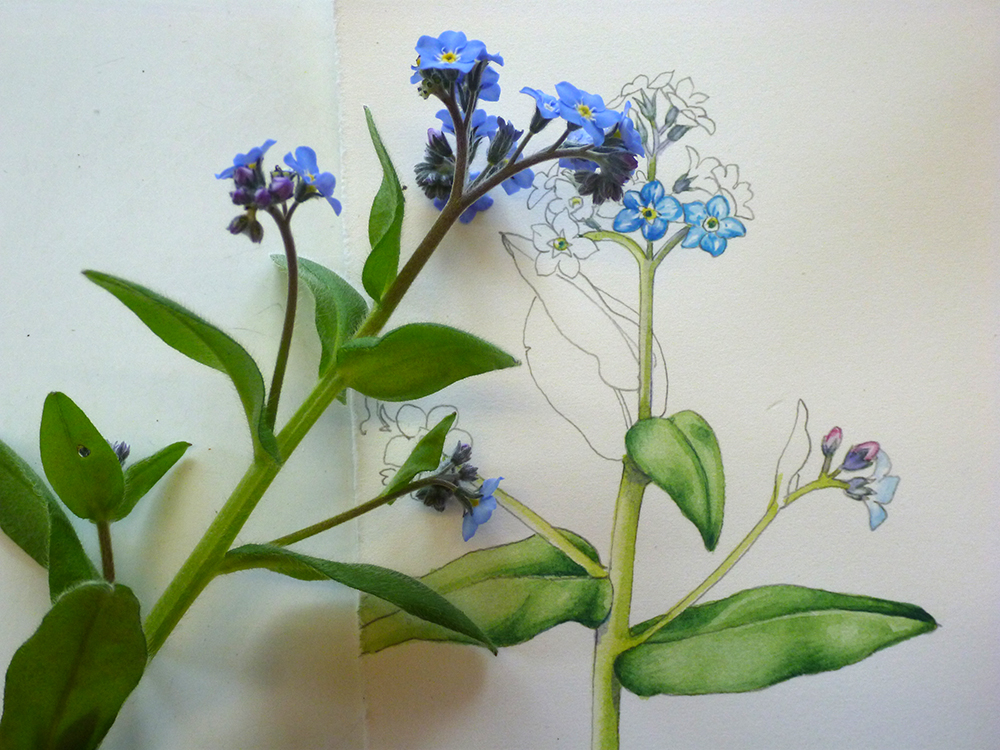
The surface is smooth, and white. I chose to paint Forget-me-not.
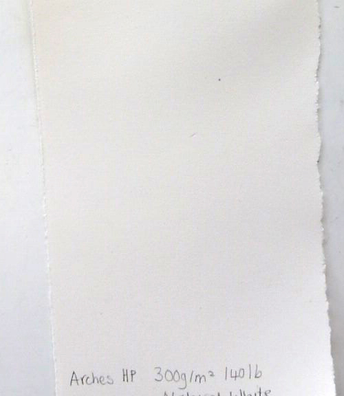
Arches HP watercolour paper
The first touches of paint are crisp and clean, and hold their edges; not quite as crisp as Moulin, but still a good and accurate line. Colours remain true to the paint-box and don’t seem to alter or fade after application.
The second (and all subsequent) layers of paint were more problematic. They left stained margins where the paint brush first hit the paper, and were not nearly as mobile as the first layer. There was also a small amount of blurring on the later layers of paint.
Sketching a forget-me-not onto Arches HP
Arches didn’t share the problem of lifting detail from the first layer, and the colours on all layers of wash remained vibrant and clean.
Wet washes were ok, but when I blotted the edge the tissue clung to the page, and the paper felt like it became slightly woolly. However, a clean transition from colour to white page was perfectly possible.
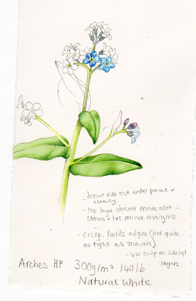
Finished sketch on Arches HP
Rubbing out wasn’t great; with graphite it was a little patchy, and disturbed the paper surface (although it didn’t dent the page). With watercolour, although it removed the graphite outlines, it also removed minute specks of painted paper, leading to an unfinished mottled effect. Moulin did not have this problem.
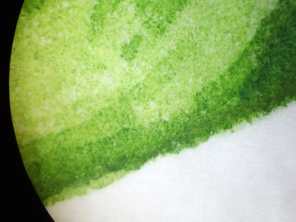
Arches HP under the microscope
Under the microscope the Arches fibres were thin and tight, although less compactly knitted than with Moulin.
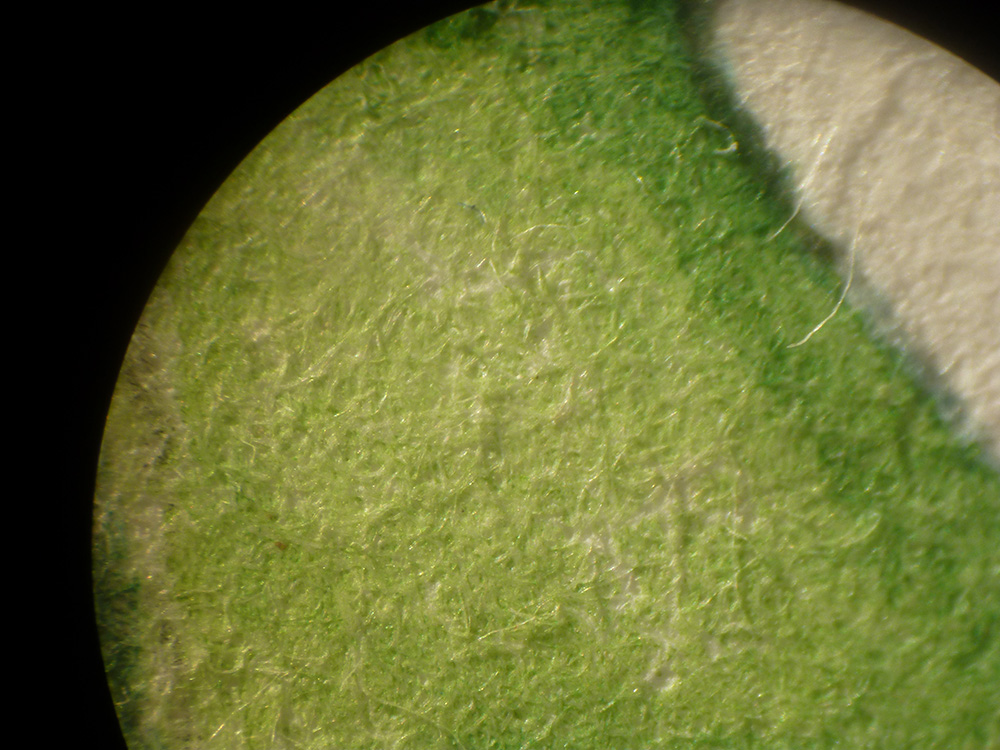
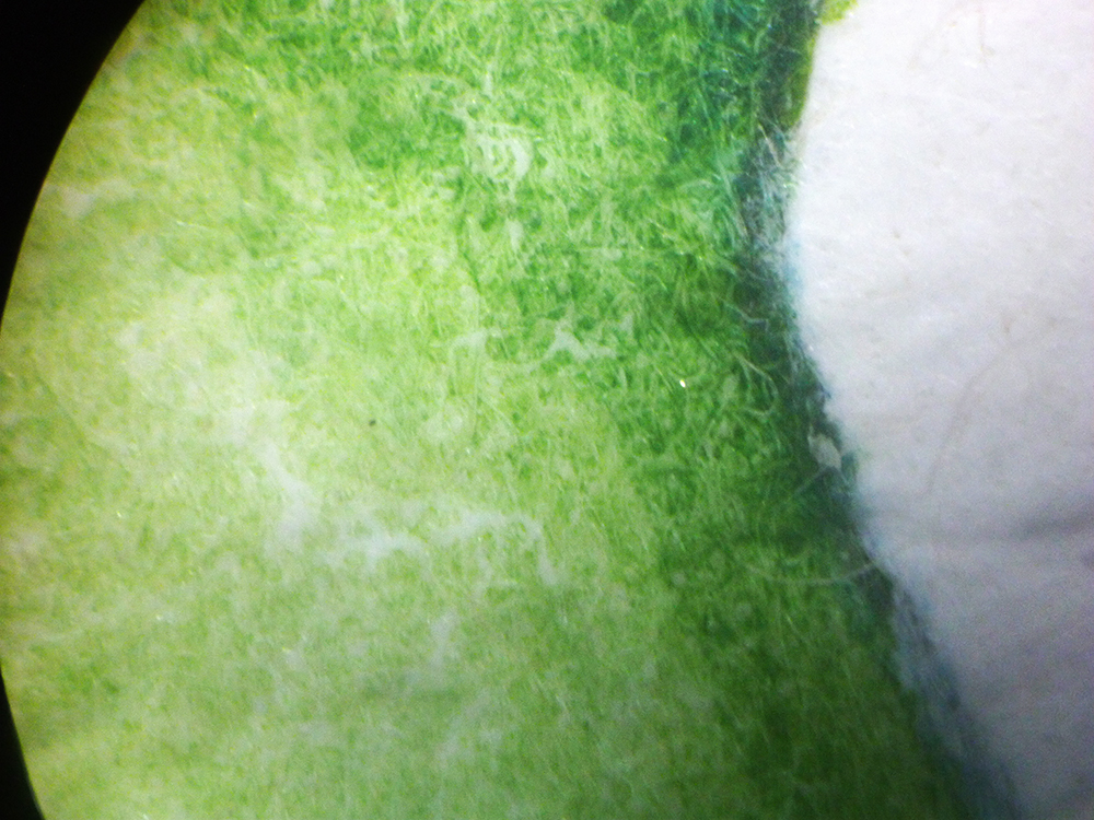
Edge of a painted leaf on Arches HP watercolour paper under the dissecting microscope
In conclusion, Arches is a very good botanical illustration paper and is able to hold onto the vibrancy of the colours painted on it. It’s crisp and good, although later layers of paint can become a little blurry, and the staining effect with subsequent layers of paint is unfortunate. I wish you could rub out without ruining the painted regions. However, because of its vibrancy and tight edges, I’ll definitely keep this one as a possible alternative to Fabriano.
Forget me not plant and finished sketch on Arches HP watercolour paper
Canson Heritage Hotpress
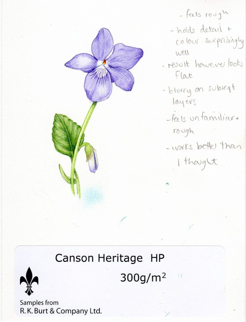
I chose to paint a violet onto Canson Heritage Hot Press, and was immediately struck by how rough it felt under my hand. You can see the texture of the paper surface with the naked eye. I’m used to very smooth papers, so it felt unusual and rather cheap (this is because I don’t use textured paper, not because the paper is low quality!)
Canson Heritage Hot Press watercolour paper
However, I was pleasantly surprised by how efficiently the paper held detail with both graphite and paint. The initial layer of paint was very tight and crisp, only bettered by the Moulin. Subsequent washes and layers of paint held their detail well, although fourth and fifth layers of paint became a little blurry.
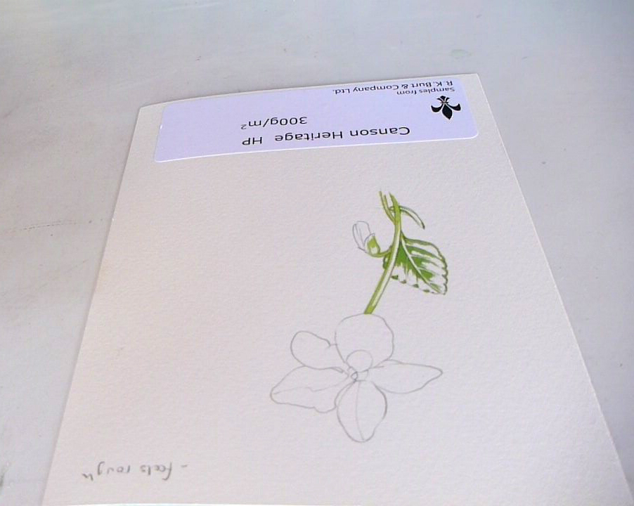
Working on a sketch of a Violet on Canson Heritage HP Watercolour paper
However, when I came to look at the final illustration I felt that the illustration had lost some of its tonal depth and vibrancy, as if the underlying paper had sucked some of the life from the picture.
Wet washes were alright, and the paper didn’t cling to the blotting tissue and allowed a gradual change from pale wash to white of the page. However, the initial area of colour stained a bit, and wasn’t as mobile within the water as I might have liked.
It rubbed out ok, not lifting any of the painted details, but left dents below the graphite lines as it’s a soft paper.
Violet sketch on Canson Heritage HP Watercolour paper
Canson Heritage under the microscope
Under the microscope, the fibres are wider and looser than with Arches or Moulin, which may explain why later layers of paint made the edges a touch blurry.
Leaf edge painted on Canson Heritage under the dissecting microscope
In conclusion, this paper works far better than I thought it would. It held detail well, and only became blurry after lots of layers of detail had been added. For me, the problem is the feel of the page, which is rougher than I am used to; and the fact that some of the tonal depth and vibrancy of colour seemed to evaporate from the paper once the paint had dried.
For people used to rough textured watercolour, it’d be a good option; for me the feel is an obstacle I’m not going to be able to get past.
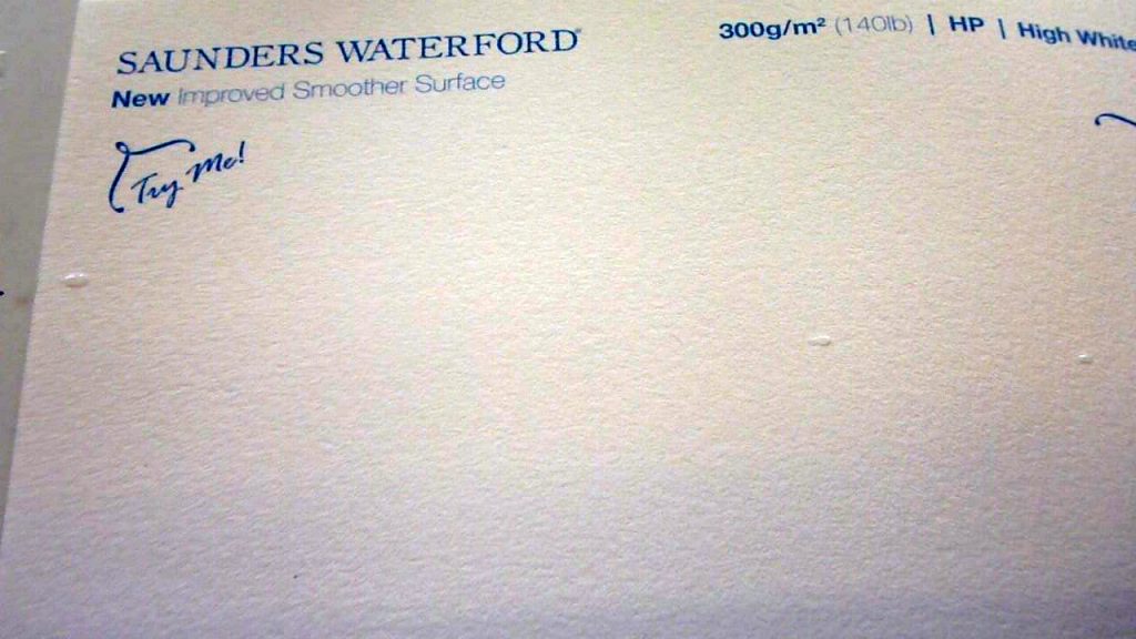
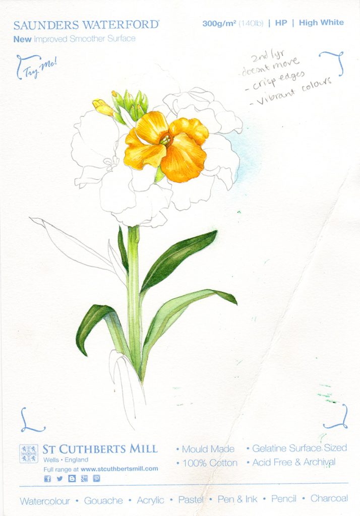
Saunders Waterford New Improved
This paper initially put me off as you can see the texture on the surface, it looks very slightly grey, and feels soft. However, it turned out to be a good hotpress option. For this test, I painted a Wallflower onto the Saunders Waterford Hot Press paper.
Saunders Waterford HP Watercolour paper
I was struck by how soft the paper was, drawing in graphite, but this didn’t compromise the accuracy of the line.
Brush strokes did not bleed, and remained crisp. This remained true even when top washes were applied; the paint below remained sharp and stable.
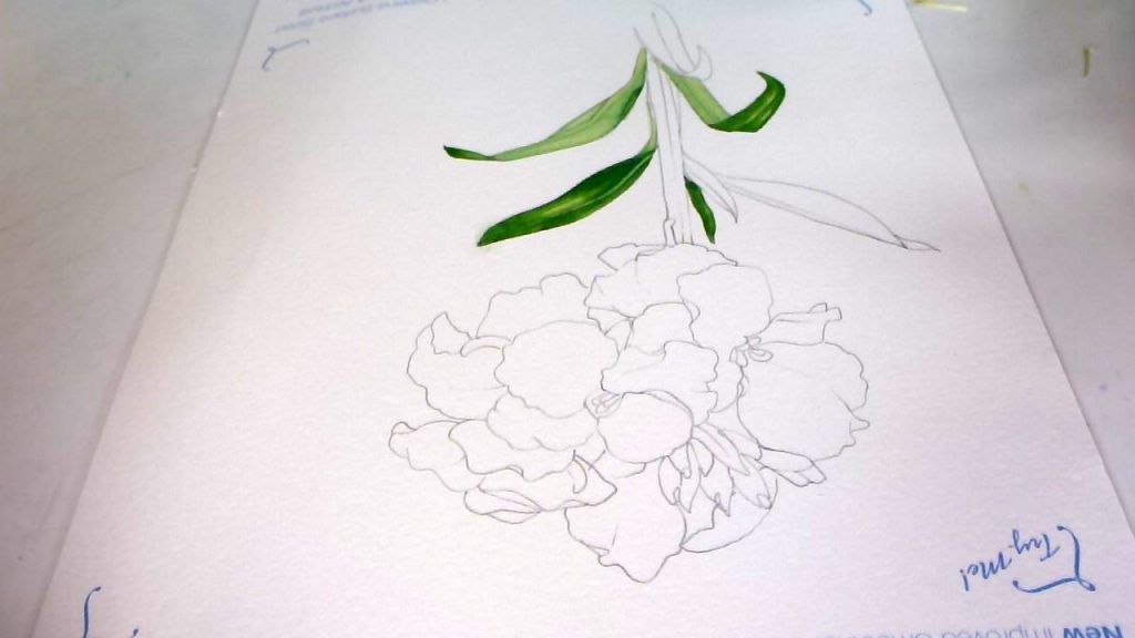
Wallflower sketch on Saunders Waterford HP
The colours were excellent, the most true to the paint box thus far. None of the tonal depth or vibrancy was lost.
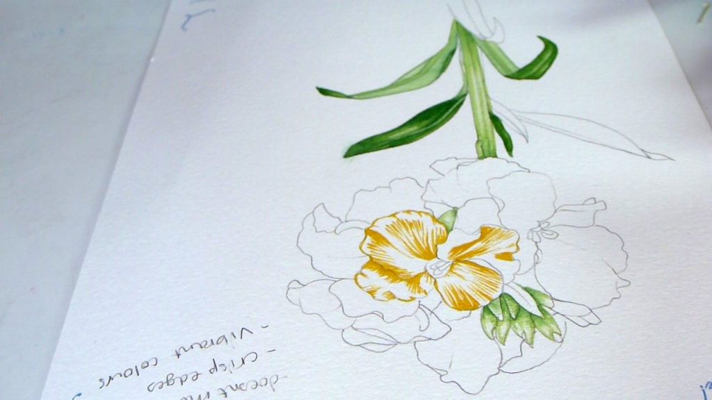
Working into the flowers on the Saunders Waterford HP Watercolour paper
Looking at the finished sketch, I felt that a little of the crispness of the edges had been lost; it seemed as if the painting blurred minutely some time after I finished working on it.
Wet washes were easy with no troubles relating to blotting or staining of the place where the paint first was laid down. However, due to the dimpled texture of the paper surface, washes cannot be entirely smooth, they will always have a slightly textured appearance.
Finished Wallflower sketch on Saunders Waterford HP paper.
Rubbing out was good for both graphite and painted areas, no paint was lifted from the page and the pencil cleared (but left dents on the page due to the softness of the paper).
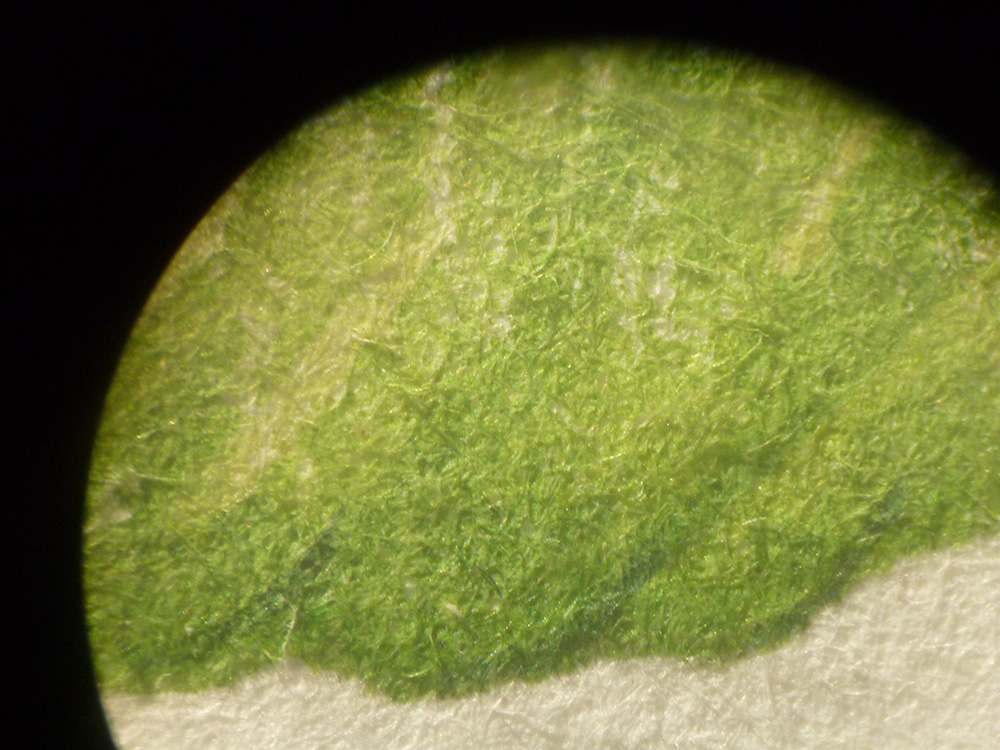
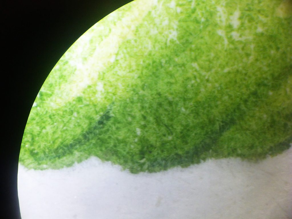
Saunders Waterford HP under the microscope
Under the microscope, the paper fibres are thin and compact. However, in amongst are tiny white granules. I think perhaps these led to the slight bleeding. I wonder if they could be removed at manufacture? They didn’t seem to be present in any of the other papers.
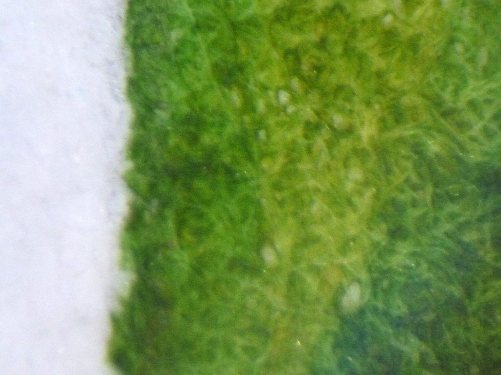
Leaf edge painted on Saunders Waterford HP paper seen under the dissecting microscope
In conclusion, Sander Waterford is a good paper. It holds many layers of watercolour well, and retains detail. It is true to the vibrancy and hue of the paint. However, the paper feels a little rough to the touch, and washes aren’t entirely un-textured. The slight bleed after painting gave me pause; had it not been for this I might have been tempted to spend some time with this paper, mainly due to its clarity of detail and truth to paint colour.
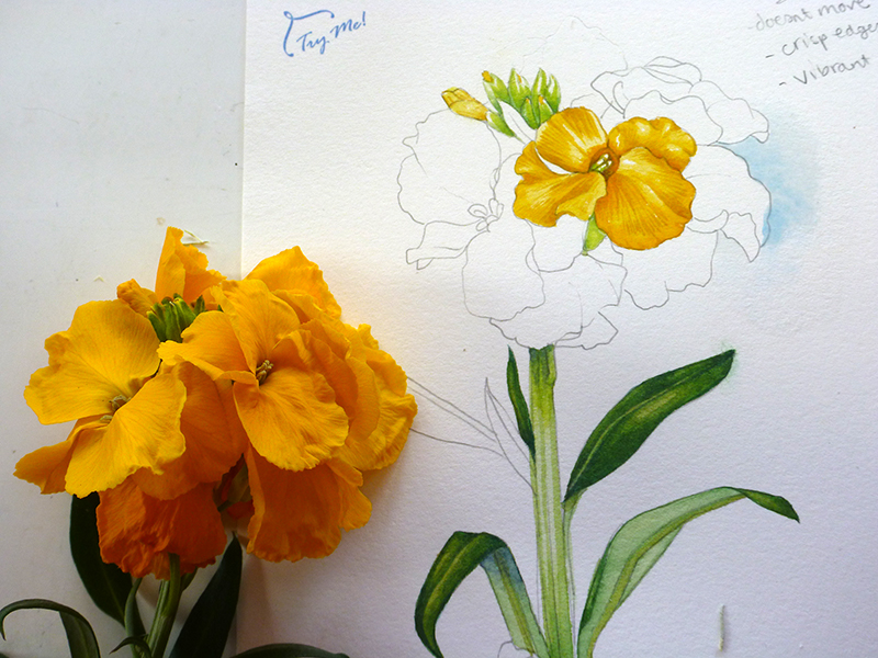
Wallflower alongside finished sketch on Saunders Waterford HP paper
Botanical Ultra Smooth
St Cuthbert’s Mill’s Botanical Ultra Smooth paper claims to be the perfect replacement for Fabriano, and is sold as such in art shops. I’ve used it before, with mixed results, so was interested to see how it compared to the other ones I’ve tested today. I painted a small blue flower for this one, something from a garden centre that grows in one of the flower beds. If anyone knows its name, feel free to tell me!
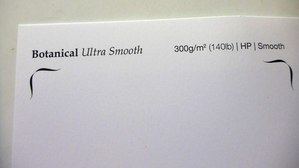
Botanical Ultra Smooth HP Watercolour paper
The surface of this paper is very white and wonderfully smooth. It takes graphite very well, and the first layer of paint goes down really well. Edges are crisp, detail is stark. Perfect.
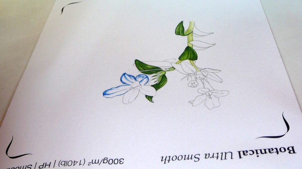
Working on Botanical Ultra Smooth HP watercolour paper
However, further layers of paint create problems. The paint seems to clump together and blur edges, but more than that (and unlike any of the other papers tested today) the colours seem to become a bit muddy. They seemed to bleed into each other very slightly making for a bit of a mess. This issue intensifies with each subsequent wash or layer of paint applied. Edges, both within leaves and petals, and against the white of the paper, are not very clear or crisp.
We should bear in mind that this was the last paper I tested today, and I quite possibly had lost my edge; the fault could very easily have been with me rather than the paper.
However, looking at my sketch, I felt like it was done by me a long time ago, and is missing the crisp detail I’ve worked so hard to achieve over the years.
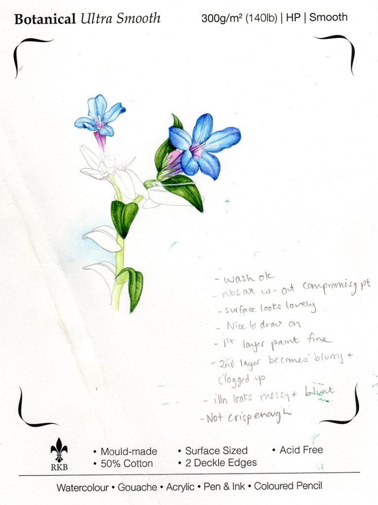
Finished sketch on Botanical Ultra Smooth HP from St Cuthbert’s Mill
The paper was fine with wet washes, blotted easily and didn’t stain the page or leave tide marks and margins.
It rubs out fine, graphite is cleanly removed and you can rub on top of paint without altering the surface. Because the paper is quite hard, rubbing out doesn’t leave dents in the page.
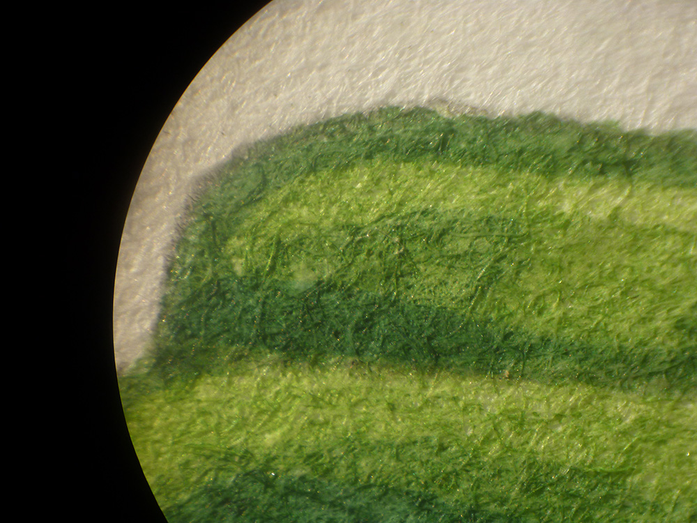
Under the microscope it was interesting. The fibres of the paper were similar to Arches and Moulin du Roy, fine and closely knit. However, the edges were noticibly less crisp than with either of these two competitor papers, and the darker secondary layers of paint looked blotchy.
Summing up my feelings for Botanical Ultra Smooth, I’d have to say that I’m not convinced. It looks amazing and feels great, has a wonderful birghtness to it, and is true to colours; but the blurring and slightly muddy effect of layers of paint made it my least favourite of these test papers. It’s made by the same company as Saunders Waterford; if they could somehow combine these two papers we’d be getting close to a dream paper. But for me, Botanical Ultra Smooth was the only paper that made me feel like I couldn’t paint well any more, and for me that’s a deal breaker.
Conclusion
The conclusion to my research is not some wonderful “Eureka!” moment where I can tell other botanical illustrators that there’s an ideal replacement for Fabriano. There is not. I will be continuing to use Fabriano, working with Arches Hot Press (and remembering not to rub anything out), Moulin du Roy (and seeing if I can sort out the issues with details being lost), and perhaps with Saunders Waterford in the future.
None of these alternatives are as good as the old Fabriano was, and I do wish the alterations in manufacture hadn’t happened. Saying that, any botanical illustrator worth their salt should be able to knock out a decent and accurate illustration on any of the papers I tried today, and on the altered Fabriano, too.
I do also need to stress that these tests are entirely my own opinion, and that I think everyone feels differently about the paper that they paint on. These alternatives are all worth a test, to see how you as painters and illustrators feel they suit your style.
To see some other opinions and reviews sparked by the alteration to Fabriano (and there’s a wide range of different opinions on the subject!), please follow links to posts by Dianne Sutherland, Jackson’s Art shop, Shevaun Doherty, Making a Mark, and Gaynor’s Flora.
Interesting information. Thank you for sharing your comparisons and thoughts on these papers.
Hi Teresa, Absolutely my pleasure.
Lizzie
Many thanks for taking the time to review the papers, it was an interesting read. The blue flower in your last illustration looks like a gentian 🙂
Hi Gilian
Thanks for this. It ended up being quite a quest, but I’m glad I did it! I now switch between Legion’s Stonehenge Aqua and Fluid 100 hotpress paper; both suit me to the ground. Yes, yorue right, it does look a little like a gentian! Painting blue flowers is such a treat. Thanks for the comment x
Hi Lizzy!
Thank you so incredibly much for your comprehensive reviews and comparison! They are just so incredible and helpful!! May i ask, was the arches paper you tested from a large sheet or a pad/ block do you recall? And did you test both sides? I have a sheet of the Arches hot pressed and the sides differ . I also compared the sheet to the pad of arches and they appear to be quite different – the sheets seem sturdier and one side is definitely more textured (the side the watermark reads ‘correctly’ is definitely smoother. I have heard that its not possible to always tell which id the ‘correct’ side of arches paper based on the watermark due to inconsistencies ). So sorry for talking so much! Paper is quite frustrating/ confusing at times! I use it primarily for drawing. May i ask, have you had
Hi Paige
Good questions. The Arches I tested was a sheet, not from a block. And I used the top side, the one where the watermark reads correctly. I did not test the other side, although people have suggested it. With some of the other papers, I do work on either side (Fluid 100 and Stonehenge aqua are similar on both sides) but this is mostly is a rough gets rejected, I don’t want to waste the paper so just use the other side of the sheet. That’s so odd that the pad and individual sheets differ, I didn’t know that was the case. Thank you for letting me know. Paper is indeed frustrating, and never apologise for asking questions about something which you need answers to! Just wish I knew more! That’s interesting that you use watercolour paper for drawing, I tend to use heavy cartridge, especially with pen and ink as the ink tends to bleed a tiny bit on some watercolour pages. Same for graphite, but I can see why graphite onto hot press would work really well, and feel luxurious too. All the best, and thanks for the quewstion! x