

Illustrating Yellow flowers: Five approaches
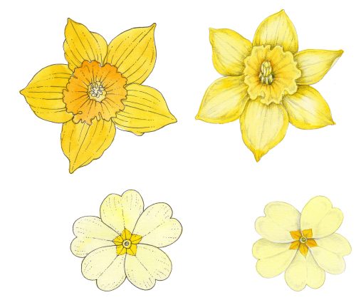
Botanical illustrations of yellow flowers can be really challenging. As you try to add depth to the darker areas of the flower, you run the risk of making the petals look green, or orange.
Here are a few techniques to try which should help mitigate this.
Yellow Flowers 1: Pen and ink
An easy way to bypass a lot of the struggles with darkening a yellow is to use ink. If you draw your flower in permanent waterproof pen, then when you add colour the ink won’t bleed into the watercolour. The ink lines “hold” the shape of the flower, and you don’t need to waste time worrying about shadows.
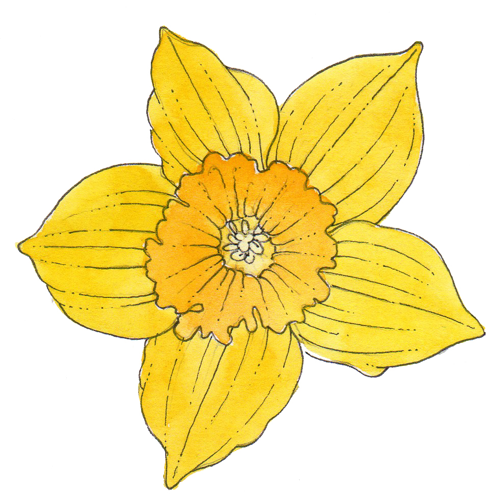
Daffodil delineated with pen and ink
This approach is probably more appropriate for quick sketches than for highly polished pieces, but it creates the desired effect with minimal time and very little heartache.
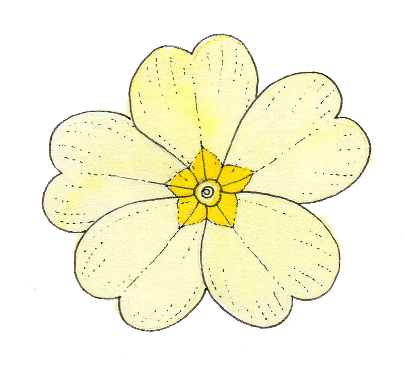
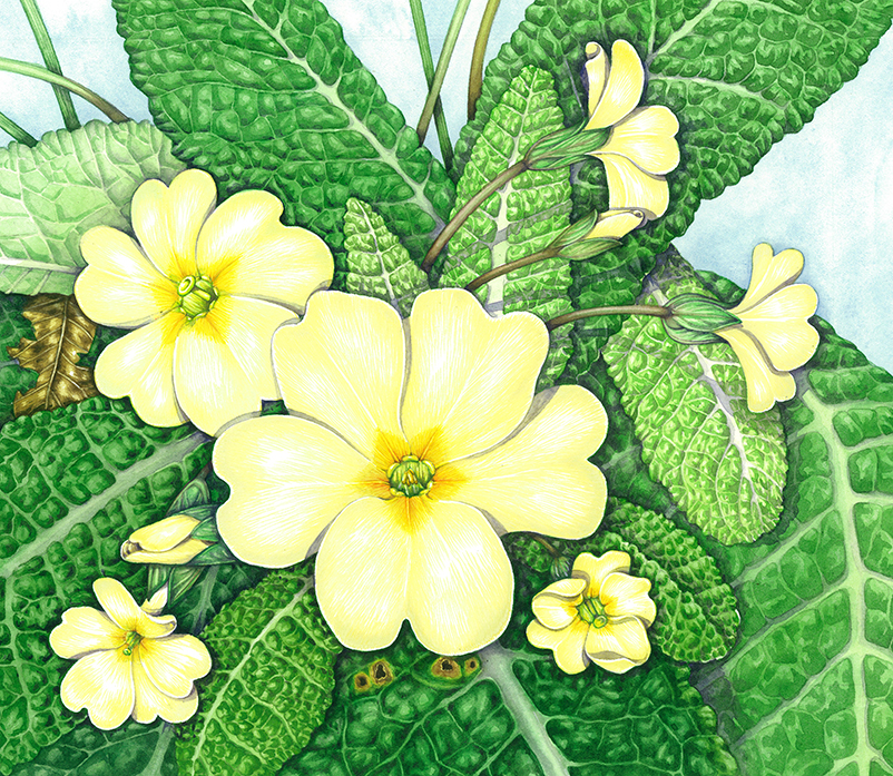
Primrose delineated with pen and ink
Yellow flowers 2: Pencil
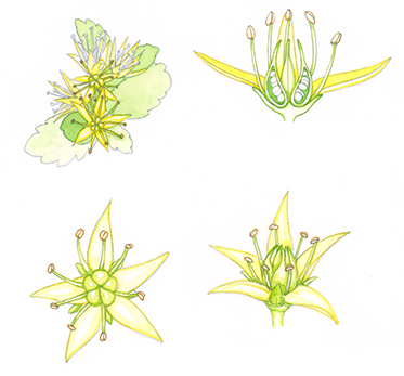
In a similar vein, using pencil to add shadows can work really well. I’ve used this not only in demonstrations, but also on finished illustrations for clients. It’s a similar approach to the pen and ink, but has far softer results. I find it particularly useful if you’re painting yellow composite flowers which have lots of tiny florets. In the White mustard Sinapis alba detail below I’ve only used the pencil to outline the petals. It keeps the yellows pale and clean.
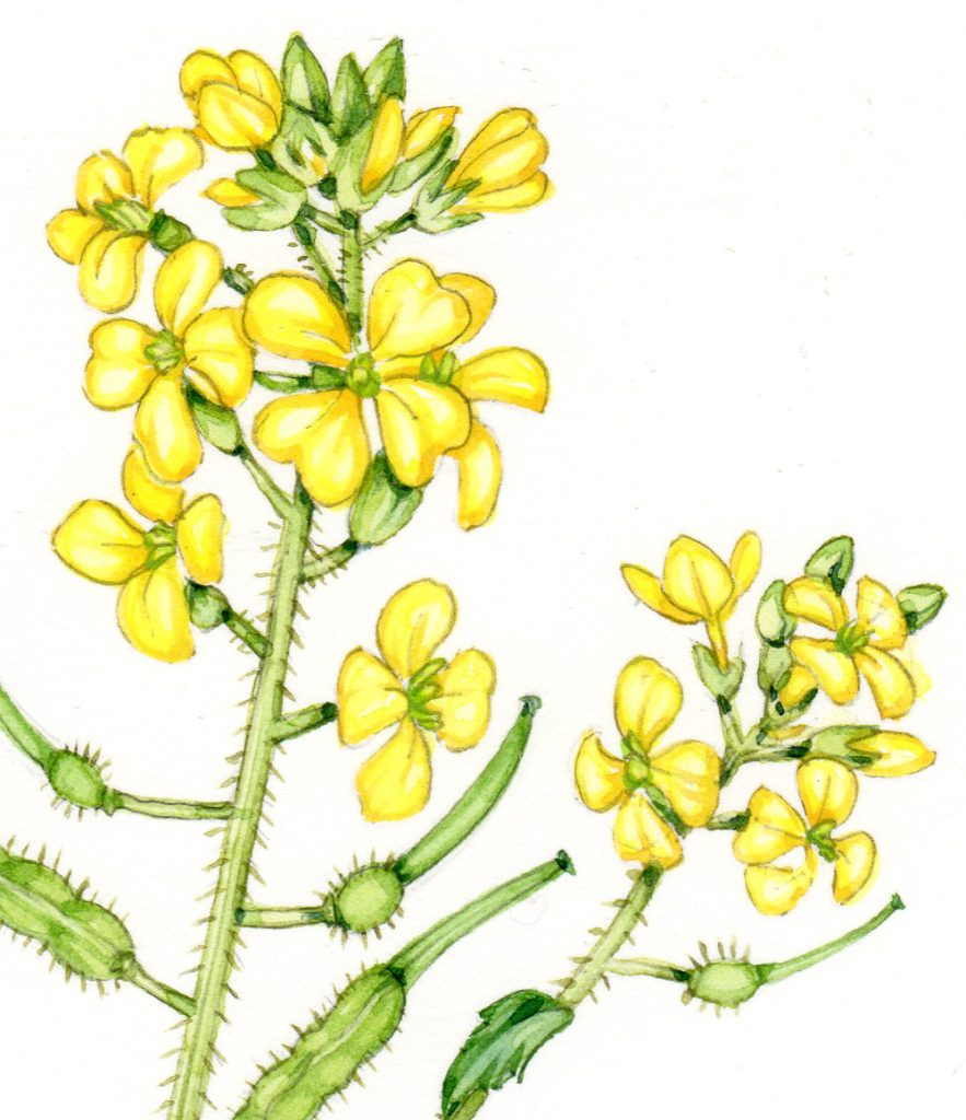
White mustard Sinapis alba detail
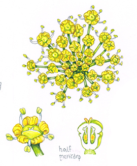
Pencil can also be really useful if you’re working into accurate details where you want to suggest colour, but where colour is not the focus of the image. In these cross sections of the Siberian stonecrop, the illustration is pencil, then a very pale colour wash covers this.
Flower details and cross section of the Siberian stonecrop Phedimus hybridus
You can go for a bolder approach with the pencil, adding shadows. This works because the graphite is a neutral colour. It doesn’t add any green or orange hues to the flower as you use it to show darker areas of tone.
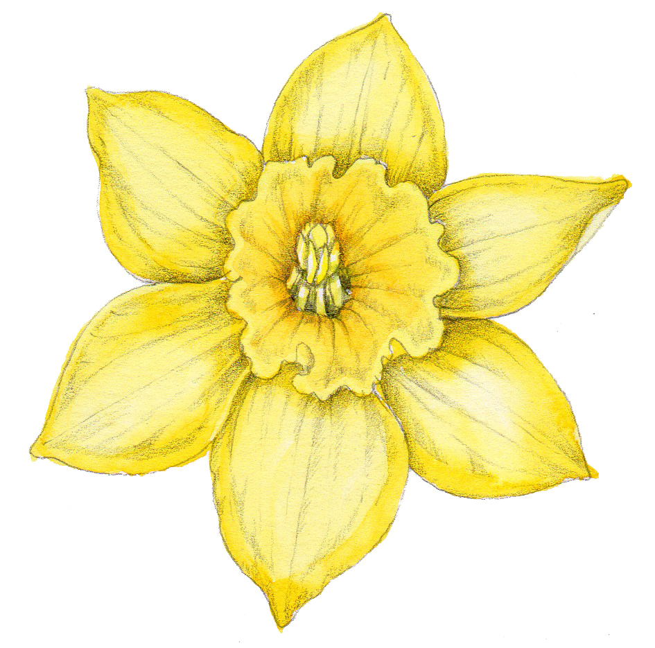
Daffodil with shadows shown using pencil
As with all pencil drawings, the harder you press with your pencil the darker the line. I favour HB or 2B pencils for this tonal work as you can get some darker regions without too much trouble.
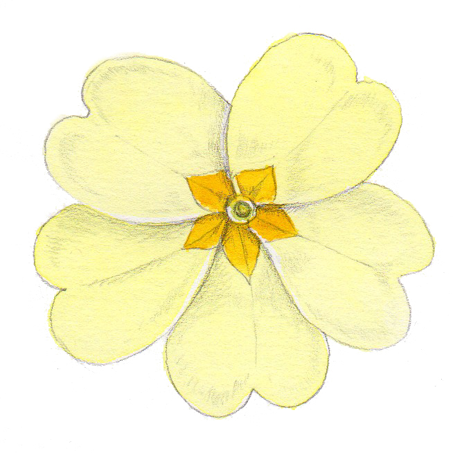
Primrose with shadows shown using pencil
I like to put the pencil over the top of a completed watercolour. However, it works equally well to put a yellow watercolour wash on top of the pencil, which in effect is what I do with areas of my sketchbook illustrations.
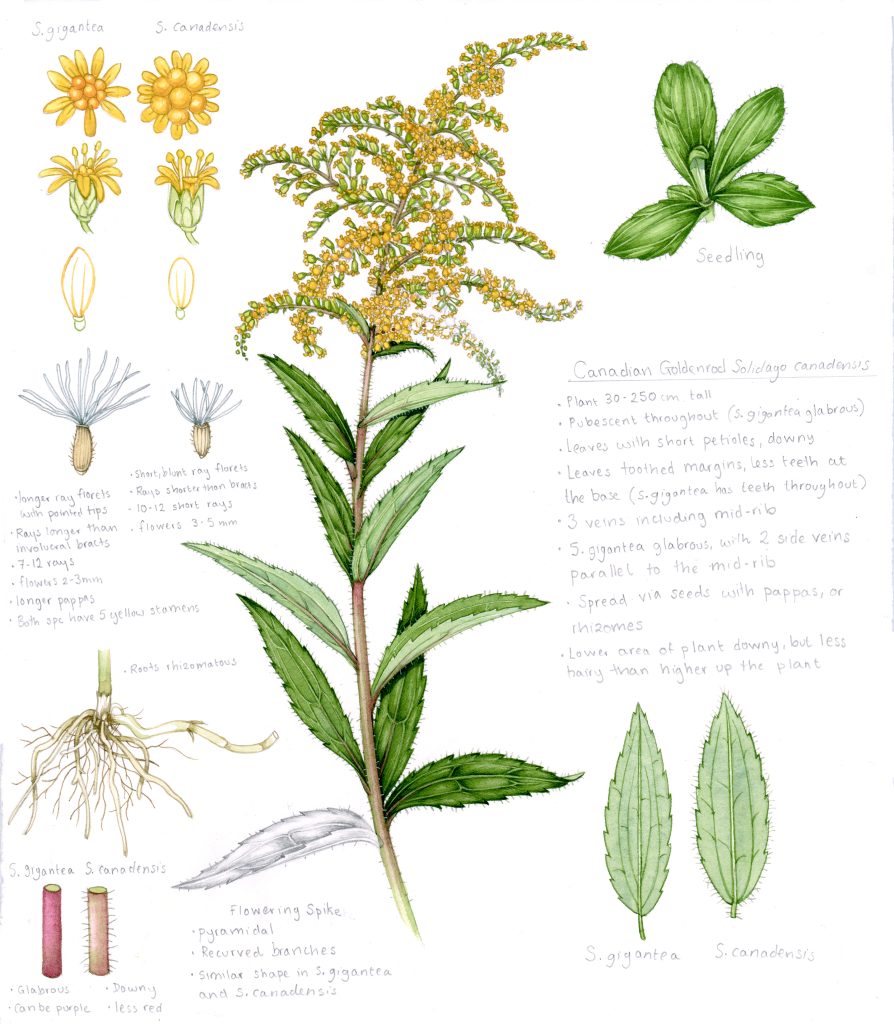
Canadian Goldenrod Solidago canadensis
Here’s a close up of some individual flowers of the Wild parsnip Pastinaca sativa sylvestris. you can see clearly that almost all the tonality is provided by the graphite. And, in fact, there was no need to provide any mroe pencil than the outline, The tiny flowers allowed this minimal approach to still convey something of the tonality of the plant.
Wild parsnip Pastinaca sativa sylvestris
Yellow flowers 3: Neutral tint
Ass hinted at before, the best way to avoid making your yellow flowers go the wrong colour is to use a neutral colour for the shadows. In general, you can mix these using colours opposite one another on the colour wheel. For example, try mixing a purple and a yellow, or a blue green and an orange red. For more on mixing and using neutrals, have a look at my blog.
Primroses with shadows provided by neutral tints
You can buy pre-mixed tints too, which do the job. I really like to take my “go-to” neutral a little to the purple side as the interaction between the yellows and the purple pleases me. If the yellow is a little darker, I’ll tweak the mixing of the neutral tint accordingly. In the Yellow waterlily below, I added a touch of orange to warm up the flower.
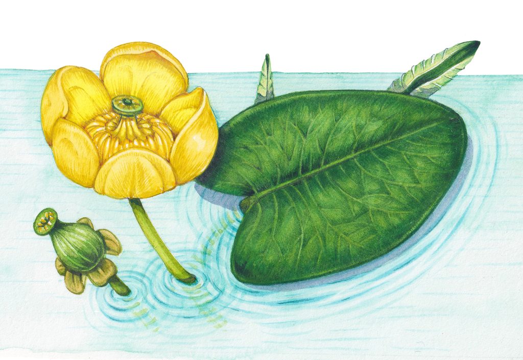
Yellow waterlily Nuphar luteum
Yellow flowers 4: Put some green behind it!
As with my blogs and films on illustrating white flowers, one of the easiest ways to show the edges of pale white (or yellow) flowers is to put foliage behind them.
This is easy in instances where the growth habit allows (as with the primrose, above).
In the example below, I tweaked the position of the leaves and sepals to help give structure to the flowers. Even so, it’s rather heavy and overworked, and I have made the flowers too orange by darkening them internally with too orange of a colour.
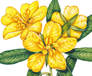
Water primrose Ludwigia grandiflora
Christina Hart-Davies has demonstrated this trick somewhat more elegantly with her posy of Beltane flowers. The majority of the blooms are held against the large central green leaf. You don’t notice you’ve been tricked, but that’s what’s happened. You simply register a beautifully illustrated posy. But it’s been carefully constructed to make sure the edges of the yellow and white flowers are delineated with minimal effort.
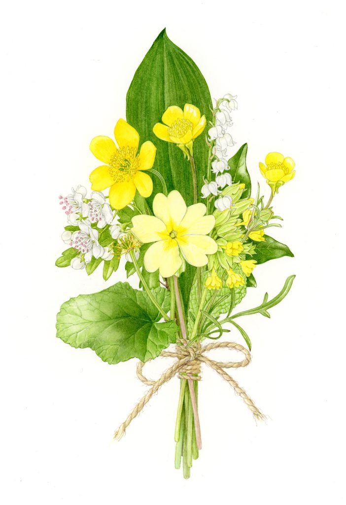
Christina Hart-Davies‘s Beltane posy showing how putting leaves behind flowers helps.
You can exploit this further. Backgrounds of any sort will help keep your yellows nice and light. If you’re illustrating elements on a landscape, then what’s going on behind the flower (or in this case butterfly) will throw the illustration forward. And you won’t have to worry about delineating the edges. In fact, in the detail below there are two layers of this going on. the very pale butterfly is backed by the darker evening primrose flowers. And they are backed by the suggestion of grass. Again, there’s that neutral tint at play, casting a shadow from the butterfly wings onto the flowers.
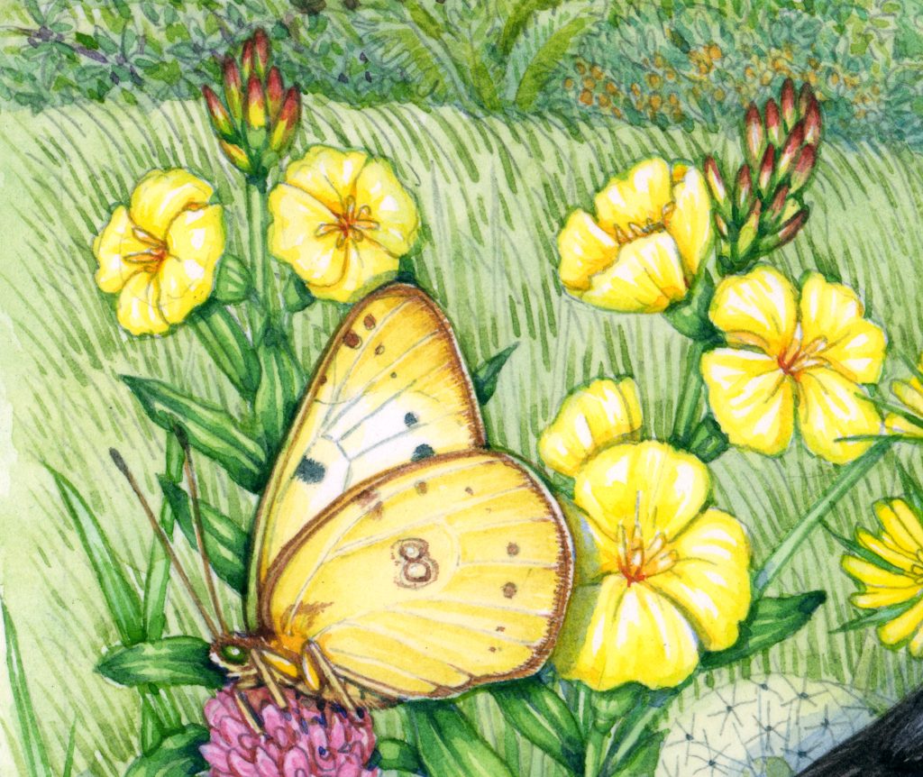
Clouded Yellow butterfly Colias croceus on Evening primrose (detail of larger landscape)
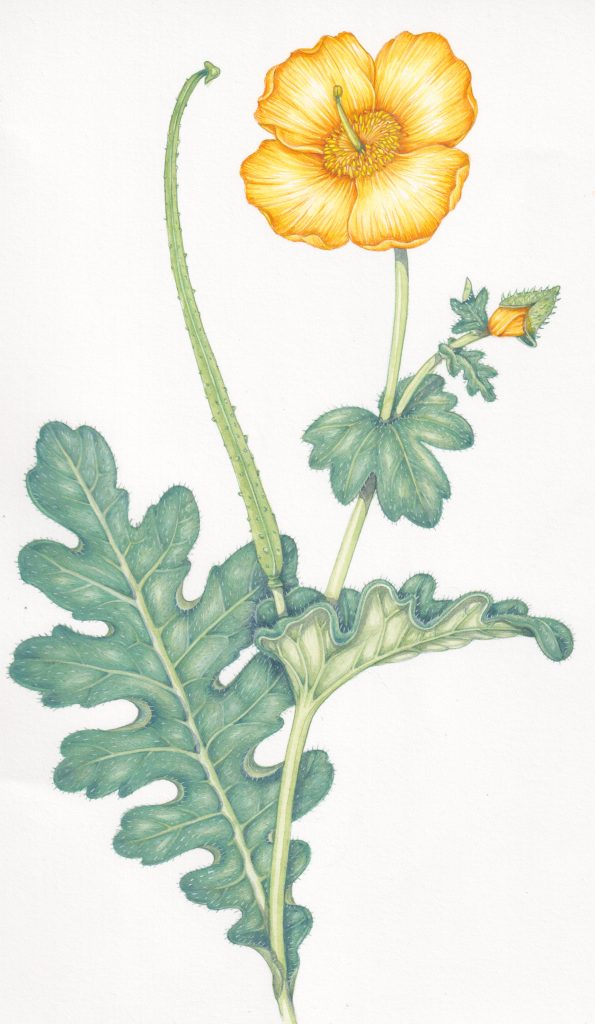
In another example, I used a shingle beach to throw the illustration of a Yellow horned poppy into sharp relief. This was for Jersey stamps (for more on this project check out my blog). Note that I put a purple-blue tint over the pebbles. Again, a cheeky way to throw the yellow petals into sharp relief.
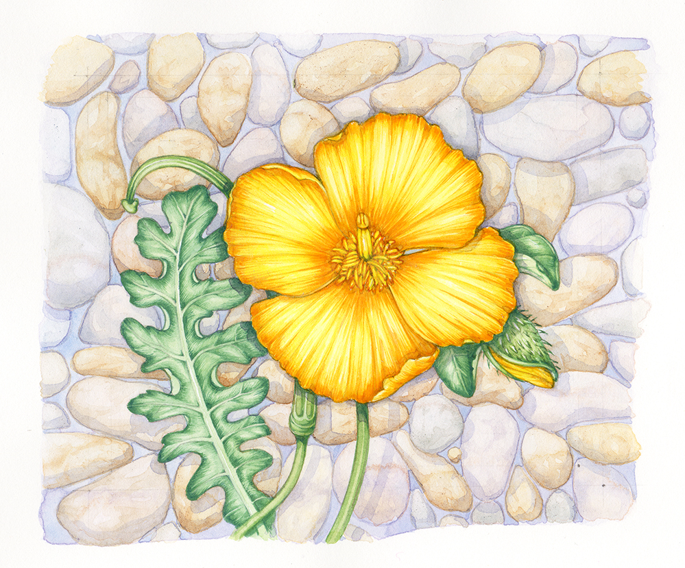
Yellow horned Poppy Glaucium flavum (copyright Jersey Post 2021)
Yellow flowers 5: Use orange and greener yellows…with care!
Writing this blog, I’ve realised that I do, in fact, often darken my yellows with reds or greens. As long as you’re really careful this can work fine. it doesn’t necessarily swallow up the yellows. if you keep an eye on your highlights and allow that white paper to remain clean and clear, then these coloured shadows can work well.
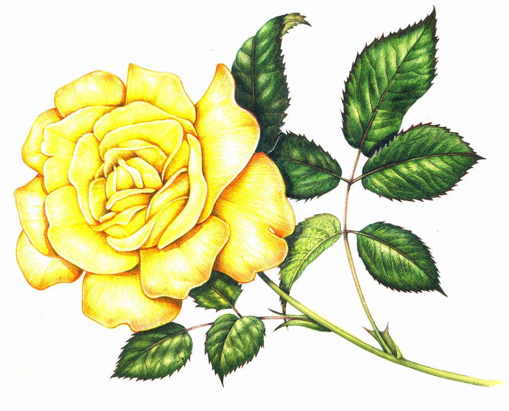
Yellow rose for Jersey Post (copyright Jersey post 2014)
The rose above has shadows picked out in oranges and dark browns. An isolated detail below shows more. In fact, the orange has added warmth to the pale yellow petals.
Detail of the rose above
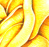
In the illustration of the Globe flower below, the darker areas have been picked out with a green-yellow rather than an orange-yellow. Again, enough of the main petal has been left untouched to allow it to continue to register as a clean, yellow flower.
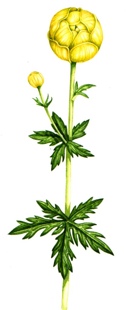
Globe flower Trollius europaeus
But if you take a good look at the close up detail, you’ll see how much green was used to provide the darks where the petals overlap.
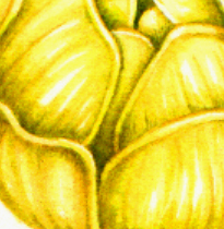
Globe flower detail
I would also suggest that the yellows in these illustrations are passable, but not as clean as they would have been if I’d used one o the other techniques mentioned above.
Conclusion
I think it’s important to experiment with different approaches, and to find what works best for you as an individual. For soem people the idea of layering graphite over watercolour would be abhorrent. For others it might be a god-send. I like my neutral tints to be a little purple, others may like them entirely neutral, or veering toward a different hue, Pen and ink with top wash may not be for everyone, but it’s a great way to start, or to get quick sketches down.
You may also find you’re less heavy handed than me with the green-yellows and orange-yellows. Perhaps you can use them without any loss of vibrant colour.
Or, the way you paint allows you to move foliage around every time, or maybe you always have backgrounds to your work so don’t need to pull leaves about.
Hopefully, whatever you find you do or prefer, there’ll be a couple of ideas in this blog on painting yellow flowers that might work for you.
Yellow horned poppy Glaucium flavum
Thank you for this Lizzie, plenty to think about for the beginner.
Regards Peter
Thanks Peter!
Thanks a lot Lizzie! Really helpful blogpost!
My total pleasure, Irma
Really helpful for my current project. I find shadows quite challenging and I am currently learning to paint white flowers.
Hi Christine
White flowers and shadows ARE tricky, they can be really challenging, Im glad that my blogs are helpful in some small way
Yours
Lizzie
I have a white Antirrhinum which is 2 years old and flowered for most of last year. I have nurtured it this year spreading it around the garden. On only one of the petals a pink stripe has appeared so I thought I would try to capture it in a painting.
When I separated the petals to identity the shape there are many small yellow insects. They look like the pollen has come to life. Please can you tell me what they are?
Hi Christine
How fascinating, Ive no idea what the insects might be. They sound like theyre toni, If they were black Id say they were pollen beetles, but theyre yellow. Thrips perhaps? Do they jump? Might they be springtails?
Sorry not to be more use.
Yours
Lizzie
Hi Lizzie, Thank you for your reply so soon, you have been very helpful, and yes they jump.
I have recently retired and plan to focus my attention on my art, I love painting flowers and whilst searching Utube for inspiration, found your site. I have only been following your site for 3 weeks and I have learnt such a lot just by watching you I feel inspired to carry on.
The white antirrhinum is proving to be a bit of a challenge but I have learnt how to master greys. Thank you so much. Christine Bentley
Hi CHristine
So glad the Youtube channel is helpful. And keeping whites clean but making them clear is one of the biggest headaches in botanical illustration, so dont feel disheartened! Im still not sure about your little insects but I reckon thrips of springtails? And well done carving out time to enjoy creating art and to explore drawing and painting plants. How emminently sensible!
Yours
Lizzie