

Hay Festival Mug Design
Hay Festival approached me early in the year, to see if I could come up with a design for the Hay Festival 2022 commemorative mug. I knew it was a big ask – a landscape full of local flowers and animals with Hay bluff behind, and plenty of references to the festival. I also knew that I would love working on it.
Pencil roughs
The first thing to do is to figure out exactly what you’re going to be illustrating. Consulting my botany books, I pull together a list of local wild flowers which should all be in bloom in late May (when the festival occurs). Then I add insects which will be present. These are early butterflies – the Orange tip Anthocharis cardamines, Common Blue Polyommatus icarus, and Small Tortoiseshell Aglais urticae. I add the White-tailed bumble bee Bombus lucorum, Soldier beetles Rhagonycha fulva, and the Marmalade hoverfly Episyrphus balteatus.
To break up the sky, I pop in a Lark Alauda arvensis and a Red kite Milvus milvus. Both these birds are quite common here, and I’ve seen Kites and Larks when walking up on Hay bluff.
The landscape is easy. Hay bluff had to take centre stage. This is our distinctive and stunning mountain, in the heart of the Brecon Beacons National Park.
I draw up my first pencil rough which shows what species will be included, and their position. It’s not got a lot of detail yet.
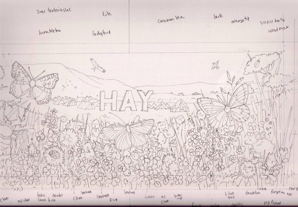
Initial rough showing what species to include, and where to place them
Over a lovely cuppa at Shepherd’s ice-cream parlour in Hay (where, by the way, you can buy my greetings cards), we discuss the rough, and decide to go ahead to a more detailed version. We decide to alter the Hay festival tents a bit, and move the bumble bee.
Detailed pencil rough
This rough takes time. All the species are drawn up exactly as they will be in the final illustration. I can make alterations (erasers are wonderful things), but the pencil drawing gets painted over, so it has to be right. It takes a couple of days to draw in all the plants, animals, and tents.
I also decide what size to do it. In this case, it’s 150% of reproduction size. This means it’ll glow more when reduced, but we won’t lose the detail when it’s shrunk.
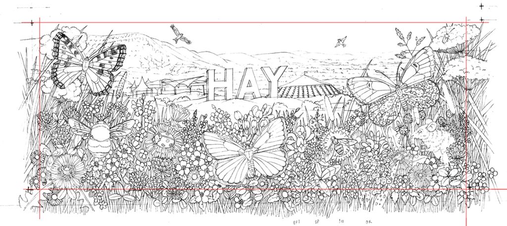
Detailed pencil rough
I add crop marks. it’s a tight fit, especially the wing tips of the red kite. But the crop marks work well. The illustration should effectively fill the space of the mug without any crucial parts getting cropped.
Mug mock-up
The rough gets the go ahead. I send it to the mug manufacturer, Duchess 1888 at Heraldic Pottery. This company is the only one in the UK which makes bespoke decorative bone china cups and mugs here in Britain; many others outsource abroad. Heraldic are incredibly helpful and friendly.
I’m worried about the curvature of the mug – will it massively alter the way the illustration sits on the cup and lead to unexpected cropping?
Duchess have a cunning graphics programme which curves the illustration. This proves incredibly helpful.
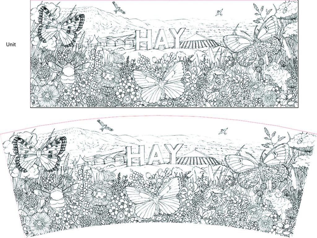
The illustration as is vs when it’s curved to fit the mug shape
They even go to the trouble of mocking up a mug for us, using the rough, so we can see how it looks. This involves creating a transfer, and applying it to the prototype mug. Once it had set, they made a short film to show the mug from all angles. They emailed us this film, and it showed everything working beautifully. Time to get the paints out.
Clip from the film Duchess 1888 sent us showing the pencil rough on the mug.
Painting a Hay on Wye landscape
I use the same materials as always. Fluid 100 Hot-press watercolour paper from Global Arts, my trusty number 1 size Series 7 watercolour paintbrush, and Winsor & Newton watercolour paints.
I start with the sky, brining a pale blue wash over everything but the very front of the illustration. Then I work into the hills and the background, keeping it really pale. You can always make watercolour paints darker, but it’s impossible to lighten them.
Next come the birds. Illustrating the Kite was ok, but the Lark really was tiny (less than 1cm), and I was working on an uncomfortably tiny scale. And loving it.
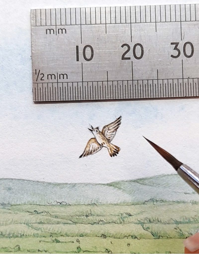
Tiny lark with a ruler and my Series 7 brush
I love to listen as I work. Painting this landscape saw me hear all of Song of Achilles on Audible audiobooks, lots of back episodes of the brilliant Americast podcast, plenty of BBC Radio 6, and the fascinating Entangled Life (all about fungus) by Merlin Sheldrake.
The bunting on the tents is fun to colour, and I’m really happy with the flat vibrancy of the “HAY” letters. I’d wondered if they might get lost or be too dark. Turns out they’re fine, Phew.
Illustrating flowers
Once the landscape is done I start on the flowers. It’s always the same process. Paint the background, Then the leaves and grasses. Follow up with flowers. Finally, add animals. For more on this, check out my blogs on illustrating an orchid meadow, Malham cove, a water meadow and a cross section of a hay meadow.
It’s vital to get a variety of greens there; some bluer and some yellower. This is often a challenge, but if they greens are too similar the whole illustration looks flat. It’s funny how very blue some greens can be. A clover leaf is a whole world bluer than a speedwell leaf.
In this case, I got a bit bored of wandering amongst greens, so moved onto flowers before dropping in the grasses.
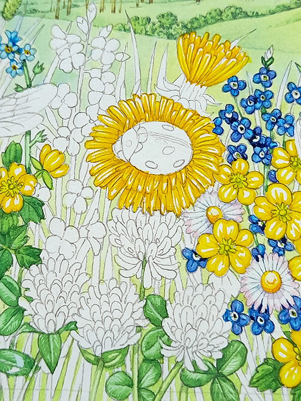
Ladybird on Dandelion (in prgoress)
The flowers have to glow, so I keep plenty of white on the petals until they are all blocked in. then I put really pale top washes over them to unite the plants. In this case, I used a very diluted Dr Martins Hydrous inks yellow – one of the cleanest yellow pigments I’ve found to date.
Illustrating the animals: Butterflies
It’s a treat when I have a sheet of paper with all the landscape and plants completed. Then I can add each animal, one by one. It feels like dropping in missing jigsaw pieces.
The butterflies are a challenge as they need to be really bright as well as vibrant. The trick is to balance saturated colour without making them too dark. Tiny brush marks help with this as they build up colour without swallowing all the white of the page. I also am lucky enough to own a collection of Victorian butterflies, so can check my colours against these gems.
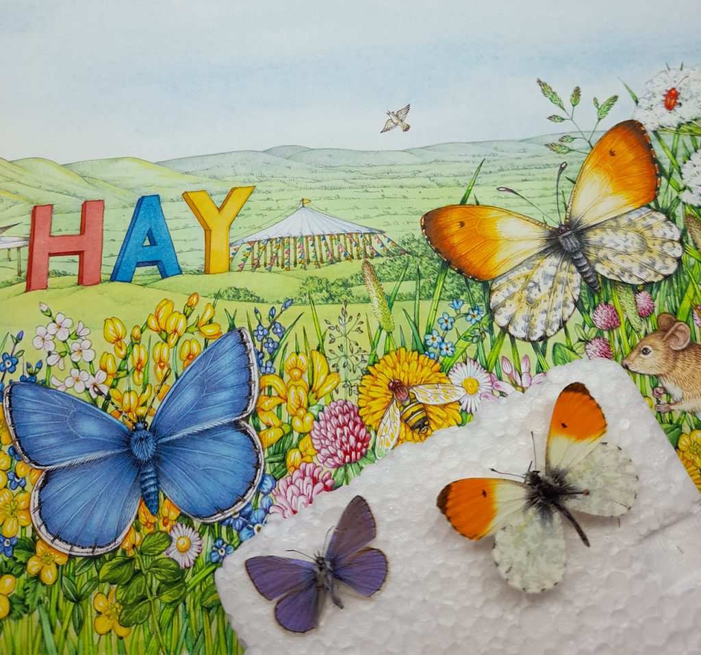
Common blue and Orange tip illustrations and specimens
The Common Blue isn’t pink enough. This was a conscious decision. Individuals do vary in colour, but I was taking a slight liberty. The butterfly had to echo the bright blue of the letter “A”, and if I’d gone too purple that wouldn’t have worked. I hope I can be forgiven…
The Small Tortoiseshell is one of our commonest butterflies, but it’s so beautiful that I never tire of illustrating it. That azure of the wing margins and the deep oranges of the wings. It’s a stunning insect. This one has worked out ok. The oranges echo the colours in the Orange-tip butterfly. This helps draw the eye across the illustration (actually, I suppose I should say “around the mug”).
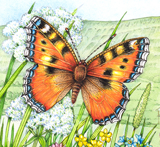
Small tortoiseshell detail
Illustrating the other animals
Illustrating ladybirds is so much fun. That shiny red against the glowing yellow of the dandelion? Loved it. Although, looking at it now, I think perhaps the elytra are a little too pink…? The red Soldier beetles were easy enough, and I enjoy the fact that I’ve got them mating on the cow parsley. I see them doing this all the time, but it makes me smile when I manage to sneak something a little more than PG-rated into my illustrations.
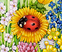
Ladybird detail
The mouse took ages, but worked out well. I wanted to echo the pinks and reds of the clover in its fur, and add enough definition for it to look a little lifelike and not flat. I still spend hours looking at the amazing illustrations done by Beatrix Potter, and am green with envy. Her mice are especially wonderful.
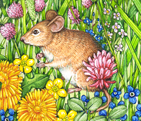
Mouse detail
Bumble bees are lovely, but not easy to illustrate. Combining the black colour with the feeling of furry-ness is something I’ve not fully mastered. But having paler versions of the grasses and flowers behind the wings is easy to do, and a good way to fool the eye into believing wings are transparent.
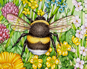
Bumble bee detail
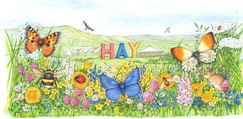
Finished Illustration
Tweaks relating to adding shadows to the illustration, balancing the reds across the page, and crisping up edges take for ever. They’re worth doing, though. You end up feeling the whole image is brought into focus. The reduction will amplify this effect, and hopefully will make the colours even more jewel-like.

Finished Hay Festival 2022 mug illustration
There’s a short film to accompany this blog.
Luckily, the team at Hay Festival are really pleased. They’re planning on getting a series of limited edition prints made, along with greetings cards and perhaps postcards. There’s talk of them buying the original illustration for their office wall. It’s all very flattering.
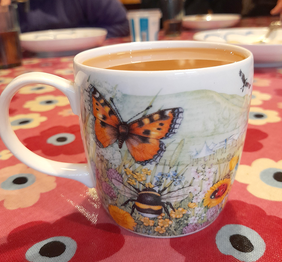
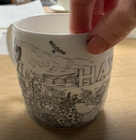
Finished mug…full of tea!
Personally, it’s the finished mug that I’m so pleased with And if you want your own mug to drink tea from as you peruse this blog, just click on the link to the Hay festival merchandise shop.
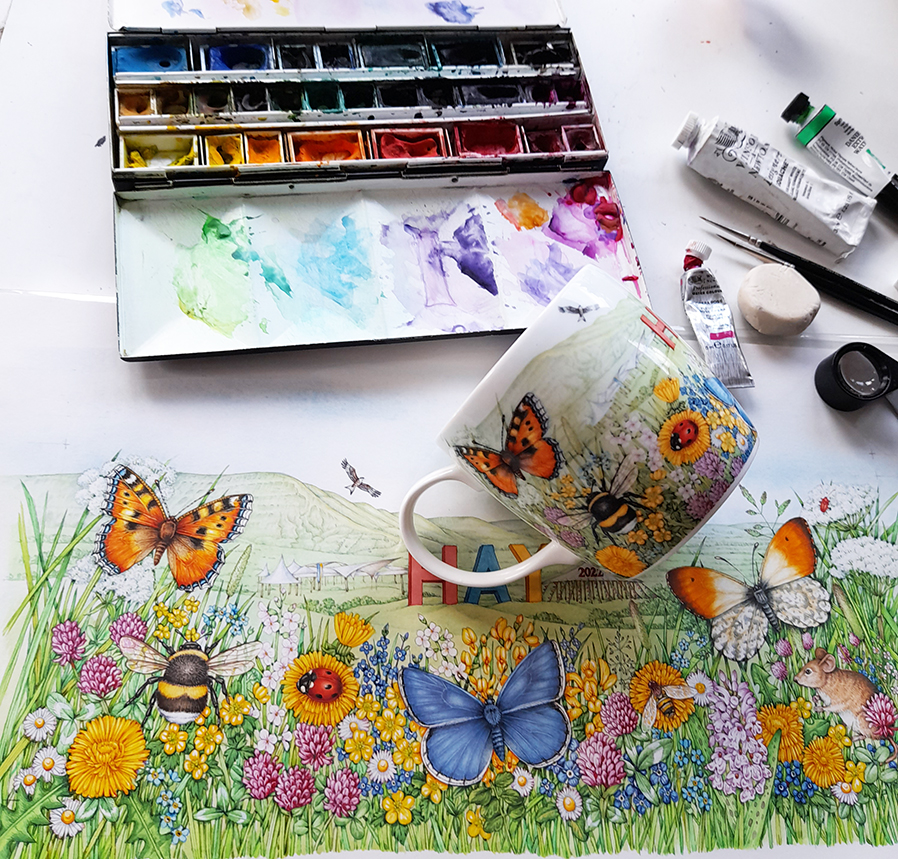
Hay festival mug with artwork and paintbox
Hi Lizzie, love your work! that is all I am going to say.
Regards Peter
Aww thanks Peter! You’re always so kind about my projects.