

Composition and sketchbook studies
Winter, and my natural history illustration work continues. There’s no problem sorting out composition and sketchbook studies if they’re of conifers, like this Douglas fir.
Sketchbook studies: Composition
Instead of examining the techniques involved in mixing colour, I thought it might be an idea to discuss composition. This is how a botanical subject sits on a page.
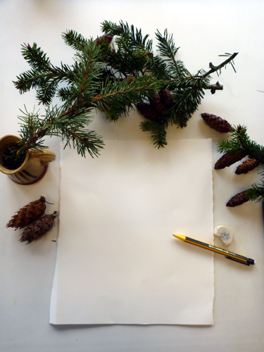
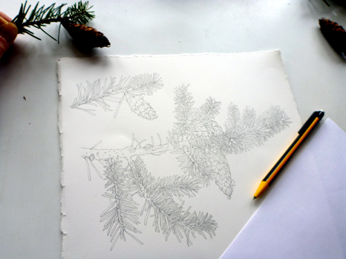
Here we are at the very start of my sketchbook studies; lots of specimens, a blank sheet of paper, and a deadline.
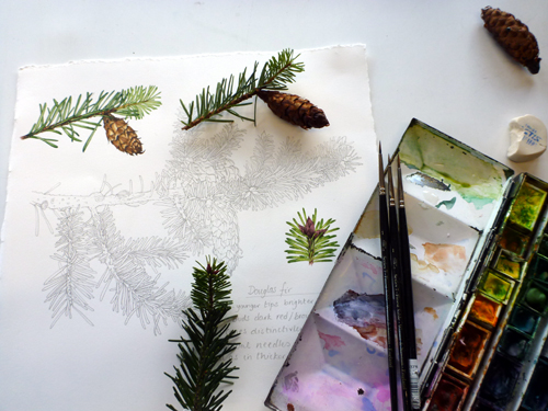
I know what elements I need to include in the composition of this sketchbook study. I need a decent sized “habit” drawing; a picture which shows how the branches attach, where the pine cones grow, and shows the shapes and map of where all the pine needles lie. I know I want a full colour study of a pine cone, with attached needles.
The focus of this illustration is the bright green fresh needles, or tips. I want to show the buds they come from, how they look as they emerge, and how they look once fully out. There also needs to be a block of text, compromising my notes on the plant. All different elements to balance in the composition.
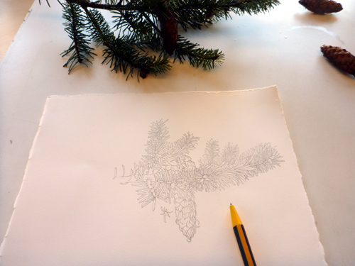
First up is the habit drawing, which forms the backbone of the piece. I want it to stretch across the page, but need to make sure there’s nothing to jar the eye (when something looks wrong in a composition). I need to be sure I don’t bore the viewer by lining up the cone so it’s bang in the middle of the page.
This pencil study is going to need to have curves and dips, some movement, as the following studies will be smaller and less able to move the viewer’s eye around the page. These things need to be remembered along with ensuring botanical accuracy isn’t compromised.
Sorting out the addition of details in the composition
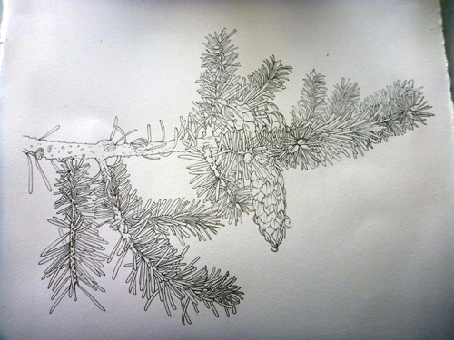
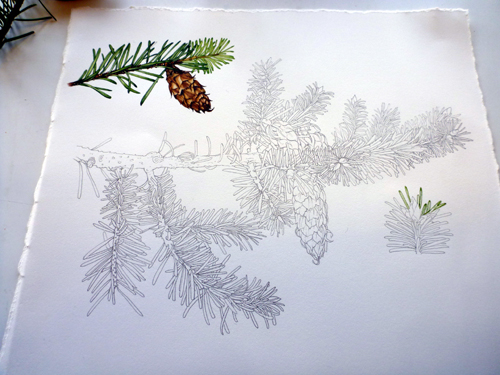
The habit sketch is complete, and I chose a specimen which has left a natural space for other details around it.
I want an area of colour to engage the viewer, so have plotted the pine cone and twig in the top left. Again, along with getting the details right, it’s important to leave enough space around this detail so it doesn’t feel cramped; and also to be sympathetic to the shapes of the central illustration. I drew the twig at an upright diagonal to try and ensure this.
Balancing colour in a composition
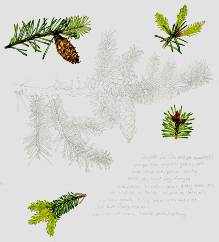
With a block of heavy colour at the top, it’s vital to provide a visual anchor lower down on the page. A study of the buds contains similar colours, and fits neatly into the space below the lifted branch tip. Below this, I can put in the text block.
With the buds complete, I need to put in some tips emerging, and some tips fully emerged. I out the first element (lighter in colour and smaller) at the top right; and the second down below. I’m not entirely convinced this has worked. The yellow in each carries the eye through, but I think the text has failed to anchor the illustration quite as firmly as I’d’ve hoped for. However, I do think all the elements work well in terms of fitting on the page without jarring the eye, and it’s just a matter of the weight of the composition which hasn’t quite worked out ideally.
In Conclusion
It’s odd deconstructing these decisions. None were taken consciously as I did the composition of this study sheet. I guess it’s like all things, the more you do it the less you think about what you’re doing.
However, there’s so much to learn about good composition. The old botanical artists were excellent at using the page efficiently and beautifully (and often very boldly. Check out the Clutius Botanical Watercolours book by Claudia Swan).
Often the only element that detracts from a gorgeous botanical illustration relates to composition. Without a decent layout any illustration can look average. It’s something which needs to be considered, in every illustration that you do.
Thank you Lizzie for sharing the thought process behind your sketchbook study. I love reading your blog and I have certainly learnt a lot from your posts and YouTube videos so thank you 🙂
My total pleasure Casey, thank you for your feedback and support!