




Review of Arrtx 24 Colors Watercolor Paint Set
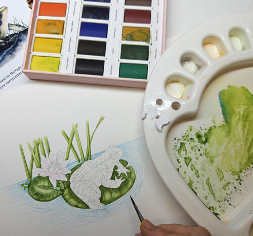
I was recently sent the Arrtx 24 Colors Watercolor paint set to review. Manufacturers send out new products to be trialled this from time to time, and I always point out it’s a bit of a risk as I am brutally honest in my reviews. Some watercolour paint sets are great (like the Paul Reubens Artist Level Youlan series, reviewed here), others not much good, and some, like this one, lie in the middle ground.
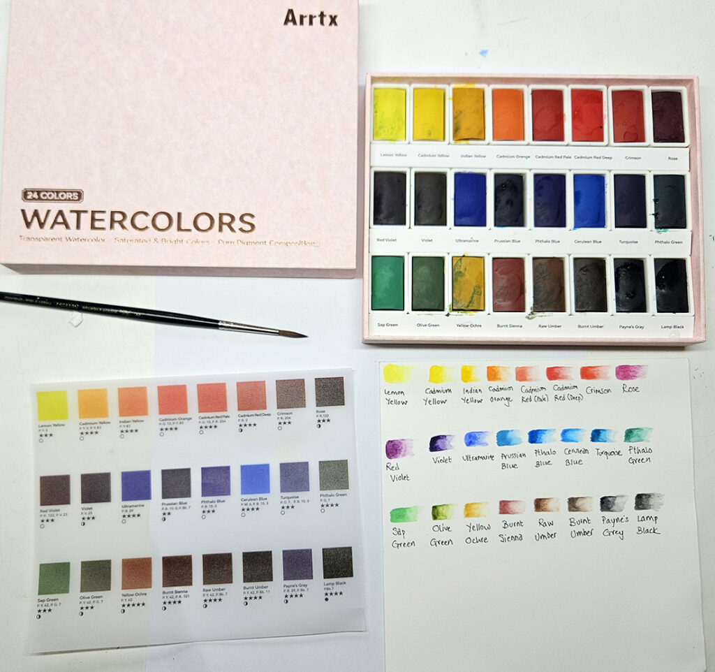
Arrtx 24 paint set (after I’d used it)) with my colour swatches
The look of the Watercolour Set
The watercolours are laid out in three rows of eight paints, in a neat pale pink box with gold writing.
On the back there’s an image showing what colours are inside. Something has gone a bit wrong with the printing, so they all look dark and muddy.
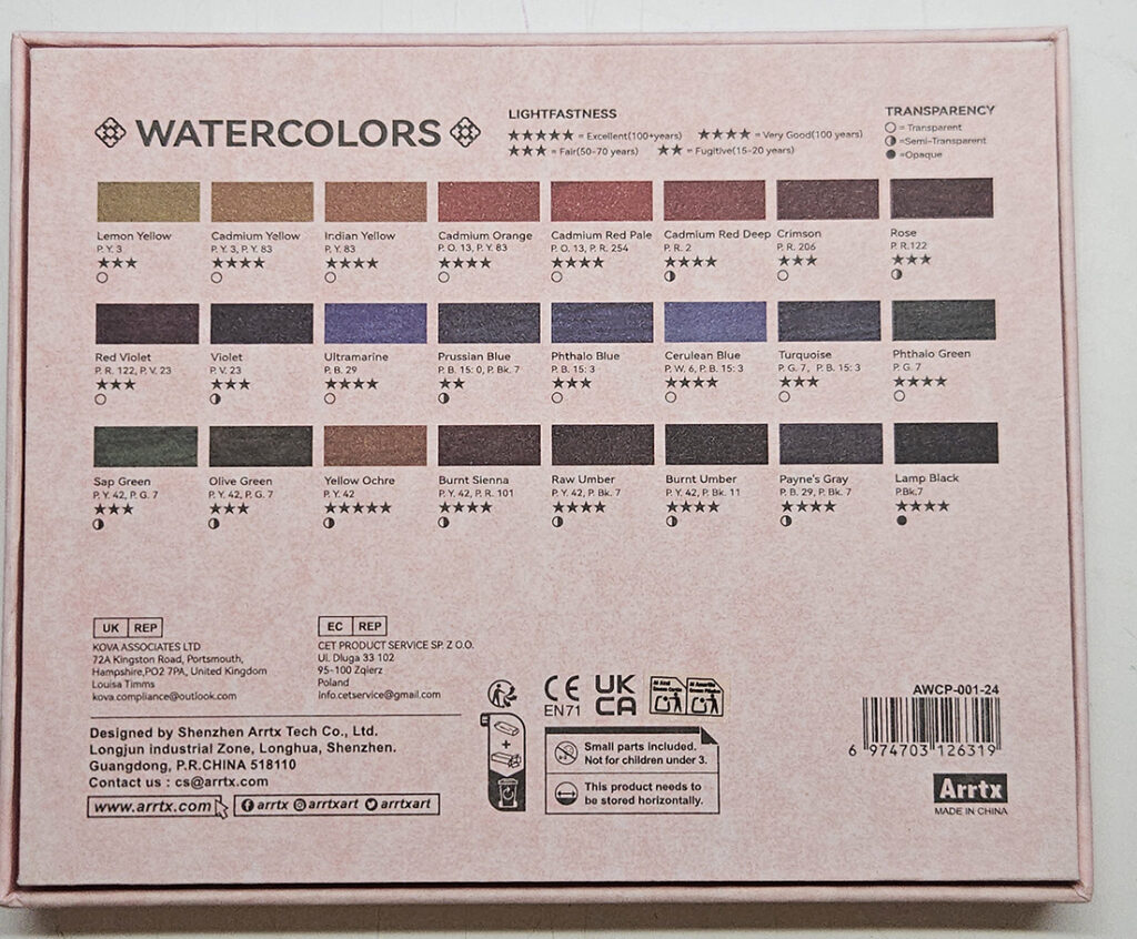
Misleading colour guide on back of box
Inside the box, a colour guide is printed on translucent paper, and laid over the paints.
The lid is cushioned, and there is no palette. I love mixing palettes integrated into a watercolour box, and although I know this is a personal preference, I sighed as I pulled mine from the drawer and gave it a quick wash.
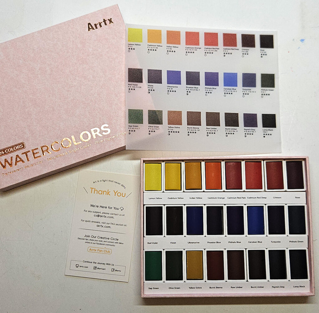
Arrtx 24 opened paint set
The colours
The colours are a good selection, plenty of yellows, reds, blues, browns, and greens, and a couple of purples. There are some pinks to work with.
All have consistent textures, and none are granulated. They mix together really smoothly, and do not separate back out after mixing.
The Subject
Drawn up onto Stonehenge Aqua hotpress watercolour paper (one of my favourites, for more on me testing different papers for watercolour click here); this is the Common Frog Rana temporia, sat on a lily pad with stems of Yellowflag iris behind.
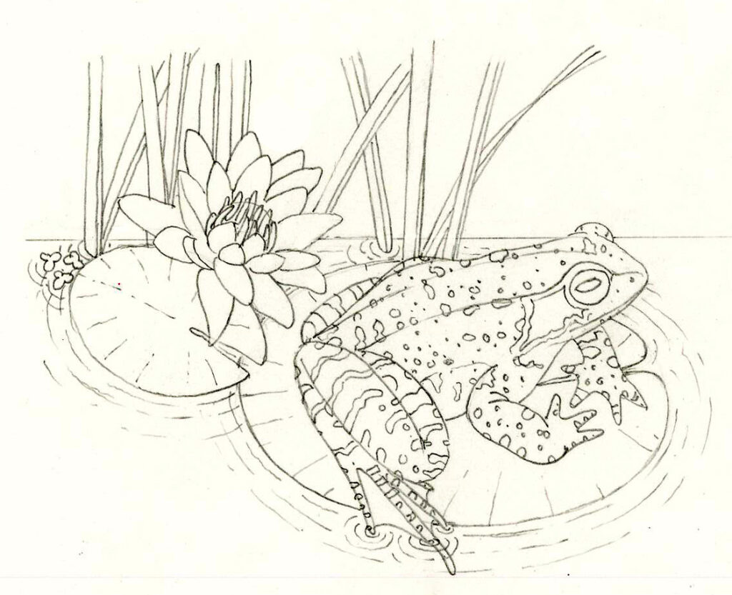
Common Frog on Lily pad
it’s a a commission for a client who is using my completed frog life cycle to support the clients she counsels, but wanted and additional step – an adult in situ in a pond.
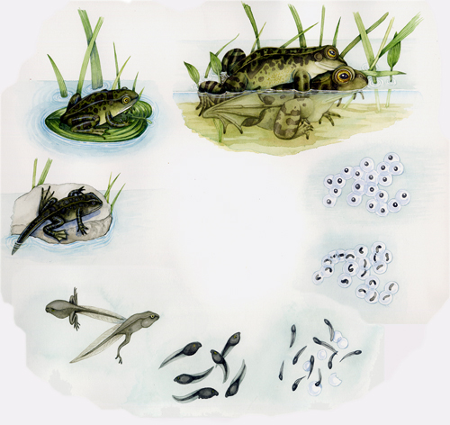
Frog life cycle including mating pair
Painting with Arrtx: Using the colours
When I use the paints, I’m impressed. The colours don’t take a lot of effort to lift from the pans, and are really clear and bright on the palette. Yes, some of the colours don’t tally with their names. The Arrtx Sap Green feels a lot closer to Daniel Smith’s Spring Green than the much yellower and browner Sap Green I have in my Winsor and Newton watercolour box. There’s not much difference between the Cadmium Reds. The Ultramarine is rather wishy-washy. But overall it’s a good bright selection of colours.
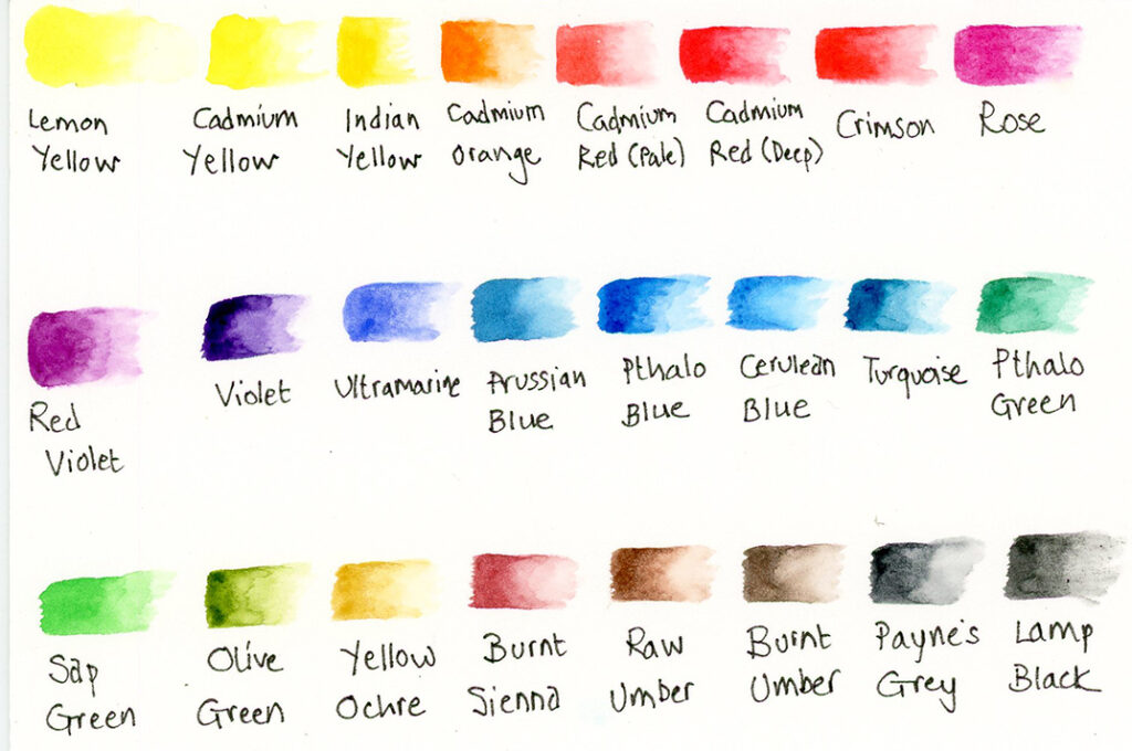
Colour swatch of the colours in Arrtx 24 set
One thing I’m particularly pleased with is how many purple and pink hues there are. Often watercolour sets miss out on these colours, which are vital for botanical illustration.
Paints on the page
As I put the paint to the paper, I’m feeling pretty optimistic. The colours aren’t granular, and they’re not doing anything weird. But then they start to look flat. I’m not sure how to explain this effect, it’s not something I’ve encountered before. They seem to dry chalky. And the chalky effect means the colours look blunt, flattened, lacking in depth.
Second and third washes don’t shift the earlier layers. This is good. Most of the colours do not “stain” and leave brush marks the second they touch the page. (Violet and Pthalo Blue are the exceptions here). But the blurry effect, like someone has slightly altered the focus on a camera, persists.
As each layer dries, the chalky effect increases.
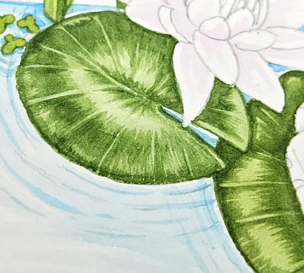
Close up of Lily pads
The Cerulean Blue, more like an Intense Blue from my usual paint-box, works well for the ripples of the pond. It’s a clean, clear blue, and the edges don’t need to be crisp. This works well.
I go over the vegetation a couple more times, striving for the clarity I feel is missing. This makes the painting slightly muddy as I’m overworking it, and it also is time consuming. I am tempted to revert to my normal paints, just to be sure the painting ends up being good enough.
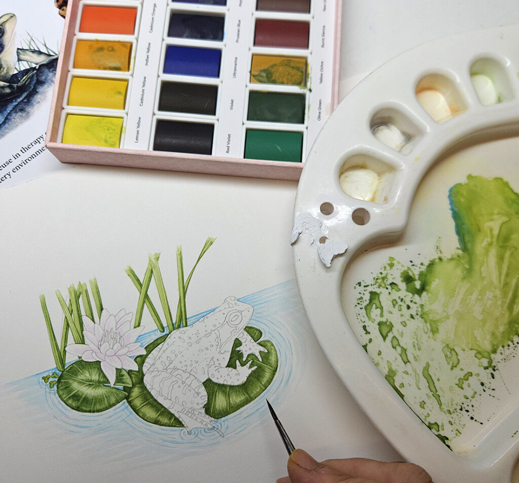
Lily pads and Yellow flag completed, time to move onto the frog
Working on the Frog
Once the background is completed, I start work on the frog. The blurry effect continues to hamper my progress. I feel like no matter what I do, I just can’t get my edges crisp. Progressive layers of outlining and darker colours fail to help. The frog is just not as crisp as it would have been were I using my usual Winsor and Newton paints.
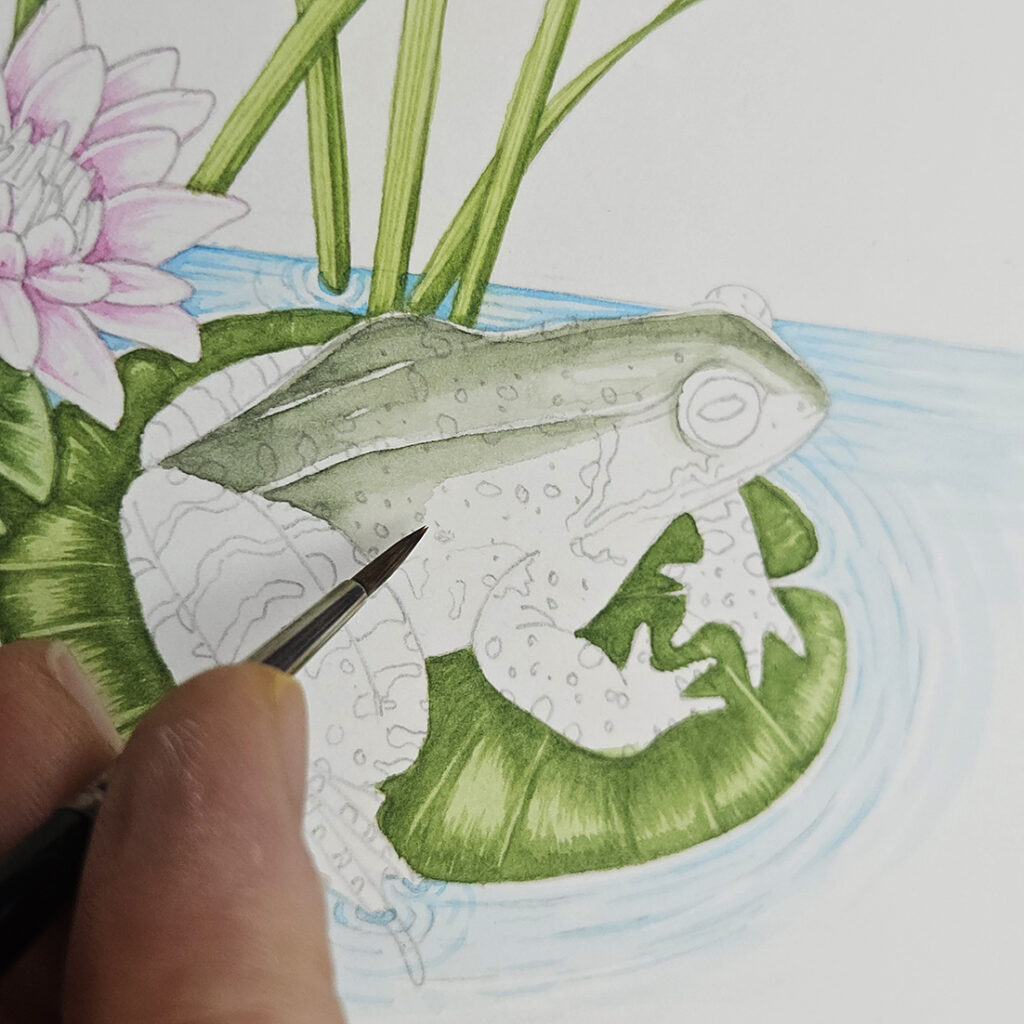
Building colour into the frog
Several layers in, I decide it’s time to add the markings on top of the frog’s green skin. I feared these would bleed and destroy the painting, but they don’t. They give the same slightly blurry effect as the rest of the illustration.
Final touches
I can’t risk messing up the eye of the frog, it’s too important of a focal feature. I use my normal Winsor and Newton paints. This also proves that it wasn’t just a quirk of this particular sheet of paper, the paints from my usual paint-box go on as I’d expect.
I mess the eye up by making the pupil too wide, so have to fix the mistake with white gouache. But to me, the crispness of those yellows and reds feels noticably different to the rest of the illustration.
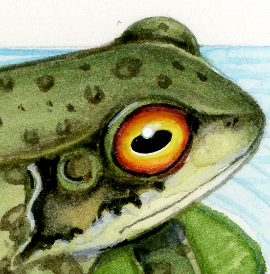
Detail of the frog
The final touch is to add shadows. These have to go below the Water Lily petals, and where leaves cast shadows on each other. I try to use the Arrtx 24 set for this, mixing a purple blue, but feel like the shadow edges blur. Doing my usual “crisping up” effect with drier watercolour looks like I’m just outlining the frog and leaves.
Comparing Water lilies and Frogs
Below are some comparisons of similar subjects done with my normal paints, and with the Arrtx 24 set.
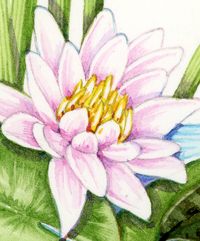
Detail of the Water Lily (Arrtx)
Compare it to the White Waterlily Nymphaea alba below. I should point out that the original below is a significantly larger painting, but I still think it demonstrates the difference in sharpness.
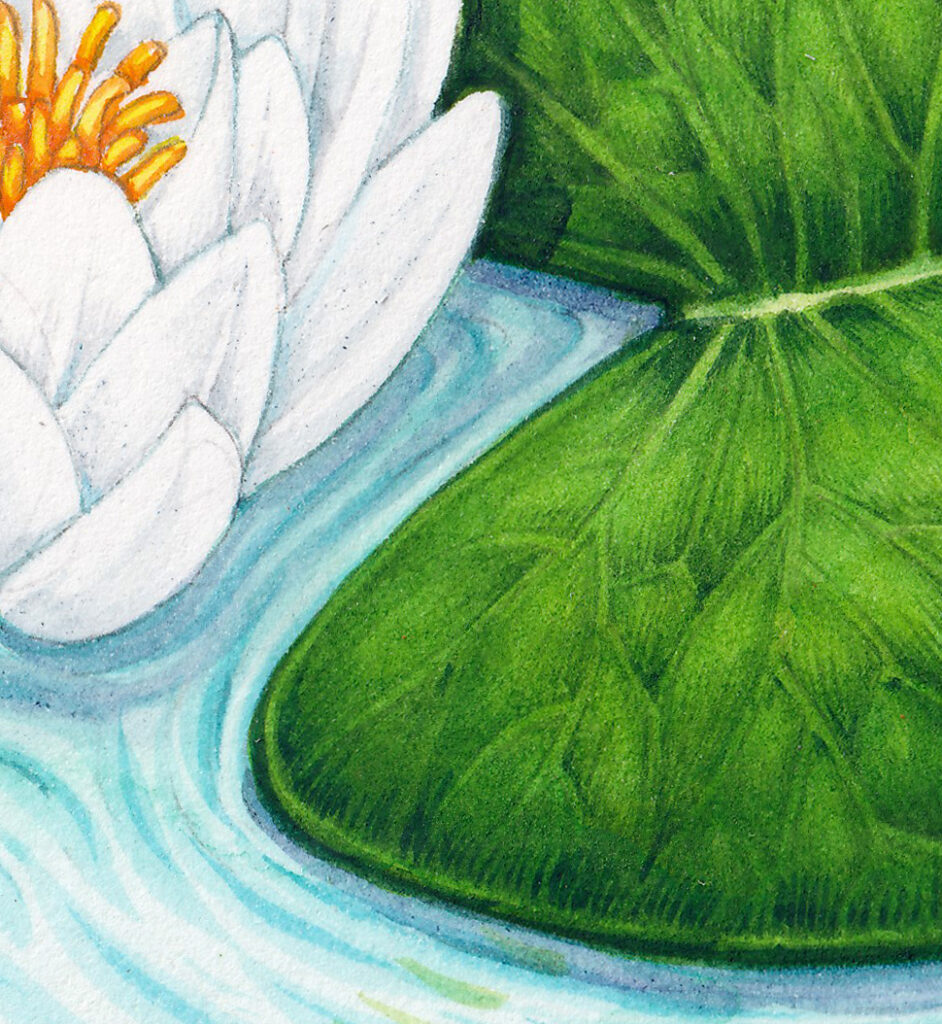
Detail of the White Water Lily (Winsor & Newton watercolours)
The same is true of the frogs. Compare the Common frog with the Montserrat Whistling Frog, especially on the crisp holding lines on the edges of the feet, and the brush strokes used to show the textured markings on the amphibian’s backs. Again, the Whistling frog is larger than the Common Frog illustration, but the difference goes beyond the different sizes of the paintings.
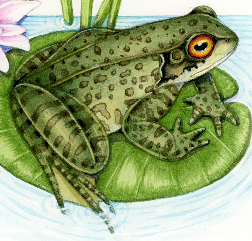
Common Frog Rana temporia
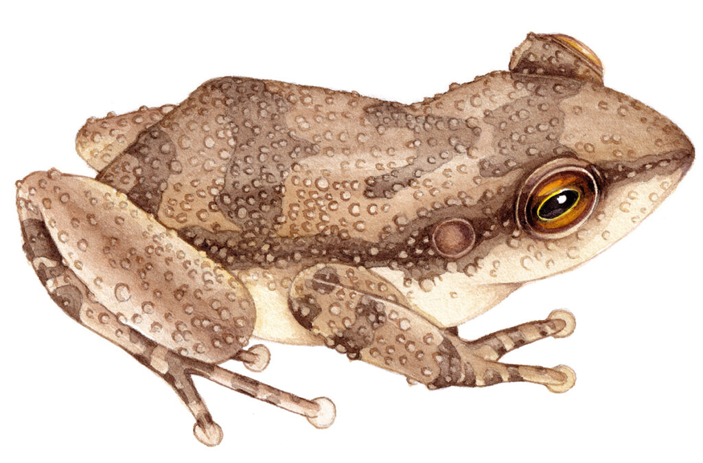
Montserrat whistling frog Antilles coqui Eleutherodactylus johnstonei
Conclusion
It’s really important to stress that paint choice is a very personal thing. For artists and illustrators who work very differently to me, this set of watercolours may be perfect. In fact, for people who work with gouache, these may be a good fit. They have a consistency somewhere between the two types of paint. But for me, with the sharpness of edges I require, these paints don’t make the cut.
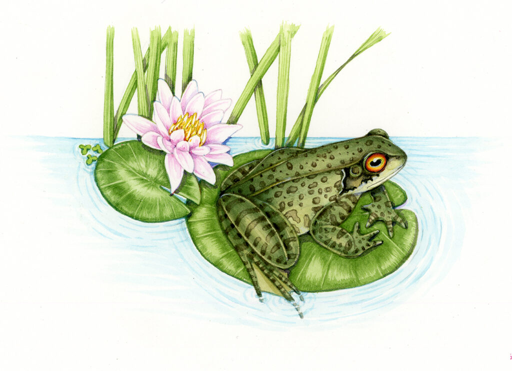
Common Frog on Lily leaf
The colours are bright and transparent. The paint is not granular and mixes beautifully. But I’m afraid I simply can’t rely on this set of paints to give me my edges. Luckily, I think the frog illustration is good enough. But it would been a bit better, a lot easier, and significantly faster to complete with my usual box of paints.
I’d like to thank Arrtx for giving me the opportunity of reviewing their paints, and am grateful to them for allowing me to be honest in my review.
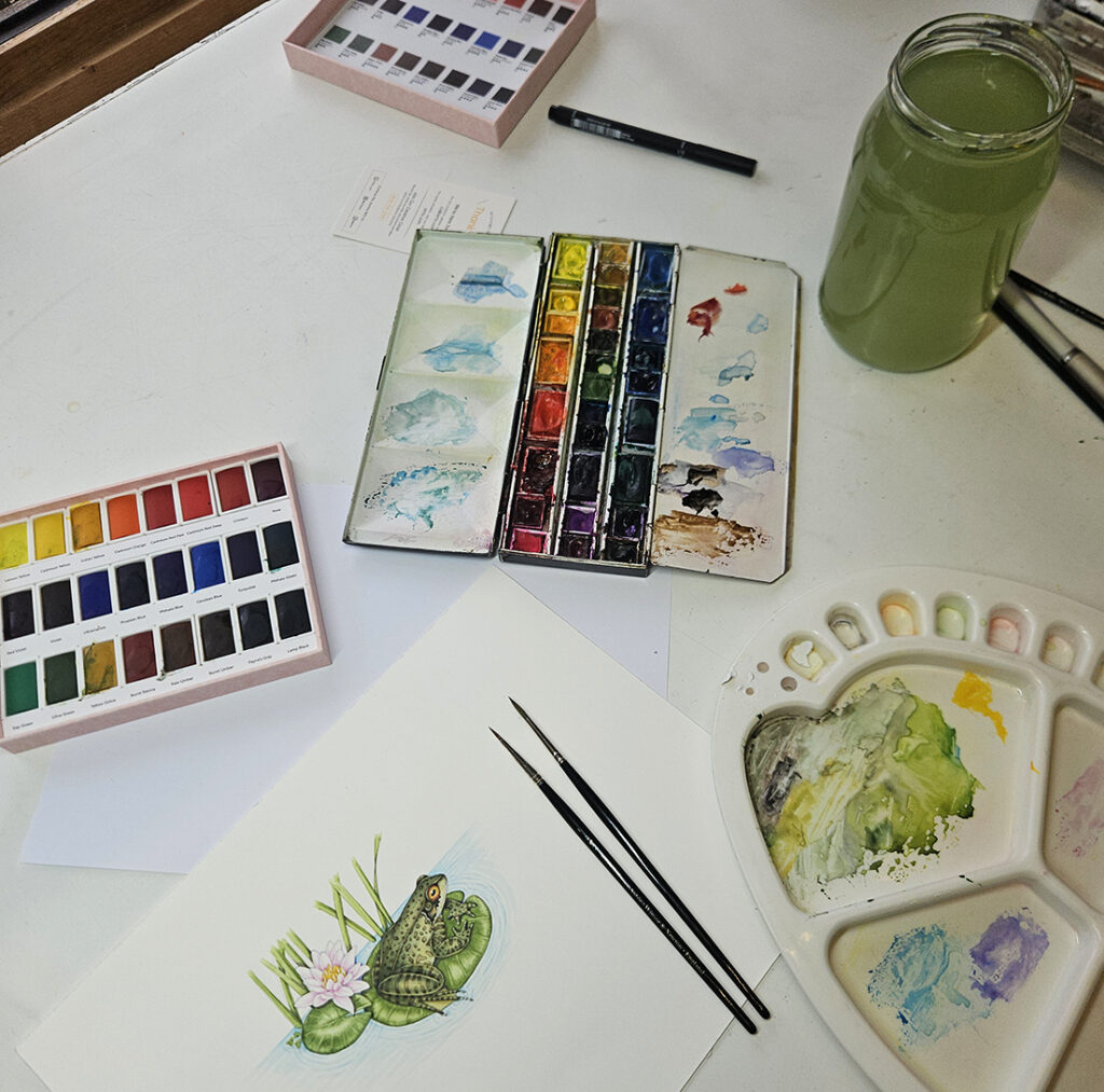
Completed frog with Arrtx 24 paints
