

Spotted Flycatcher step by step
Spotted Flycatchers Muscicapa striata are lovely birds, often overlooked because of their seemingly dull grey and brown plumage. They are one of the species I was recently commissioned to illustrate for a wildlife information board at Cusop churchyard; so I decided to do a step-by-step blog (and accompanying film) of the process.
When I illustrate an animal, I like to learn about it as well as about the way it looks. I always spend a little time online getting to know my subject before I begin, and when I make my films, this allows me to talk about what I’m illustrating as well as how I’m illustrating it.
Researching your subject
Before putting pencil top page, you need to have some knowledge of the species you’re illustrating. I tend to take a look at the RSPB and Woodland trust page when it comes to birds, along with reference books such as Birds of Britain and Europe by Peterson & Mountford. I check out illustrations, and photos on iNaturalist. I’m also lucky enough to have been given permission from Pete Walkden, incredible wildlife photographer, to work with his photos.
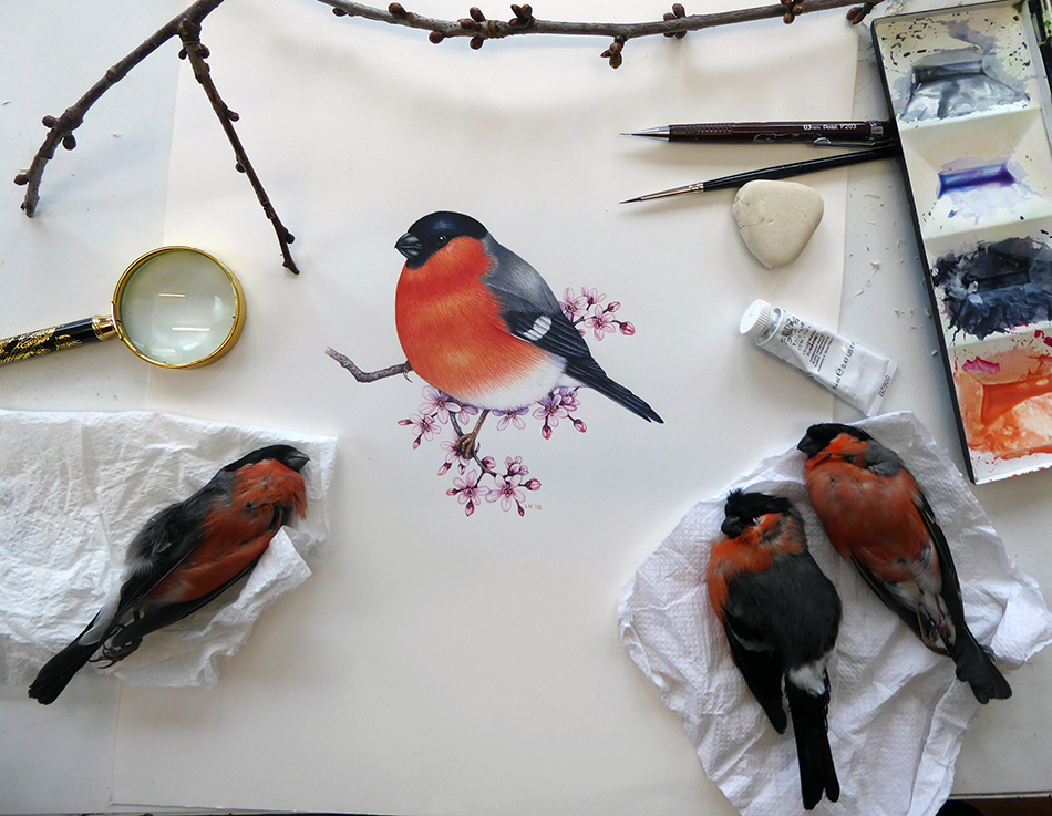
Bullfinch illustration with reference materials
In some cases, I’m lucky enough to have a specimen of the bird available to draw (as with this Bullfinch). This always makes colour-matching a doddle. This time no-one had bought me a flycatcher, killed by a cat or found on the road verge, for the freezer. Alas.
Drawing up the Flycatcher
Referring to the reference, and bearing in mind that I need to make the identifying features obvious, I combine my visual and written reference and draw up the bird in pencil, direct onto hot press watercolour paper.
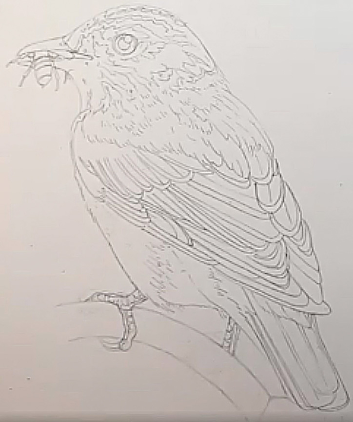
Pencil rough of the Spotted Flycatcher
Equipment
It’s worth name-checking the equipment I use. Pencils are Pentel P205 mechanical pencils. Watercolour paper is Fluid 100 by Global arts (for more on hot press paper choice please look at my series of blogs and films).
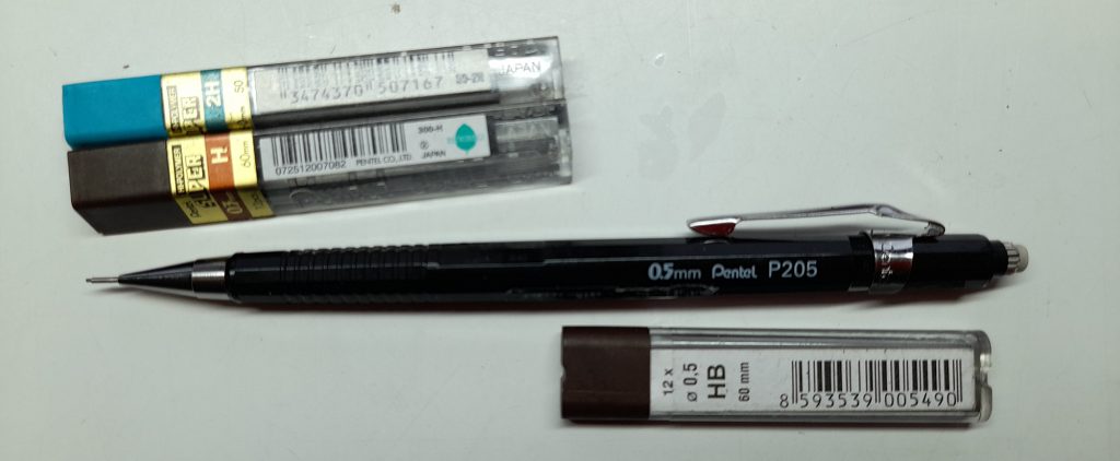
My favourite pencil – the Pentel P205
My paints tend to be Winsor and Newton watercolours, although other brands are good too. In this step by step, the colours we’ll use are Purple, Naples yellow, Burnt umber, Cobalt blue, Cadmium yellow, Cadmium orange, Alizarin crimson, and a dark blue such as Phthalo or Winsor blue.

My Winsor and Newton paintbox (which I wash clean before each new species)
Brushes are invariably Winsor and Newton Series & sable, size 1. I’m still on the lookout for good synthetic alternatives; feel free to check out my blog and films to see how far I’ve got with my quest!) Factis Tri-24 erasers are my go-to, and they remove pencil line from painted surfaces without damaging the paper too much.
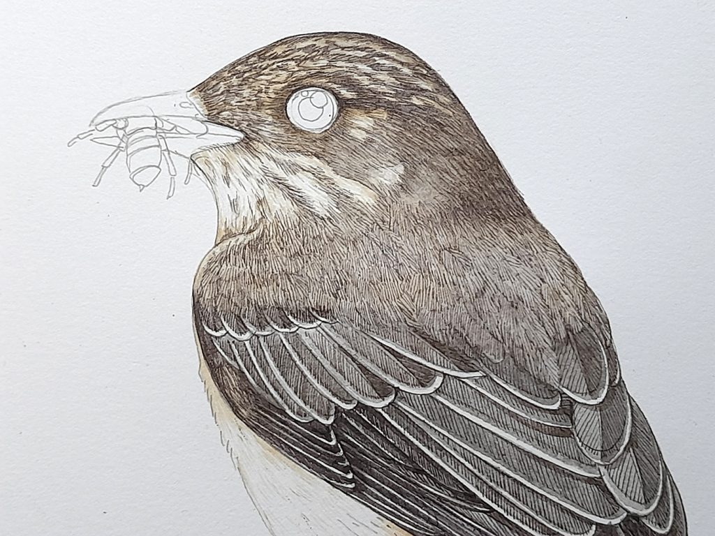
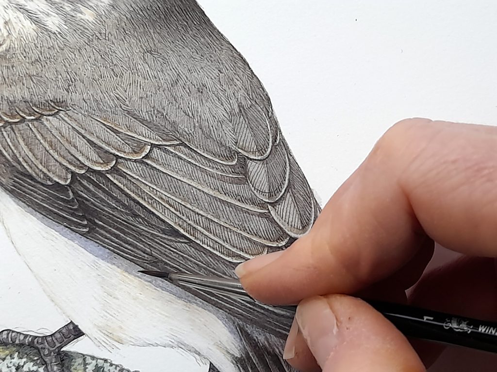
Painting the Spotted Flycatcher: Wing outlines
The first step is outlining the edges of the wing feathers. Some of the flight feathers have pale margins, so this needs to be respected. Leave the white of the page for pale areas, in watercolour it’s always easy to make an area darker but very hard to make it lighter. Use the white page for highlights and pale colours.
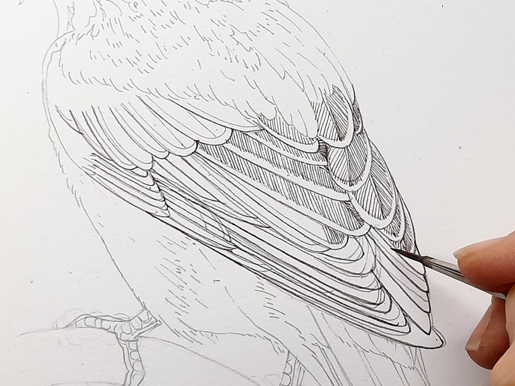
Outlining feathers and barbs
The wing colour is a brownish grey. This is a mix of Purple, Naples yellow, and Burnt umber. I simply outline the edge of each wing, then add the barbs of the feather in the same colour, putting thin lines parallel to one another. I keep the barbs on one side of the rachis closer together (and therefore darker) than on the opposite side. Swiftly painted, pale drop shadows help show the difference between feathers.
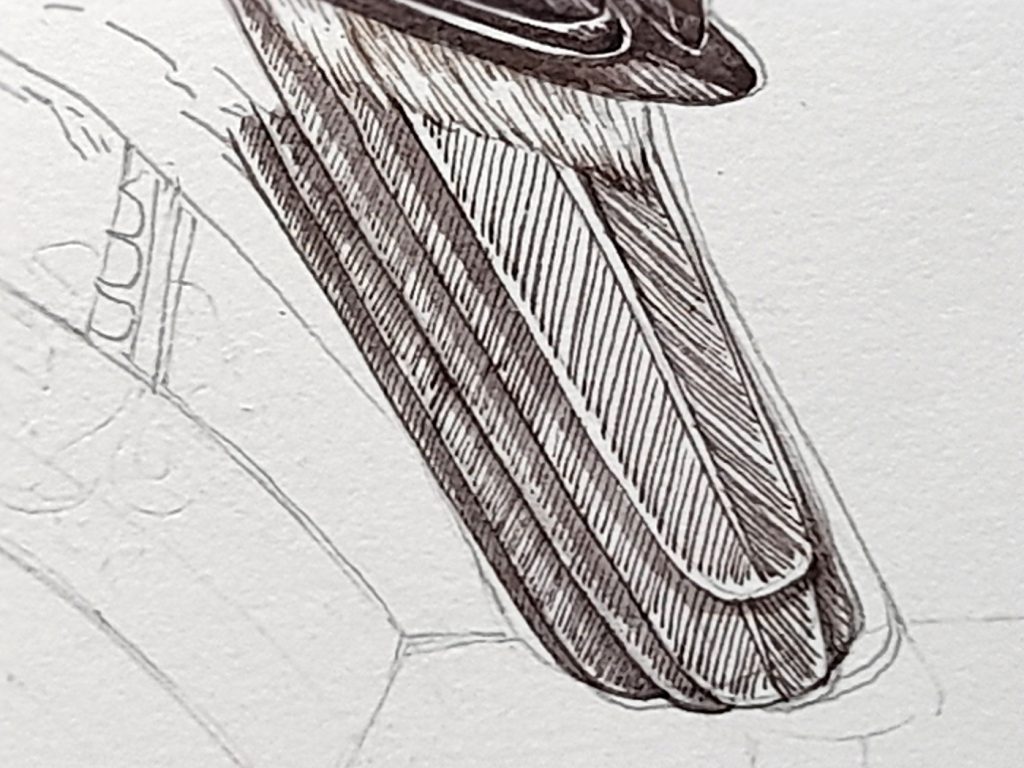
Further down, the lower flight feathers and the tail have no pale margins and are a darker colour. Alter the ratio of the colours in your mix to reflect this. Take your paint marks up to the edge of each feather, but leave a hairline of white paper so you can see where one feather ends and the next beings.
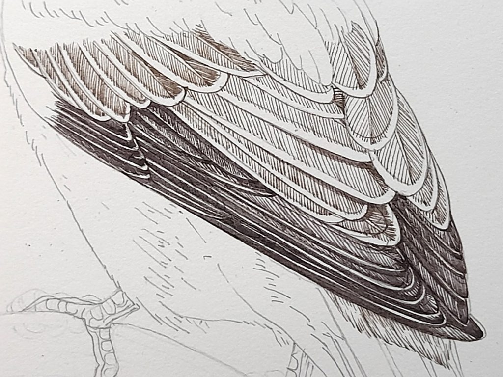
Lower flight feathers
As these are closely aligned, in some cases you may simply want to show one feather with a thick, dark line instead of with the network of feather barbs. This works well, but remember to leave space between feathers.
Plotting in the Body colour and texture
It’s important to keep the colour consistent across the bird, so there are no stark colour changes (unless the bird has these). This means the back is plotted in using the exact same colour as the wings. Brush strokes vary a little, fanning out to show feathers, and make it clear the texture on this part of the Flycatcher differs from the smoother flight feathers.
Laying down colour and texture on the back
Painting the Flycatcher head
When you’ve worked up the body, you reach the head. It’s important to concentrate here as too many dark lines, or lines which are too thick can really compromise an illustration. Follow the edges of patterns you’ll have included in pencil when you drew up the bird. Check your reference. Even though you’re “colouring-in”, you need to be drawing with the brush the whole time, and transferring your observations to the page.
Head of the flycatcher
For areas which are noticeably darker (around the eye, at the nape) put your brush marks closer together, or layer them. Always follow the line of growth, in this case the way the feathers lie on the head of the bird.
Tail feathers
As discussed above, the tail feathers are a little darker than the wings and have no distinct margin. We continue with the same colours in the mix though, and the darker tones build up more when we add washes on top of this initial layer.
You can see how the brush marks are carried right to the tail feather edges as there are no pale margins.
Tail feathers plotted in
Painting the flanks, rump, and throat
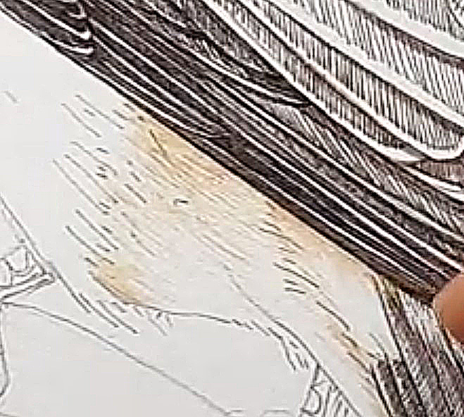
Finally, we get to use new colours! This mix is going on the belly of the bird, under the wings, and up the throat. An initial glance might suggest these areas are white. However, there is some cream in there, and a stark white against the browns and greys would be much too fierce of a contrast.
Mix up Naples yellow with plenty of water (to dilute it and make a paler tint of the colour). Add the tiniest smidgen of Cadmium orange.
With a very delicate touch, paint the colour onto the bird. You may not be able to see the brush strokes clearly – this is a good sign and suggests you’re keeping the paint nice and pale.
Laying down the cream colour
Observe your reference again. Where are the darkest areas on the pale parts of the Flycatcher’s body? More strokes and colour in these regions helps give shape to the bird, and depth to the colour. Be sure not to swallow up your white areas, remember, the page is your white colour.
In amongst doing this, I also painted in the gravestone. Lots of blues, greens, and browns. And a lot of waiting for colours to dry. I won’t bore you with the details, in all likelihood the last place you’d be illustrating your Flycatcher would be on a lichen-encrusted gravestone!
The bird with cream flanks, rump, and throat.
As before, we don’t want any jarring colour transitions, so carry the cream on up into the head area, and across the back. Use tiny light brush strokes. Focus more of these in the darker areas, like the circle round the eye and the back of the neck.
Lots of tiny cream brush strokes in amongst the darker browns of the head
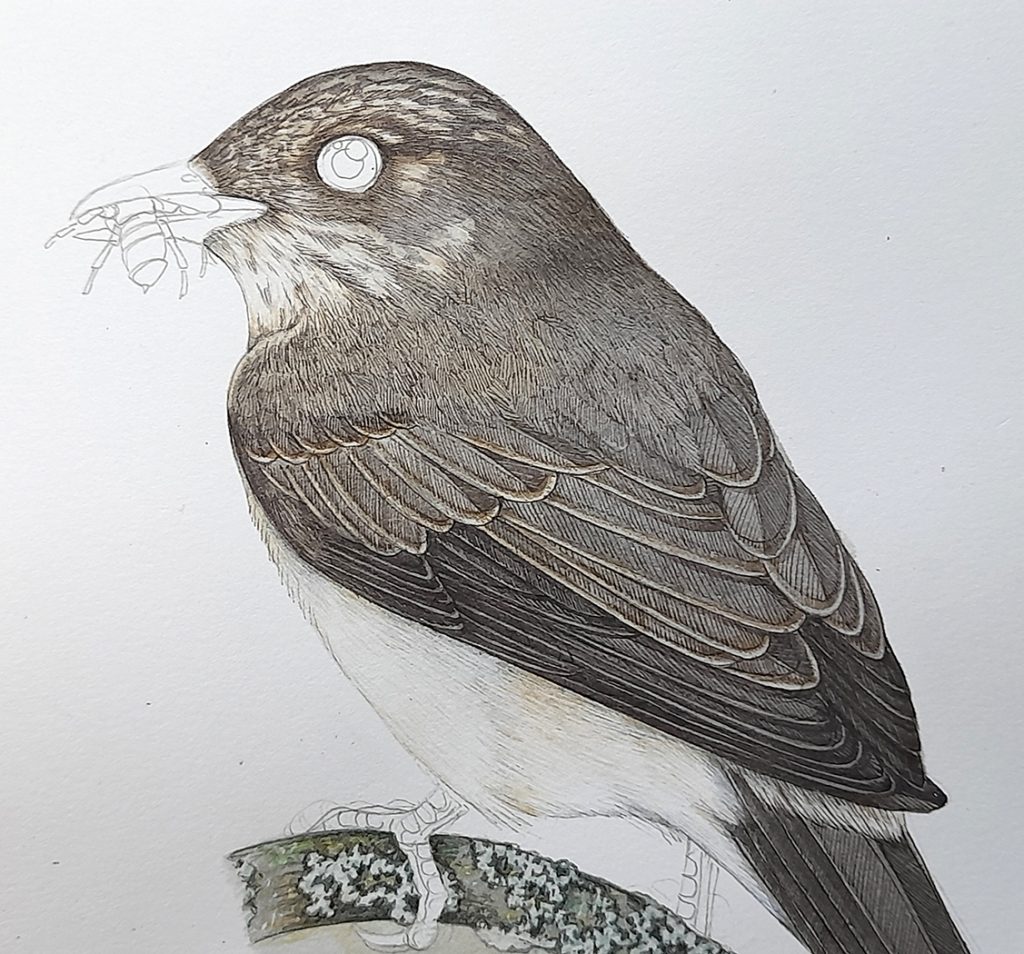
First top wash on the feathers
Now we begin to work on adding depth and colour. Mix up a watery colour made from Cobalt blue, Burnt umber, and Naples yellow. Lay this on the feathers, but only on one side, on the darker side, where you placed your parallel feather barb lines closer together.
Allow the paint to dry completely. (If you get bored waiting for paint to dry, you might want to try using a fan heater or a hair dryer. It can speed things up!)
Flycatcher with wash drying on one half on wing feathers
Add the same mix to the other side of the feathers, making sure to put a second layer on top of the (dry) areas you’ve just worked on. This layering means one side of the flight feathers looks marginally darker than the other which gives the bird texture and depth.
Use that same watery colour mix, and paint it over the back and body of the bird. In fact, put it everywhere except for the pale belly, rump, flanks, and head markings. Suddenly the bird is starting to look more lifelike.
Flycatcher with second colour wash on body and wings
Tackling the edges of the feathers
Remember those pale feather margins? Well, these are now coming back to haunt us. I put several layers of different colour on these areas, knocking them back but keeping them paler than the rest of the wings. Yellow ochre in an extremely pale concentric circle (also applied to the rachis), a very very dilute version of the top wash, and a separate extremely dilute wash of Naples yellow were all involved. In all cases, washes were allowed to dry fully between stages.
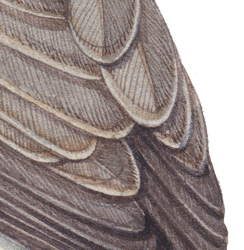
Detail of the feather edges
I know suggesting that you keep working on these until they feel right is unhelpful, it’s the best I can do. I returned to them so many times I forgot what I did at what point! Just remember they have to blend in with the main body of each feather, and also be distinctly paler. Don’t try to add a white or pale top colour, this would just muddy the bird.
Adding colour to the body of the bird
Apply a second wash of the exact same colour mix, and let it dry. The colour is now building up, but is transparent enough to prevent the details from disappearing.
Spotted flycatcher after the second all-over top wash is applied
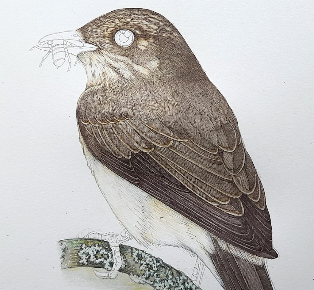
Adding definition and shade
Once dry, you can work into the feathers a little more. Judicious use of a mix of Burnt umber and Cobalt blue, used carefully, can crisp up edges between feathers. Mix a colour for shadows, I like to use Cobalt blue and Purple. Using this quite watery (dilute), I drop in a shadow below each feather, and another onto the flank. This always makes me feel very nervous, but usually works out ok.
Adding shadows
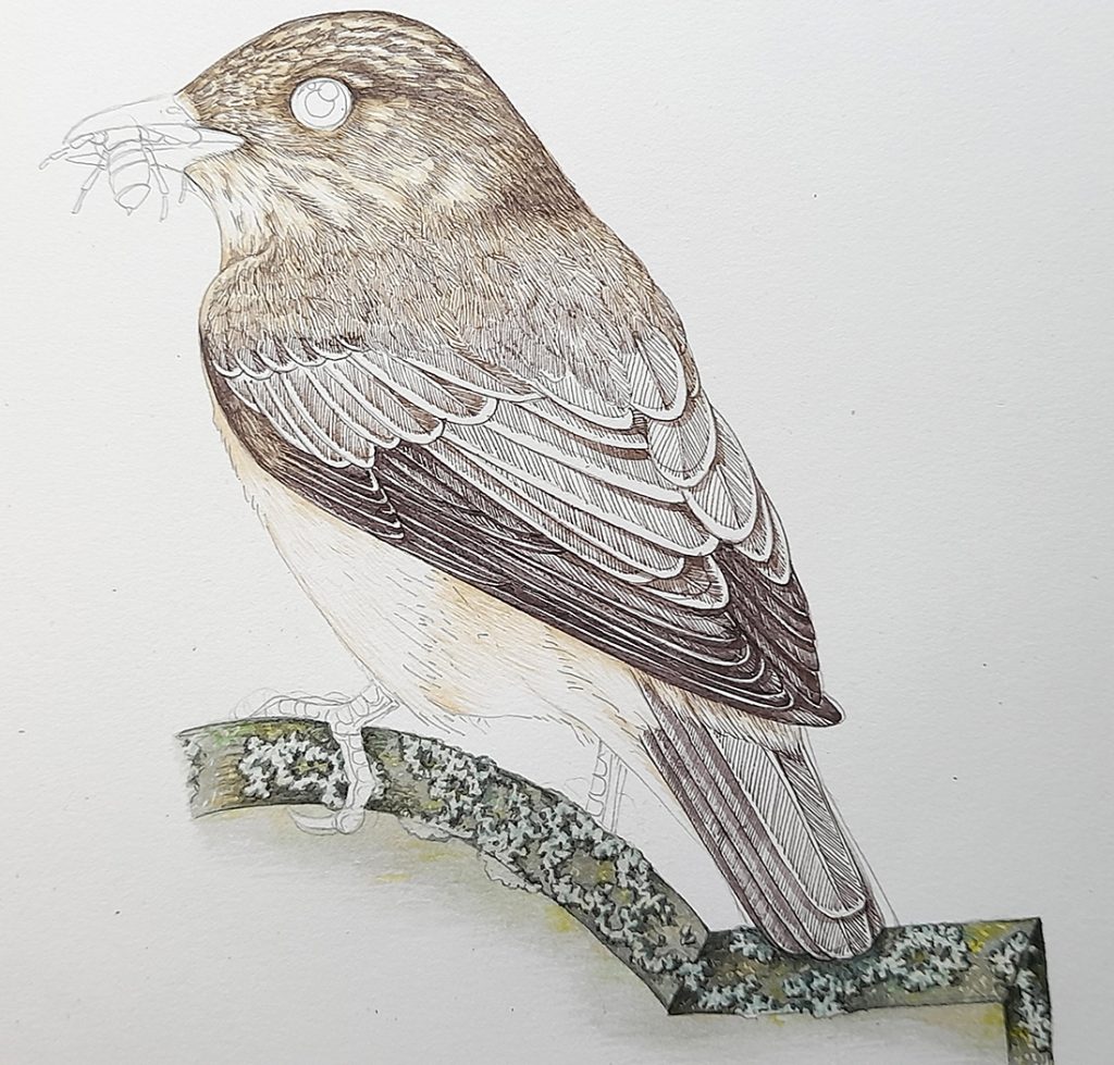
At this point we’re really nearly finished with the main part of our Spotted flycatcher. There are details to complete – so far the bird has no eye, beak, or insect to eat! But the bulk of the work is done.
Painting the details: Beak
The first detail I focus on is that beak. It’s black, but I avoid using black paint. I prefer to mix purple and burnt umber. Not only does this make for a more interesting colour, it also echoes the browns in the flycatcher’s plumage. We’re forever trying to unite colours across the subject so the eye doesn’t feel jarred, or stuck, in one area of the illustration.
Detail of the Flycatcher beak
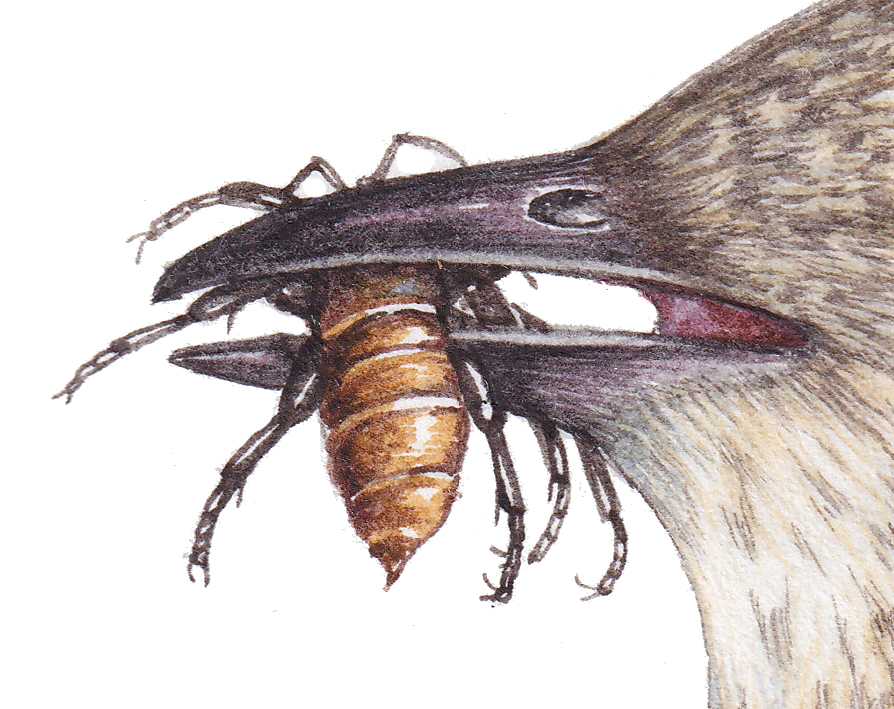
Keep the paint darker at the tip, and leave a margin at the edge of the beak. Remember the highlight along the length of the beak. The open mouth is a mix of purple, brown, and Alizarin crimson. Keep this light, reds attract the eye, so we have to balance it across the painting by adding touches in the legs, the bird’s eye, tiny areas in the flight feathers.
The insect is painted in Yellow Ochre, Burnt umber, and Purple. I was thinking of a fat beetle, wing cases already removed by this feisty arial hunter. As an aside, di you know that flycatchers not only capture their prey in flight, but will deal with wasp and bee stings by rubbing the insect against a stone or branch to disarm it. How cool?
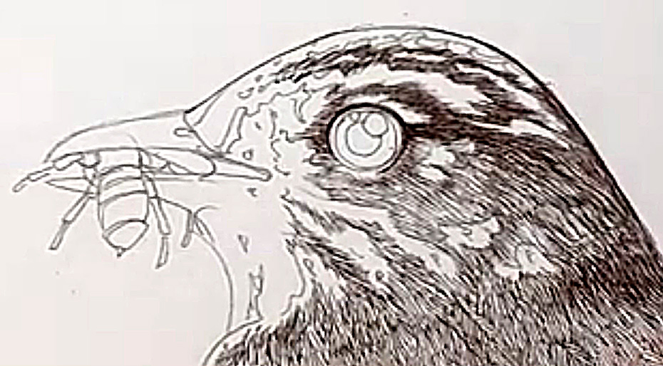
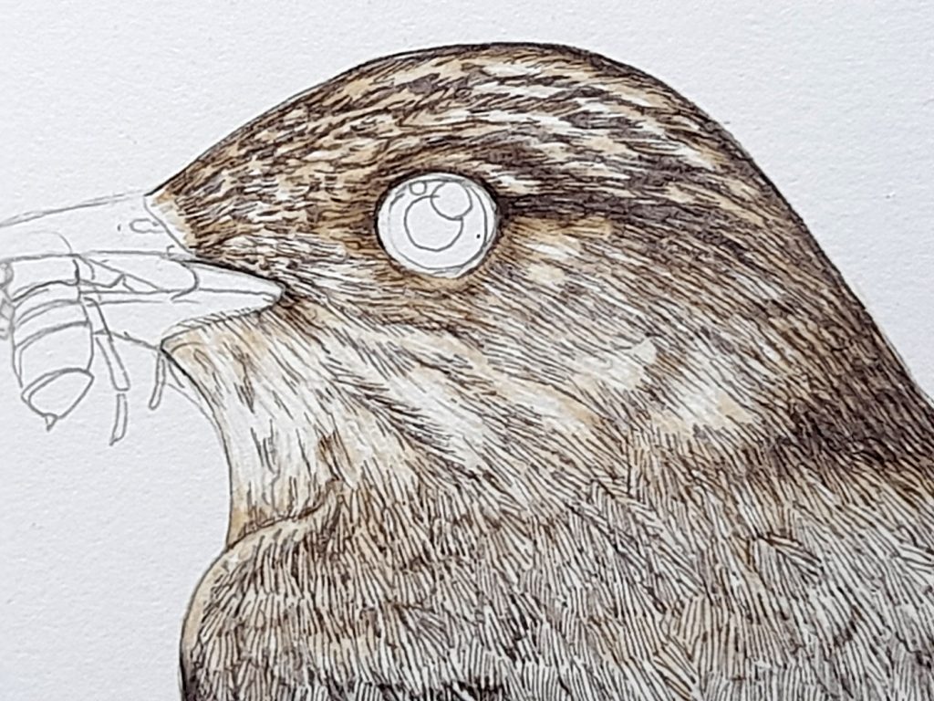
Painting the Details: Eye
The eye is, for me, the scariest part of any illustration. Some illustrators do them first so they don’t risk messing them up and having to start over. I don’t like the vindictive stare I get from my subjects as I paint them into being, so only add their “soul” and accusing eyes at the very end.
For this one, I used Cadmium yellow, browns, and a mix of Alizarin crimson and purple in the dark areas. The pupil is painted in black, overlaid on the iris. It’s vital to leave the white page as a highlight, and to try and have bright areas within the iris, so the eye seems to glow.
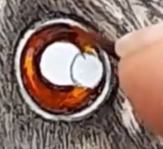
Working into the iris of the eye
Getting this balance right is always difficult, as is painting near perfect circles in the centre of the eye, on such a tiny scale. If the worst comes to the worst, you can add to the highlight on the pupil with a dab of white gouache, but it’s best to try and avoid this as it slightly dulls the highlight.
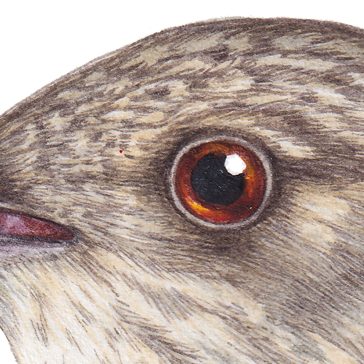
Finished eye
Finishing up: Last shadows
The very last step is to go around sharpening up those shadows one more time. Use a careful touch and a really dark mix of Burnt umber and purple, or Purple and Cobalt blue. For me, this last step is when the bird springs to life. It’s high risk though, as if you overdo the shadows you can lose detail, so please be careful.

Completed illustration showing the colour mixes used
In the photo above, you can see the dark colour I used for the final shadows in the paintbox, along with the greys for the feathers, and a dark maroon which we used for the open mouth, areas of the legs, and to add vibrancy to the eye.
Conclusion
So there you have it. Lots of tiny brush strokes followed by lots of layers of top washes, and completed with shadows to add crispness.
The original watercolour worked on here is available for sale for £75, email lizzie on info@lizzieharper.co.uk for more.
To see this all happening in more detail, and at a more leisurely pace, please feel free to watch the film below:
Any bird can be illustrated using this approach. For more of my step-by-step bird illustrations please see my blogs on illustrating a Robin, a Pied Wagtail, a Swallow, a Goshawk, and a Puffin (amongst others).
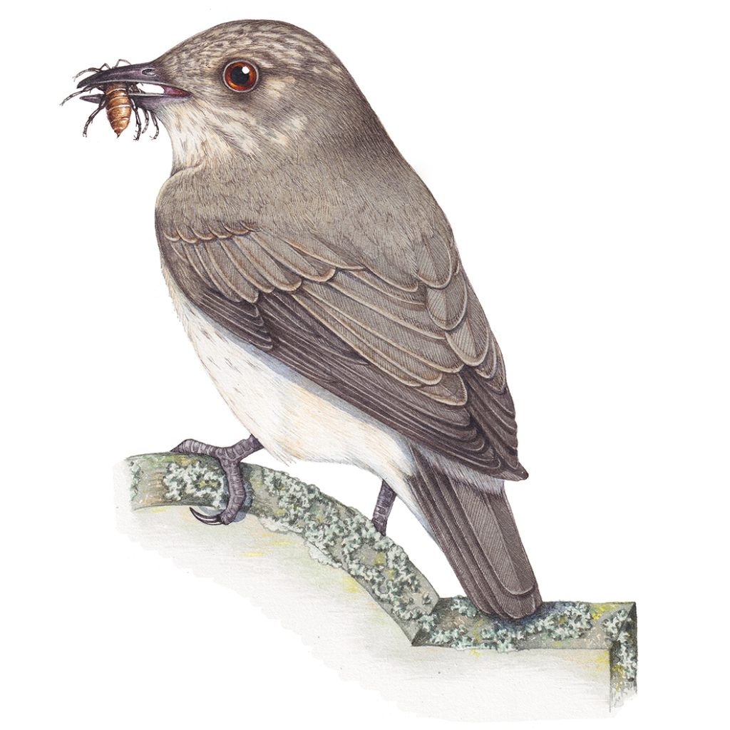
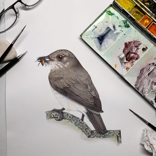
Completed Spotted Flycatcher Muscicapa striata
Hi Lizzie
Great instructional and informative video. Thank you.
Regards Peter
Thanks Peter!
How long does it take you Lizzie to produce a piece of work with this level of detail? It’s just amazing.
Jaine
Hi Jane
So the Spotted flycatcher took about 2 hours to thoroughly research, 2 hours to draw up in pencil, and all told about 6 hours to add colour. All told, about 10 hrs. Bit I have a reputation for working absurdly fast, those who are more meticulous than me can spend weeks or longer on one illustration!
Hi Lizzie just wanted to commend you on your talent. Your work is sublime wonderfully detailed and totally inspirational. Thank you for sharing your techniques….Gerard
What a lovely comment, thank you so much!