

Step by Step illustration of Tupelo & Sweet orange
A recent natural history illustration commission was to complete two botanical illustrations for labels on jars of honey. The plants in question were Sweet orange Citrus sinensis and Tupelo Nyssa ogeche.
Neither plant grows wild here in the UK, and there was quite a tight deadline so I needed to work from other illustrations and photos. For more on how I go about doing this, please check out my blog.
Pencil roughs
First step is to complete the pencil roughs. I worked with a mechanical P205 Pentel pencil, and I’m currently working on Stonehenge Aqua Hot Press watercolour paper.
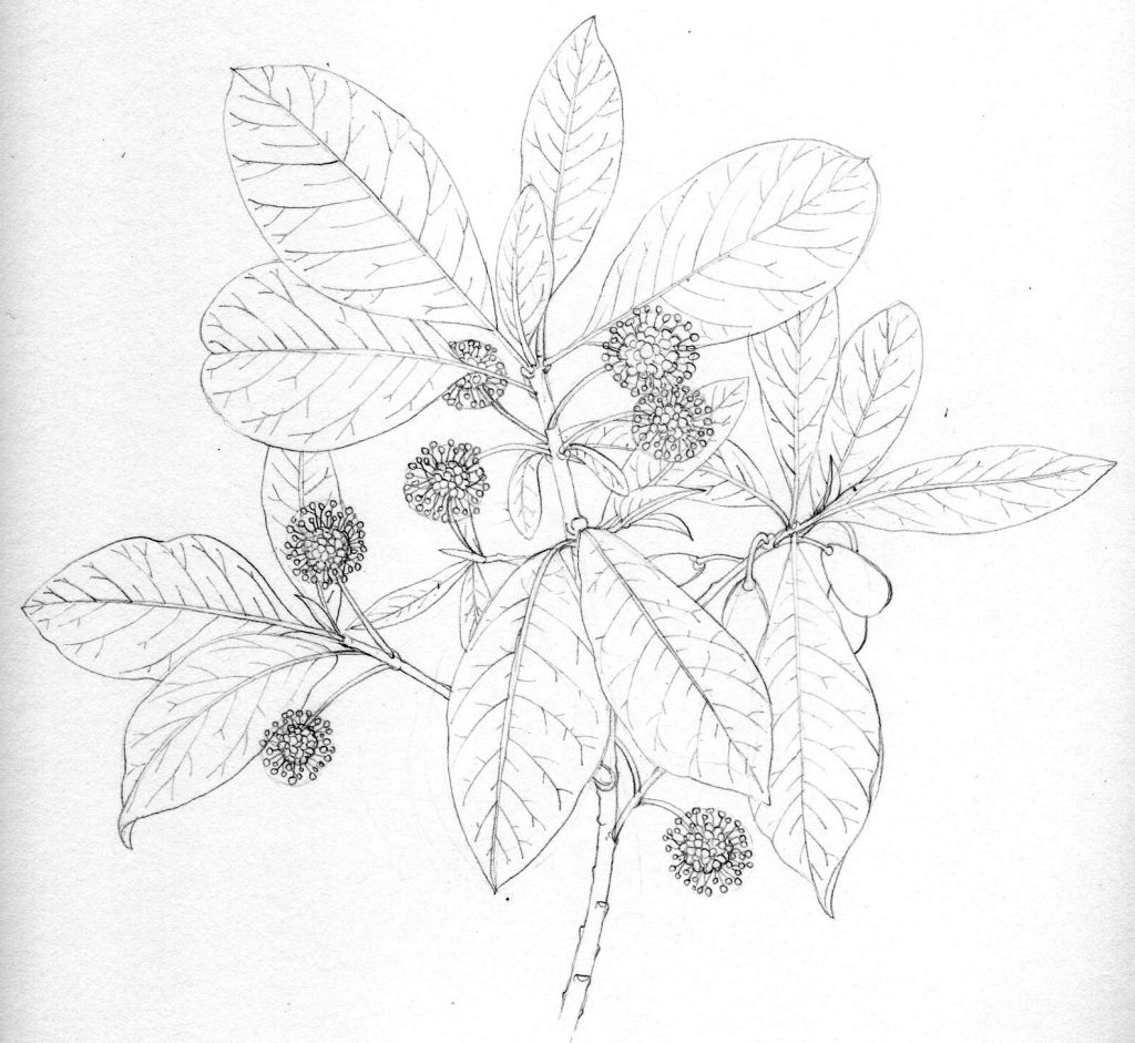
Pencil rough of the Tupelo Nyssa ogeche
It’s important to think about composition as well as including all the elements of the plant, especially as the illustration is going to be reduced massively. It needs to read clearly as a big illustration or as a tiny picture.
![]()
Pencil Rough of Sweet orange Citrus sinensis
Next, the client (Sleeping Bear Farms) had to approve the roughs (which they did very fast and with no alterations. This, by the way, is the dream scenario; if you have live plant material it’ll still be fine to work from when you get the paint-box opened, and even if you’re working from other reference it’s lovely as all the learning and observation is still fresh in your mind).
Painting the leaves: Step 1
I use the same process of painting for both illustrations, so will discuss them alongside each other. However, it goes without saying that I will work on one plant to completion and then start the next one.
For more of my botanical illustration step by steps, please click on the link.
First, I plot in the darkest greens on the leaves. I do the leaves first as I find them less thrilling than the flowers, and harder to successfully illustrate. I always start with my darkest darks, which is an unusual approach for watercolour artists, but it seems to work ok.
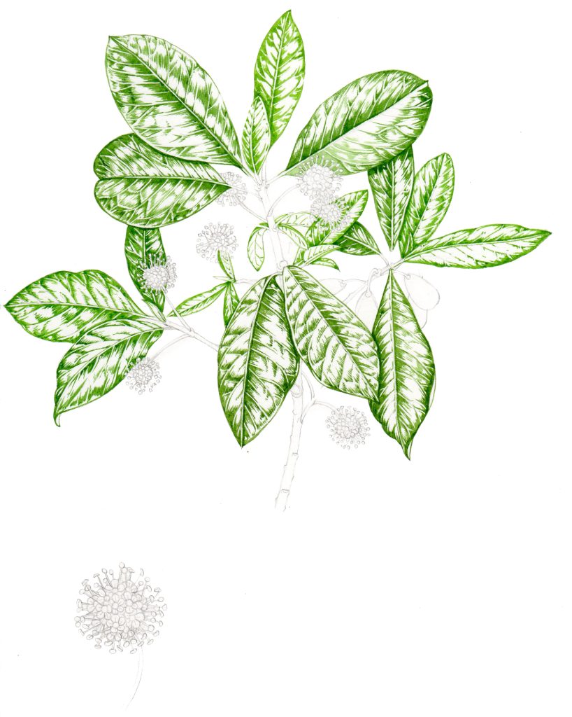
Tupelo with darkest greens plotted in
The Tupelo green is quite a bright and yellowish green. I mixed this from Sap green, Yellow ochre, Cobalt blue, Vandyke brown, and quite a lot of Cadmium yellow pale. My paints are in pans. I favour Winsor and Newton and Daler Rowney.
I build up these areas with lots of little brush strokes, making sure the edges of the areas aren’t too stark. The only brushes I properly love are Winsor and Newton Series 7. They’re pricey, but this is because they’re pure sable, and hold their tip like no other brush I’ve tried. I use a tiny 000 for detail and a number 1 for most of my illustration work. A larger no 2 is good for bigger areas. Every 6 weeks or so I need to buy a new number 1 brush as I wear through the bristles, but they are the best available and are reliably excellent.
The Sweet orange had darker glossier leaves, so the green is bluer and darker, and it’s important to be more aware of the light areas of highlight; if they get swamped with colour then there’s no way you can make the leaves glossy.
The green for the darks on the Sweet orange is a mix of Sap green, Vandyke brown, Yellow ochre, Winsor violet, Winsor blue and Cadmium yellow pale.
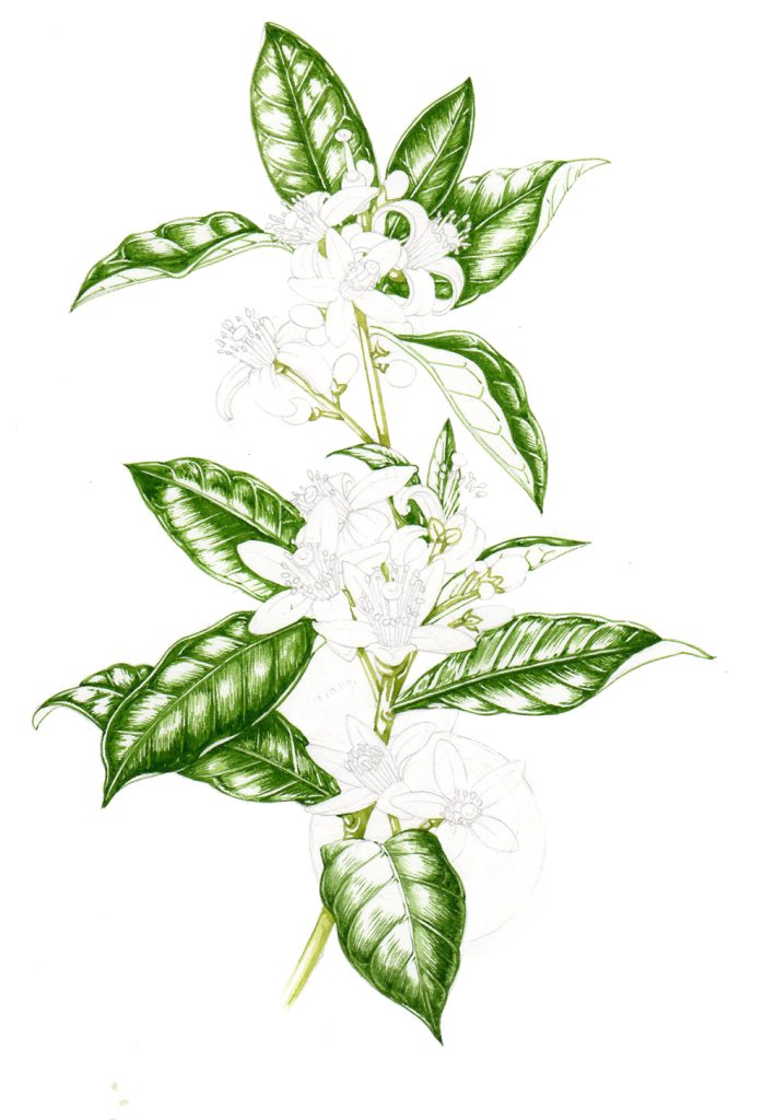
Sweet orange with the darks plotted in
Painting the leaves: Step 2
Next step is to paint the mid-tones on the leaves, and to take the sharp edges off the areas of shadow. These greens are the same mixes as before but slightly diluted with water, and with a little more Cadmium yellow light mixed in. With the Tupelo, the younger leaves are noticeably brighter and yellower than the older larger leaves, so the colour mixing reflects this.
Mid tones of the Tupelo tree added
I also start putting colour onto the underside of the leaves at this stage. In the Sweet orange these are a blueish chalky colour. I use Cobalt green, Cobalt blue and a touch of Permanent mauve for this mix.
Plotting mid tones on the Sweet orange
Painting the leaves: Step 3
The next step is to put a yellowish pale layer of colour on top of the detail already painted. It’s important to allow the paint to dry between these stages or detail will get blurred and lost. Generally I mix a new yellowish green for this. I use plenty of Cadmium yellow pale and Yellow ochre to get the yellows bright, but true to nature.
I paint in the stems and twigs at this point too. Here the Tupelo twig is a mix of Vandyke brown, Sap green, and Winsor violet. Darker areas are bumped up with a bit more Winsor blue.
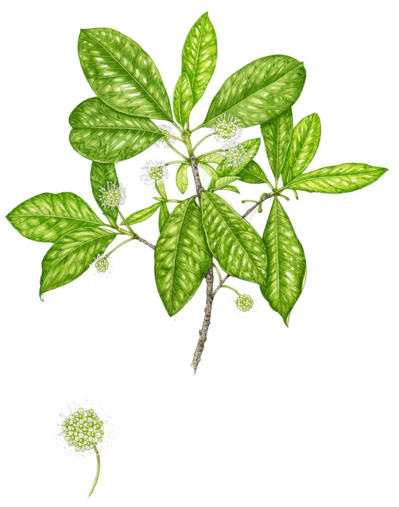
Highlights and woody areas of the Tupelo finished. Beginnings of flowers being worked on.
It’s vital to keep an eye on your highlights, which need to be left as plain white paper. The trick is to leave the paper clear of paint. Make a smooth transition from the green to the white areas. I do this by using tiny brushstrokes with a pale yellow green, and by blotting with tissue paper.
Working into the lighter areas of the Sweet orange leaves
Painting the leaves: Step 4
Next it’s time to work into the shadows on the leaves. I pick out these dark areas with a properly dark paint; Vandyke brown and Winsor blue, often with a touch of Winsor violet. I use this paint quite dry, and lay it down in tiny brushstrokes. This layer of colour gives definition and crispness as well as tonality to the image.
Step 5: painting fruit and flowers
I get on with fruit and flowers at this point too. Sorting out the anatomy of the Tupelo flower without a specimen in front of me was a real challenge, especially when it came to deciding what parts of the blossom were what colour. They’re a bright yellow green, so I used Cobalt green with Winsor lemon as there’s a softness to the shade which I wouldn’t get from Sap green.
![]()
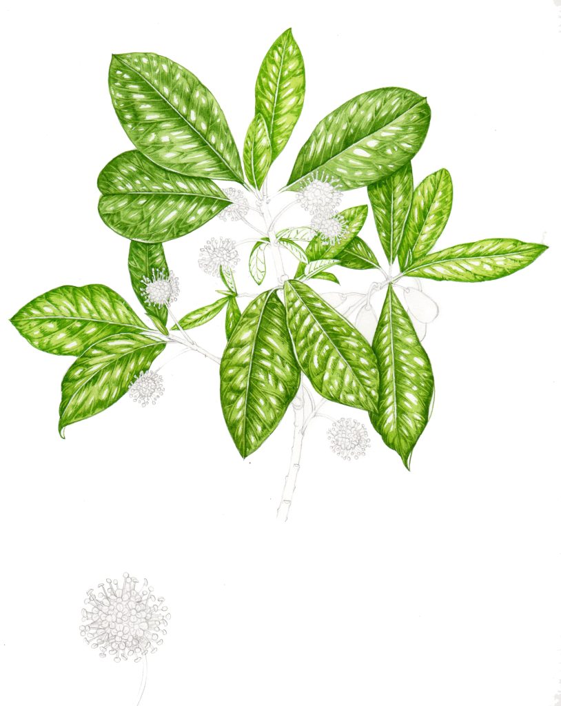
Adding the final details to the flowers and the fruit of the Tupelo
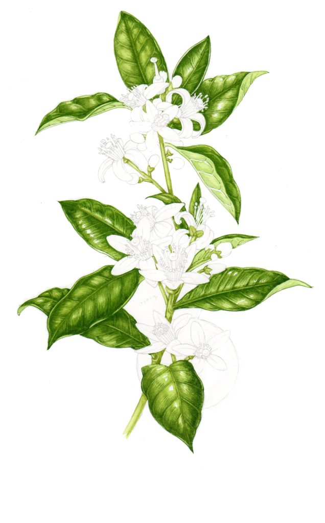
The Sweet orange has a similar treatment of leaves, then there’s the challenge of painting the white flowers. Painting white flowers is tricky as you need definition but also need to ensure the petals look crisp and clean. You can leave defining pencil line, ensure the flower has colour behind it, or use a pale watercolour mix to pick out detail. For more on painting white flowers have a look at my blog.
The Sweet orange has clusters of these flowers, so I used a pale Cerulean blue to get some details in. I’ve tried using Cobalt turquoise before, but somehow it’s too bright. I then mixed up a darker blue to pick out some tiny areas of darker blue. The buds are really quite yellowish, so I used a different colour for these.
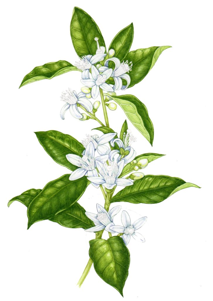
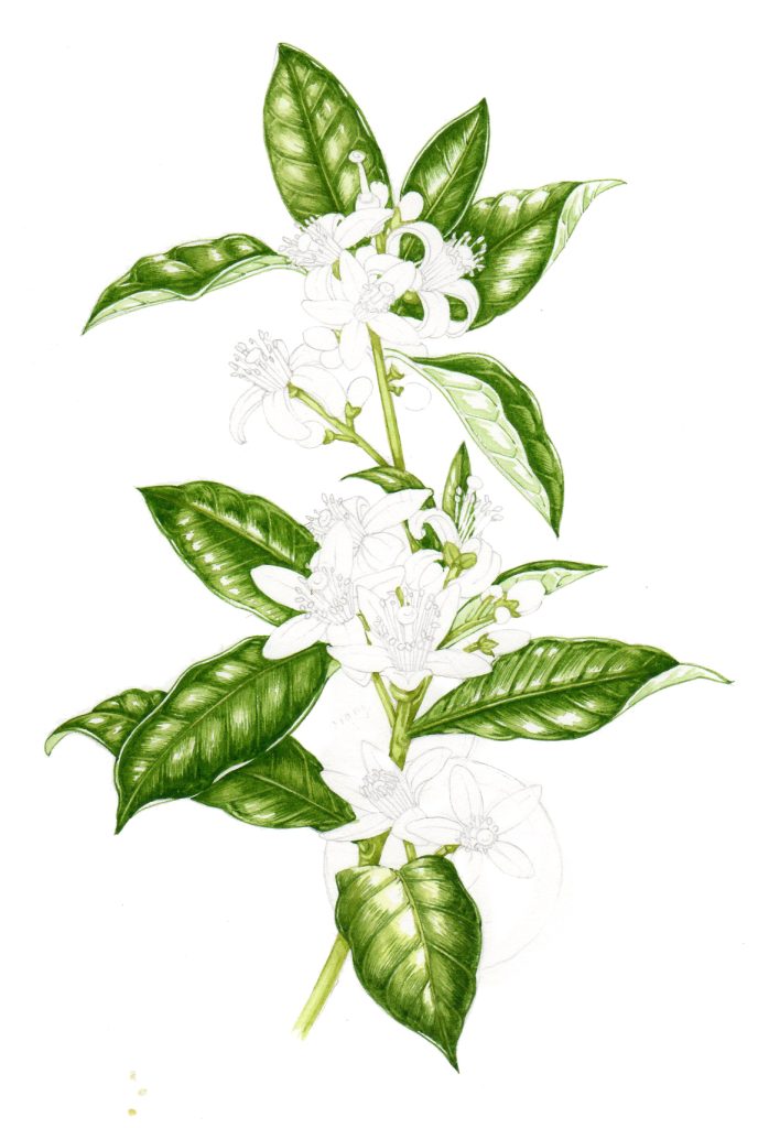
Illustrating the white blossoms of the Sweet orange
The Tupelo is nearly done now. It needs just a little more orange on the fruit (being sure to keep the highlighted areas as white paper) and a few more tweaks with the very dark blue paint mix.
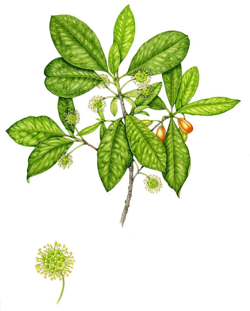
Tupelo Nyssa ogeche final illustration
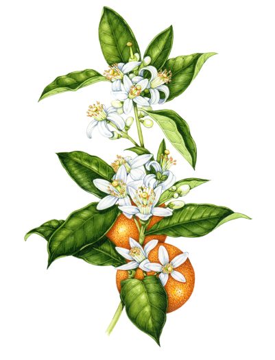
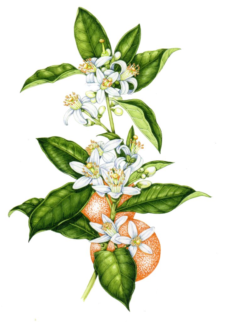
Step 6: Painting the oranges
The biggest challenge of the Sweet orange remains, the oranges! They’re actually even larger in comparison to the flowers and leaves than I’ve drawn. However, I used artistic license as I didn’t want the fruits (or colour) to swamp the whole image.
I finish off the leaves. The dark shadows are dealt with and I make the edges between leaves crisp. I also pop in the stamens on the flowers before starting on the oranges. I start on these with an orange mid tone, and apply the paint with a spotty paint stroke. A mix of Cadmium orange, Cadmium red, and a touch of Winsor violet seems to work.
Starting work on the oranges
Unfortunately, when I find an area of a painting challenging or enthralling (in this case the oranges were really difficult), I forget to stop to take progress pictures, so the next Sweet orange image is the final piece!
Working into the oranges, I first picked out the darkest areas of shadow, again favouring little spotty strokes to echo the texture of the fruit. The darks need to be redder and browner than the rest of the orange, so I mixed in Vandyke brown and some Alizarin crimson, along with a touch of Hookers green (so the hue echoes something of the leaves).
Lastly, I mix a really pale orange wash, in this case it’s Indian yellow with a tiny bit of Cadmium orange. Again, leaving the white areas as highlight is vital, and adding a bit of texture to these areas makes the oranges a bit more realistic.
![]()
Final illustration of the Sweet orange Citrus sinensis
So there we are, both illustrations completed! The client seemed dead pleased with them, which was really lovely. Now I just have to wait to see them on the honey labels!