Illustrating a Butterfly Bouquet

I’m often asked to combine botanical art with scientific illustration. This butterfly with bouquet wings took this to a new level!
Begin by drawing your Butterfly
The client sent me a rough visual, and asked me to combine features of a butterfly with a Victorian style bouquet. Species and details were up to me.
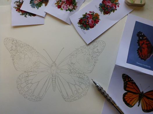
Well, first thing was to choose the butterfly. The client is American, so I decided to stick to common species from the USA. The iconic Monarch butterfly worked well, but I wanted a species with some blue on the lower wings. This would echo the purple and blues I plan to put in the bouquet. I ended up morphing the upper wings and body shape of the Monarch (Danaus plexippus) with the lower wings pattern of the American Lady (Vanessa virginiensis).

Pencil rough of the invented butterfly, and reference materials.
Now draw up your Bouquet
Next, I researched the flowers. Die-cut Victorian scraps are an excellent source of pretty, old-fashioned bouquets. I chose one which fitted neatly onto the upper wings.
Painting the butterfly wings
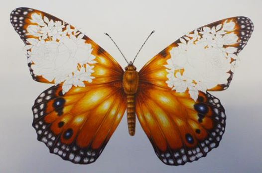
Then it was time to apply colour. Oranges built up with lots of tiny paintbrush marks into a thick layer of colour. Blacks with brown marks at the edges. Areas of white were left in the centre of the wings to make the illustration glow, and I also left white where there are wing markings on the margins.

Butterfly in progress – now for the flowers!
Illustrating the bouquet
It’s always nerve-racking at this point in a job. Part of the illustration has taken a long time, and you’re pleased with. But the terror that the next step (in this case the bouquets of flowers) will go wrong and ruin it all is ever present and hasn’t faded with age or experience.
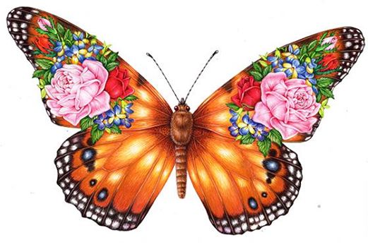
Although I worked from the Victorian reference closely, I tweaked certain details so it fitted better on the wing. The main alterations were a total re-calibration of the colours of the original – I wanted these to be bluer, and for the roses to be a soft pink. The rose colour had to be a cool pink; there was plenty of yellow and orange going on with the wings, so a light and cool pink was needed to balance things out a little.
Once I’d painted in the flowers I added some tiny tweaks to balance out the colours; a spot of pink in the white spots on the margins; some blues and purples in the thorax. Doing this helps to unify the piece visually, so your eye can move across the whole illustraion instead of getting caught on one jolt of un-repeated colour.

So here it is, the final piece. I was really pleased with it til my other half said he thought it looked “like Guns ‘n’ Roses” tattoo, which rather took the edge off things. I believe he may have a point.
It seems to be a popular picture too, with plenty of comments and attention on social media networks. So, for any of you out there who want to do yoru very own butterfly-flower mash-up; now you know how. And enjoy it, it was a really fun and frivolous piece to work on.
Other butterfly blogs
I’ve also blogged on more traditional ways ti illustrate butterflies! Below are some links:
Illustrating the Amazing Blue Butterfly

