

Illustrating a Honey Label
I love it when I’m asked to produce botanical illustrations and natural history paintings for packaging. That was the case for this honey label. It’s a different side to what I do and I find the change refreshing and challenging.
Sleeping Bear Honey Farm in the USA have commissioned me before to produce artwork for their honey labels, botanical illustrations of the Orange blossom and of the Tupelo (click here for a blog on the steps involved in producing these). This time they wanted something a little different, a landscape.
![]()
Sweet orange Citrus sinensis artwork for another Sleeping Bear honey label
Drawing up the pencil rough of the label
The brief was to produce an idealised scene of a wild flower meadow. This was to be full of bees with beehives (or skeps), and some honey dripping out. It was to reference the Florida pan handle where this particular honey is made.
After getting the reference together and finding out what flowers grew in the Florida pan handle and what the area looked like, I got out my trusty mechanical pencil (a Pentel P205) and drew up the landscape. I made sure there were plenty of flowers, plenty of bees, and that the skeps were the sort favoured by my client.
Background
First up is a very pale background wash; this layer is water with a tiny bit of pigment. Sap green and yellow ochre for the foreground, ceruelean for the sky. I cover the entire page, except for the foreground images which I leave white. This means there’ll be the impression of background, except for the bees and skeps which will have sharper contrasts between their lights and darks and will therefore be the focus. The background wash at the front of the painting is brighter and more intense, this makes this area seem closer to the viewer.
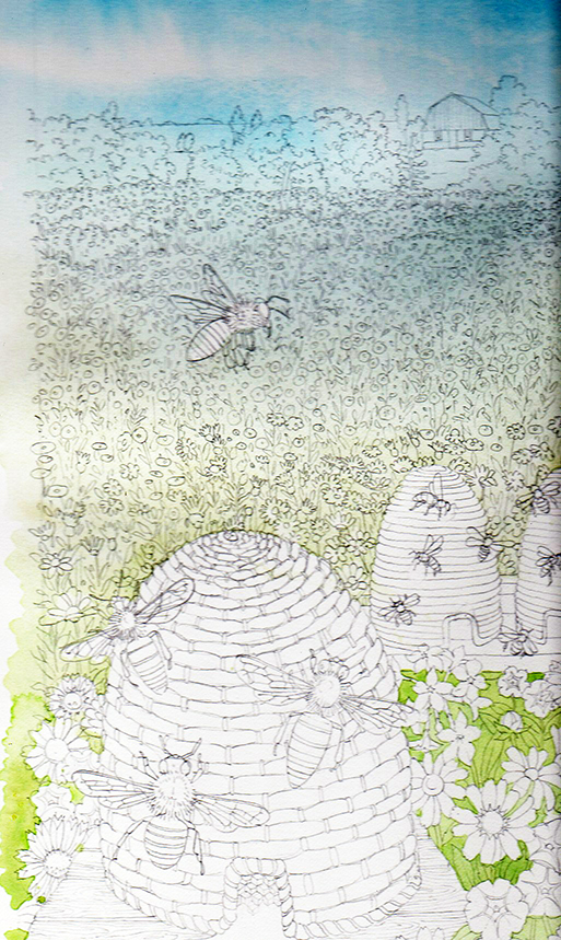
Landscape with background wash
Working into the background greens
Next I work into the greens. This takes ages, and I mix several green colours. These become bolder and yellower as we approach the foreground. It needs to give the impression of healthy distant foliage. I build this effect with lots of dabbing, and little rough brush strokes. As ever, I use Winsor and Newton brushes, Series 7(no. 1 size).
The leaves in the foreground are untouched. I’ll paint these individually later on.
Distant greens
Here’s a close up to see how the colour and texture is built up.
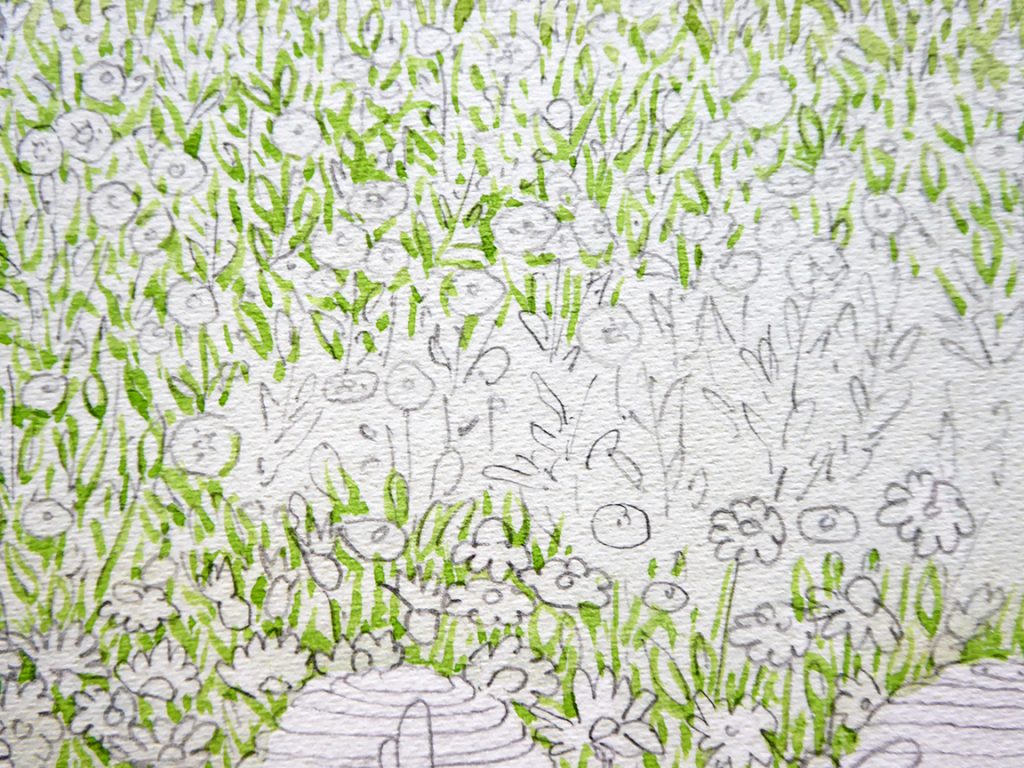
Close up of foliage effect
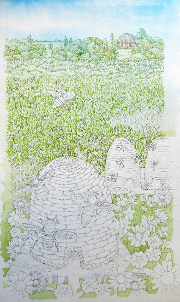
Adding the distant flowers
Getting the flowers in comes next. Again, it’s time consuming, but I use yellows to build up the effect of lots of blossoms filling the field. More contrast, detail and intensity in the foreground helps give a suggestion of distance and depth.
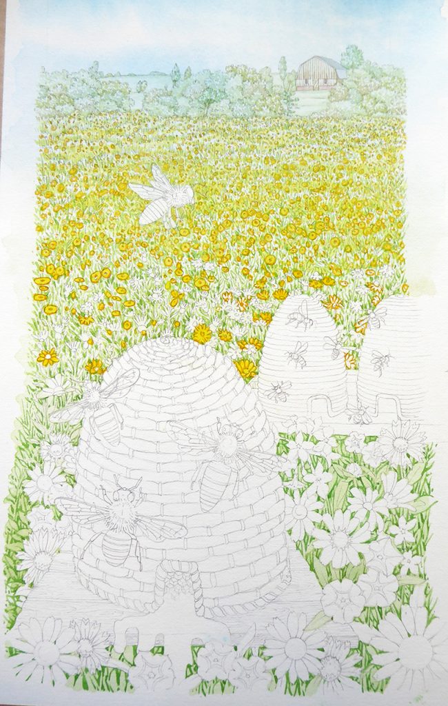
Plotting in the distant yellow flowers
You can see here how I paint in an outline of each flower in yellow then pop a brighter tint of a paler yellow on top.
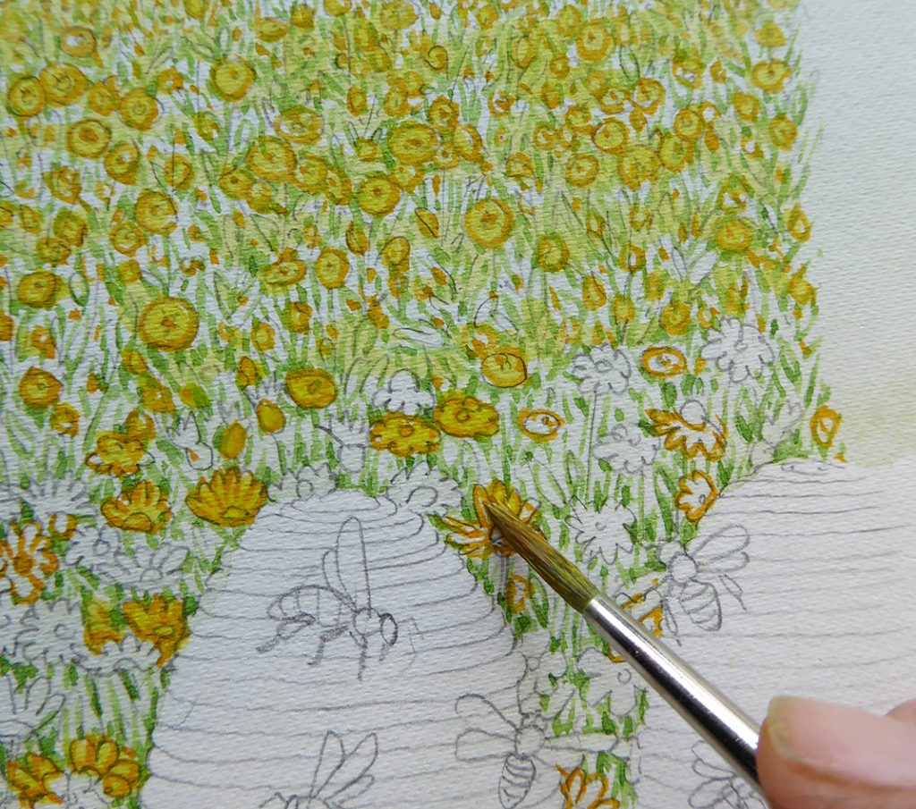
Putting a bright yellow wet tint on the flower petals
Next, I repeat the process for the pink flowers; details in a darker shade of crimson and the top wash just a watery tint of this.
Painting in the pink flowers
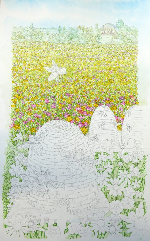
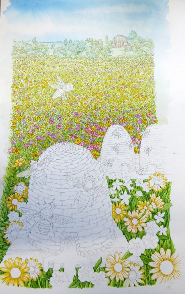
Foreground vegetation
Now to focus on the foreground. I get a bit bored of leaves sometimes, so tend to paint these in first, leaving the detail of the flowers as a treat for later. Bolder and brighter hues of green are used here, with suggestions of shadow and venation which were omitted for the more distant plants.
![]()
Foreground leaves are painted in
Illustrating the flowers in the foreground
Onto the yellow foreground flowers. these need to be bright, but also have contrast. Using more detail than before, I repeat the process of painting in the structure and detail of each flower petal, then popping a bright paler yellow wash on top. At this stage I’ll leave some whites as highlights, only covereing them with a very pale yellow wash once the rest of each flower is dry. This helps give tonality.
Painting in the yellow flowers in the foreground
Here’s a detail of the process in action:
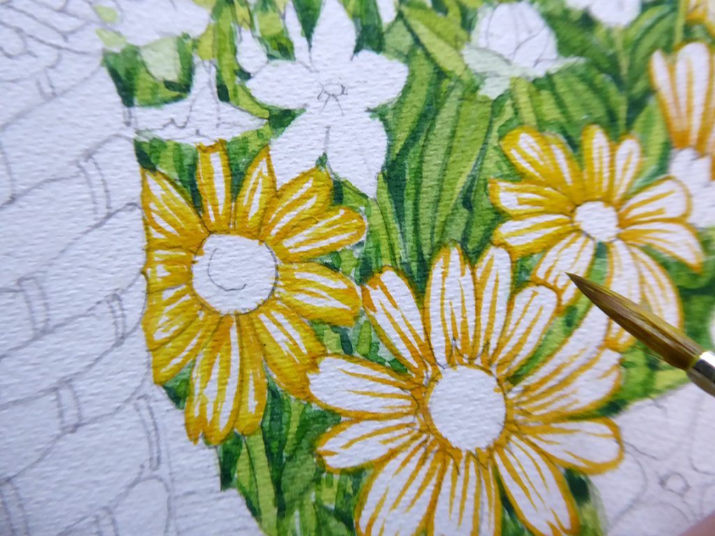
Next, I’ll paint in all the Rudbeckia flowers. These are quite fun, yellows and reds. I use the same technique as before; detail then a top wash. I leave the centre of the flowers white for now; both the yellow and these blloms have similar centres so I’ll blitz them all at once after the petals are completed.
More foreground flowers are painted in
I take on the central discs of the Compositae; they’re a tawny gold colour. A bit of texturing on the bottom right hand side stops them from looking flat.
Painting the pink flowers
Pink flowers! I use winsor and newton watercolours. But for these pink flowers I rely on a tint. A tint is a watered down and paler version of a colour. Doctor Martin’s Hydrus watercolor ink 5A Quinacridone magenta is the ideal candidate. By itself it looks atificial and too bright. But when ,ixed with a touch of crimson it’s perfect. The intensity of these inks is unmatched. They’re fade-resistant too; I use them a lot to add a kick to my colours.
Below is a detail that shows how some areas of the petals are left white. You can clearly see the pencil lines. Luckily these rub out despite the watercolour on top of them. You can also see that I’ve revisited the yellow flowers. I used a darker orange to give a little more shadow and definition.
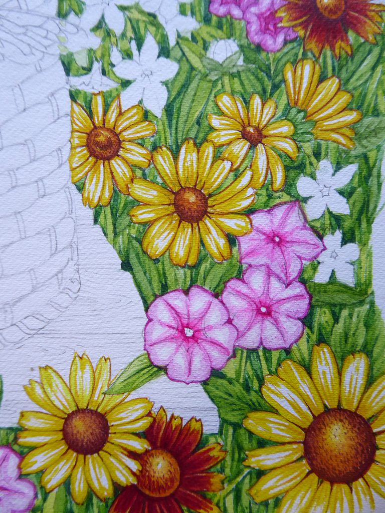
Close up of the foreground flowers
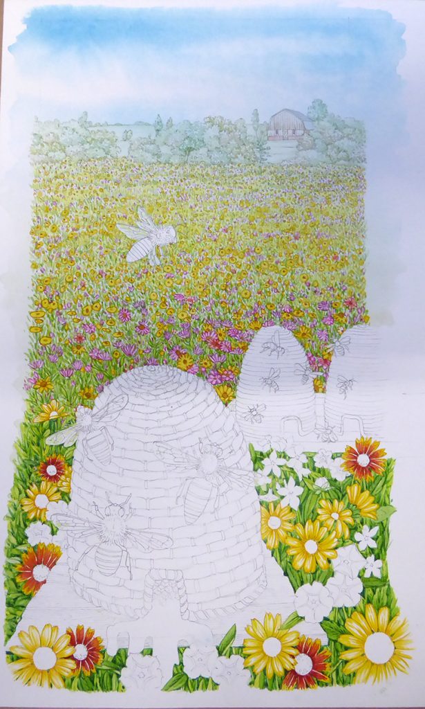
Illustrating the beehives supports…and the bees
I paint the wooden supports that the bee hives are perched on. This mix is mainly ochres with slightly darker brown lines to suggest wood. Next I apply myself to the main bee in the illustration. This has to be right or the whole painting will look silly. I work from dead specimens and take a long time trying to ensure the bee is fluffy, and has the correct colouration.
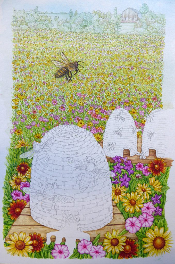
Bee and hive supports completed
Here’s a detail of the bee. To be honest I’m not entirely satisfied with him, he’s too dull and overworked. He’s passable though, which is lucky as it means I won’t have to start all over again.
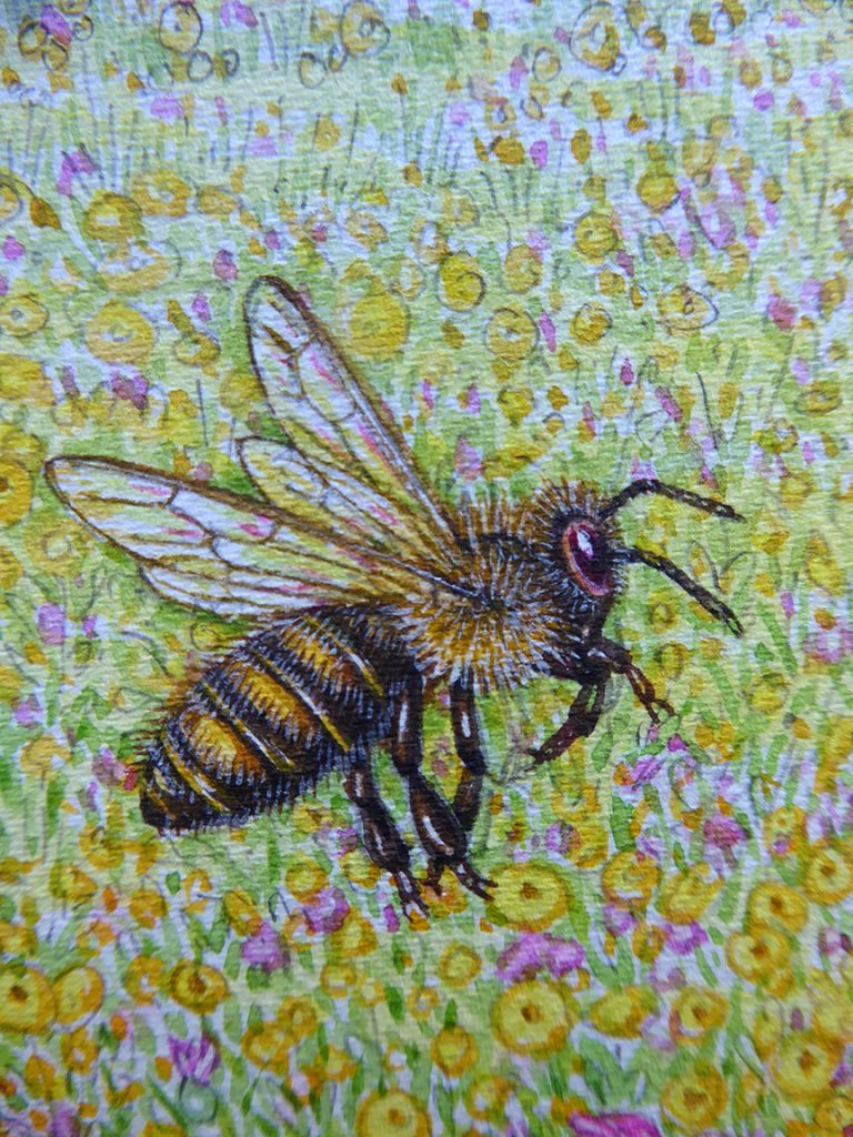
Close up of the worker bee
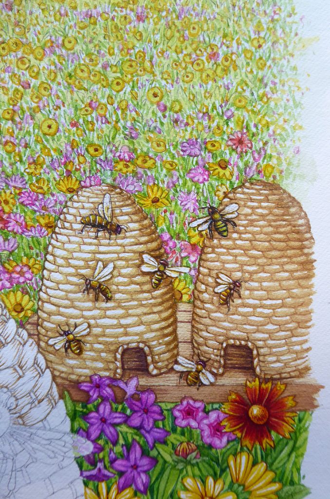
Painting the skeps or beehives
Skeps next. These are a sort of straw gold, so I use yellows, ochres, and naples yellow. Painting in the texture of these hives is rather soothing and I enjoy myself. Painting in the remaining bees is mroe exacting, and require a tiny brush (a No.000) and me holding my breath as I do the tinier details. Again, the bees aren’t magnificent, but they’re good enough.
Skeps and distant bees complete, working into the texture of the skep in the foreground.
Here’s a detail of the skeps and the bees; because the bees are distant and so small (think how tiny they’ll be when reproduced on the honey label!) they can be less intensley detailed than the main one:
Detail
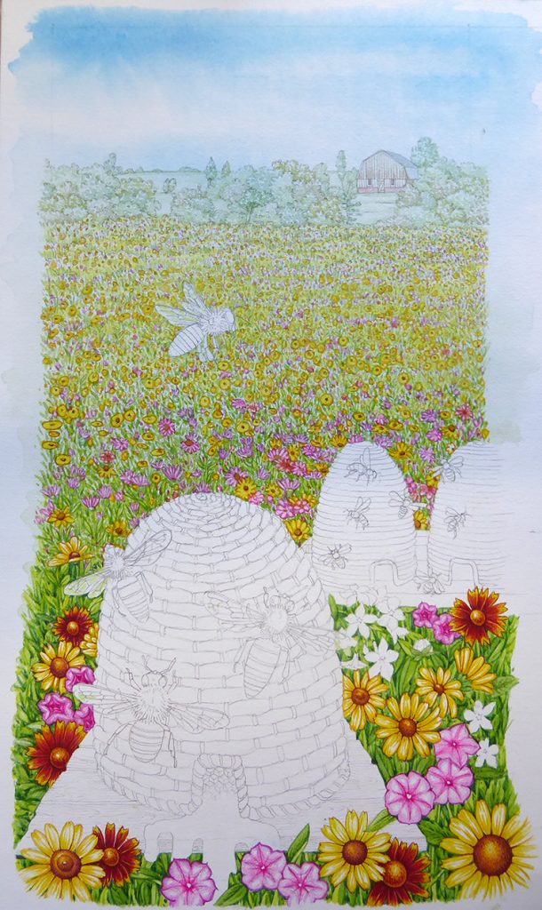
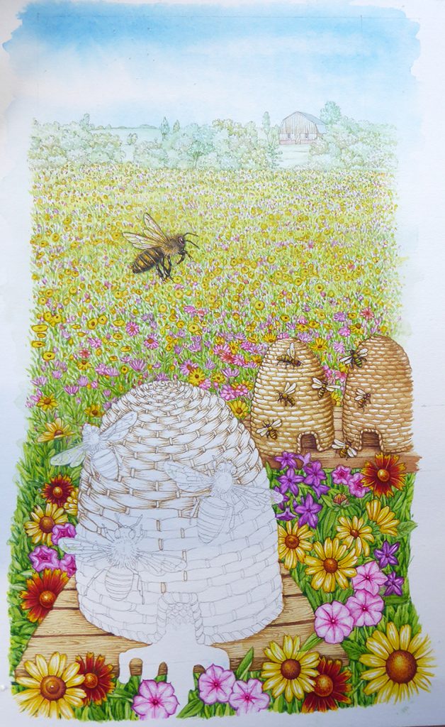
Adding the dripping honey
We’re getting close to finishing now. The main skep needs completing, which is easy in comaprison to the bees and the detail on the flowers and leaves. Once that’s done it’ll just be the dripping honey. This has to glow. Then it’s just the remaining foreground bees.
The reason I’ve left these elements until last is that this illustration is almost layered. You can only move onto each element as the steps involved is sorting out the background get completed. The main skep goes in. Once it’s there I’ve got a background for the flying bees and dripping honey.

Detail showing the texturing of the straw of the skep
Honey! Distant honeycomb within the skep is painted in dark reds and golds (I’ll add the details of the comb structure once the yeloows have dried), and then I paint the river of honey pouring out. (I am aware this is fictional, no self respecting bee would allow such a waste of such a precious resource!) Making the honey shiny just means ensuring there’s a smooth transition from dark gold to white, and ensuring the white of the page is left to suggest the glinting highlights.

The honey is added
Adding the foreground bees
The final step is the remaining three bees, and any tweaking or addition of shadows to add depth. Again, I use a smaller brush on the bees and take my time. They end up a little more convincing than the one we see in side view, but I think the take home message is probably that I need to do more practice when it comes to painting honey bees!
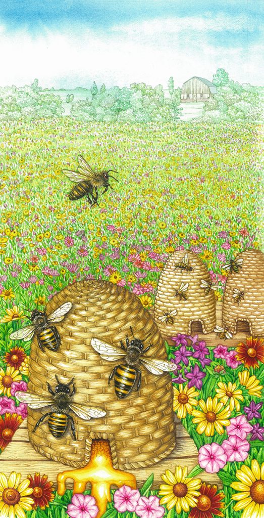
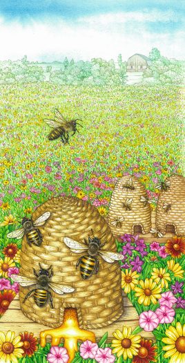
Final honey label with flying bees and honeycomb texture added.
I submitted the artwork and the client seemed really pleased, which is always a relief and a treat. He also sent me a massive box of absolutely lovely honey and honey products along with my remittance – I wish all my clients were so generous!
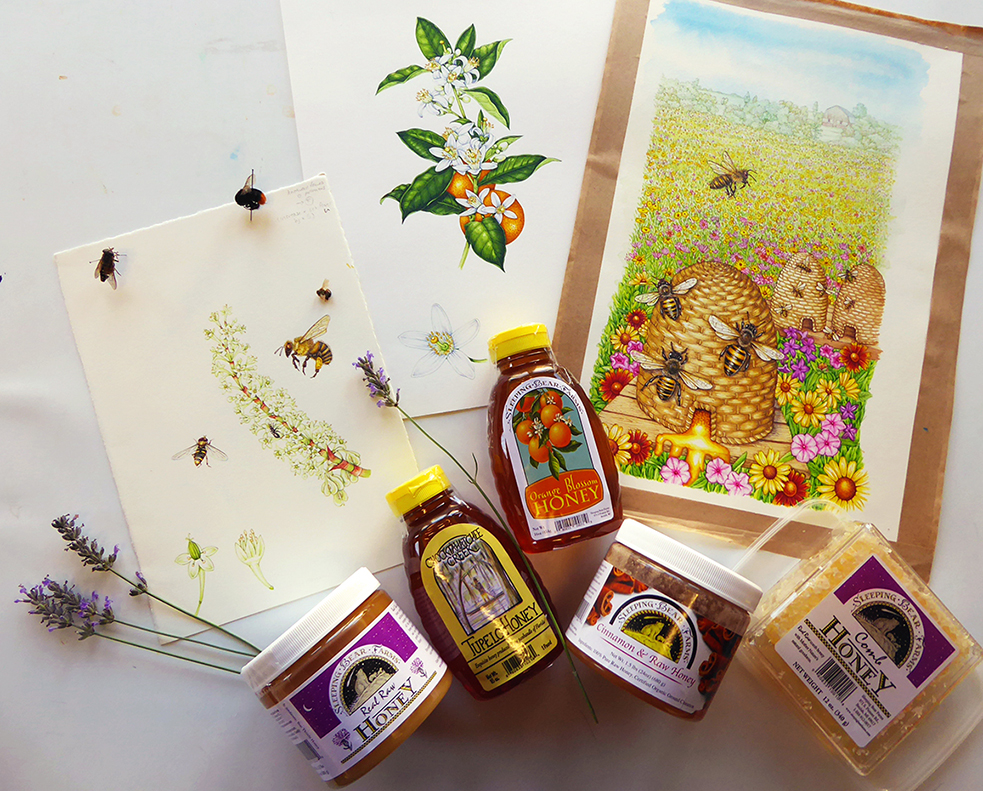
Illustrations and honey gifts from Sleeping Bear Farms
Absolutely beautiful!! Thanks for all your step-by-step blogs! So very interesting and educational to read! And gorgeous to look at! You are so talented!
Hi Irma
Thanks for such a lovely comment! And Im glad the step by steps are helpful.
yours
Lizzie
Wonderful. The step by step blogs are inspiring. Thank you for sharing. Feel as if I’m looking over your shoulder. The steps make so much sense. Would never had realized the process.
Thanks Beth! It always simplifies stufff when you break it down into its component parts. So glad it helps.