

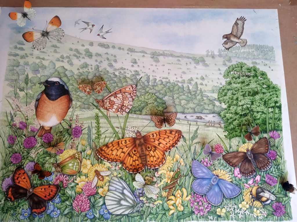
Illustrating a Wild Welsh Meadow of Butterflies
Illustrating a wild Welsh meadow complete with clouds of butterflies was a wonderful commission. Not only do I know the location well, but the landscape was a leaving present for the director of Radnorshire Wildlife Trust, who is a good friend. He’s obsessed by butterflies, so including a whole ton of these seemed sensible.
Working with Specimens
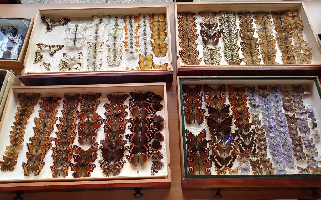
I also had the luxury of being able to work from my Victorian butterfly specimens, and I found this incredibly educational and helpful. I inherited this amazing collection of three cabinets of British moths and butterflies from my talented costume-making friend Wendy. By a circuitous route, she ended up saying that yes, she knew someone who’d love to have the cabinets. What an excellent decision, and what an excellent friend!
This blog really is just a way of showing how much easier life is when you have actual specimens to work with. There are times when this is impossible (see my blog on working from photos for more), but in general if you can beg, borrow or steal a specimen that you’re illustrating…do it!
Gilfach Nature Reserve
Gilfach is the flagship nature reserve for RWT, and is a gorgeous place to visit. There are limestone crags and ancient oak woodland dripping with lichen and echoing with birdsong. An old longhouse (now a visitor centre) is perched halfway up the wooded hill. The beautiful river Marteg sparkles and babbles as it flows through the reserve. The site of my illustration is a lovely patch of sunny meadow. Wild flowers speckle the long grasses with colour, and the meadow clambers from the Marteg up the side of the valley. I spent a lovely day gathering reference there. Listing plant species, butterflies, and birds; I came up with over 60 species! The next task was to whittle them down.
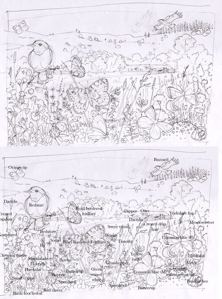
Pencil roughs
I was asked to include some key species, and added to these. Pencil illustration are useful as you can alter them, and allow the client to make changes. It also gives me a chance to make sure everything is included, by labeling up the rough. I think this helps the client see what they’re going to get as well! The only change requested was to pop a caterpillar in the mouth of the Redstart. The initial rough (and annotated version) is below.
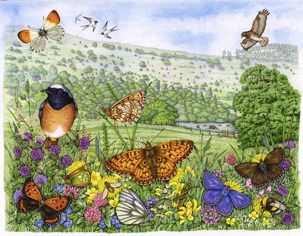
The more detailed pencil rough followed. This ends up being like a line drawing in a colouring-in book. If the drawing is correct, you’ll get a decent final illustration. Once you have the go ahead, it’s just down to getting the colours right.
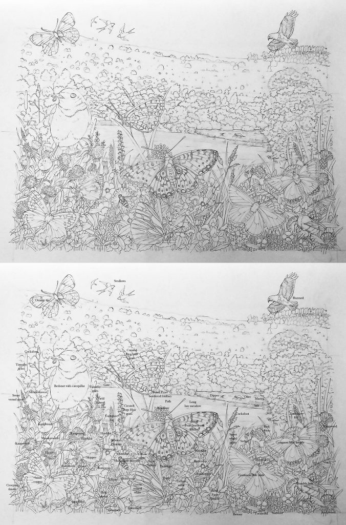
I work into the landscape first, then add the wild flowers. Eventually, I have a landscape with white shapes where the insects and birds are to be. For more on this aspect of building an illustration, check out my earlier blogs (Illustrating a Coastal Hay Meadow, Illustrating a cross section of a hay meadow, Illustrating a Water meadow landscape and Natural history landscape amongst others). For now, I want to focus on the butterflies and bird.
Illustrating a Wild meadow: The Common Blue butterfly
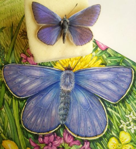
The Common blue butterfly Polyommatus icarus is a small species. Males are a glorious blue, females a dark brown with orange marks at the wing margins. Having my specimens to hand for this species was a revelation. I’d never realised before that these beauties are irridescent! To capture the glitter and pink-lavender-blue hue I had to add a little something to my watercolours. Eye make up was perfect, and made the wings glitter as they should. They’re not a sky blue as I’d previously thought. I suppose when I see them fluttering in the wild, their glittering wings must reflect back some of the blue from the sky above? Getting the colour closer to correct felt good.
I also love how you can just see the circles on the hind wings through the blue. I tried to include a suggestion of this in my illustration. Although I know I can never capture the true colours of nature, this Common blue specimen made my task significantly easier.

Mixing up the browns of the female was easier.
It was only with the butterfly in hand that I could see how rich and dark the wing colour becomes where it abuts the thorax.
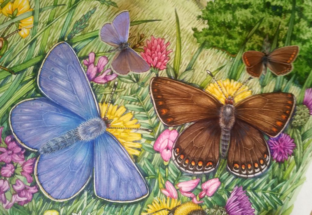
I used my Winsor and Newton watercolour paints and (as always) my trusty Winsor and Newton series 7 brush. This illustration was done on Stonhenge Aqua hotpress paper, my current favourite (available from jackson’s).
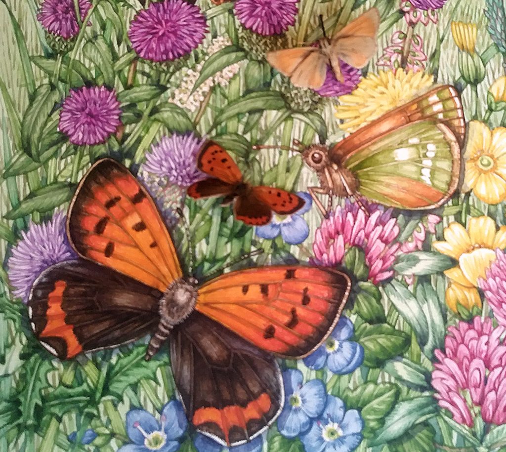
Illustrating a Wild meadow: The Small Copper Butterfly
The small copper Lycaena phlaeas is a beauty. The orange almost glows against the brown of the hind wings. I think I failed to make the browns quite rich and velvety enough, perhaps I could have added a little more purple to the colour mix?
The orange is very slightly richer and redder where it meets the dark brown wing margins. You can get this effect by adding a discrete layer of small paint brush strokes, slightly deeper in hue than the background orange colour. Top washes help blend the colours together. This photo also shows the Skipper butterfly. This little insect is a subtle mix of orange and green. It doesn’t sound pretty, but in reality it’s a beautiful colour scheme that helps make the butterfly almost invisible amongst the long grasses. Again, the most vibrant colours are where the wings attach to the thorax. Would I have know this without my specimens? Probably. Would it have been as clear to me? Definitely not.
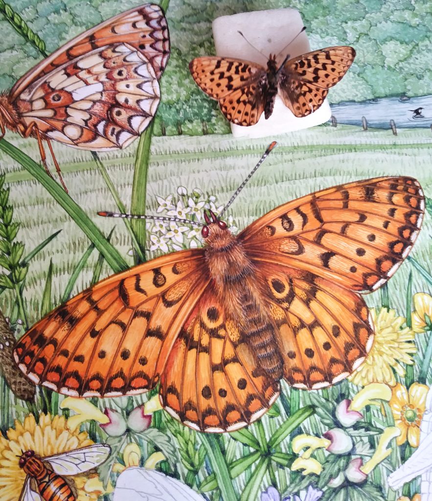
Illustrating a Wild meadow: Flummoxed by Fritillaries
I know that this lovely butterfly (Bolorao selene) is one of the favourite species of Julian Jones, destined to receive this leaving present. I popped two in, one with wings outstretched and one with wings folded.
I have to admit that I am no expert on the differences between the fritillaries. Telling the Small Pearl-bordered fritillary from the Pearl-bordered fritillary Boloria euphrosyne is beyond me unless I have a book, or an expert at hand. I know it relates to the number of pearly markings on the underside of the wing. The Small pearl-bordered fritillary has more. I was worried that the specimen I worked from may be a Pearl-bordered, not a Small Pearl-bordered. However, Julian (and the folks at RWT) haven’t complained, so I’m hoping I worked form the correct specimen. Or maybe they’re too polite to point out any mistakes!
Illustrating a Wild meadow: The Small Pearl-bordered fritillary side on
I illustrated this species as I do all my butterfly subjects. Plot in a colour map in pale watercolour. Then work into the depth of the markings with lots of tiny brush strokes, in a richer and thicker watercolour paint. For more on this technique take a look at my blog on painting a Silver Washed fritillary Argynnis paphia (another fritillary!)
The detailing between the dark lines and russet regions of the wing are complicated. By looking at my specimen and comparing it to illustrations in books by illustrators such as Richard Lewington, I could get my head round these intricate patterns.
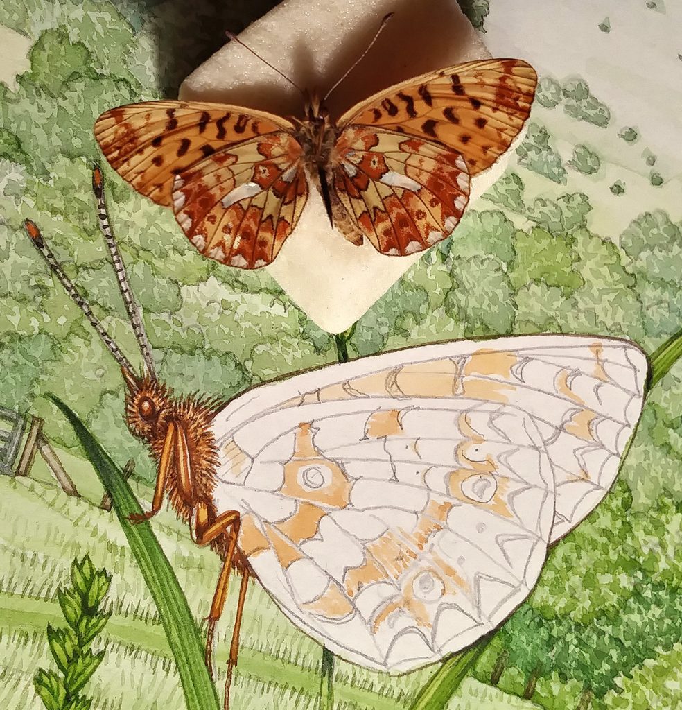
In the illustration below you can see how I worked into the areas of colour. Being able to move my specimen around so it was right next to my illustration, and at the same angle was invaluable.
Yet again, I got to examine the shiny, pearly areas on this butterfly wing and decided Something Must Be Done. Once more, I used eye make-up to catch the glittery shine. I believe the shiny component is mica, and since painting this piece have found an irridescent watercolour to use instead. This is Daniel Smith’s Luminescent pearlescent white. Not cheap, but worth every penny if it saves me having to raid my make-up box every few months!
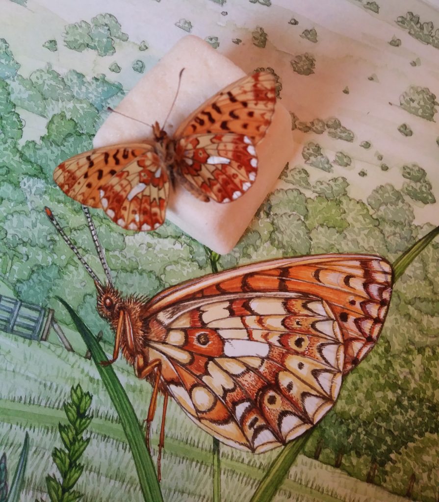
Illustrating a Wild meadow: The Small Pearl-bordered fritillary top view
Having the butterfly right there was so helpful for colour matching. It was also great to be able to get up really close, and to see where the colours are caused by a speckling of different colour scales optically blending, or whether it’s the result of scales of a differnt hue. Having several butterflies of the same species helps too. There’s quite a bit of variation between individuals, and it’s interesting to see what form these differences take.
I used white gouache to add texture to the hairs on the abdomen and thorax. Colour of the antennae was copied form the specimen. I love how lots of butterflies have antennae striped black and white, it’s peculiar and very pretty.
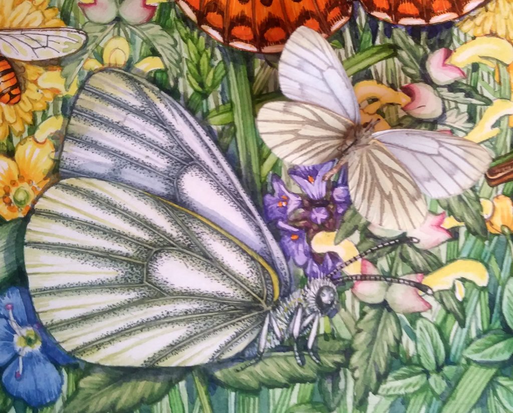
Illustrating a Wild meadow: The Green veined white
The problem with illustrating white butterflies is that they seldom are pure white. There’s always a slight tint presnt. The trick is to avoid swallowing up the delicacy of that paleness by overdoing the tint. The same issue arises when painting white flowers (see my blog on this for hints on how to deal with white petals).
In this case, the Green veined white Pieris napi has a yellow-green tint. Most of this colour comes from the top vein of the wing which is distinctly yellow. Then a small tweak along the outer wind margins provides enough. Our eyes do the rest, assuming the whole white area is slightly yellow-green.
I adored working into the spots on the wing on this insect. Again, the specimen was so useful. How far our do the markings come from the veins? Are they actually black? (Under the dissecting microscope they are, indeed, black). Are they more concentrated in any areas? Do they cover the veins or not? This information would be available in photos, but far harder to make out. Again, I bless my lucky stars that I have my Victorian butterfly cabinets to work from.
The tiny black spots are applied with the tip of a series 7 paintbrush, the paint applied quite thick. Not making any of the marks too large or elongate is vital. Look! More stripy antennae!
I also illustrated an Orange tip Anthocharis cardamines, one of my favourite species. It always comes to the garden at the beginning of spring and fills me with hope that warmer weather and an end to the gloom is on the way. The specimen was useful for colour matching that glowing, vibrant orange.
Illustrating a Wild meadow: Bumble bee
Anyone can get their hands on a dead bumble bee Bombus lecourm. These are useful too. Not so much for looking life-like as they seldom do, but for establishing where stripes are, and their colour. Someone told me recently that bumble bee colours will be somewhat bleached by the end of a season; I bear this in mind now as I work from specimens found on window sills or the garden.
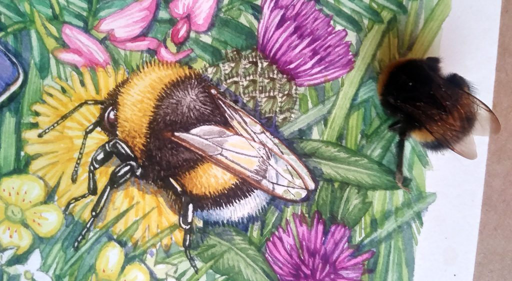
Bumble bee wings, however, do not bleach or alter. Being able to examine an isolated wing and copy the venation is vital to getting the bee “looking right”.
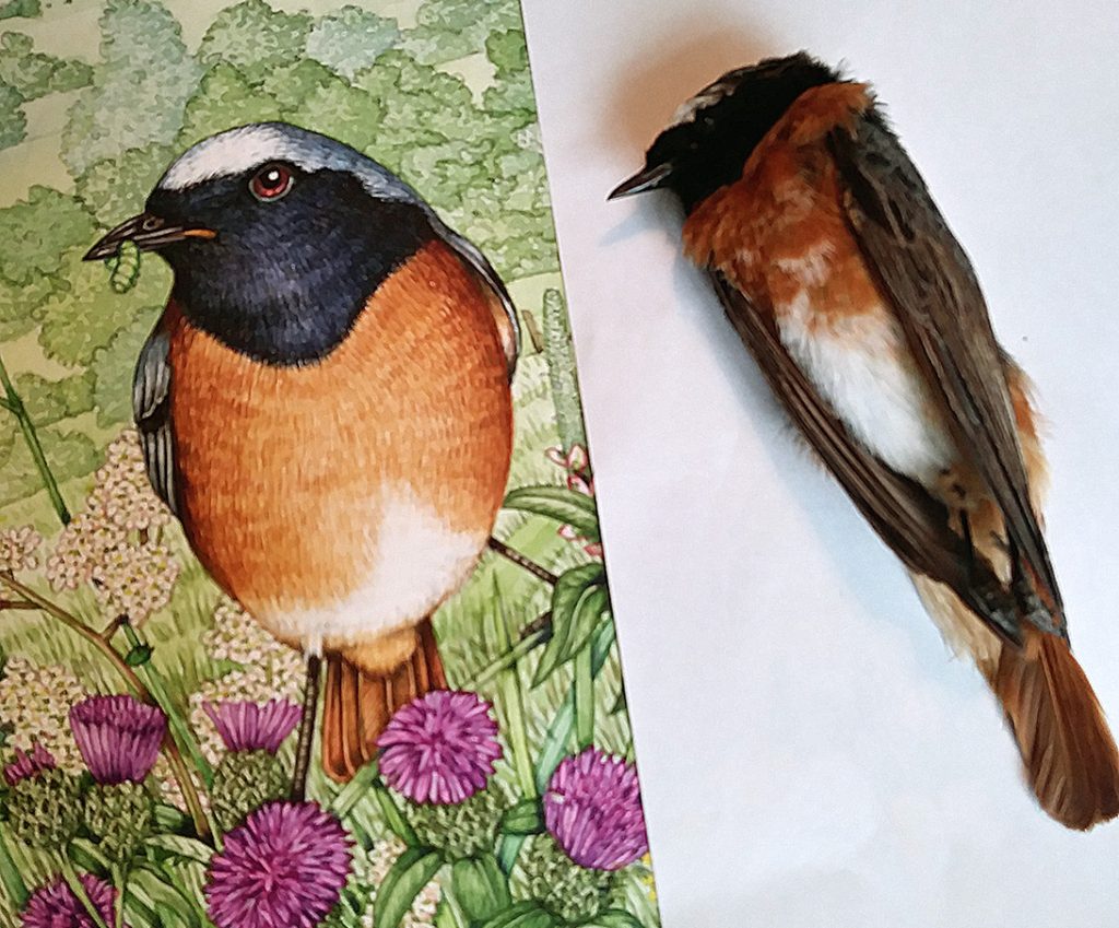
Illustrating a Wild meadow: Redstart
Amazingly, I had a pair of Redstart in a jar in the freezer. I’m lucky in that people know I use dead specimens to work from, so they literally bring me what the cat brought in. It is always sad to see these tiny beautiful creature lifeless. Being able to examine the detail and complexity of the beak, feathers, and legs is wonderful, but I’d always prefer to see them in the trees.
For more about my rather esoteric collection of dead things, have a look at my Youtube video.
Finished illustration…with specimens
Below is the completed illustration. I’ve popped all the specimens next to the butterfly that’s been illustrated.
To be able to work from life (from death?) is amazing. You can match colours. Details become clear. Patterns can be double checked against reference books and other specimens. You can turn a specimen to the light and discover it glitters like a jewel. The stripes on an antennae are clear, as are the hairs on a thorax.
The amount of information you can glean is breath-taking. By looking and examining, you learn so much.
I acknowledge that I’m incredibly fortunate to have inherited my Victorian moth and butterfly cabinets. I am also acutely aware that butterfly collecting, except for scientific research, is no longer thought of as a good idea. Long gone are the days when every young curate would have an extensive collection of butterflies. And I’m very glad that’s the case, animals are always much better alive than dead. This doubles my fortune – due to the age and provenance of my collection I don’t feel guilty working with it. All the insects collected would have been assembled more than 70 years ago. Many are much older. I’m triply fortunate in that my butterflies have been keep well. They haven’t faded much, nor fallen apart.
I guess my message is that if you can borrow older specimens to work from, do it. Museums often have lending collections. Ask around, the most unusual people own the most surprising things. But if you CAN get your hands on some antique insect specimens enjoy it. The luxury of being able to look that close at something that beautiful is hard to beat.
If you’d like to hear me talking about the butterflies as I painted them, take a moment to check out my Youttube film:
Dear Lizzie
Thanks so much for sharing this with me. You inspire me to be better at my watercolor intents, really thanks for be unselfish☀️and help others learn from you!!☀️☀️☀️☀️
Hi Ginie
My absolute pleasure!
Yours
Lizzie