

Step by Step Rowan berry
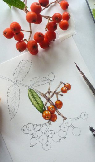
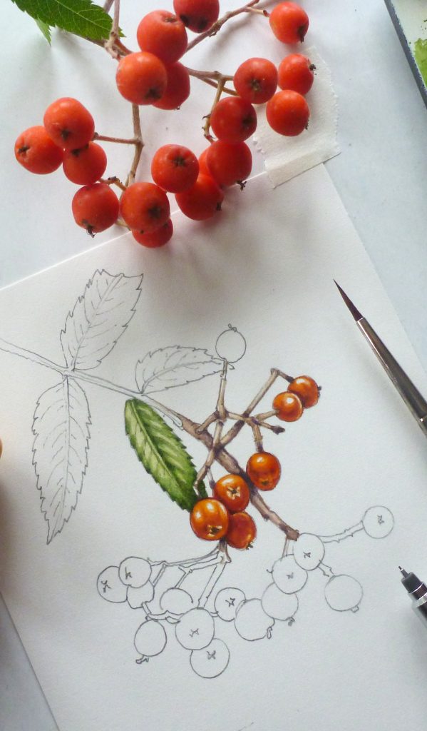
If you’re doing a botanical illustration of a cluster of fruit, the first thing to do is figure out how to tackle one lone berry. In this case, it’s the beautiful bright orange Rowan berry that’s under the spotlight.
I have a Rowan, or Mountain ash tree in my garden. Not only do the clusters of blazing orange berries look stunning long into autumn, but they provide a vital food supply for the garden birds. They also give me something colourful to illustrate in the depths of winter.
Drawing the Rowan berry
First, draw a cluster of berries. I use a Pentel P205 mechanical pencil, H lead. This is because it never needs you to break from drawing to sharpen it, just snap the lead to a crisp edge by pushing against the page.
Keep the drawing simple. No lights or darks, just a simple and accurate representation of the shapes of your clutch of rowan berries.
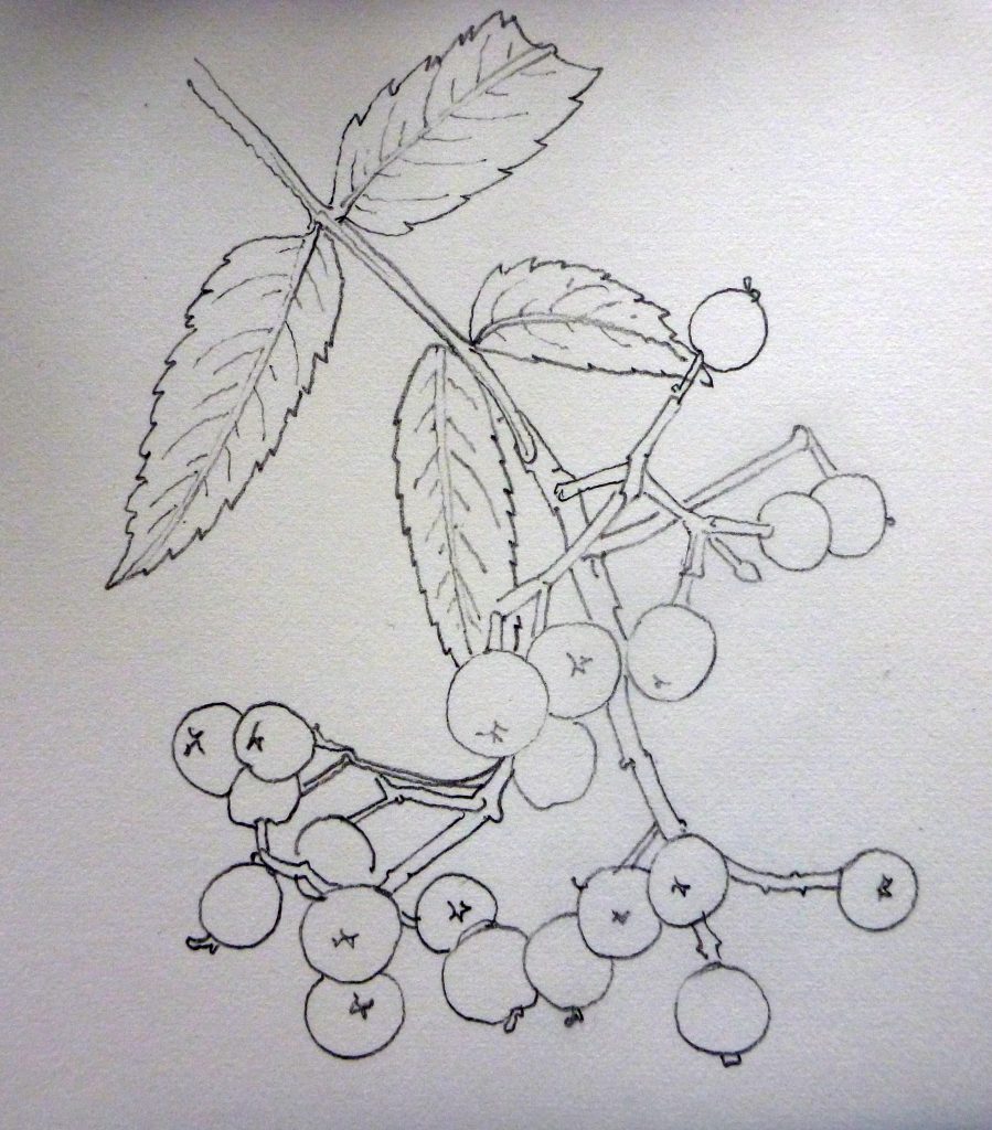
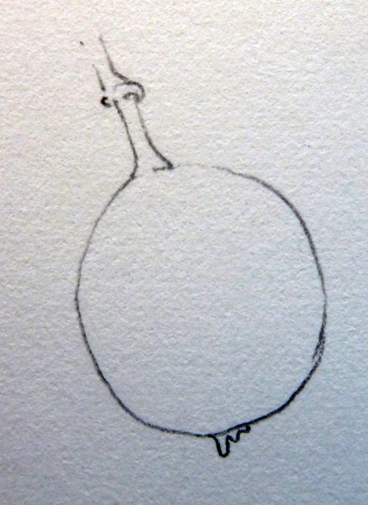
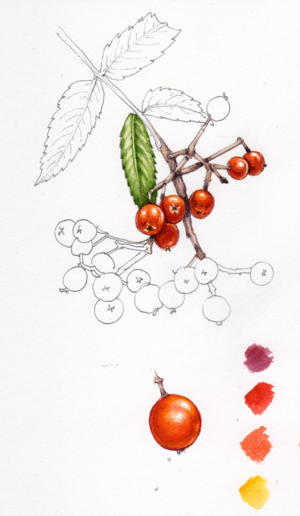
Beneath this study, I also draw one single berry. I’ll be focused on this lone rowan berry, then using the approach used on the single fruit to add colour to all the berries in the drawing.
Mixing your dark oranges
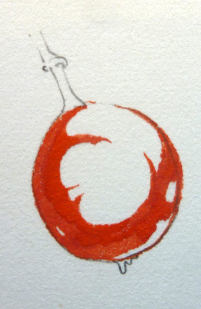
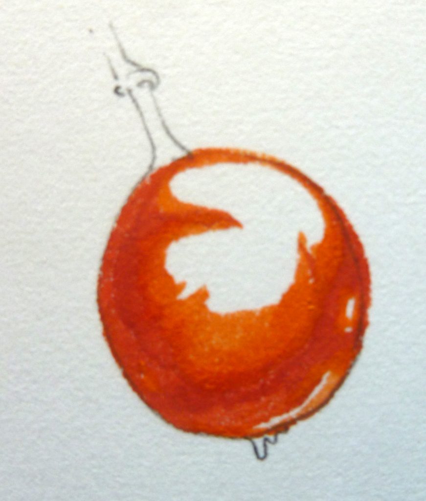
Unconventionally, I start by plotting in areas of dark. This helps me understand the shape of what I’m painting. Lots of people using watercolour start very light and take their paintings gradually darker and darker; it’s an approach which works well. However, I’ve always painted this way and even thought I’ve tried to change my ways, it’s easier for me to start out with those shadows.
The colour I mixed is cadmium orange light mixed with a little crimson. This adds a darker red kick to the orange of the berry. I look for distinct shapes in the darker areas, and plot them in.
It’s vital to leave lots of white. Not only will these spaces provide you with highlights and shine, but you’ll be using them to work into gradations of colour between the dark orange and the shining white highlights. Give yourself space to manoevre!
Look out for shine on the bulk of the berry, but also on the bottom of the curve. Adding this light area helps describe the spherical shape.
Between all these steps, be sure you leave time for the paint to dry fully, or your layers of shade will all merge into one atonal muddy mess.
I always use a Winsor and Newton Series 7 paintbrush (in this case a number 1). Winsor and Newton watercolour pans fill my paintbox, (although I’m currently experimenting with Daniel Smith watercolour trial dot cards too.)
Plotting in the mid tones
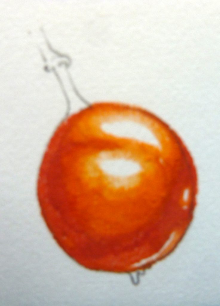
Next, you need to work into the bulk of the berry. You need to keep the highlights white, but show a gentle change between the shadows and these light regions. Mix a lighter orange. I used cadmium orange light with less red added. Lay this on top of the painted area, and overlap the edges a little, into the white zone.
I also dilute the mix with water as I move into the paler regions of the berry. This is why the orange looks a little yellower there.
Repeat the action, but this time with a paler hue. I mix some cadmium yellow light in with cadmium orange, and add some water to keep it bright and light.
Unfortunately the photo is a little out of focus, but I hope you can see how using the paint in an ever more dilute mix gives the suggestion of the colour brightening toward the highlights.
Always keep looking at the berry you’re illustrating. You’ll only get the tonality right by referring to it endlessly.
Working into your darks and finishing your lights
The final step with the highlights is to unite the colour of the berry without swallowing the highlights. A very dilute yellow provides the perfect colour. Apply it over the entire berry, except for your most startling highlights. If you look at the bottom curve of the rowan berry below, you cn see that the white has been entirely covered with the yellow wash. It still provides visual information that tells us the berry is round, but it no longer pulls the eye from the highlight at the centre of the rowan berry.
Now you’ve sorted out the shine, you can look at the darks and shadows again. I always come back to these areas and take them a couple fo steps deeper and darker. In this case I mix up a deep crimson from cadmium orange dark, alizarin crimson, and a touch of purple.
Be careful adding these super-darks. You don’t want them to swallow the whole rowan berry, just to add a bit of a “pop”.
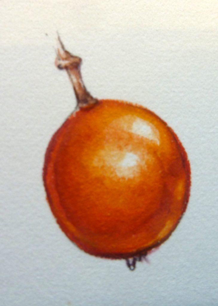
You can see that the darks have been added at the very bottom of the fruit, and a touch in the dark area on the right, below the shine. Another touch goes below the stalk and a final bit just on the left hand curve.
Colours used
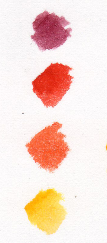
Here is a colour swatch of the mixes I used. The top purplish crimson was the final darkest darks. Next colour down was the first painting I did, the initial plotting of shadows and shapes. The second, paler orange was used for the midtones. The bright yellow was applied across the whole berry, except for the brightest highlights. In lighter areas it was diluted with lots of water.
For a step by step on painting blackberries, sloes, and hawthorn berries, please follow the links. For all my botanical illustration step by step blogs click here, and for a whole gallery of my sketchbook studies, please click here.
Applying this technique to the whole cluster of berries
Now you’ve figured out your approach and palette, you can apply it across the whole sketchbook study.
You also need to think about how the proximity of berries and leaves interplay. One berry will cast a shadow onto the rowan berry below it. A leaf may cast a shadow over the whole lot. Keep looking at your specimen as you untangle this interplay of dark and light.
And here’s the finished study:
I used this as a base for a teaching session, and filmed some of it in real time (see below). If you’d like a simplified version of this blog, as a printable A4 sheet, please check out my Pinterest post.
I hope this explanation of how you can use a study of one lone rowan berry as a starting point for a seemingly complicated sketch might be helpful. As with everything to do with drawing and painting, it all boils down to looking, and taking things slowly, step by step.
Thank you for your detailed instructions. Your work is fabulous and much appreciated by me, a novice watercolor artist. I know drawing is important as the underpinning of any watercolor work; I always think I can skip over the drawing and somehow a magical work of art will appear! Your instructions give me hope to keep trying. Thank you from New Richmond, Ohio, America
Hi Denise
What a lovely comment! I’m glad you find the blogs have enough detail. I have a bad habit of explaining everything fine, then getting towards the end and rushing at the painting, forgetting to take photos or make notes! And yes, Im afraid the drawing is indeed the foundation of it all. but the encouraging thing with that is that the more you do it the better you get. It’s just like learning a foreign language – practise makes perfect.
I’m mostly elated that my blogs encourage you to keep at it, there’s no greater reward than that. Thanks again for such a positive and cheerful comment.
Love to you in New Richmond, and keep up the art!
Thank you for sharing this, it is extremely helpful.
I am so glad to hear that! Thankyou for taking the time to leave me a comment, that’s lovely!
Hi Lizzie
As another novice watercolorist who loves botanical studies, I just loved the Rowan berry tutorial. It was helpful hearing your frustration when colors didn’t go right and how you went about fixing them.
I think the best advice I took was to lay down the color and dont fiddle with it! I’m one of nature’s fiddlers: and a bit more here, change a bit there….ad infinitum. And what do I end up with? Muddy colors.
I’d like a bit more info on your materials:
Daniel Smith paints? Pan or tube?
Series 7 brushes? What are your “go to” sizes?
Thanks again for the video. I’m now off to search out more of your video tutorials. Please,keep them coming!
Forget the questions….I just scrolled back and you’ve given all the information in the blog which wasn’t on the video. Thanks.
Hiya Laura
No problem. And if there’s ever stuff I do fail to pop down (materials etc) then let me know and Ill happily fill in the gaps. I do plan to do more video tutorials when there’s a little more time, they’re quite fun (although scary! No way can you mess up if you’re trying to film in real time!)
The fiddling thing is common to all of us, wanting to add a final tweak and…losing the fluidity and transparency and immediacy of a painting. I know about doing that, I do it myself far too often! Mostly, keep those highlights clear and white for as long as possible!
Thanks for the comment, and encouragement. And good luck with all your painting!
I’ve been searching for a site to help me with my watercolor paintings. Yours is perfect for what I want. Thank you for sharing your talents. Your work is beautiful! Please add me to your mailing list.
Hi Paula
Thanks so much! Delighted it’s of some use. And thanks for the kind comments about my work. I’ve added you to my newsletter (next one out in the autumn). Thanks agin!
Lizzie
I do try to do botanical pictures and to a little success however ,,expert tuition is worth it’s weight in gold!! Your narrative plu illustration stages are perfect for keeping me on straight and narrow! I’d love to be added to your mailing list too x
Dear Jane, Im so glad the tuition I offer is helpful. It’s great to hear that breaking down an illustration into component parts can help de-mystify the process. Thanks, and thankyou for the feedback too.
Ive added you to my newsletter, as requested; thanks for subscribing!
Yours
Lizzie
I found it fascinating that you worked from dark to light and that the results are so beautiful. I am definitely going to give this technique a whirl in my own paintings.
Hi Louise, yes, give it a whirl. Some people really don’ get on with the approach, others find it much easier than the traditional way of going darker. Hope it works for you, and thanks for the comment! x
Thanks so much for this amazing illustration and demo! I’ve just started my botanical watercolour journey and find them to be really helpful!
Hi Ed
So glad you feel it’ll be useful. And enjoy your illustrating and work with botanical subjects!
Yours
Lizzie
Thoroughly enjoyed your demo. I don’t have access to classes right now and im feeling a bit rusty.
Thank you. Especially enjoyed the way you brightened up your berries.
We may have met at an ASBA conference some years ago.
Hi Carolyn
Glad to be able to un-rust you! And yes,ASBA some years ago,I think your nane is indeed familiar.
Thabks for the generous feedback
Yours
Lizzie