

Botanical Illustration: Step by step Hazel

I’ve recently started painting up some botanical illustrations for FSC Publications, including the Hazel Corylus avellena. I worked for FSC before, on the Caring For Gods Acre illustrations).
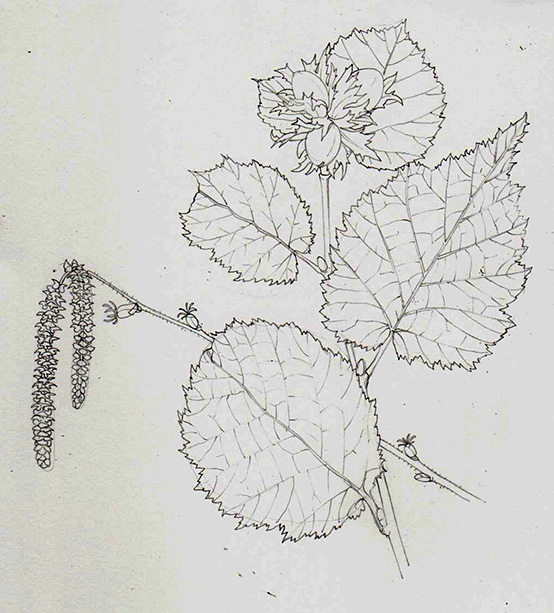
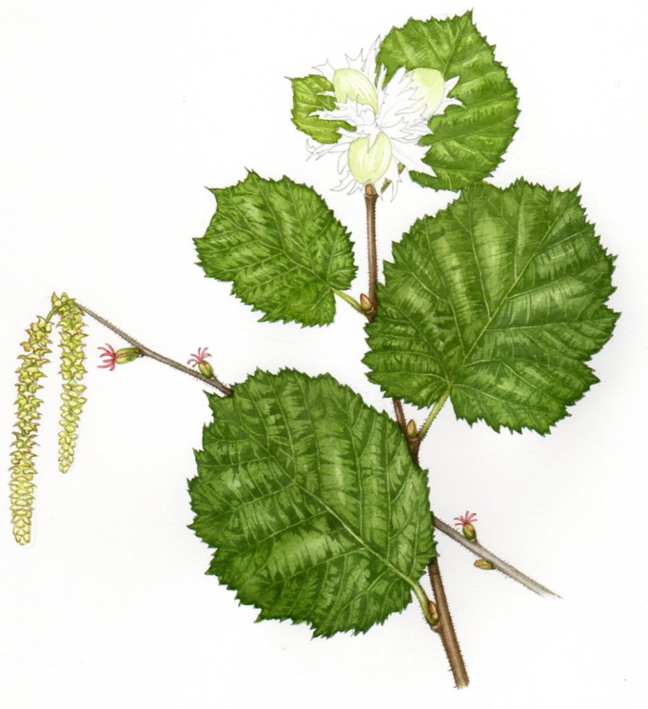
One that I knew would take some time, but was seasonally appropriate, was the Hazel Corylus avellana. I drew the leaves and nuts from reference gleaned from a local hedge, and had information on the catkins and flowers in my sketchbooks.
Materials and drawing up the Hazel
I started by using a mechanical pencil (Pentel P205 is a favourite) to draw the plant onto Fabriano artistico Hot Press watercolour paper, which is the brand I favour for all my natural history illustrations.
The contrast is more extreme than in reality in this scan.
Although ripe nuts and flowering catkins would never appear simultaneously in nature, the joy of illustration is you can include both in a convincing format.
Painting the darkest darks
Once drawn, the first thing I do is plot in the darkest veins. I use a number 1 Winsor and newton series 7 brush, and Winsor and Newton Watercolour paints. The lower leaves are darker; and there’s a slight chalky flatness to all the hazel leaves I examined. The greens were mixed using Yellow ochre, Cadmium yellow pale, Sap green, Cereulean blue, and Vandyke brown.
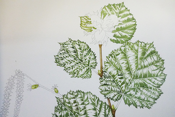
Next stage is to paint in the twig, buds and catkins. The catkins are outlined in a greenish yellow. A wash is applied on top. Shadow is picked out in a slightly browner, darker yellow. Including things like the minute hairs on the twigs is important.
Working on the hazel leaf midtones
I plot in the central veins with a pale yellow-green. Next, I mix up a watery pale green wash to cover and unite the leaves. In fact, I believe I made this initial wash too dark which means some of the life is lost from the final illustration because the white of the paper can’t show through. I underestimate how opaque the Oxide of chromium green was. It’s not devastating, but it’s important to understand where improvements can be made next time.
I like to let the wet wash dry naturally; it helps define the sharp edges of the serrated leaf margins. Younger leaves (towards the top of the plant) are yellower and fresher. So they get a lighter, yellower wash.
A second wash is applied and allowed to dry. This one’s less opaque, and yellower. The distinctions between the lights and darks of the leaf become less abrasive and more natural. Even as I apply the washes I keep examining the leaves I’m painting because it makes things so much easier when you have the specimen right in front of you.
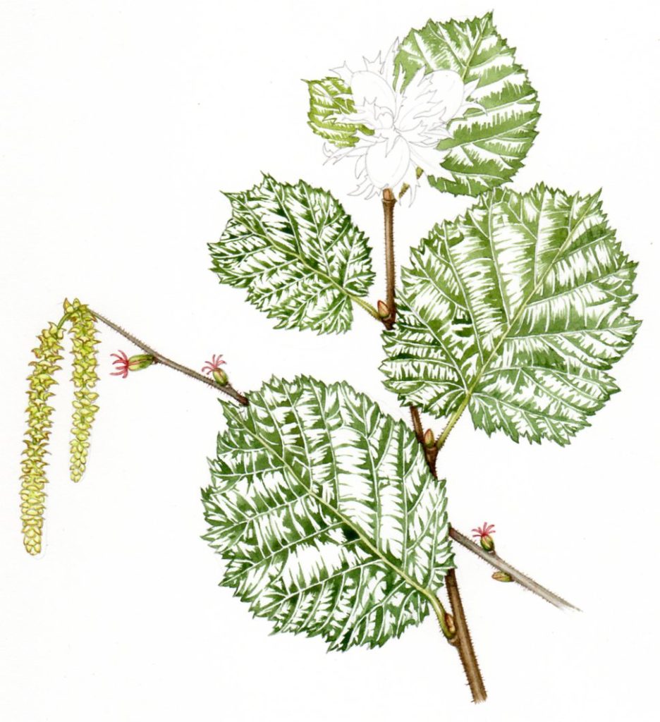
Illustrating the hazel nuts
Next up is the hazelnuts.
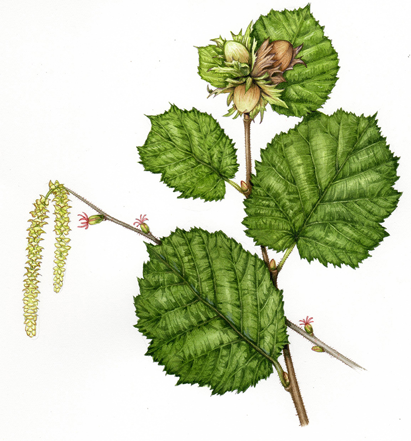
I choose to paint the hazelnuts at various stages of ripeness. It’s unlikely such a mix would occur in nature. I want to show the nut at different developmental stages. The joy of an illustration is that you can do just that.
I work further into the shadows with a mix of Vandyke brown and Permanent mauve, and make sure the tips of the leaf margins are crisp, again using a purple-brown.
And the final illustration is completed. Only another 89 to go, as it’s one of a whole long list for the Field Studies Council Publications fold out charts.