Scientific Illustration of a Death’s Head Hawkmoth
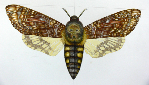
I received a private commission to do a scientific illustration of the Death’s head hawkmoth, Acherontia atropos for someone who is passionate about moths. Normally the first step is to get a specimen to work from, but alas in this case there were none at the local museum, and the deadline was tight.
Gathering reference
I collated picture ref from as many sources as possible (it’s always so much harder to work from images than from the real thing which you can rotate and examine), and combined it with the geometry and anatomy of the hawkmoth. I chose to do a male as I prefer the tapering point of the abdomen to the broader one of the female.
Drawing up the pencil rough
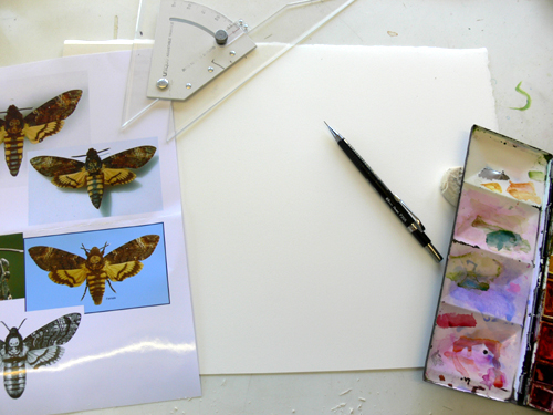
Paper, Pentel P205 mechanical pencil, watercolour box and rubber at the ready. To ensure I positioned the wings correctly, and got the width of the abdomen correct I also use a set square (hence the straight lines visible in the next illustrations).
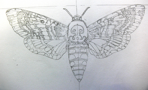
This is the pencil rough. You can see how the veins on the wings are critical; not only are they necessary for the illustration, but they also act as a map in plotting out the markings on the wing surface. In highly complicated areas or colour (such as the forewings) I often write a letter to remind me of what colour needs to go there, and sometimes shade in the darkest areas with graphite.
(Interestingly, I recently discovered that some of the great illustrators of the past, such as Ferdinand Bauer, would also color-code their illustrations of specimens. This was so they could get the details down correctly before the specimen rotted; at a later date they’d work up the final illustration.)
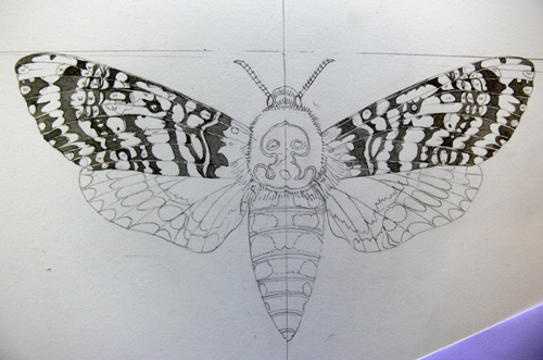
Plotting in a colour map on the wings
In order to feel less overwhelemed by the complex marbling patterns on the wings, I tackle them first by putting a dark wash on the areas which will end up black. I do both wings in parallel to keep myself organised and to avoid ending up with completely mis-matched wings.
In lepidoptera wings there is a certain amount of asymentry, but I like to try to record what’s actually there rather than adding to this by getting it wrong! There’s also plenty of variation between individuals of the same species; I always admire entomologists who can decide which individual animal will be preserved as the “type specimen”, or representative, for that species.
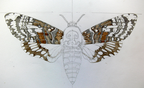
Next I plot in the brown areas. When doing this colour mapping, I always work from the darkest areas to the lightest. Not sure why, it’s just the way I seem to operate.
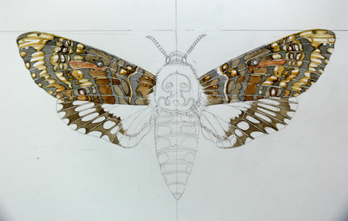
Paler browns (vandyke mixed with cadmium orange and alizarin crimson) and off-yellow areas get put down next (yellow ochre). The paint is pretty light, and pretty wet. I want to avoid putting down sharp dark edges which I’ll have to disguise later.
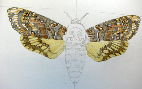
Leaving the veins and lightest areas white, I plot in the yellows. The yellow of the death’s head hawkmoth is slightly green and slightly creamish, a touch of white gouache mixed with yellow ochre and cadmium yellow dark gets the hue right.
Plotting in colours of the head, thorax and abdomen
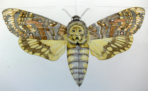
Next the body and head. This is a very hairy moth, so I wanted to make the finished animal show this. I avoided putting background washes on, and decided to simply build up the colour with layer on layer of tiny strokes of colour.
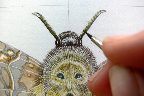
To get the details as sharp as they need to be I use my eternally trusty Windsor and Newton series 7 brushes. They’re the only ones I’ve found which hold enough of a resevoir of paint to be of any use, but which also hold their point. Doing the antennae was really tough without a specimen as they are white tipped (but from what segment?) and bi-coloured.
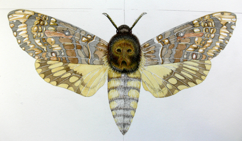
Working into the detail of the head, abdomen and “skull” on the thorax
The thorax of the Death’s Head Hawkmoth is what everyone gets excited about (specially since the movie Silence of the Lambs) so I wanted to make the markings which people interpret to look like a death mask or skull clear. However, it’s important to be true to the animal and not to make this marking cartoon-ish. Trying to strike the right balance here was hard, and I ended up making the thorax muddy by over-working it (applying too much paint). Were I to repeat this painting, it’s this thoracic marking and the antennae that I’d be most keen to improve.
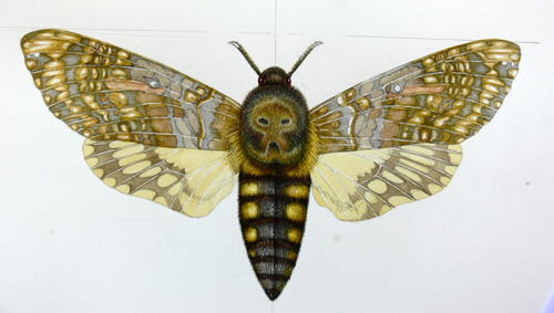
Adding the browns and more colour to the wings
Working into the wings takes ages, but it’s peaceful work as the headaches of mapping out the markings is complete. I mix up my paint (a less watery and darker yellow in this case) and work into the areas of colour, leaving the central regions paler and blending towards the outside of the area with tiny brush strokes. Obviously my brush strokes are blunt and clumsy compared to the microscopic scales of a butterly or moth wing, but I like to flatter myself by thinking the way I create the wing colour echoes the process of layered scales that occurs in nature.
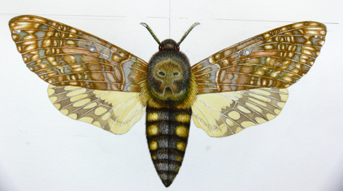
Next I repeat the process with the pale browns. I’ve just realised, writing this, how inconsistent I am. Plotting the colours I work from dark to light; working into those regions I do the complete opposite, working from light to dark. Ridiculous.

This is the moth with the reddish browns worked up. About now I realised I had to take a more distant view of the fore-wings since they were all becoming a bit too “samey”. Indeed, the larger view shows there are areas of pale towards the outer wing tips, and the darker reddish browns are predominantly on the lower part of the wing. Lucky I caught myself in time before swallowing up the paler regions.
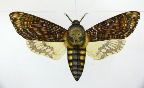
Here I’ve worked into the blacks. Note how the white wing spots are now starting to stand out. The veins remain unpainted, but very thin.
Working on Hawkmoth wings: Top washes
I used a reddish brown wash over the entire forewing, including the veins, but avoiding the palest areas of wing tip, eye-sopts, and white markings.
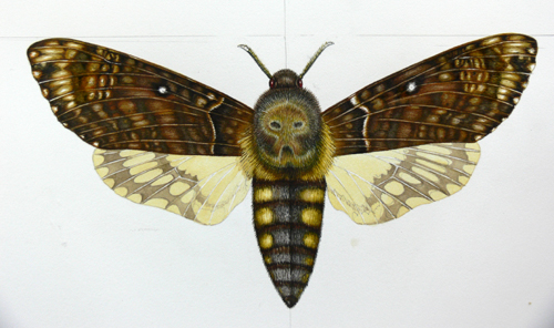
Once the wash is dry, I work into the darkest darks a little more, with a thick rich black (prussian blue mixed with vandyke brown and purple. Pre-mixed blacks don’t have the depth or warmth required.)
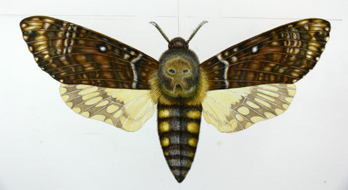
Painting the Hawkmoth hind-wings
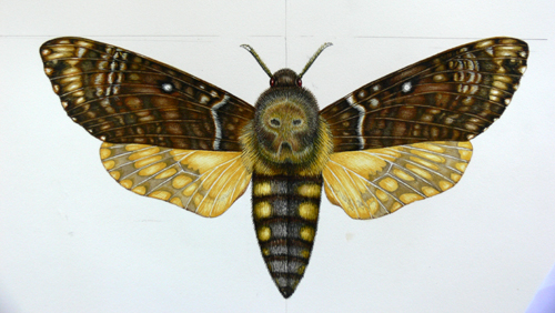
Working into the hind wings is an identical process; here the yellow areas have been completed.
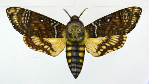
And now the brown regions are done, again, leaving the veins white til the end when I’ll go over them with a very pale brown wash.
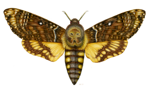
Finished!
This is the final piece. It’s a scan not a photo so the colours are brighter and lighter. Often, once you’ve completed an area of an illustration it shows the faults of another into sharp relief. This was true with the moth, Once I’d completed the wings I felt the need to work further into both the yellow thoracic tufts, the thorax markings, and the abdomen.
I’m pretty satisfied with this piece; however, it would have been improved had I been able to get my hands on a specimen instead of working from picture reference. Often when I complete a painting, I take a moment or two to consider what the weakest areas are and how I can improve on these the next time I’m commissioned to paint a similar subject. Here, it’s definitely the thorax and antennae.
Then, inevitably once a painting is finished. I go and make a nice cup of tea before moving onto the next job.

