Pen and Ink Techniques – Colour
Last week’s blog explained the importance of pen and ink techniques to scientific illustration, and showed how to use line and stippling. This week explains how to use colour with pen and ink illustrations.
Introducing colour to pen and ink
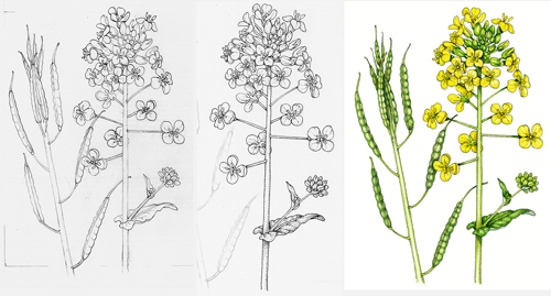
Sometimes monochrome illustrations can feel gloomy, but the commissioner still needs accurate line illustrations. A good solution is to introduce colour. This gives the illustrations the feel of an old-fashioned hand-coloured engraving; which can be very effective. It also has the benefit of being, for the illustrator, incredibly easy. All you need to do is to put a watercolour wash over a completed line drawing. And if you know you’ll be using this technique, do the pen and ink work onto watercolour paper instead of cartridge. Below is an example of an oil seed rape flower, done for a high-end oil producer’s label. The stages are pencil, pen and ink, then colour wash.
Pests and Diseases: Ink with colour wash
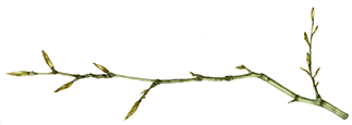
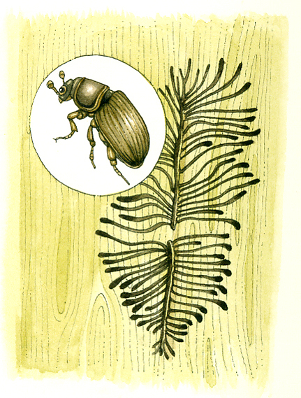
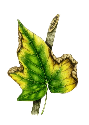
In these illustrations of pests and diseases done for Alan Titchmarsh’s “How to Garden” series; I’ve simply put colour over an atonal line drawing. In some cases, most of the information comes from the pen and ink (bark beetle), in others the information is carried by the colour and paint (leaf fungal wilt). Occasionally, the ink work and painting carry equal importance as with the diseased hellebore (hellebore).

Diagrams: Ink with colour wash
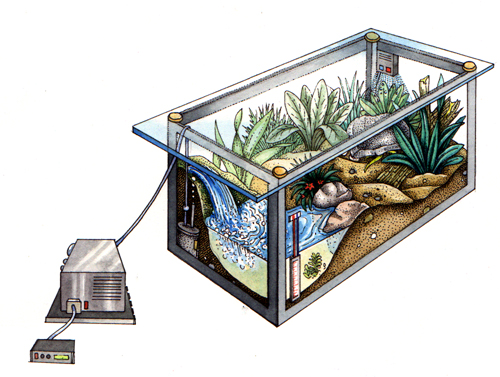
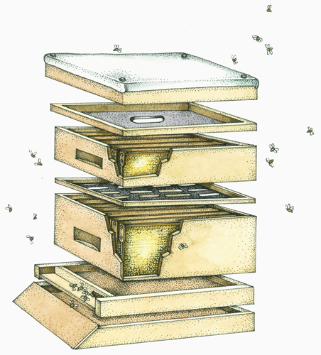
These next illustrations are detailed diagrams, and the watercolour wash is only there to lift them and add a little interest. The vivarium appears in The New Amateur Naturalist by Nick Baker. The Beehive is from Keeping Bees and Making Honey by Benjamin & McCallum.
Stippled illustrations with colour wash
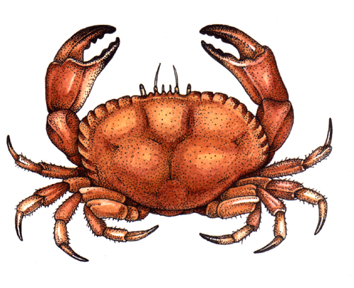
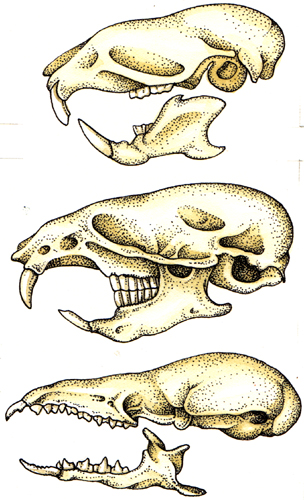
These pictures below (also from the New Amateur Naturalist) are highly finished pen and ink illustrations, and most detail and tonality is provided by the stippling. The watercolour gives them interest, but didn’t need to be worked into in any depth. In both cases, the watercolour was only two washes; one to give colour (leaving the palest areas white) and a second one to show a suggestion of shadow in the darkest areas.

My favourite ink and colour piece
My favourite piece done using this technique was the cover of HomeGrown: A Growing Guide for Creating a Cook’s Garden by Marta Teegan.
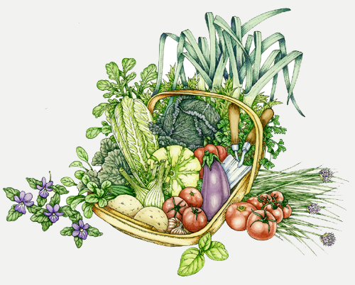
There was a lot of debate about whether the illustration should rely on the ink for tone, or the paint. We decided on paint, and I think there’s a really satisfying freshness to the illustration. It’s avoided being overworked in either medium, and I think that’s why it’s retained it’s lightness.

