

Water violet Step by Step
Water violet step by step explains the stages involved in illustrating the aquatic plant Water-violet Hottonia palustris. It’s one in a whole series of about 50 step by step blogs, many accompanied by films on my Youtube channel.
Water-violet Hottonia palustris
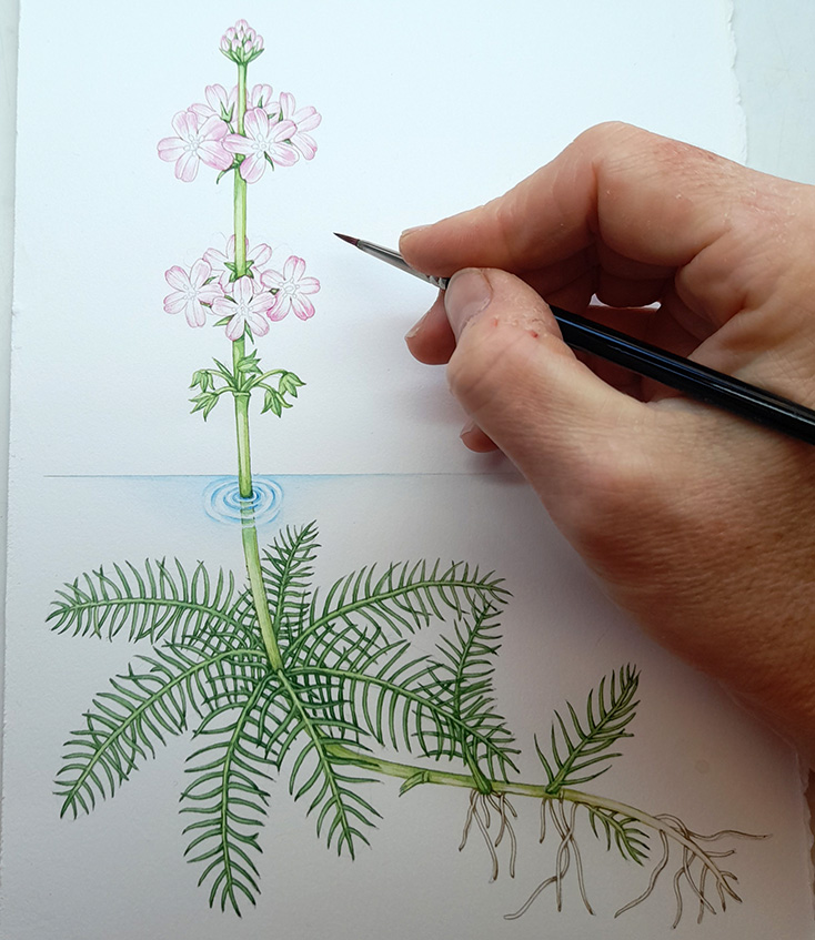
The Water-violet is a native UK aquatic plant, also known as Featherfoil. It features in the FSC’s Guide to Waterside Flowers, along with about 38 other botanical illustrations. As with lots of aquatic species, the challenge is representing water and showing the differences between submerged leaves, and those above the water level (if any are).
This species has whorls of fine pinnisect leaves below the surface. It bears a flowering spike of pretty mauve flowers and some of the leaves and stems are evergreen through the winter.
Drawing up the Water-violet
This sounds easier than it is. Finding reference to show the way the leaves behave below water is tough. I rely heavily on past illustrations and engravings, along with photos. Unfortunately, the plant was not growing near me, and the seasons were against us. In general, it’s easier to work from life.
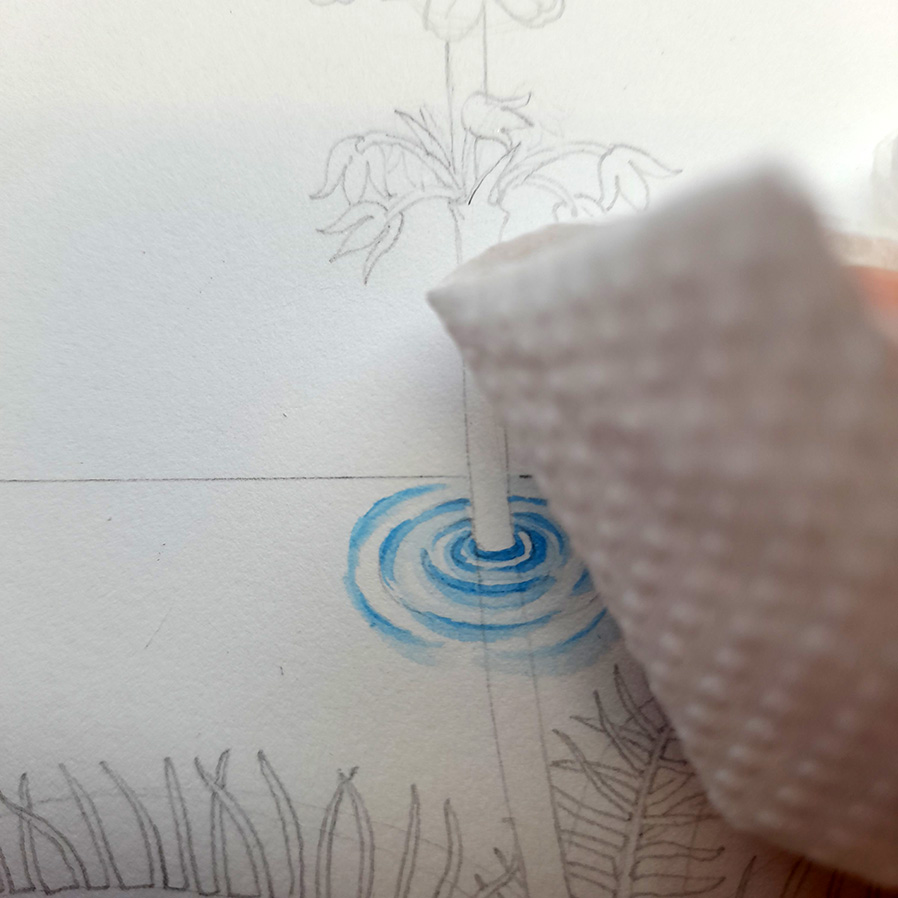
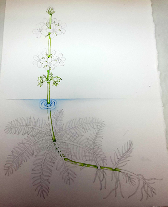
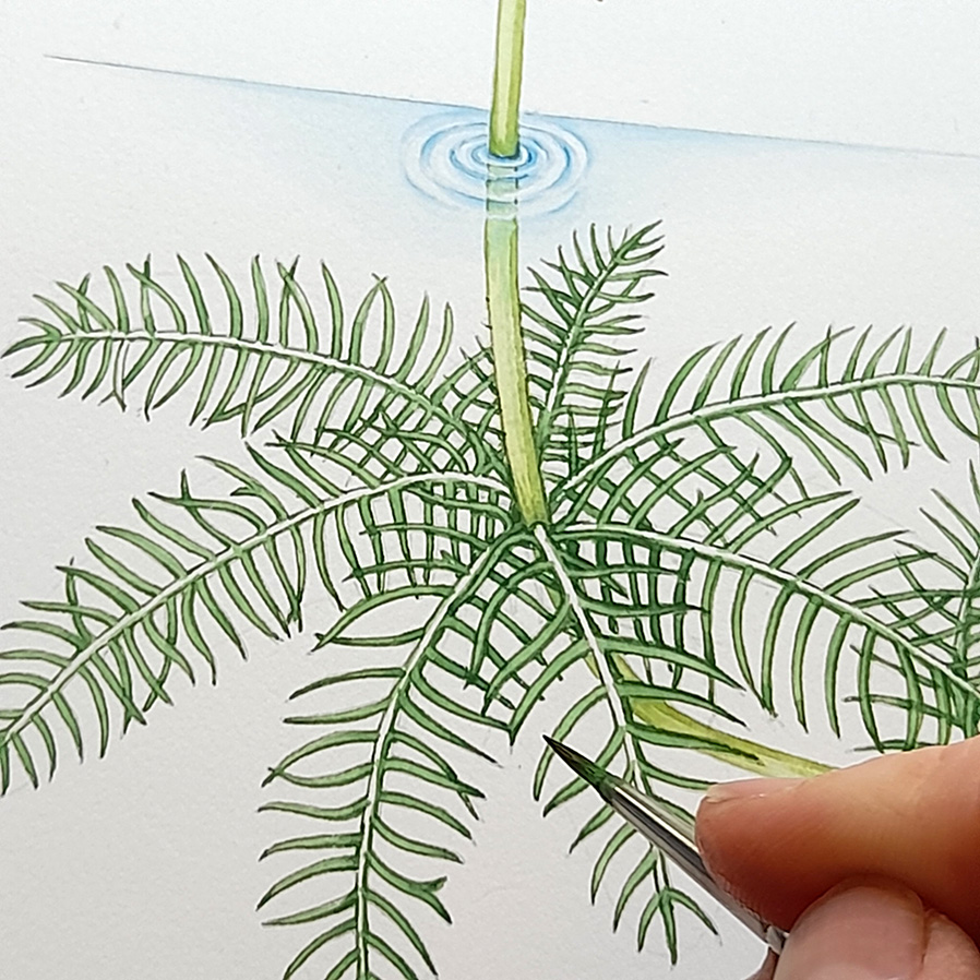
I combine several sources to create a pencil drawing which shows the plant and its’ relation to the water level. I always show emergence from water the same way, with concentric rings of blue paint, faded on the outer edge. I include information on roots and stem as this is important.
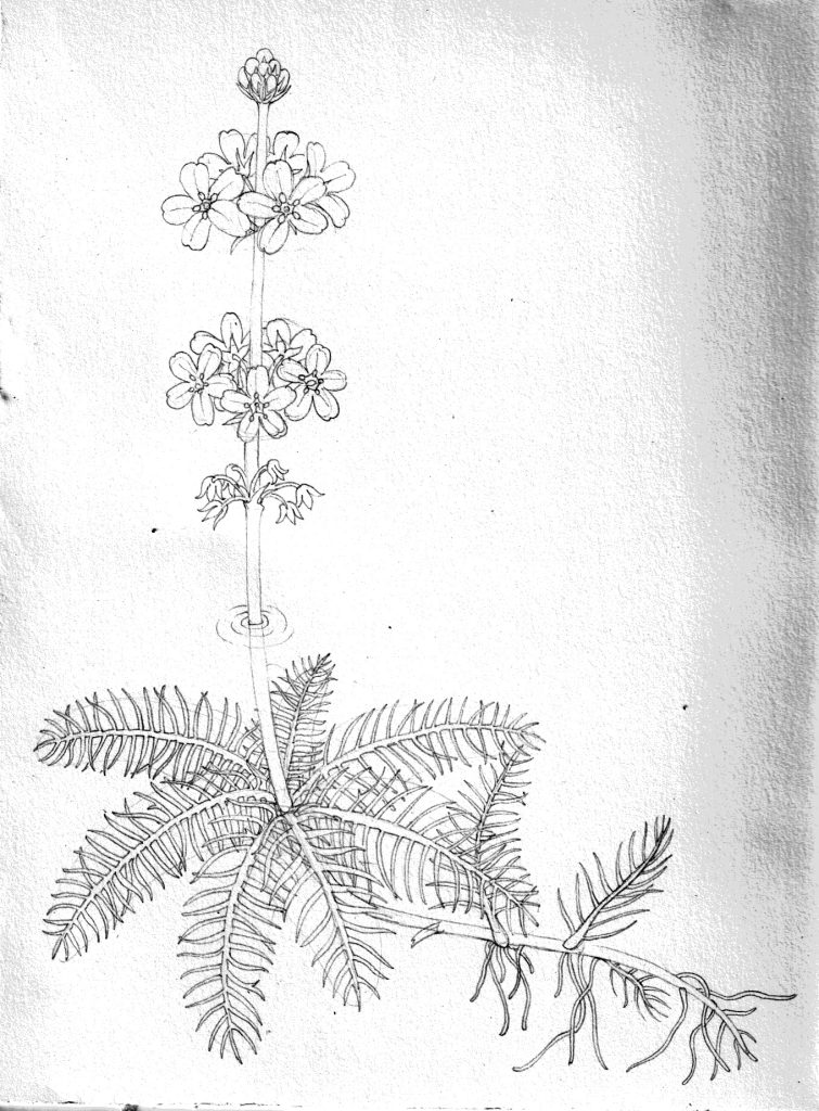
Rough Water violet Hottonia palustris
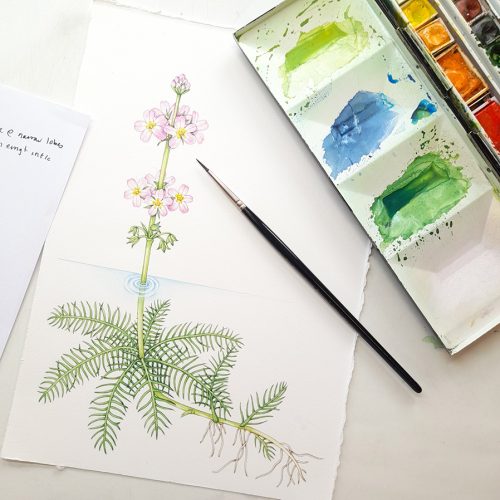
Materials
This illustration is done on Fluid 100 by Global Arts using Winsor and Newton watercolours and a Winsor and Newton Series 7 sable brush (size 1). Paint colours used are Cobalt Blue and Cobalt Blue, Yellow Ochre, Cadmium Yellow Pale, Cadmium Lemon, Sap Green, Opera Rose, Intense Blue, Vandyke Brown and Winsor Violet.
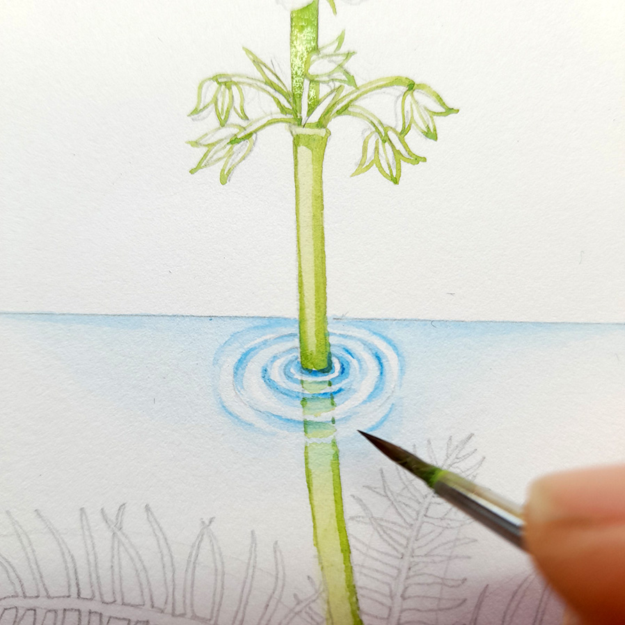
Painting Water
The first step is to illustrate the water and the ripples around the emergent stem. Using Intense blue, I paint in some concentric circles, swiftly softening their edges with clean water.
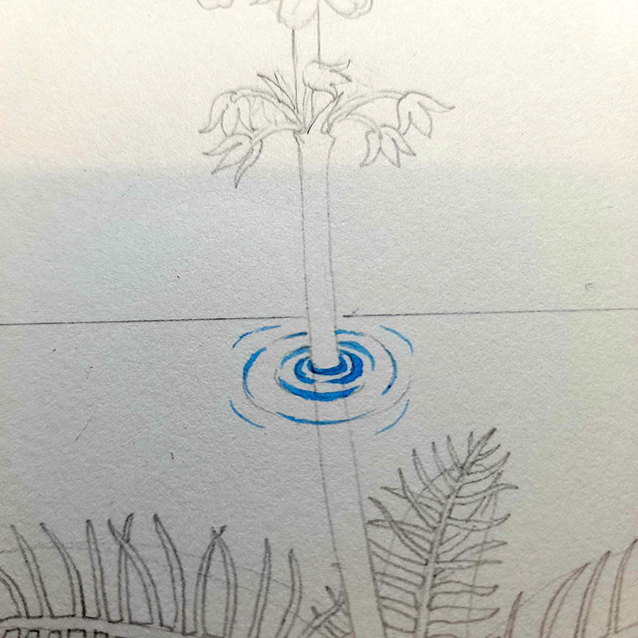
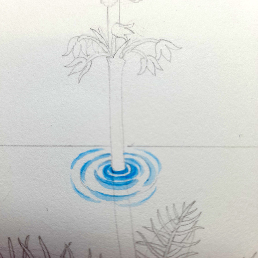
Using tissue or toilet paper, I blot the edges of the blue rings. This is as much to dry the paint so that I can get on with the painting as for any artistic reason!
Next, I use a dilute blue to show the “horizon line” of the water. I use the same colour to further soften the edges of the ripples. Leave some white paper to show highlights on the water or the ripple effect won’t work.
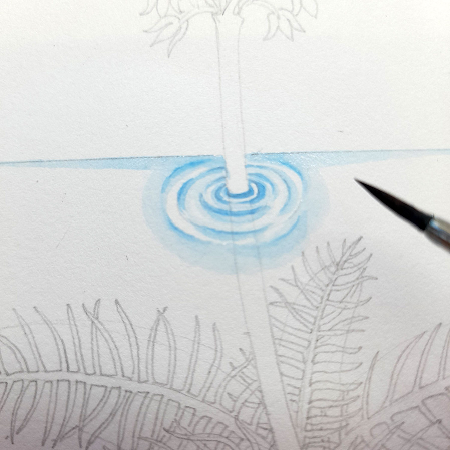
Diluting the blue further, I put a very pale very wet wash over the edges of the horizon. This softens the blues and makes the water look more natural. I repeat the process for the ripples, and manage to leave some white there too.
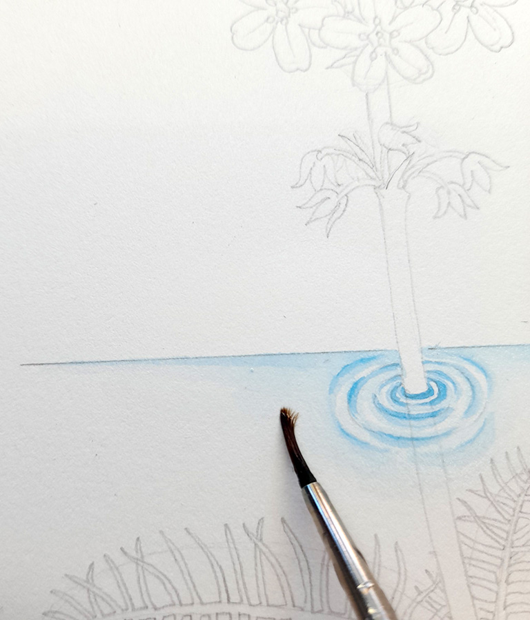
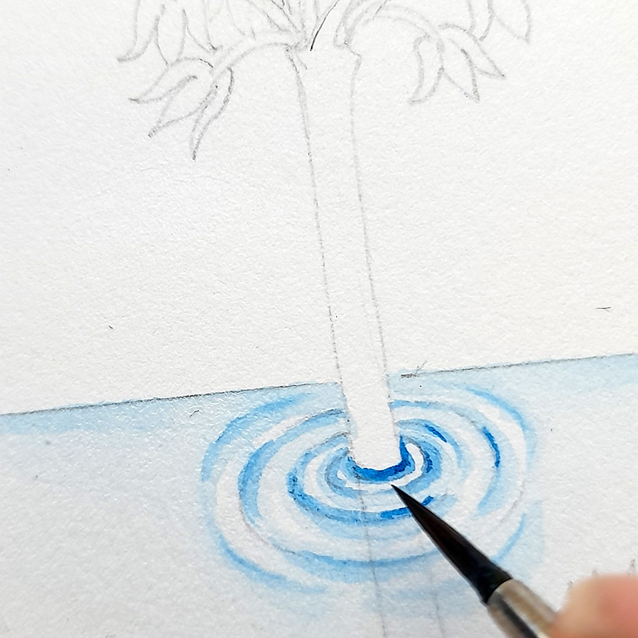
Once the pale blues are dry, I add some very thin darker blue lines. These sharpen the ripples and throw the white highlights into a more intense contrast.
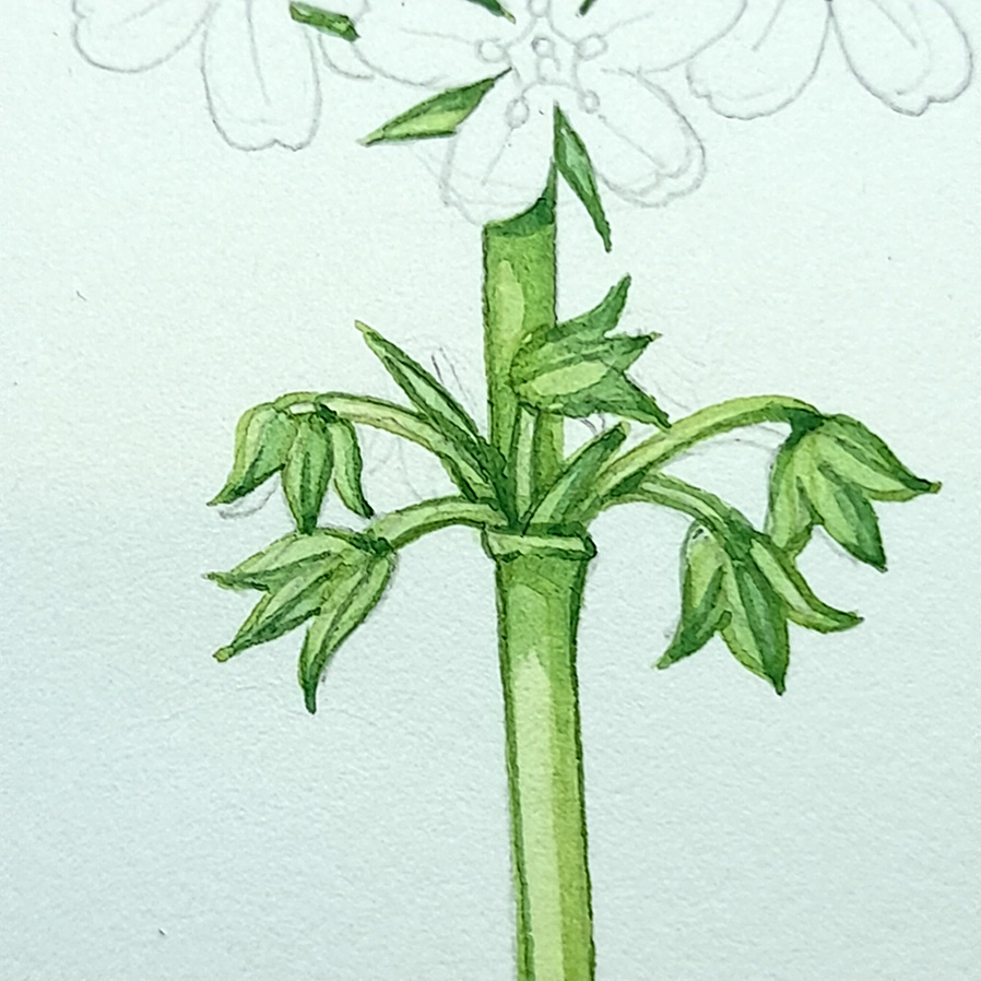
Illustrating the plant: Stems and buds
I mix a pale green from Lemon Yellow, Sap Green, and a touch of Yellow Ochre. If it looks too bright, add a tiny bit of Winsor Violet to knock the intensity back a little. Using a dry brush technique, I outline the stem, buds, and calyxes. The lines are thicker and heavier on the right hand side of the plant. This tricks the eye into seeing that side as in the shadow, and correlates to the botanical illustration convention of having a light source coming from the top left hand corner.
Where the leaves overlap the stem I paint around them. They are a bluer colour, and will be painted in later on.
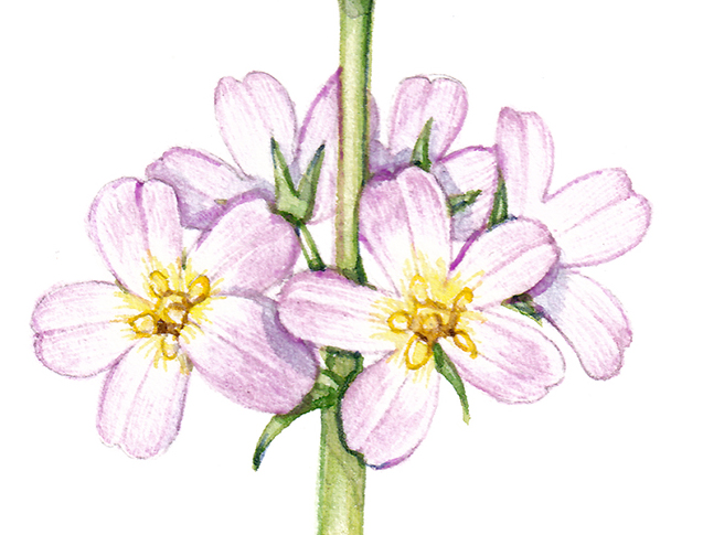
Below is a close-up of the flowering spike showing how the outline on the right of the plant is heavier than that on the left. You can also add colour below the attachment nodes of the flowers and calyx.
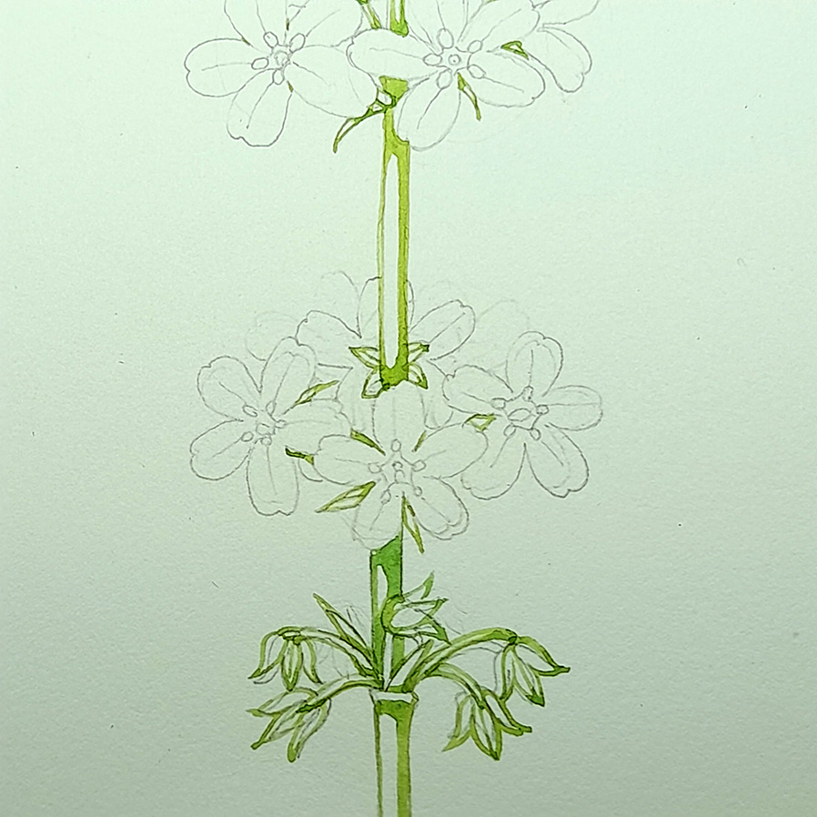
I carefully pick out the line of the stem below the ripples. The aim is to suggest the stem is there behind the ripples, under the water. Too strong of a line stops the illusion of ripples sitting on top of, or above the stem. I dilute the green with clean water and add a wet top wash which gives body to the stem of the plant.
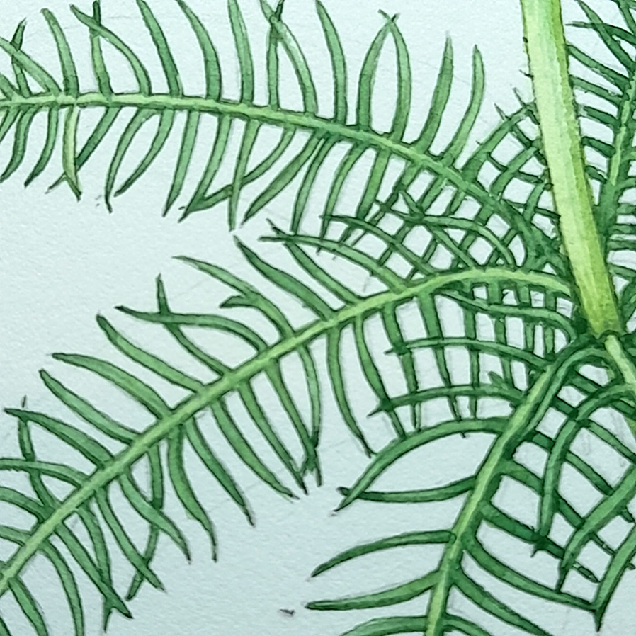
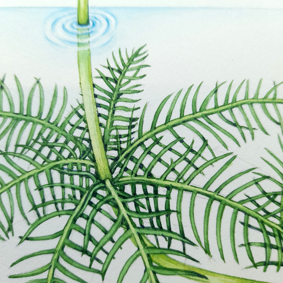
Adding the leaves of the Water-violet
Once the stem is fully dry, I mix a green for the leaves. This is Cobalt Blue, Cerulean Blue, Winsor Violet, Cadmium Yellow Pale, and a little Vandyke Brown. Carefully outlining each filament of each leaf, I plot in the whorls and fronds. Hopefully our earlier work with the water will create the illusion of these being underwater.
As before, there is more weight on the right hand side of each leaf midrib. Where the sections overlap I add a little more paint, suggesting a shadow cast by one leaf overlapping another.
Below is a close up that shows how simple this approach is. The leaf is literally just outlined in green paint, slightly heavier on the right than on the left hand side. Thin leaves are a welcome relief, they are much easier to illustrate than those with large, flat surfaces.
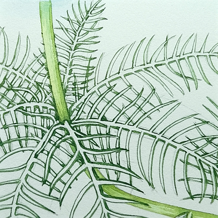
Once dry, I dilute the leaf green with water and paint this wash over the whole leaf. I finish each brush stroke at a point that is a little darker in nature, in this case it’s at the tip of each filamentous leaf lobe.
Next I mix the diluted leaf green with the diluted stem green and when everything is dry, paint this over all the leaves. This gives the suggestion of the mid ribs being slightly paler than the leaf blades.
Illustrating the Calyx and adding shadow to the stem
I use this same green mix on the calyx, the green whorl at the base of each flower. First I plot in the central line of each calyx lobe. Once dry I paint the far side, on the right, with a layer of the same colour. Allowing this to dry before adding a second more dilute coat of the same green gives the impression of the right hand side of the plant being more shaded than the left hand side. There’s a pattern emerging here!
At this point, finding myself dissatisfied with the saturation and hue of the leaves, I add a dilute bluer top wash. This is Sap Green plus Cobalt Blue and plenty of clean water.
I use the same dilute blue-green to plot in the shadows cast on the stem by the pale pink flowers. You can see this clearly in the next image down.
Illustrating the Water-violet flowers
Before starting work on the flowers it’s vital to have a clean brush and clean water. It’s also a good excuse to make a cup of tea as I have to go to the kitchen anyway, to change the water, wash the palette of my paint box, and rinse my brush under the tap.
The first step is to mix the perfect delicate pink-violet. This is Opera Rose plus a touch of Cerulean Blue. And plenty of clean water, Initially, I outline each petal and add a central vein. Using a very light touch and the tip of the brush, I use parallel paint marks to add colour and depth to the flowers. These are anchored on the outside edge of the petal. This species has flowers with paler yellow centres, so weighting the petal colour outwards echoes the colouration found in nature.
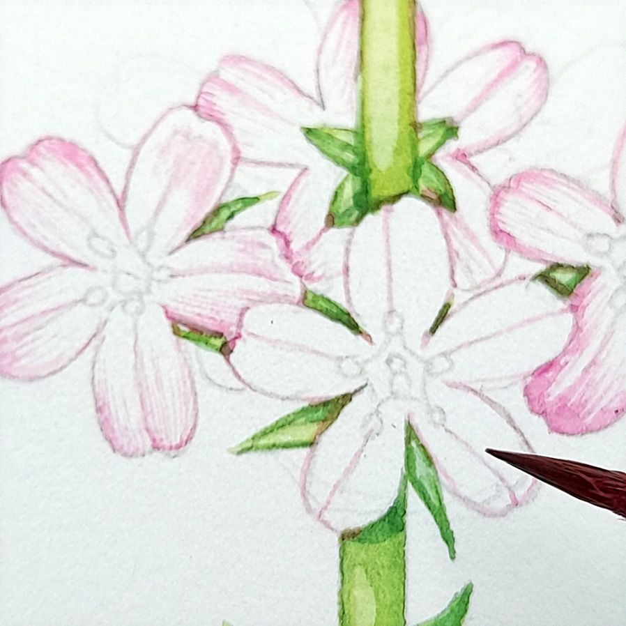
The next picture gives an idea of the scale we are working at. Each flower is smaller than a 1p coin, so a reliable watercolour brush with a sharp tip that isn’t about to spit paint all over the paper is paramount.
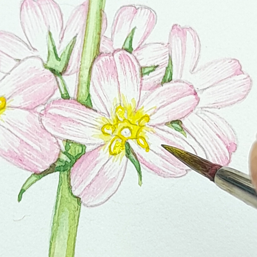
Adding detail to the Water-violet flowers
Once the pink petals are dry I add the yellow centre and the stamens. This is a mix of Lemon Yellow and Cadmium Yellow Pale. Each flower has five stamens emerging from the corolla tube. The Water-violet is a member of the Primulaceae family, and now the similarities between the flowering form of the Water violet and the Primrose are clear.
Adding Shadow
As all the elements of the illustration are complete, I add shadows. I often use the same colour mix for these, Cobalt Blue and Winsor Violet. Anywhere there is overlap, just add a touch of the shadow mix. This helps disentangle the different parts of the illustration and it also makes it more visually satisfying. I think a big part of how we see is differentiating between lights and darks, which explains why sharp shadows are so welcome.
Shadows are added to the flowers, too. It’s the same mix, a blue-purple, but very much diluted.
Finshing
The last stage is to take a close look at the illustration and add any final darks to the areas in deepest shadow. If there are mistakes and areas that need to be highlighted, I use white gouache and a careful brush point (the same Winsor and Newton brush as I use for the watercolour work). Sometimes I erase the pencil lines, but this can damage the paper. Increasingly I find leaving pencil lines in place helps keep an illustration clear, especially if there are very pale or white flowers. (For more on painting white flowers check out my blog and Youtube film).
Conclusion
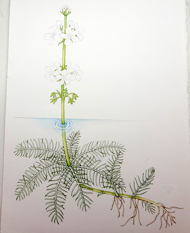
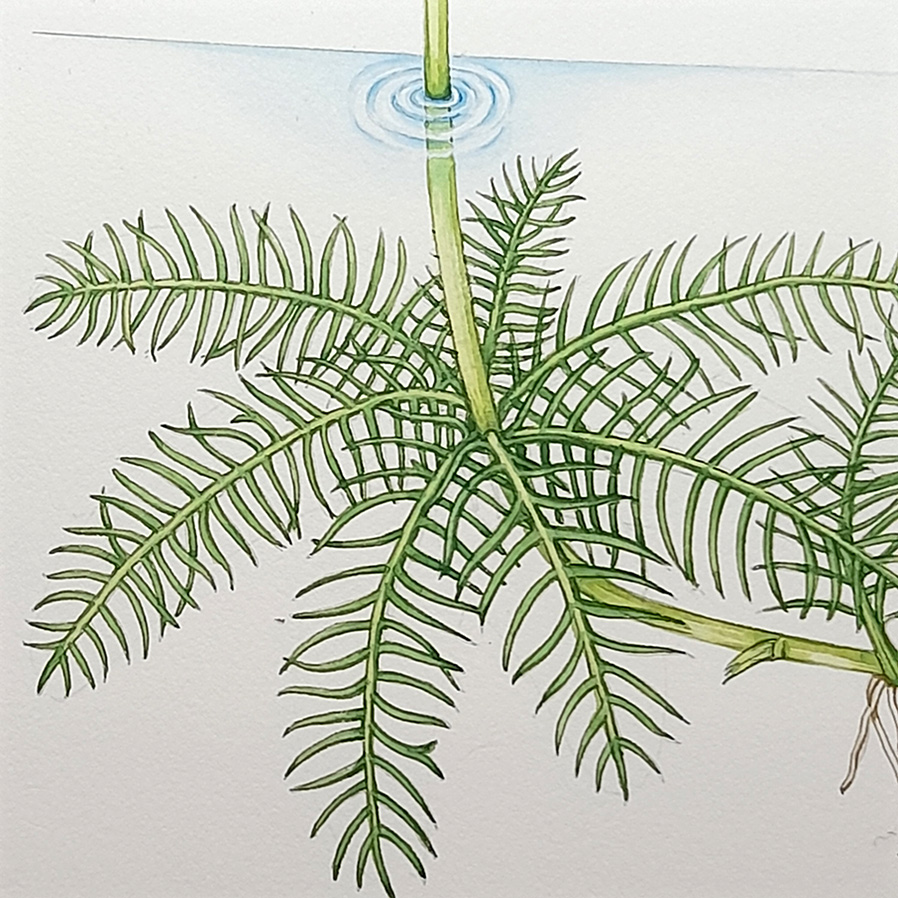
This plant is comparatively easy to illustrate, thanks to the thin segments of the leaves. But my approach to painting all botanical subjects is similar. Outline, add a wash, pick out the shadows. The toughest part is definitely representing ripples and an aquatic habit, and showing that the plant is emerging from the water.
One of the treats of my job is seeing my illustrations in context, and this one looks great alongside the other 41 species featured on the FSC’s Waterside flowers guide. Unfortunately you’ll have to take my word for it as it doesn’t appear on the two pages of the guide featured on the FSC’s website!
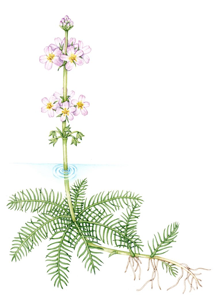
Completed Water violet Hottonia palustris
Hi Lizzie
Thanks so much this again helped me with my project
If u can pls keep posting ur amazing art work and strategies
My pleasure Connor, and thanks for the comment
I’m impressed by the dedication you’ve shown in your series, particularly the detail in capturing the underwater aspects of the Water-violet. It adds depth to your illustrations.
Thanks for this, it’s always tricky sorting out what happens below the surface of the water!