

Jersey Post: Illustrating Thrift
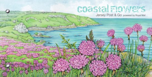
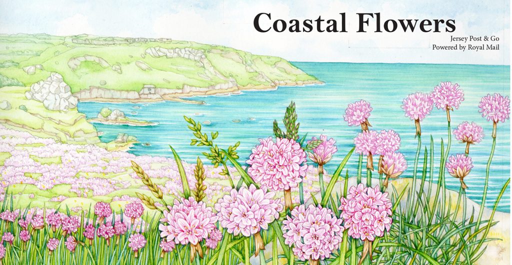
In February, my series of Coastal Flower postage stamps were published by Jersey Post. The presentation pack featured a cliff-top scene in amongst clouds of thrift. This blog explains how I did my best to capture both the flowers and the landscape behind. (All illustrations in this post are copyright Jersey Stamps 2020.) For more on doing the stamps, check out my blog; and if you’re interested in how these maritime plants can handle salt, take a look at my blog of salt-loving Halophyte plants.
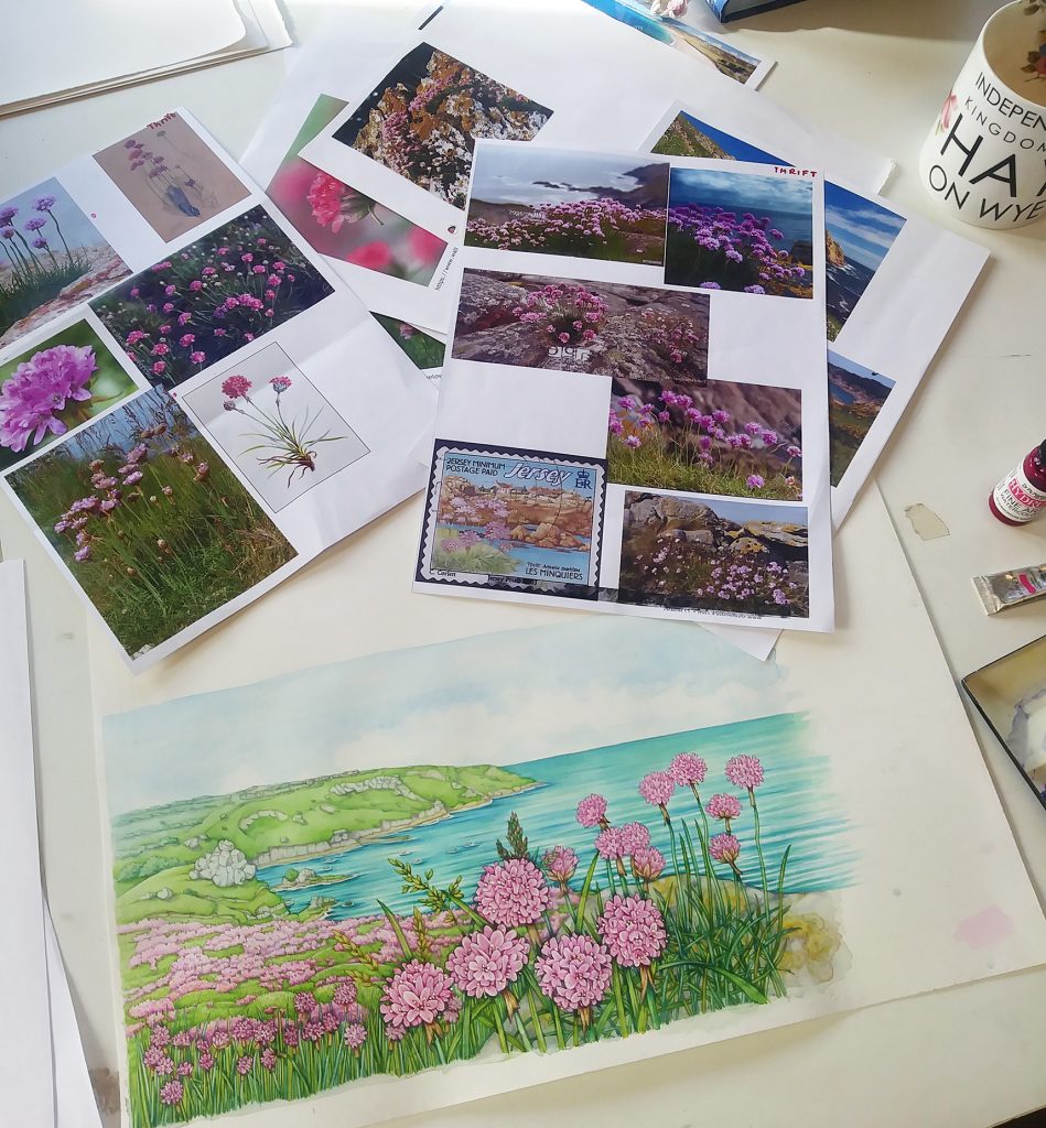
Starting out and gathering reference
I decided what view I wanted to use first of all. A curved bay with golden sands, cliffs and a distant house with turf-topped headlands. Jersey, in the Channel Islands, has plenty of coastal gems like this to choose from.
Next, I gathered reference of the Thrift flower (Armeria maritima) up close, and of clumps of thrift heading into the distance.
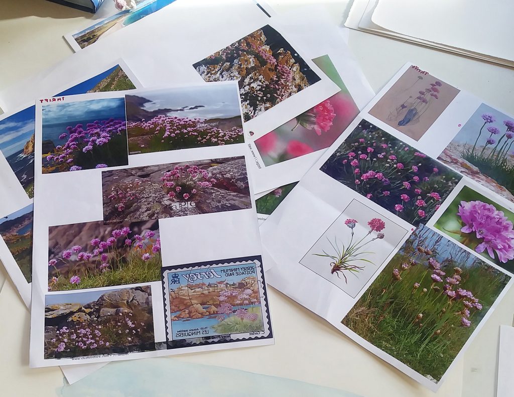
Reference materials
Rough Illustration
Working on Fluid 100 hotpress watercolour paper,with a Pentel P205 mechanical pencil, I drew up the scene. Landscape first, distant thrift next, and finally a few flowering heads which would be executed with botanical detail in the foreground.
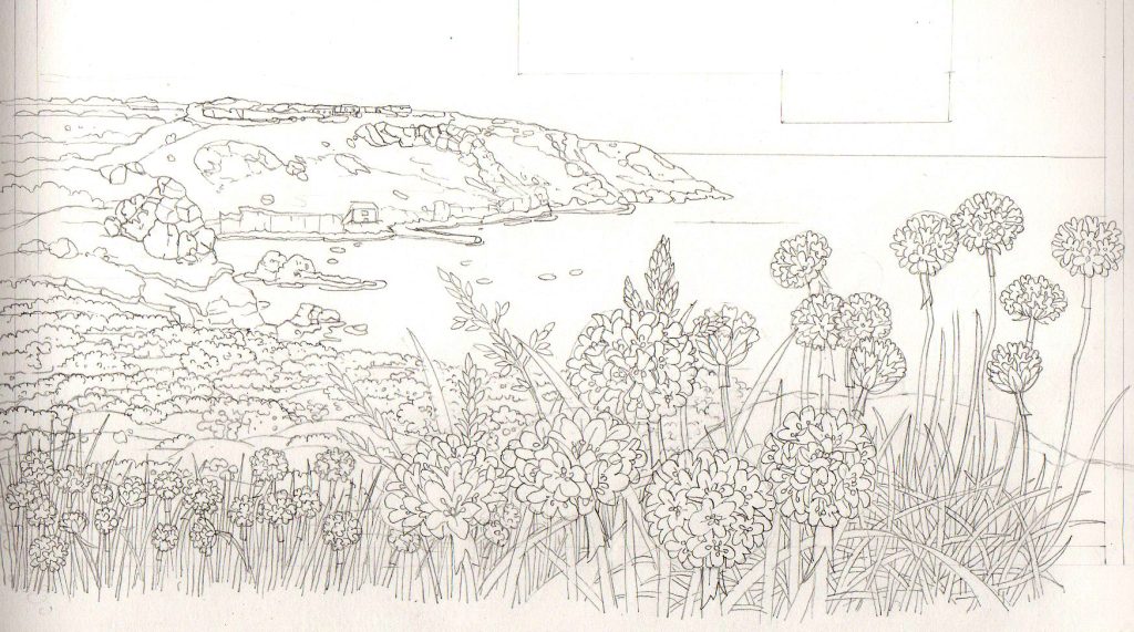
Pencil rough
Jersey Post like to see colour roughs of each element in a postage stamp commission, so I worked into the colours using light watercolour. I use Winsor and Newton watercolour pans and half pans, and adore my Winsor and Newton Series 7 paintbrushes (a number 2 handles bigger areas of colour, and a number 1 and 000 manage detail).
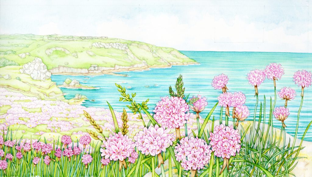
Colour rough
The trick with landscapes, which I admit are not my forte, is not to overwork them or go too dark. Always, the most pronounced contrast will be in the near foreground. This means you have to ensure distant elements (the house on the shore, the waves breaking on the beach) are softened. I still struggle with this.
I provided jersey Post with the colour rough, and in a suggested layout. This helps them to visualise the illustration in context.
Colour rough in layout
Working into the Final
Once approved, it was time to take the colour rough to final stage.
This involves adding a lot more detail, and making sure the thrift jumps out from the background. There are several tricks I used here, some more successfully than others.
Flattening out the background
To ensure that the thrift flowers take centre stage, and hold the attention, you need to “knock-back” the other parts of the illustration. I used a series of very pale watercolour washes. These have two purposes; first, they dull any white areas in the landscape, allowing the whites in the flowers to glow more prominently. Second, they add a soft colour unity to the background. This tricks the eye into seeing the landscape as a whole, and as slightly separate to the thrift blooms in the foreground.
![]()
Pale background wash drying on the landscape (note the shine from the wet paint on the right of the painting)
I spent a long time fiddling with these layers of very pale transparent colour. The bright pink colour of the distant thrift made it impossible to simply put a clean blue or green wash over everything. Those pinks still needed to glow, but not to jump out at you. This means you have to balance the wash. Blue enough to unite and knock back the landscape, not so blue that it makes the distant thrift purple.
Likewise, the structure of the composition meant the thrift in the immediate foreground was flanked and backed by more thrift. Separating these elements without compromising the pink of the flowers was really hard. Darkening behind the focus flowers is needed, but the risk of messing up the flowers behind them is high. Go slowly, and build up layers of colour. Re-appraise as you progress.
A few pale blue (Landscape components) and pale pink (background thrift) washes later, and I’d done most of what was possible.
Adding Detail
Another way to make the foreground jump out at you is to get really crisp and clear detail in the flowers at the front of the illustration. Higher contrast is required, as is botanical accuracy. Luckily, I’ve done sketchbook illustrations of thrift in the past. These are vital when it comes to figuring out the anatomy of the globe-like flowering-heads. I also refer to the excellent line drawings of Stella Ross-Craig.
There’s been a lot of illustrating of maritime species recently, so the Thrift I completed for Field Studies Council’s leaflet on Sea-side flowers was helpful too.
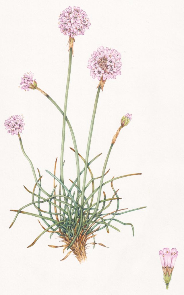
Thrift Armeria maritmum completed for FSC
As always, at this point in the process there are lots of moments of panic. It doesn’t feel like it’s coming together right. The flowers look blurry, mucky, anatomically wrong. How on earth to get the stamens (which are pale) to show up? Each of these challenges has to be calmly worked through.
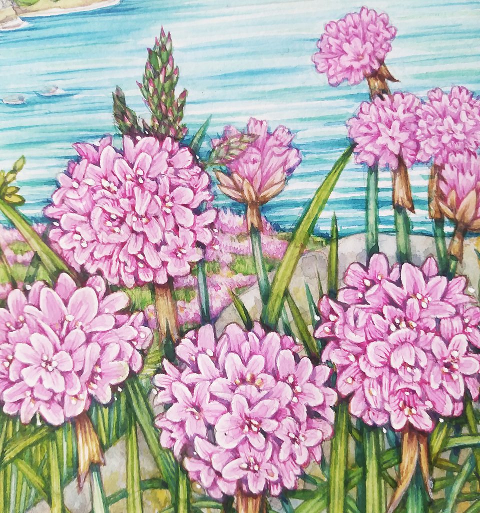
Thrift flower detail with detail picked out and stamens added
It’s always a fine balance between over-working an illustration (which kills it and sucks the life and brightness from it) and getting enough crisp detail in there. I used a touch of white gouache to bring the stamens out. A pale top-wash of a ridiculoulsy bright pink (Doctor Martin’s Hydrous inks) helped make the petals glow.
Completed illustration with reference and Doctor Martin’s ink just visible on the right.
Finishing the Thrift Landscape
Eventually you reach a point where you accept that it’s good enough. It’s a funny thing, even now, having been a professional illustrator for 25 years, I’m always slightly disappointed that the illustration on the page is never as good as the one my mind had conjured up. I think this is common with everyone who tries their hand at creating art, whether professional or a beginner.
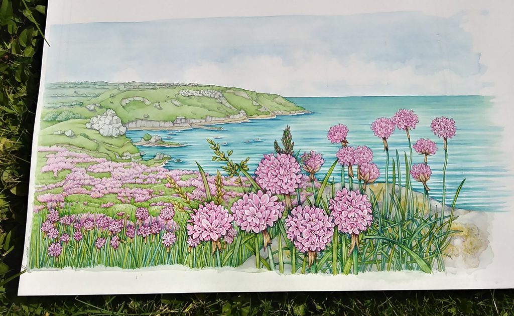
Completed illustration, drying in the sun
Often it’s a good idea to go and have a swift cup of tea when you think you’re done. When you return, you see the illustration in a slightly new light, and generally a more favourable one. Which is lucky!
Conclusion
Using a wide array of illustration techniques allowed me to complete this landscape. Watercolour washes, ensuring contrast and fine detail were right in the foreground, tiny details in gouache… When I saw it in context, on the presentation pack, I was really pleased. The design team at Jersey Post did a brilliant job with the lettering and layout.

I made a film of the later stages in completing this illustration, and you can hear me talking through these challenges and trying different approaches.