Landscapes, a map, and an otter
Recently my natural history illustrations and botanical illustrations have been used for an interpretation board for the Combe Mill visitor centre and nature reserve in Oxfordshire.
It was a pleasure to work with the excellent graphic and museum designer Linda Francis. It means I don’t have to worry about the lay out, but can concentrate on doing the illustrations.
Straight forward illustrations: Treecreeper and Otter
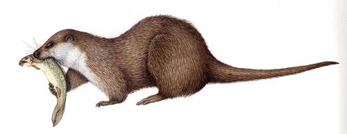
There were a wide range of images required for this job. So I began by focusing on the straightforward natural history ones. These are a treecreeper Certhia familiaris, and an otter eating a fish.
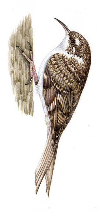
Treecreeper Certhia familiaris
Although I already had an illustration of a European otter eating a fish, the client very much wanted to show a brown trout as the species being eaten. Piecing together various sources of reference made this possible (but was tricky!)

European otter Lutra lutra eating a Brown trout Salmo trutta
Map of the site: Preparation
Next came the small matter of an enormous map of the site. This is based on overhead photos, guidance illustrations from the client, Google earth images, and a video of a drone flight. The client was excellent at explaining my queries. So pretty soon I had all the information straightened out, and was ready to draw up the rough of the map.
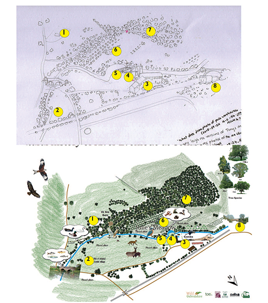
Some of the queries and explanations bandied between myself and the client in understanding the details of the Combe Mill map.
Drawing up the map of Combe Mills
The map measures 120cm by 60cm, so was a challenge to work on in my little garden studio. However, by taking photos of it we could thrash out any areas that needed to be tweaked and altered.
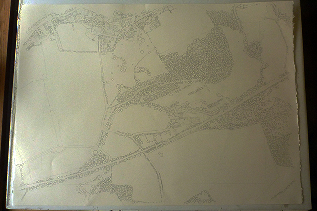
Pencil rough of the Combe Mill site
Colouring in the map
Once I got the go-ahead, it was a matter of layering colour on the map. Lots of watery sap green and viridian for the fields and landscape (I use several different greens to add interest). In this case I had some full-on panics about watermarks and lines being left on the larger fields as the paint dried. I fixed these by applying a very watery top wash of Doctor Martins hydrous Hansa yellow light, and a touch of sap green. This smoothed out the tide marks and unified the green countryside.
Next each tree is painted with a few dark green marks on the right hand side (this helps to give the map some weight, and to look as if the trees are being hit by light coming from the top left hand corner). Each tree then has a lighter top wash of green applied. As with the fields, I make sure there’s a proper mix of green hues used to add variety.
The turquoise (with a little green) river and pond go in next, then reddish buildings.
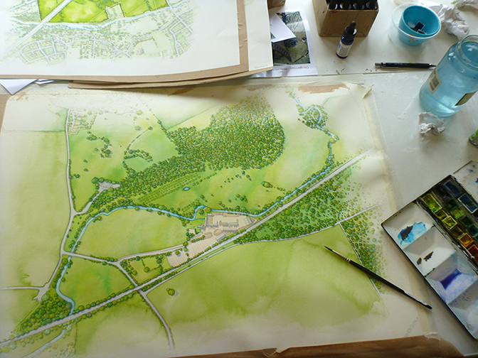
Combe Mill map in progress (raods and shadows yet to be added)
The pale grey roads are blocked in next; I use a purplish shade and keep it really pale so these routes don’t overwhelm the map. Finally, I put in the shadows – a watery mix of purple and blue beneath each tree, building, and roadside verge. These add a bit of depth, and I hope make the viewer think that the site is bathed in that glorious late evening golden light of summer.
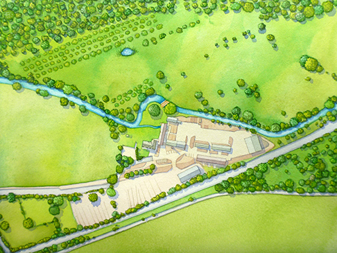
Combe mill map detail
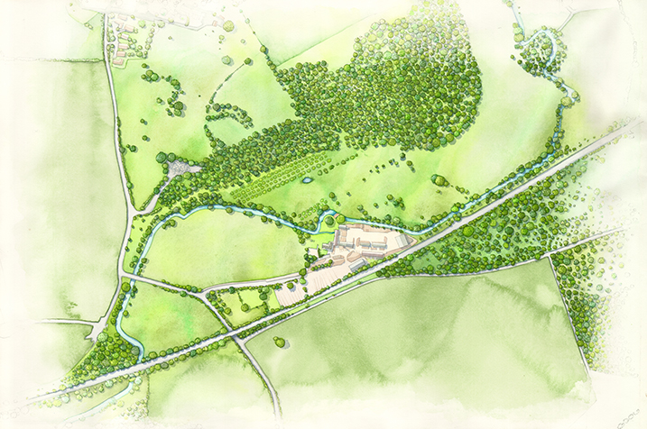
Finished Ariel vie of Combe Mill site
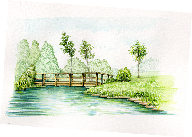
Next came a few landscape vignettes. these were simple as I had good reference to work from.
Landscapes
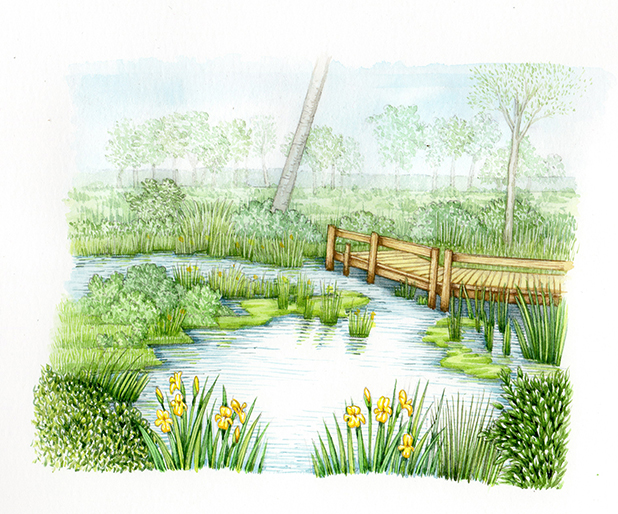
Pond in Julie’s Meadow
Here’s the photo of the footbridge from the site:
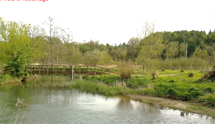
And here’s the (slightly idealised) landscape vignette of the same view:
