

Botanical Illustration: Tips on mixing greens
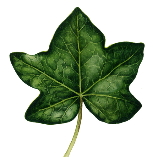
This week I’ve been mixing greens and painting ivy leaves, as have many members of the Botanical Art for Beginners group. Comparing the dark greens of an ivy leaf with those of a yellow butterwort leaf got me thinking. A crash course in mixing greens could be handy.
Watercolour paints
First, I think it needs to be said that everyone likes to mix colours in their own way. We become used to certain mixtures and certain paints. Two big watercolour paint manufacturers are Windsor and Newton and Daler Rowney. I source my paints from them but know there are other good companies out there. I also use Doctor Martin Inks, mainly when it comes to light final washes. Their grass green and chartreuse are great for these if diluted.
Mixing greens: Don’t use them straight from the pan or tube
The golden rule of mixing greens is to try to avoid using the colour direct from the tube or pan, these greens rarely match that of the leaf you’re painting, and can make an illustration look artificial. I often start with a colour like sap green or oxide of chromium, then alter it by mixing in yellows, blues, or browns.
Dark Greens
The difficulty with painting a dark green leaf is that you need to get real depth to the darks without losing the lighter areas. I do this by starting off by plotting the leaf in pale graphite, not only the shape and venation, but also the areas which are darkest. I paint these first, in a bold dark colour such as Prussian blue mixed with a little yellow ochre and a touch of a warmer colour (cadmium orange, burnt sienna, or Vandyke brown). Then I work out from the darks in lighter versions of the same colour (leaving the veins unpainted). On top of the whole, once dry, I put a pale wash. This will often be far yellower than the underlying colours and covers the veins too. Blend it very gently to the highlights which you should try to leave unpainted. This unites the leaf. The final touch is to work further into the darks and shadows; I favour a mix of Prussian blue and burnt umber, or of cobalt blue and purple.

Pale Greens
Lots of leaves are very pale in colour, just consider the broad leaves of a tulip.
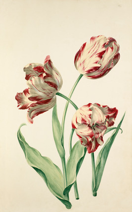
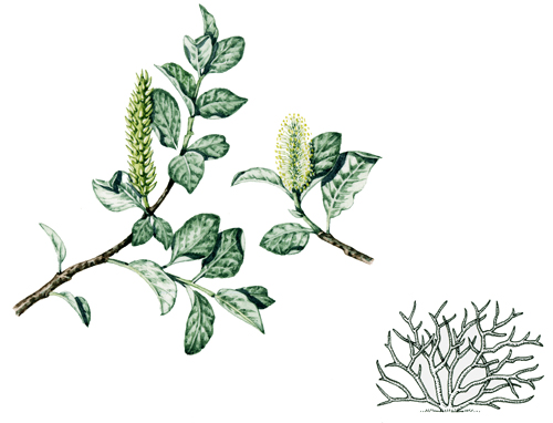
The temptation is to water down a more vibrant green, but this leaves the painting looking washed out. A touch of white gouache can be incredibly useful, as can pale blues like cerulean. The very pale underside of this wooly willow are a green mixed from cerulean, sap green, and a lot of white.
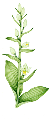
If the leaf is pale but yellowish, it’s easier to get the correct colour without adding white. The colours used when mixing greens for this helleborine leaf are cadmium yellow, sap green, and a lot of water.
Blue or darker green washes help to give depth and shade without swamping the subject.
Blue Greens
Some leaves are very blue (glaucous). They can be a deep dark blue or a pale light blue. Different colours are required for each.
A dark blue-ish leaf, such as on this rose can be mixed from raw umber, sap green, a good wallop of ultramarine, and a touch of cadmium yellow.
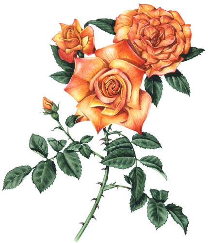
A dusty dark rose leaf
Make sure to let the white of the paper shine through. Work into lights and darks as with the dark leaves (see above).
Paler blue leaves can be found on plants like this Rose by Parsons.
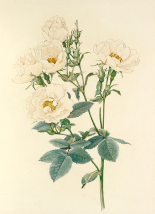
These require a bit of white, which can make them a chalky.
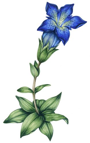
The colours used in mixing greens for this gentian leaf are cobalt blue, yellow ochre, brown, and some white gouache.
Putting in the shadows cast by the veins helps show the paleness of the leaf. Shadows are a very dilute mix of ultramarine and purple.
Yellow Greens
These strident bright coloured leaves can be a joy to paint, but seem so unnaturally bright that it takes a little courage to mix the colours that you see. The underside of the vanilla leaves in this watercolour by Aubriet are very yellow.
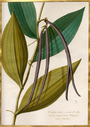
I think he’s relied on yellow ochre in his mixing of greens.
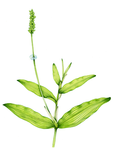
This pondweed done for Harper Collins Flower Guide is the same mix, but with a touch of burnt sienna and yellow ochre to give it the slightly duller, browner hue.
The main trick to mixing good greens is to look really carefully at your plant. I’ve been known to test if greens are right by painting direct onto a specimen’s leaf. I’ve also been reduced to tears by the way greens change colour as they dry. Keep trying new mixes, take courage, experiment, and don’t worry. Even if a painting doesn’t end up perfect you will have learnt a great deal from the mistakes you made while creating it. The supplementary images for this blog are all to be found at the RHS Lindley Library in London; well worth a visit to view the originals. Many thanks to Botanical Art for Beginners for suggesting this as a topic.
Your website is very good. It is very helpful for the common public. I also read your website twice a weak.
www.freedigitaldesignstocks.online
Hi Babita
What a lovely comment, Im so glad my website is interesting to you, thats lovely to know!
Yours
Lizzie
I paint on porcelain and it is certainly difficult to get the correct colours or leaves, your suggestions are very helpful. Thank you
Painting on porcelain, how tricky (bit also how very lovely). And I bet the colours alter in the firing. I have no idea how my tips help for such a difficult task as yours, but Im so pleased they do! Thanks.