Botanical illustration tips on painting leaves
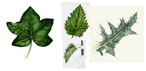
I’ve been doing botanical illustrations this week, and think perhaps some ideas on how to undertake a scientific illustration of leaves might be useful. Most of these examples are from my botanical sketchbooks (always keep sketchbooks!); although the final pieces are completed works for clients.
Getting Reference before you start
It goes without saying that whenever possible, you need to get your hands on the plant you want to draw. It not only makes for a more accurate illustration, but also makes life much easier than trying to piece together a plant from various photos or other illustrations.
Draw up your leaf
The first thing to do is to draw the shape and venation of the leaves. I do this in light pencil, a propelling pencil tends to stay sharp, and a rubber is handy.
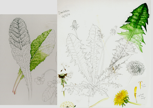
Tonality studies of leaves
Next, it’s worth thinking about the darks and lights, and how they fall on the sections of leaf which lie between the veins. I use graphite to do this, again, an 0.5mm HB propelling pencil works for me.
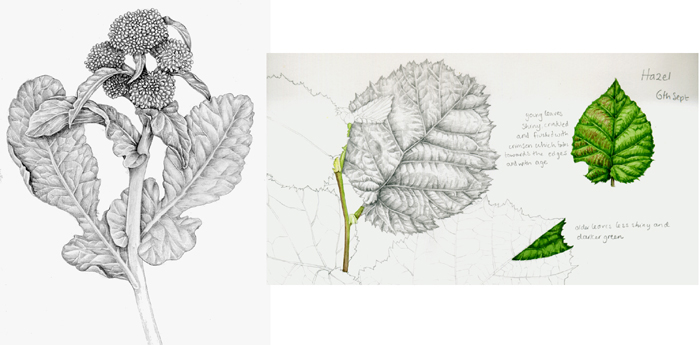
Mixing your greens
To get going on the leaves, you need to mix the right greens. Volumes have been written on this as greens are really tough to get right. They either seem artificially bright, too blue, or muddy. I find cobalt blue, yellow ochre, cadmium yellow light; and sometimes a touch of pre-mixed green like sap green or Windsor green can work. Never use a green direct from the pan or tube; they’re just not true to life. To tone down a green try using a dash or red or orange, I find burnt sienna is good for this
Observing the leaf, I plot in the darkest areas first. Once dry, I’ll work further into these areas, leaving the veins white. Only once I’ve got a certain depth to the study will I put a pale wash on top of the whole leaf; this is usually a much paler and slightly yellower version of the green I’ve been working with.
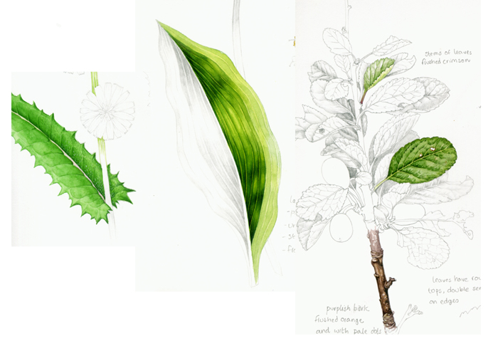
Working into the shadow of the leaves
The next job is to work into the areas of shadow, making them richer and deeper. Browns and blues and purples are good for this; mixed in or laid over a green. I try to avoid using pre-mixed black, even for the darkest of areas. Only once I’m satisfied with the tonality of the leaf will I work into the detail; perhaps adding hairs to the leaf margins, or tiny details with white gouache. I try to let the white of the page, gleaming through the paint, provide highlights as it feels less chalk than white gouache layered on top.

Watercolour leaves I quite like
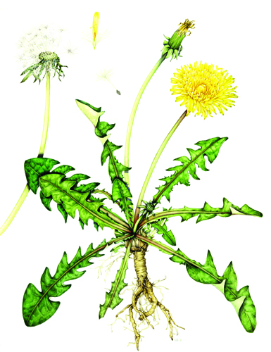
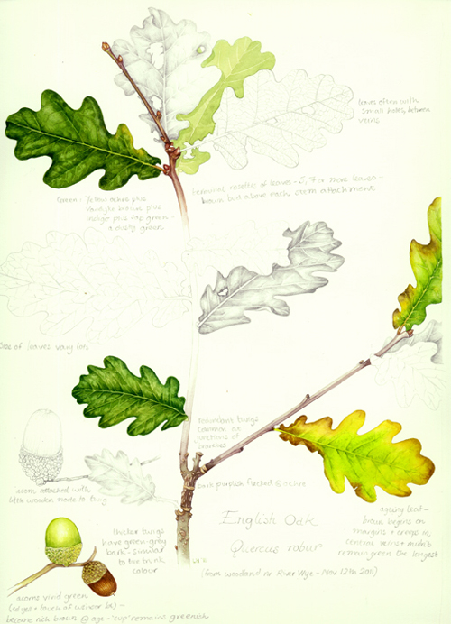
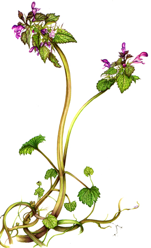
The following pieces are completed botanical illustrations which I think have worked well in terms of depicting leaves.
Learning how to paint leaves from other illustrators
However, I admit that painting leaves is not one of my strengths; and although I’m improving by observing, I acknowledge I have a long way to go before I get as expert as the illustrators whose work I’m including below.
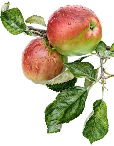
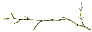
Anna Knights apple shows incredible clarity of observation on the lights and darks of the leaves.
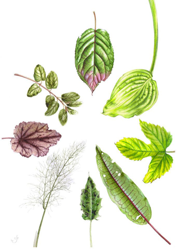
Chris Taylor’s leaves are exquitiste in terms of detailing and colour range.
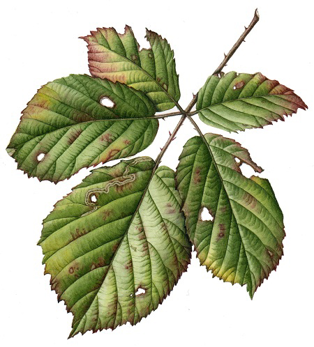
Julia Trickey’s study of leaves is wonderful in terms of shade and observations of the leaf damage.

Thank you! This is a really great and thorough post explaining your process in simply terms. Just what I was searching for.
I’m so glad you found it useful! I also feel that when people explain their processes, break them down into steps, then it doesnt feel nearly so impossible to learn or emulate them. I love the online tutorials and videos you can find of botanical illustrators at work; I may not be able to paint like them or share their style, but it’s endlessly fascinating seeing how the machinery of creating botanical illustrations works. Glad you liked th eblog post. x
Beautiful. Thank you for the green tips. I too enjoy the online tutorials and videos. Watching watercolor paint is is a thrill. I am working on seeing all of your blogs.
Keep up the good work.
Thanks for the feedback and support, Beth. Its lovely to hear that there’s an appreciative audience out there. xx
jai club is gaming plat for to play online games and to enjoy the best games at online and with draw is best easy way
jai club is the gaming and best support gaming to play online games and play and enjoy the games