

Paul Reubens Artist level Youlan series Watercolour box: Review

Paul Rubens artist level YouLan series of solid watercolours is a set of 24 paints in half pans aimed at both amateur and professional artists. I sometimes get asked to trial products by art material manufacturers, so I was pleased to have the chance to give these paints a try.
In exchange for my free paint box, I’ve been asked to make an honest Youtube film review and accompanying blog. I like freebies, and I like trying new things, so I happily agreed. I impressed on them that I am extremely honest in my reviews, and they were willing to take that risk. (If you want to try the paints yourself, with a very limited time 10% discount code, please scroll to the bottom of the blog).
The box of paints arrived a couple of weeks later, along with some rather posh cold press paper, an added bonus. However, I use hot press paper, so won’t be trialling the paper here.
First impressions: Unwrapping the paintbox
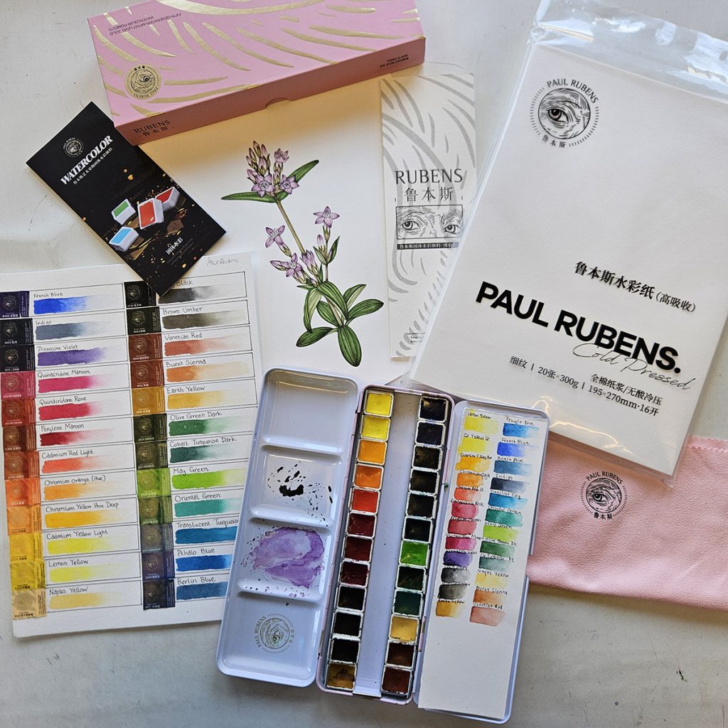
Once I get the box out of the envelope and unwrap it, my first response is excitement at the beautiful packaging, all pinks and golds. Not only does the paint box come in its own cardboard box, but there is a branded sort of wiping cloth in with! (I am certain someone out there will be able to tell me what this is meant for, but I’m going to use it as a classy way of cleaning my glasses).
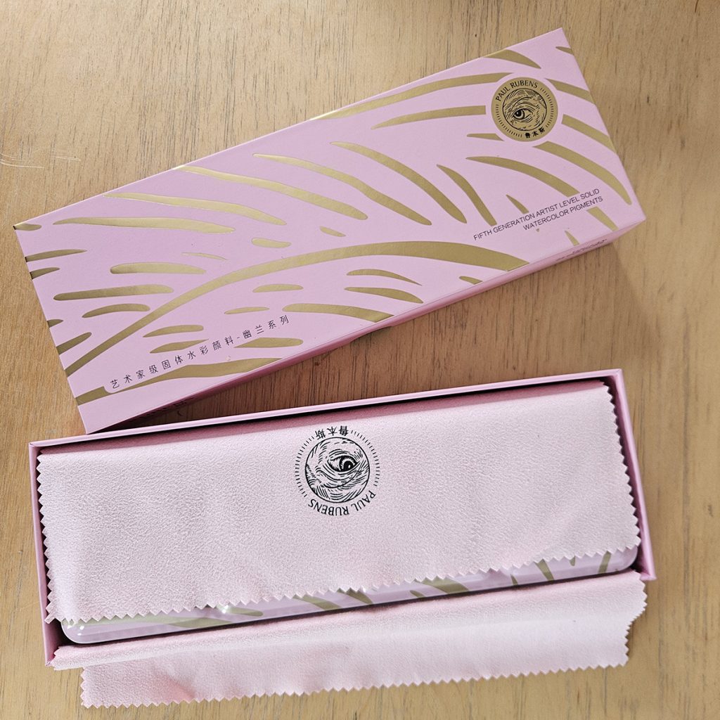
In the box is a test card to do your colour swatches on (the names written in Chinese not English, but Paul Reubens are a Chinese company so this makes perfect sense) and information about the paints (also in Chinese).
![]()
The Paints
Each of the pans is wrapped in a simple layer of printed plastic showing not only the colour but also the transparency and light fastness, along with the code for that specific hue.
These covers came off easily, and I was gratefully not to have to pick at bits of plastic and paper which is what I’m used to with the two-layer wrapping of Winsor and Newton and (if I remember rightly) Daler Rowney pans. For environmental reasons I’d prefer this one-layer packaging to be paper not plastic, but it’s still an improvement on other brands.
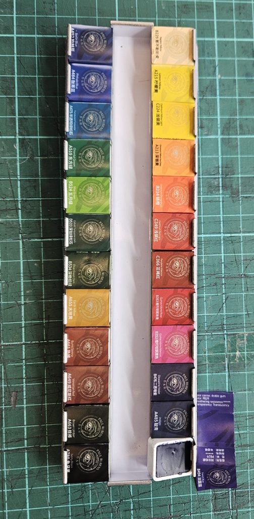
Each pan is full and the paint texture looks smooth and consistent.
The Paints: Names of colours
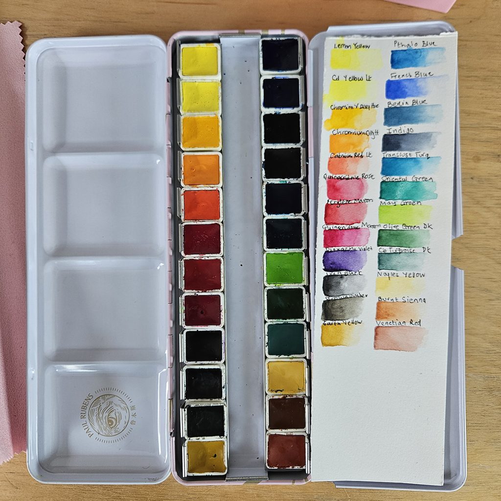
The names of the colours are mostly not the same as the ones I’m used to, although some hues are names identically.
I use Winsor and Newton watercolour paint, and found that the Rubens French Blue is a match for French Ultramarine. Earth Yellow is the same as Yellow Ochre. Berlin Blue is probably Prussian Blue. Some colours are familiar, but remind me of the names of my lightfast Hydrous inks from Dr. Martins. These include Quinacrodine Maroon and Chromium Yellow.
Some colours are totally new, like May Green (a bright, acid shade) and Olive Green Dark.
Some have identical names, Ivory Black and both Cadmium and Lemon Yellows.
The differences in names is irrelevant once a colour swatch is completed.
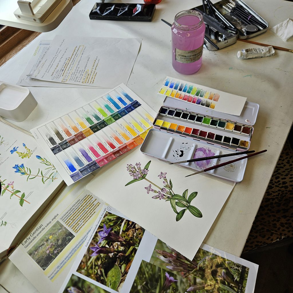
Colour Swatch
I draw up a colour swatch chart, and can’t help feeling rather like a child in a sweet shop. There’s something about new untouched paints that’s thrilling.
I stick the label (with its extensive info in English and Chinese) next to a swatch and write out the name, then trial each colour.
I use the Reubens Cold press watercolour paper for this task, and it works well, holding the paint and keeping a crisp edge.
![]()
Using the paints: Completing the Colour swatch
I am surprised by how bright these colours are. They glow, especially the yellows. They fade out on a gradient to pure water (no pigment) smoothly. None of the pigments is grainy. All those which claim to be transparent are indeed transparent.
When I try mixing, they work well and blend together without separating. So far so good.
The only thing I do notice is that some of the colours look slightly chalkier than my Winsor and Newton paints, especially the oranges and yellows.
Using the paints on my work: A second colour swatch
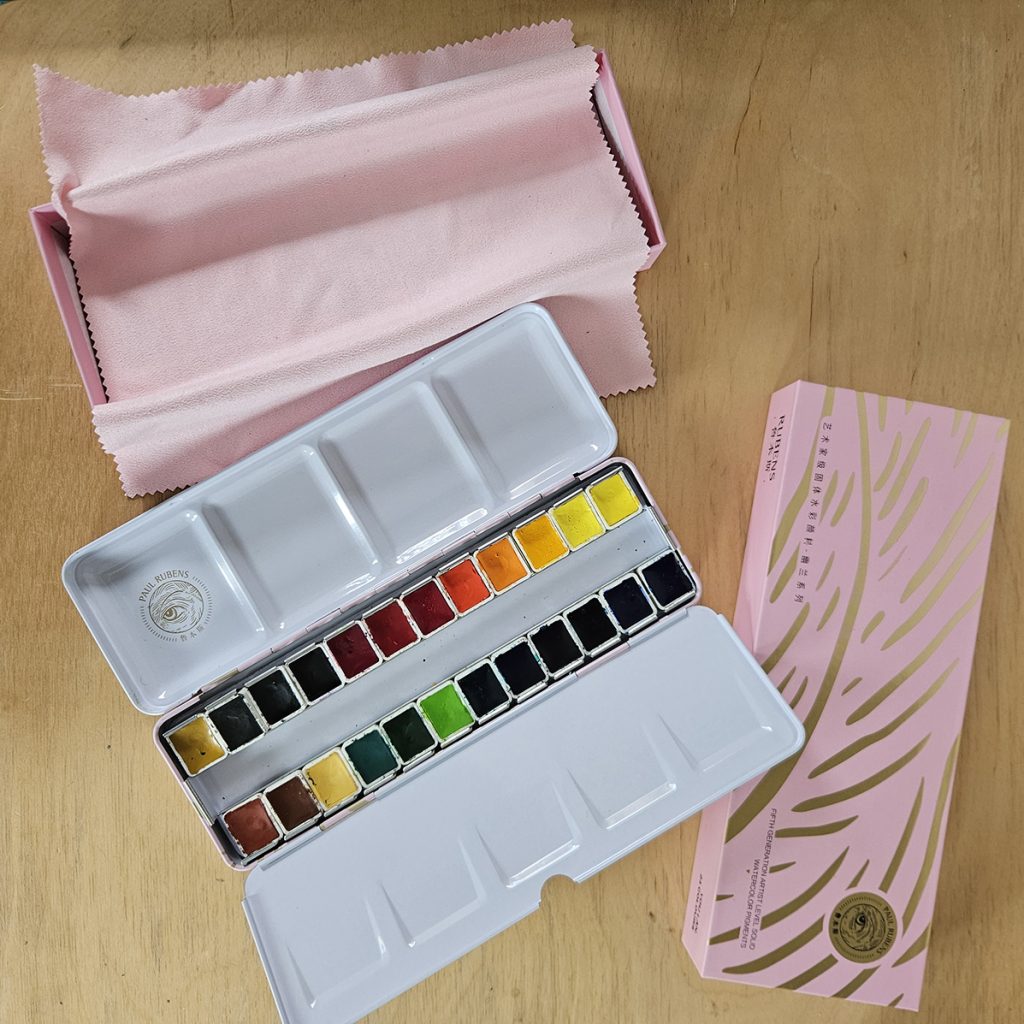
Feeling really quite positive about this box of paints, I do a second small colour swatch to live inside the box and I totally reorganise the layout of the paint box so it echoes what I’m used to. This swatch shows a little more of the difference in handling between Reubens watercolours and Winsor & Newton colours, but the colours are still strong and pure. I put yellows at the top left, blues top right, greens and browns below the blues. It’s a personal thing, the placement of colours in your paint box, but once you’ve lived with a certain layout it’s pretty hard to adapt to a new one!
I’m currently working on another set of botanical illustrations for the Field Studies Council, This time it’s botanical illustrations of the plants of Cranbourne Chase in southern England.
Using Reubens watercolours to paint an Early Gentian
I decide to start with one of the prettiest plants on the list, the Early gentian Gentianella amarella subsp. anglica. This is a washed out mauve colour, and pretty unobtrusive. However, the nuances in the colouration of the leaves, green flushed red, should test the Reubens watercolours and their ability to capture colours, to layer effectively, and to mix smoothly.
I have made a Youtube video of this as I painted and narrated the process in real time.
The upshot is that the Reubens watercolours seem to work just as well as my regular Winsor & Newton paints! This is not the result I’m expecting, and I’m genuinely surprised.
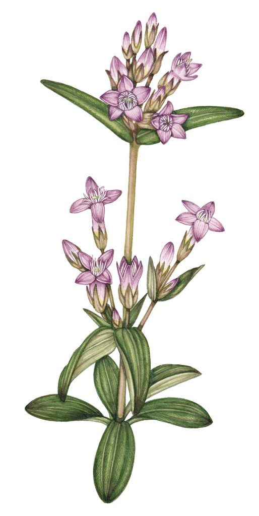
Early gentian Gentianella amarella subsp. anglica painted with YouLan watercolours
Using Reubens watercolours to paint a Field Fleawort
I want to see how the colours perform on a plant with very different colouring, the furry Field fleawort Tephroseris integrifolia with its bright yellow flowers and blueish leaves.
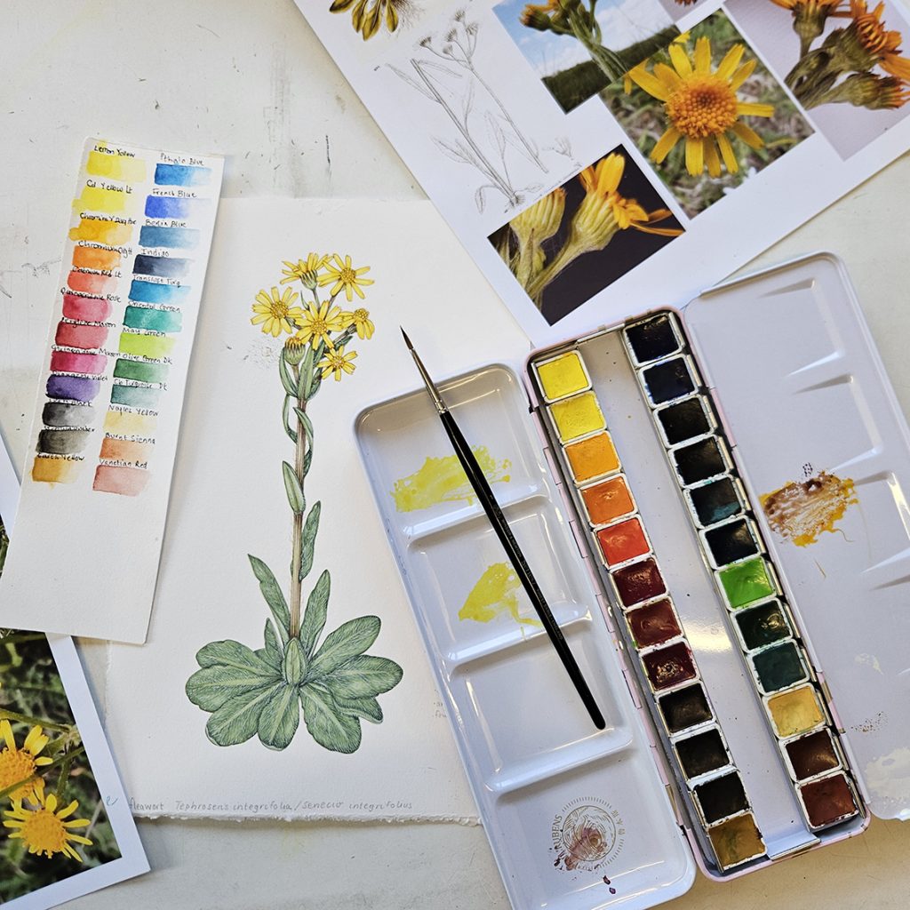
The paints work so well that I do not think I would know the difference from my usual paint box. I find myself pining for a colour like Cereulean Blue, but other than this omission they mix and behave wonderfully. Hairs on the pilose leaves are added with white gouache, and I’m pleased with the finished result.
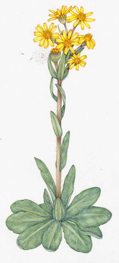
Field fleawort Tephroseris intergrifolia painted with YouLan watercolours
Completing the task using Paul Rubens Youlan series paints
I’m committed to illustrating all eight of the Cranbourne chase species using this paint box. I hope this will bring up any glitches that should be flagged up to anyone looking at my review.
Many of the plants on this species list are rather obscure little things, and not very glamorous. However, they command the same respect at the prettier ones like the Prickly poppy.
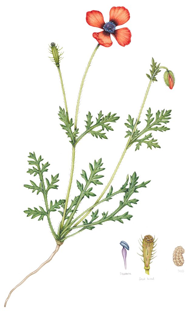
Prickly poppy Papaver argemone painted with YouLan watercolours
At the end of illustrating eight botanical illustrations, I remain impressed by the Paul Rubens watercolour set. There is a certain chalkiness to the paints, and at times I would prefer to be using my Winsor & Newtons. I think this is to do with what I’m used to as well as the fact that we’re comparing the (very expensive) gold-standard of watercolour paints (Winsor & Newton) with a more modestly priced alternative. There is bound to be a difference in quality, I’m just surprised it isn’t more obvious to me. Perhaps if I used wet washes more over larger areas I’d feel more of a difference? The way I paint inevitably will inform how well this set works for me. I do not know how fade resistant the paints are, and although they are good to use I may notice glitches over time. This is true of all watercolours.
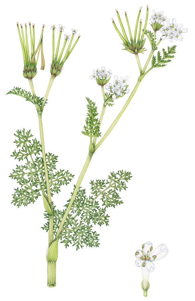
Shepherd’s needle Venus’s comb Scandix pecten-veneris painted with YouLan watercolours
Conclusion
In conclusion I have to say I am very pleased with the Paul Rubens YouLan Artist series watercolour set which can be bought from Amazon UK, Amazon US, Amazon CA, Amazon France, or Aliexpress for those in Australia.
The paints are vivid and bright. They behave well when mixed and capture nuanced colour as well as my regular brand. The packaging is gorgeous. Even though the yellows look a bit chalky this doesn’t translate to my illustrations which remain clean and unmuddied. This could be because of the way I paint, using watercolour more solidly than many botanical illustrators. It could just be cause the paints are good quality.
Remember, this really is an unbiased review, and I’m looking for things to fault. I don’t have the same knowledge of the chemistry and behaviour or paints as some of my botanical illustration colleagues. However, I know what works for me and for the style of illustration I use. And these paints fit the bill!
Where to order the Paul Rubens Watercolour set & 10% off
If you are tempted to try a set for yourself, get them from Amazon UK, Amazon US, Amazon CA, Amazon France, or Aliexpress (Australia). They cost a bit less than some of the other brands, and are good value. The company have also generously created a (time-limited) 10% off discount code that can be used at the checkout. It runs from April 12th 2024 until April 18th 2024. I think this is exclusively for people who watch my review film or read this blog. Paul Rubens say to apply it at check out using the Amazon links supplied: 45SW79RU
Thanks so much for reading this review and I’m fascinated to hear any other experiences of these paints. I’m a pessimist by nature, so there’s a part of me that’s wondering, “are these too good to be true”? For now though, I’m impressed and pleased with my lovely new box of watercolours from Paul Reubens. I will use it as a back-up to my Winsor & Newton box, confident that the paints are good.
Here is the accompanying film:
The 24 pans Paul Rubens set costs on French Amazon 57,99 euros. And bellow is the price of a similar W&N 24 pans set at a local store.
https://www.hobby.gr/winsor-newton-profesional-watercolor-black-box-me-24-half-pans-2
That is £118
And here is the same set at Jackson’s
https://www.jacksonsart.com/winsor-newton-professional-watercolour-lightweight-metal-sketchers-box-set-24-half-pans
I’ve checked out the pigments used in the Paul Rubens set and they are all lightfast. So don’ t worry they will not fade.
I would suggest to start using the new box. You can add in the middle empty space of the Paul Rubens box some of the colours from your old box and secure them there with a bit of blue tack ( that sticky thing for posters). This pink box is so pretty ànd so much more compact. And it has additional mixing space at the bottom if you remove the tray when you are painting.
Thanks Marialena, and for checking the lightfast quality of the pigments. Its just a cerulean blue Im missing so I may well blue-tak that into the central space. Great idea! Thanks
Hello, I’ve been looking for a set of good quality watercolour paint, but being a beginner in watercolours, I found Winsor and Newton a bit expensive! So I looked at your blog and saw your youtube videos( which are brilliant by the way!!) So, today the Paul Rubens box arrived!! All looks really nice and I’m eager to start testing them and making colour swatches! thank you for your blog and video, I would never had thought that a box of 24 halfpans of this price could be so good!!
Oh a little question, how do i learn to draw the flowers and plants? is there a book of someone that explains about setting up and drawing the flower/plant before painting? My results are very ‘cartoonish’ and would like to improve!! Many thanks, Ingrid
Hey Ingrid
So glad the suggestion about the cheaop but good paints was helpful.
I’ve written lots of step by step blogs here on my website, or you could check out my youtube videos (https://www.youtube.com/channel/UCd_5uf3Zy8q0bLFy5b5PHiw) which also include lots of step by steps. Although Ive done a book for beginners, the editng process is yet to kick off, so it’ll be a long wait til its published I fear. Any “beginners guide to botanical illustration” should be useful, sometimes guides to flower painting can be less accurate and may not be as precise as you’d like, so look out for “botanical” in the titles.
Hope this helps and good luck!
Yours
Lizzie
Hi Lizzie,
Thank you very much for you reply. I’ll certainly check your link and will look out, impatiently, for your your book!!
Thank you for your wonderful creations and all the work you put in to let us, the public, see and read about your work! Much appreciated!!
Hugs,
Ingrid