Garden Illustrations for National Geographic books
I was recently excited to get a commission in from National Geographic Books in the US. They needed a series of full-colour garden plans; showing plants, and possible planting schemes for wildlife gardens. They will be used in a book promoting wildlife gardening, “Birds, Bees, & Butterflies”.
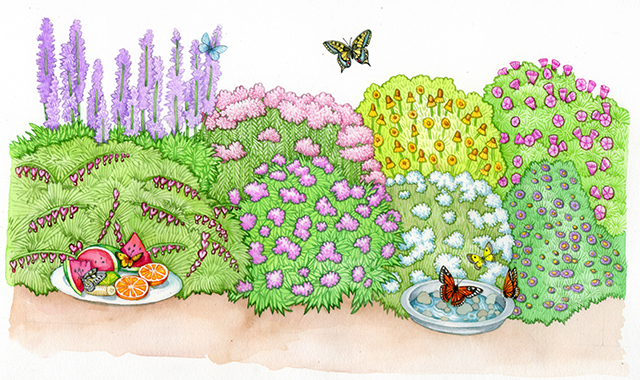
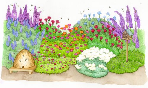
One plan would show a garden designed to encourage birds, one designed to tempt bees, and the third aimed to be a haven for butterflies. Not only did each garden have about 8 plants to include, but each one needed to include some symbol or prop to show what animals were being lured in.
I worked on the bird garden first. National Geographic books was unusually generous in providing lots of reference of the plants to be included; this speeded things up significantly. I wanted to include a bird house, but also a couple of birds to show the diversity of species you could attract by thinking about your garden’s design.
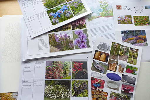
Thumbnail sketches, very swift, and more like a visual thought process than anything else came first.
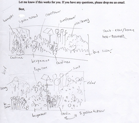
These are helpful in figuring out the composition of a piece, how the image will be balanced, and how to include all the required components without swamping the illustration.
Pencil roughs
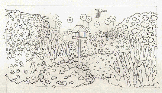
Once I was happy with the layout, I drew up the pencil rough. The trick with garden plans is to simplify the different plants into representative “blocks” of shape and colour. These need to suggest different species, but too much detail swamps the picture. The rough I submitted was my second attempt, the first was far too cluttered and didn’t read clearly.
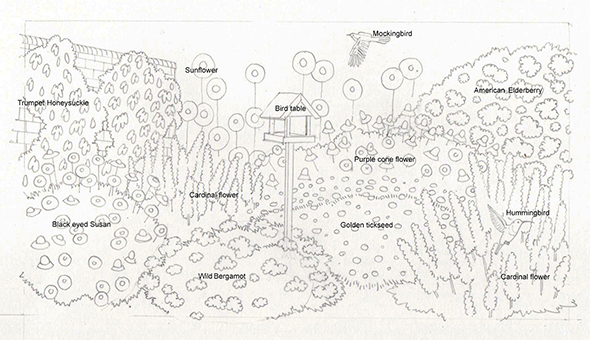
To help the client see my thinking, I submit an annotated rough too. This way she and the panel can decide if the representative shapes and simplified plants register correctly, and can make alterations to positions of different elements of the illustration. I also needed to check that using a hummingbird and a mockingbird (both familiar east coast US species) was appropriate; and that our typical European bird table was of similar design to American ones.
Colouring-in the illustration
Once I got the go-ahead, I started by plotting in the greens. These needed to have some resemblance to the plants, but also to be different enough to clearly show different species. I painted lines around the edges and flowers, then used really wet watery washed to fill in the areas of green, and allowed it to dry and leave the sharp edges of watercolour to help delineate the different species. I used Winsor & Newton watercolour paints, Winsor & Newton series & watercolour paintbrushes, and doctor martin watercolour inks which are brightly coloured and completely transparent and thus glow and help keep an illustration light.
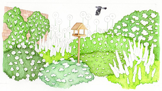
Next, I painted the birds, with as much detail as possible. They give the depth and texture to the garden plan, so had to be good. Easy enough to say, but a challenge when each one is only 2cm long! The flower details followed. Again, I used outlines and different colour mixes and allowed them to dry before applying washes on top. I tried to suggest the shape of the plant, and some essence of the inflorescences, without getting bogged down in dark colours and unnecessary complexity of form.
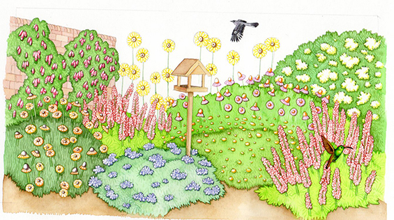
The last step was to place watery washes on top of the flowers. I then work gently into the areas of dark in the plants to suggest a little depth. Again, it’s always a scary moment as it can be ever so easy to muddy and over-work an illustration.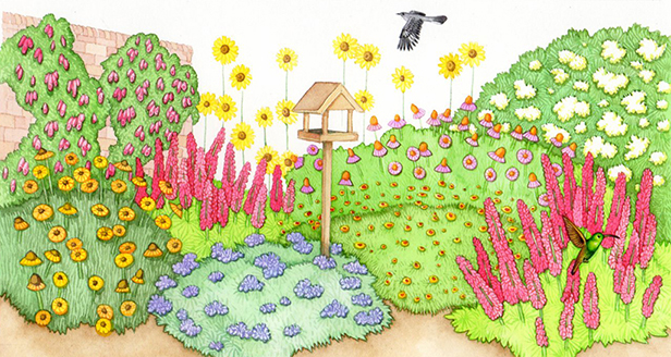
I was pleased with the finished piece, and delighted when the client approved all three garden plans too. It’s always wonderful having happy clients, and even more so when they’re high profile as in this case.
Illustrating the other two garden plans
The other two garden plans, for bees (with a skep) and for butterflies (with a plate of pebbles in water and a dish of fresh fruit) were equally enjoyable to illustrate. They were also approved. I look forward to seeing them in the book. The client was generous enough to show me how they’ll look in situ on pdfs of the layout, so I feel optimistic that the book will look lovely.
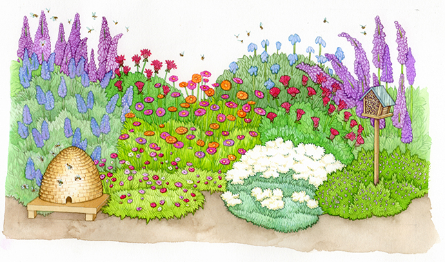
Bee Garden plan
