

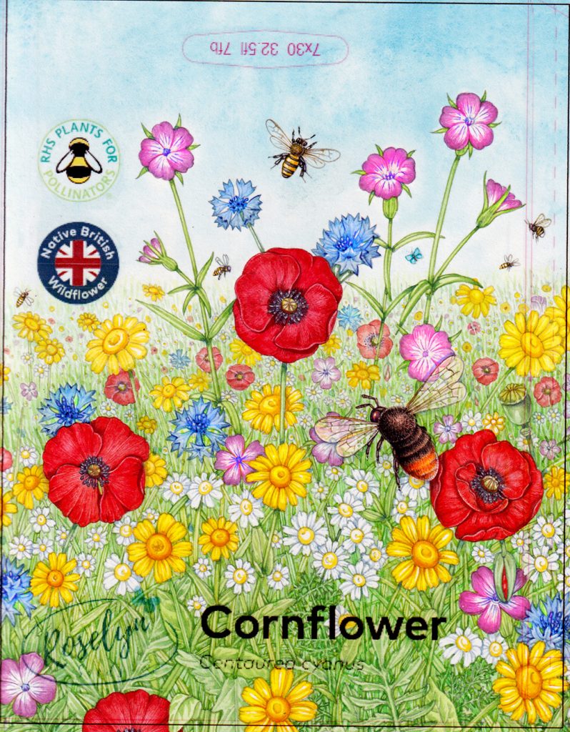
Wildflower seed mix – Packet design
This wildflower seed mix packet design is a recent illustration completed for Roselyn Seeds. I have created illustrations for several species of wildflowers grown by the company, including Cornflower, Red Campion, Cranesbill, and Meadow buttercup.
Roselyn seeds logo, (featuring my Common blue butterfly)
I have also created the artwork for their Wildlife Garden seed mix, and am working on designs for their Meadow cranesbill, Corn chamomile, Borage, and Sunflower packets.
Seed packet designs completed for Roselyn seeds
Design constraints
When working for packaging, there are always things to consider as well as the depiction of a flower species. In this case, it’s the position of the hole at the packet top (so it can hang up on a display unit), logos relating to the credentials of the seeds, and the name of the seeds along with the Roselyn Seeds logo.
![]()
Logos which appear on the left side of the seed packets
Initial thumbnail roughs
The first thing to do is share ideas with the client. I often submit these thumbnail sketches as pencil drawings, but because colour is so crucial to this design, I roughly added colour to the images, using photoshop. There were about six options submitted, and once we agree on one or two, the process of fine-tuning the design can begin.
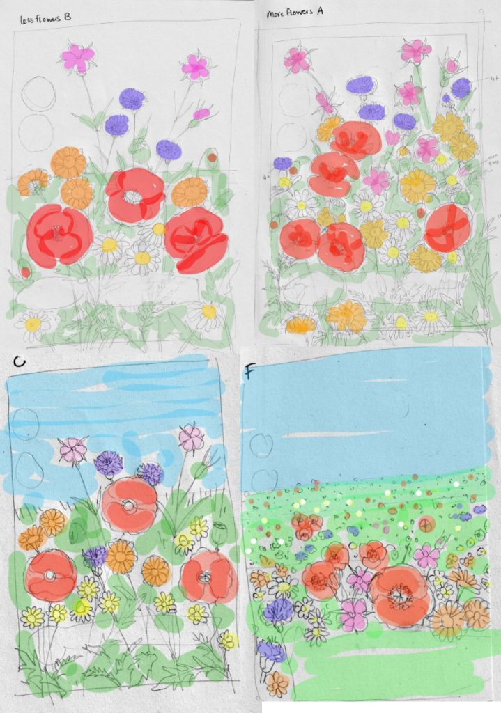
Initial colour thumbnail roughs
Working up roughs
We decided on elements of two of the colour roughs. The next step is to decide on a more precise composition, establishing where the flower heads should be, and how zoomed into the meadow the viewer should be.
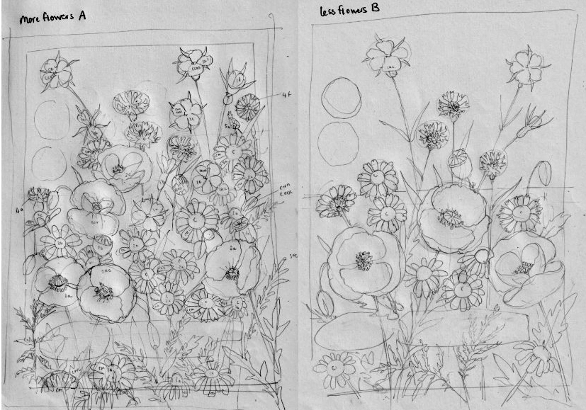
Working on initial pencil roughs
After feedback on this stage, I worked up a more detailed pencil rough, showing all the elements in the correct position. We also decide which pollinators to use in the illustration, and where to place them. The blue circle on the drawing below dictates the position of a honey bee.
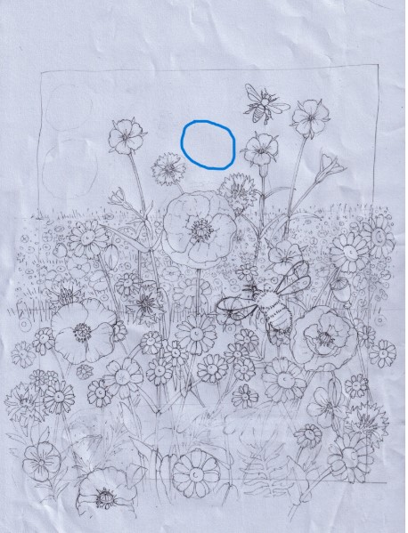
Detailed pencil rough
Final pencil rough and layout
Once this gets the go-ahead, it’s time to draw it up in detail and to overlay the design constraints on top of the drawing. This ensures that the artwork won’t bump into logos or text, and that the logo can still be seen clearly. The details of the foliage in the background is added.
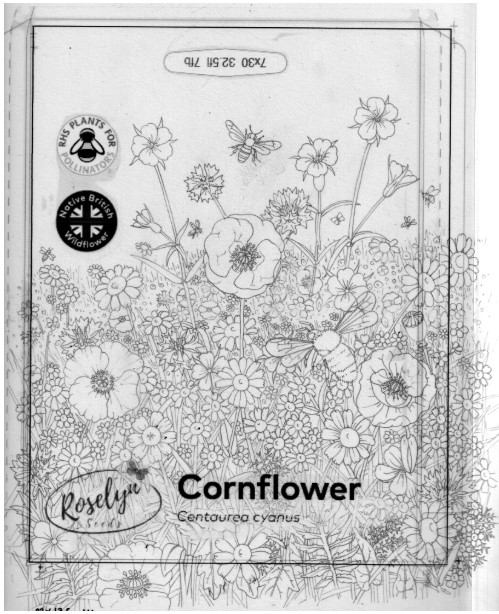
Final rough in layout
I do this with an acetate overlay. I use this same overlay for all the designs, hence the wording not being correct. It’s good enough to prove there will be no stark colour contrasts between flowers and leaves in critical parts of the layout.
Adding the background
I work from background to foreground when I illustrate. This helps ensure the areas of highest contrast are right at the front, which gives a sense of depth to the illustration. For more on illustrating landscapes, see my blogs on illustrating a coastal hay meadow and illustrating a water meadow landscape.
The sky is added first. This is a very watery mix of Cerulean blue and Cobalt blue. I extend it half way over the meadow so there will be a smoother transition between sky and plants.
At the base of the sky, while the paint is still wet, I add a very pale green wash. This does not cover the main flowers, but unites all the other elements at the base of the design.
Adding foliage
Next, I outline the leaves. This is a basic re-draw of each blade of grass and leaf, using a variety of greens. I add details like veins and accurate leaf margins. I’ll also put in some suggestions of shadow to give the leaves depth.
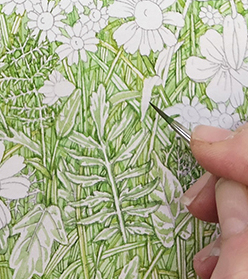
Detail of the foliage
The flowers are left as white paper, for now, but will receive similar treatment in due course. The reason for doing the leaves and grass first and the flowers later is simple. The flowers are more exciting and fun!
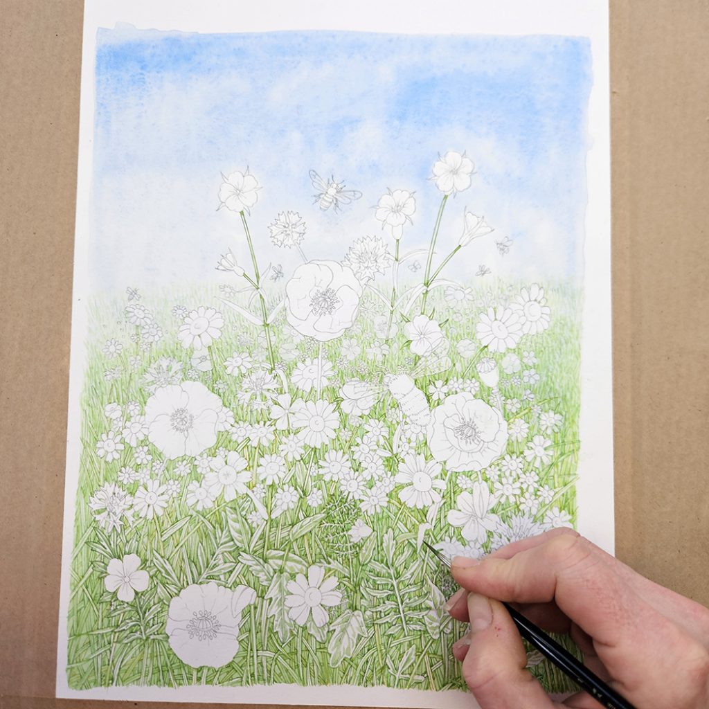
Illustration with background completed and foliage plotted in
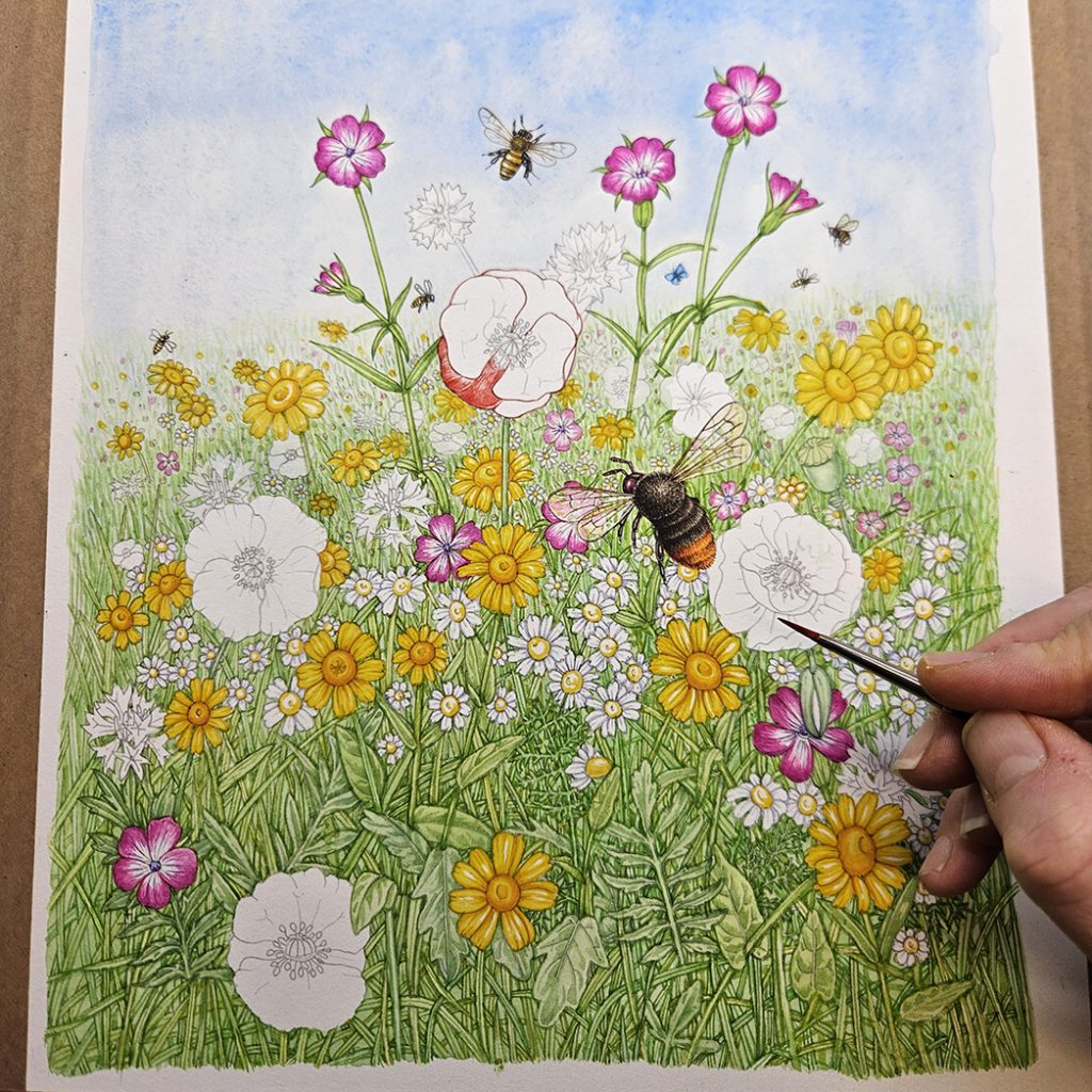
Adding the insects
Before getting into the details and darker tones of the leaves and flowers, I add the insects. This ensures I don’t paint over them by mistake, and that I can calibrate the tonality of the landscape and be certain they’ll show up.
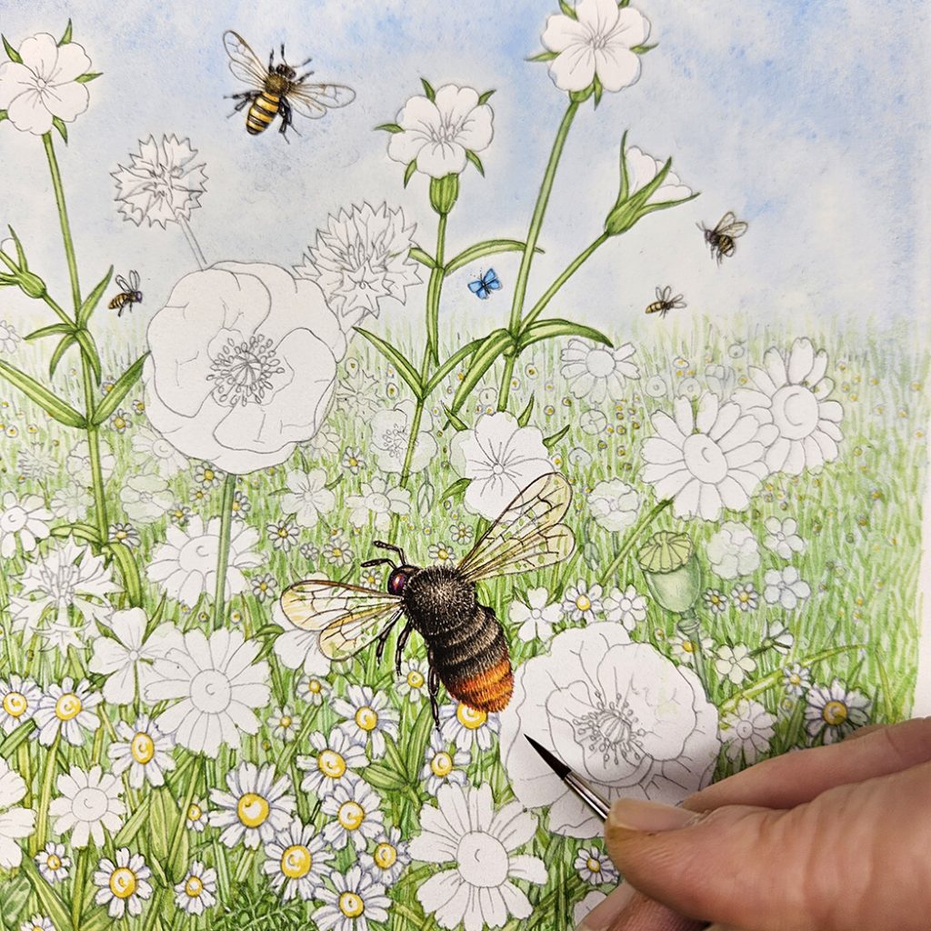
Adding the bee pollinators to the illustration
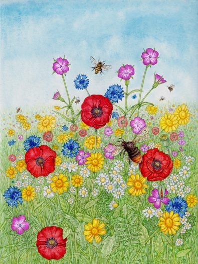
Each of the seed packets features one or more common pollinators. For this wildflower mix, we could take our pick from any number of bees, beetles, wasps and butterflies. This is the Red-tailed bumblebee.
Adding flowers: Yellows
Next, I take on the flowers. I do this colour by colour. If you only have yellows on your palette, you’re far less likely to mix some random muddy colour by adding red or blue by mistake. I delineate each petal, and then the centre of the flowers. For the white flowers, it’s only the central area of each inflorescence that gets colour added.
Once this is done, I add a more dilute yellow top wash to the marigolds. The corn chamomile and corn marigolds are more or less finished.
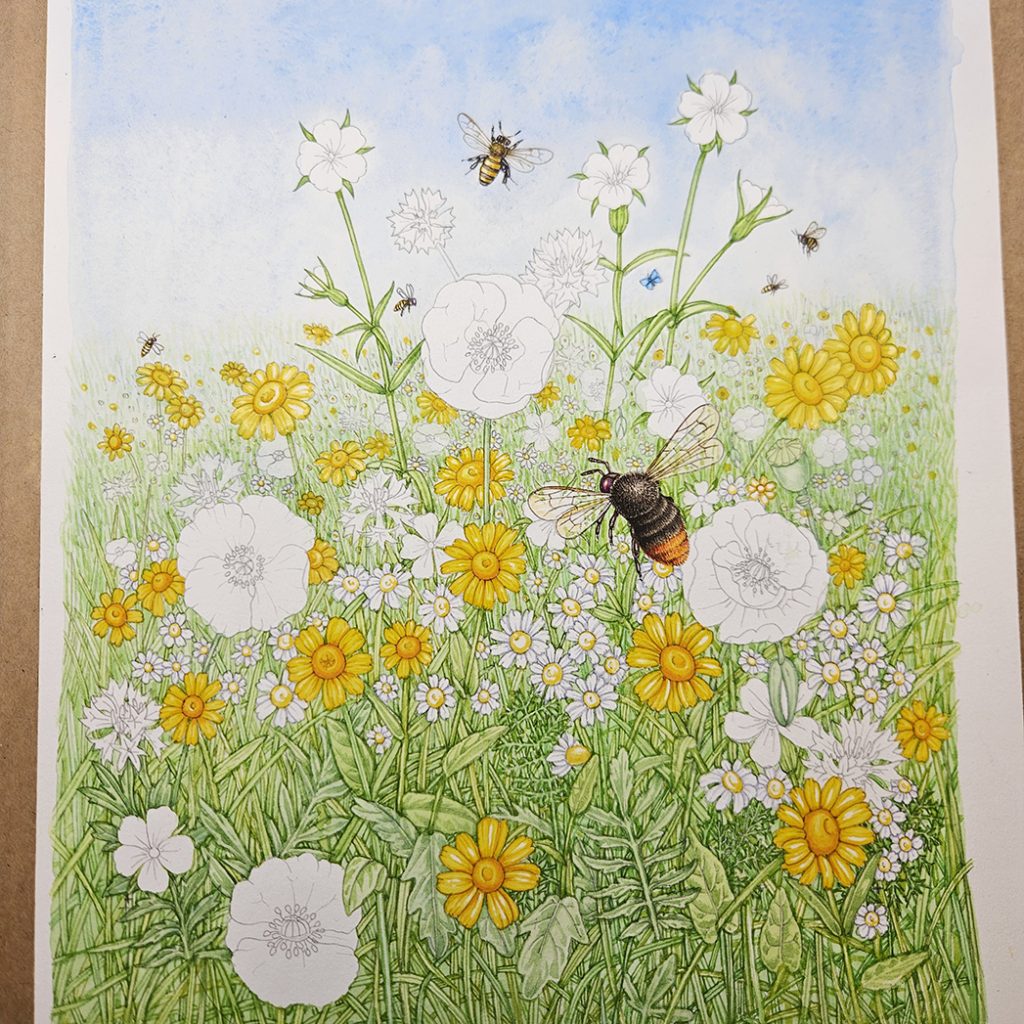
Painting the yellow flowers
Adding flowers: pinks and reds
I repeat the process for the pink Corncockle flowers. These only have colour at the edges of the petals, the centres are white. They’re one of my favourite meadow flowers, so I was glad they featured.
Adding the pink flowers
You can see I’ve started adding the red poppies too. Paint water is changed and the palette is given a wipe, even between painting colours as similar as reds and pinks. I also add the poppy stamens, making sure they’re a purple hue rather than plain black.
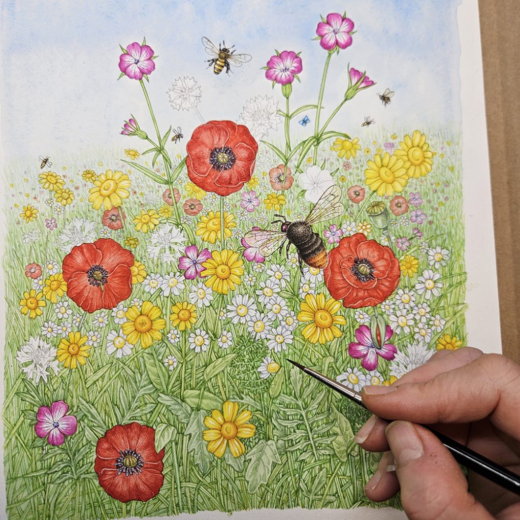
Illustration with Pink, red and yellow flowers completed.
Again, once the poppies have been painted, it’s time to get fresh painting water and to clean the palette.
Adding flowers: Blues
The Cornflowers are such a lovely shade of blue. It’s a surprisingly easy colour to mix. Just Cobalt blue and Opera rose. I have practise in painting these, having done the Cornflower seed packet illustration eatrlier. It’s useful being able to cross reference your work.
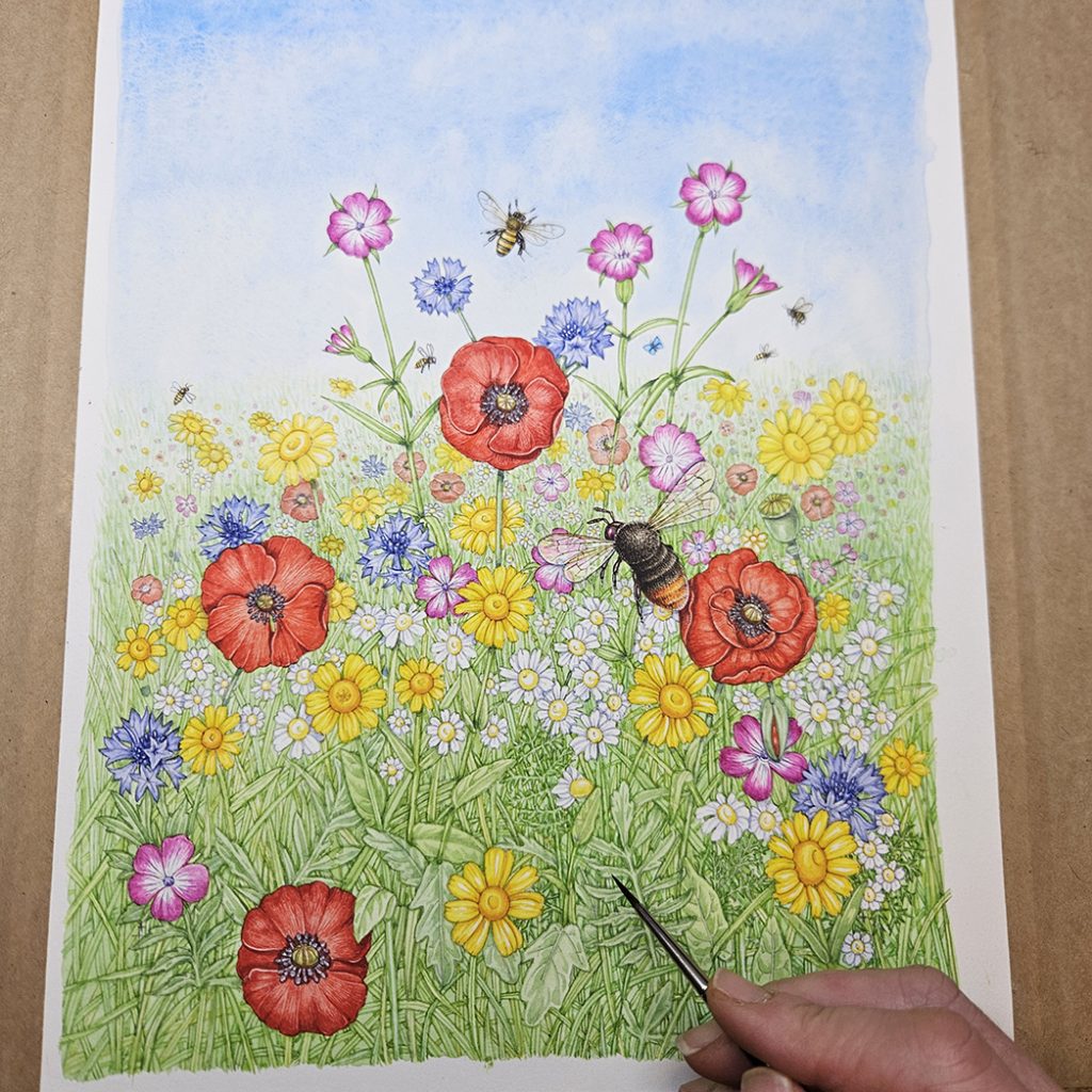
Blue cornflowers are added
A pale diluted blue is added to the top of the cornflower petals, and the central florets are picked out in a darker blue.
Finishing touches, and reflection
To make the colours of the flowers more intense, I add further glazes or top washes. More distant flowers are kept paler to try and give a sense of depth.
As we need to leave the background behind where the words appear clear enough to allow text to be legible, there’s no scope for adding much in the way of tonal depth to the leaves and grass. The result is a flattening of the illustration which I’m not entirely happy with.
The flower colours are correct, but because of the lack on nuance in the leaves, the illustration appears both slightly washed out and simultaneously super saturated.

Completed illustration
Illustration with Layout guides
The acid test is to lay the acetate with the design elements over the top of the completed illustration. It’s a moment of truth, and I am always very relieved when no crucial element is overlapped by bright colour, and no important flower is obliterated by text or logos.
Completed illustration with design overlay
I like many elements of this illustration. I’m fond of the bumble bee and the poppies. The composition works. But the disconnect between the tonality and saturation of the flowers, and the less shadowed leaves feels a little jarring. This will be reduced once the illustration appears on the seed packet, some of the intensity of colour gets washed out in the printing process.
Other seed packet designs
The seed packet below is for a wildflower garden mix. It features an idealised garden, complete with pollinators, a bee hive, and a well-visited bird table. (Not to mention a ridiculously clean shed). I like the way this image works on the packet label.
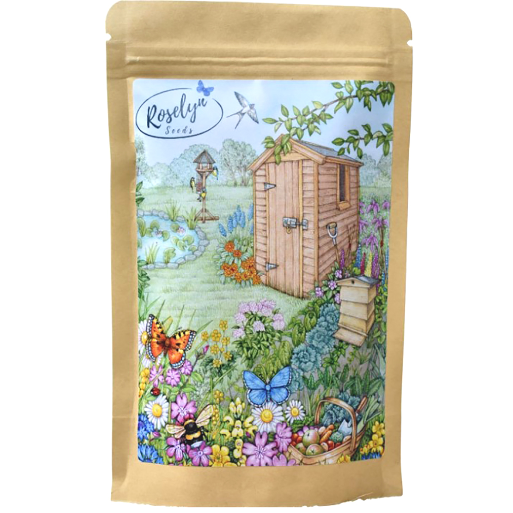
Wildflower garden seed mix
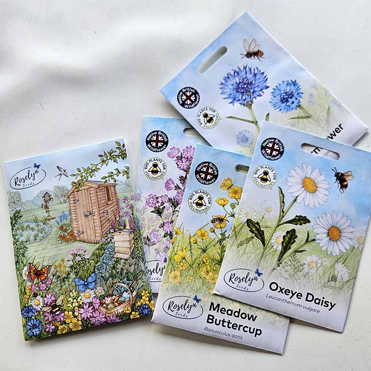
Below are some of the individual species’ seed packets. I think they show how the colours are slightly less saturated as a result of the printing process.
The ones I’m currently working on include borage (one of my favourite flowers) and the sunflower. These seed packet designs are an ongoing job, and one I’m enjoying.
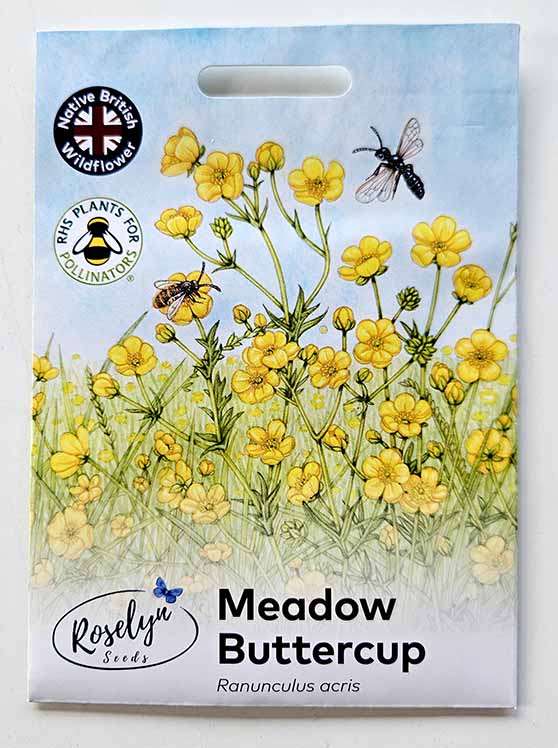
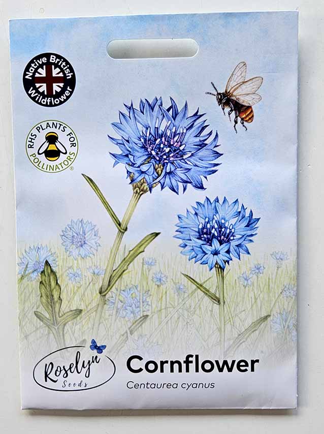
Meadow buttercup and Cornflower seed packet designs
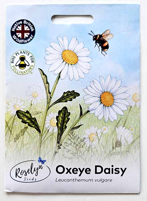
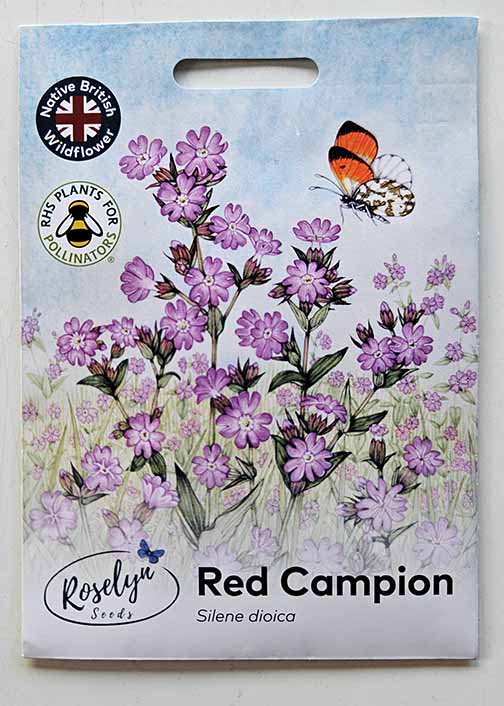
Ox-eye daisy and Red campion seed packet designs.
Roselyn seeds haven’t yet rolled out these designs across all of their products, but will do so soon. In the meantime, feel free to order their (excellent) wildflower seeds. And maybe have a go at illustrating them yourself?
Thank you Lizzie for sharing the process of the package design, I enjoyed reading it. I like borage too, they look very otherworldly and the blue and pink flowers are just gorgeous! I had a go at painting a late bloomer borage recently, the hair is hard to master. Would you use gouache for the hair? Or the same colour of the plant part? I used the latter to give the idea of the hairy-ness. Will try again next summer when I see them at the allotment and probably try to paint it at 1.5x.
Hiya
So glad you like the blog. I would use a neutral grey for the hairs where you can see them against the white of the page (or even pencil). Hairs on the leaves, yes, white gouache and a tiny brush. Use it quite thick. 1.5x sounds like it’d be glorious!
Thanks for the question
Thank you for this blog! I love following your work here and on You Tube and admire your work very much!
Thanks so much Bronwyn!