Natural History Illustration: Wildlife garden
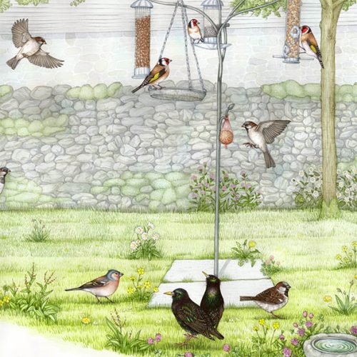
A recent natural history illustration job for the North Yorkshire Dales National Park involved painting two large landscapes for use on a desk at Malham Cove visitor centre. The first landscape was of Malham Cove, the second was of birds commonly seen in the garden at the visitor centre.
Pencil rough
As always, the first step is to get a pencil rough drawn up and sent off to the client for feedback.
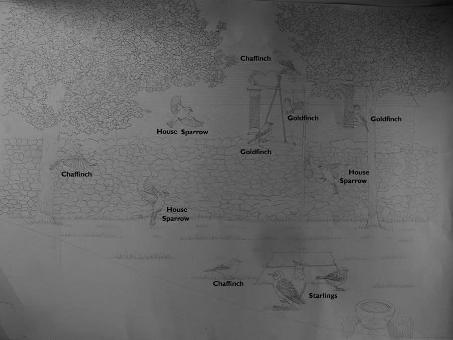
Malham Visitor centre annotated pencil rough
I needed to add a few flowers to the turf. Then we were good to get going on the painting.
Starting out: Sky and the stone wall
As with the Malham Cove landscape, I start by painting in a sky across almost the entire sheet of paper. This unifies the illustration and allows foreground details to pop out at the viewer. These are spared the pale blue wash.
Next I painted the wall. Talk about mindfulness! It was a full (and happy) day of painting first the shadows, then a top wash on each and every stone. I mixed up five different greys. There was one purplish, one greenish, one with a blue hue, one brown, and one with lots of yellow in. Switching between these colours ensured the wall looked varied and interesting.
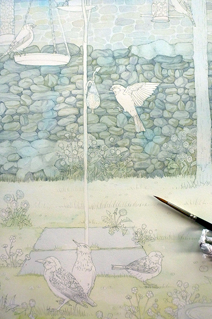
Detail showing painted wall
Painting the trees
Next up came the trees- another day of pale washes, but these ones were gentle greens. For these colours I mixed plenty of yellow ochre and some blues and purples with the pan-ready greens. This makes the greens truer to nature. I plotted in the turf, getting brighter and more saturated in colour as I progressed to the foreground.
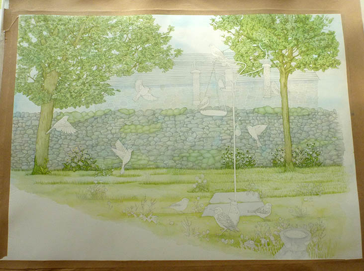
Malham visitor centre landscape with most of the background painted in.
Illustrating the Wildlife Garden bird feeder
After spending some time working into the plants in the turf, I started on the precise detail of the bird feeder. After so much wet landscape work, this close and exacting work was a relief. To get the effect of brushed aluminium I used cerulean blue watercolour (I tend to favour Winsor and Newton paints) mixed with a touch of purple lake and a tiny bit of vandyke brown, and made sure to apply the paint in sharp stripes, going over the centre of each area of blue twice to show the darkest parts of the metal. The peanuts were less successful and I fear they resemble baked beans.
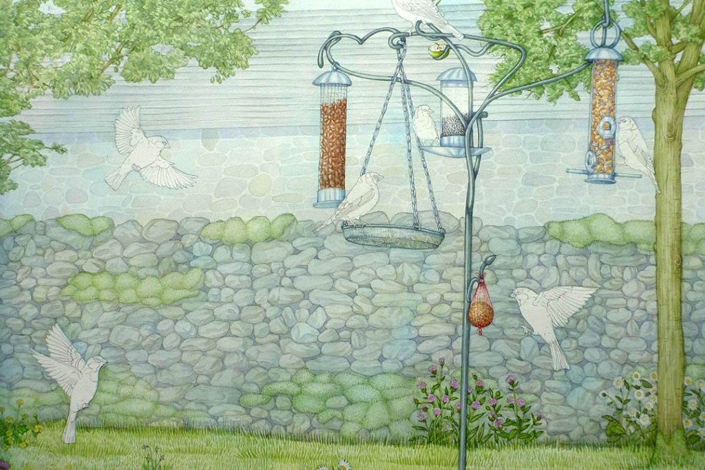
Detail of Malham visitor centre illustration showing detailing of the bird feeder

Malham visitor centre landscape in progress
I enjoyed working up the bird bath in the foreground, making sure there were plenty of wild flowers around the base. These included black knapweed, hawksbit, red clover, daisy, buttercup, and self-heal. I trieda to get some decent texture into the moss and lichen on the limestone.
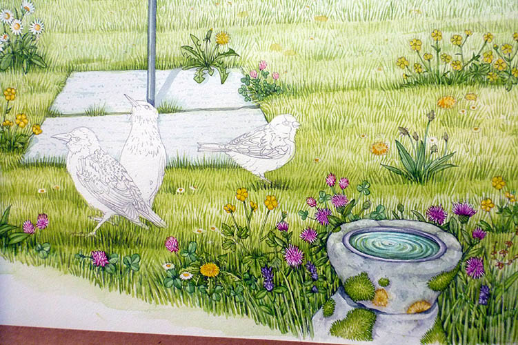
Detail of Malham visitor centre illustration in progress showing the bird bath and wild flowers.
Adding in the birds
The birds now look like bits of a jigsaw puzzle that are missing. This is one of my favourite moments in a landscape like this – the hard work is done and just the detailing of the animals remains.
The first two birds were not a great success, I went in too heavily with bright colours and lost some of the delicacy of the colours of a chaffinch. I also think there’s something wrong with the chaffinch perched on top of the bird feeder. It looks rather pigeon-esque. However, I enjoyed the golfinches and the sparrows. I love mixing the blue greys and warmer ochres and browns of the sparrow feathers. Going in with the facial scarlet on the goldfinch is great fun.

Detail of the bird feeder (from the completed illustration).
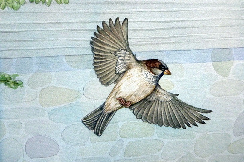
Close up detail of sparrow in flight (larger than life to show brush strokes)
Illustrating the starlings
Once I’d finished painting all the sparrows, goldfinch and chaffinch, there were just the starlings (and their stunning irridescent plumage) to paint.
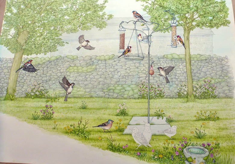
Wildlife garden at the Malham visitor centre in progress.
I loved doing the starlings, using vibrant pink, green, and yellow Doctor Martin hydrous inks straight from the bottle.
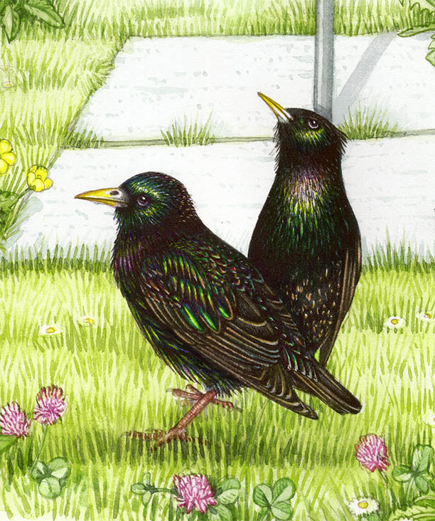
Deatil of starlings (3 x original size so you can see the brush strokes)
The landscape was now complete. A few more tweaks here and there, mostly making the shadows under the birds bolder by adding purple and blue washes, and we were there. In the past, I would have rubbed out the underlying pencil from a landscape such as this, but now I tend to leave it as it adds a bit of clarity to the work but (I hope) doesnt look too clumsy.
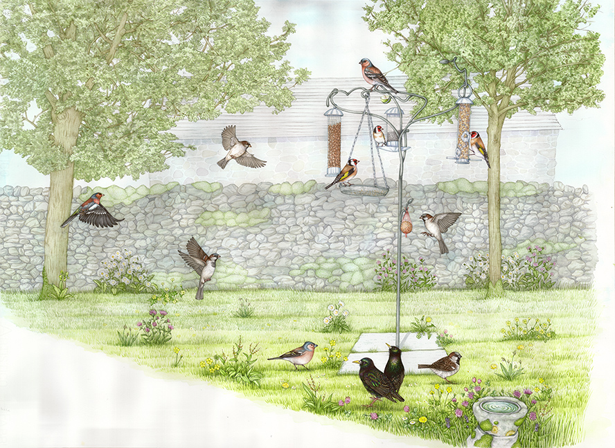
Completed illustration
It’s always scary working on such a giant illustration, but the sense of relief when it’s compelted and I’ve not made any irreperable errors, or spilt a mug of tea over the whole thing is immense.
It’s also worth noting that if you’re into wildlife gardening, spare a thought for the mammals such as the hedgehogs as well as the birds. For more on this check out this hedgehog blog by Claire Mitchell.
Now I’ll use this and the sister landscape of Malham Cove and its birds (see my blog on creating this accompnaying landscape) in a layout for the desk in the Malham Visitor Centre. And then maybe, sometime down the line, Ill treat myself to going to see it in situ!

